bondo321
09-21-2016, 03:13 AM
Is it just me or did the new Apple iTunes update completely do away with the awesome colored-backgrounds while playing albums??
gururu
09-21-2016, 03:15 AM
bondo, see this thread (
Thread 209850).
bondo321
09-21-2016, 03:18 AM
Thanks gururu, missed that one
Jasonjhn8
09-21-2016, 06:13 AM
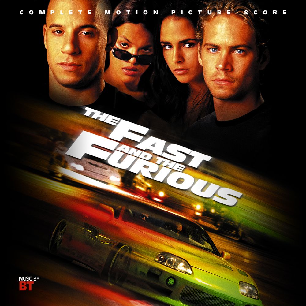
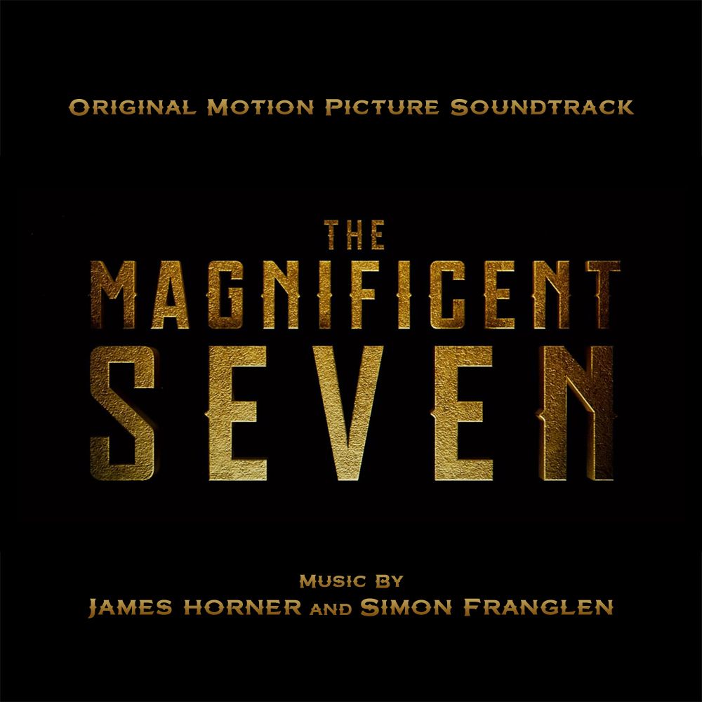
Hey folks. Been away a long while. Life has been crazy and i've lacked time and motivation recently. But DAK called me in from the bullpen for a short appearance at least. :)
<A HREF="
">
<IMG HEIGHT=300 WIDTH=300 SRC="

"></A>
<A HREF="
">
<IMG HEIGHT=300 WIDTH=300 SRC="

"></A>
Dave999
09-21-2016, 09:24 AM
Thanks for Urban Legend, gururu. Looks great! :)
Penderghast
09-21-2016, 09:40 AM
Hello, since Ramin Djawadi's score for Gears of War 4 is coming and it'll probably feature that uninspired official cover, would someone be kind enough to create a custom one from this image? :)

Dave999
09-21-2016, 10:57 AM

(
http://imgur.com/l65VEba)

(
http://imgur.com/wGw3oKq)
Hello, since Ramin Djawadi's score for Gears of War 4 is coming and it'll probably feature that uninspired official cover, would someone be kind enough to create a custom one from this image? :)
I'm politely going to pass on this one. I personally don't find this poster not very inspiring either. I'd prefer the official art over this any day.
Here's the official art for those who don't know what Penderghast is referring to:


Dave999
09-21-2016, 03:20 PM
FilmScore1978
09-21-2016, 03:48 PM
Is it just me or did the new Apple iTunes update completely do away with the awesome colored-backgrounds while playing albums??
Yes it did, I'm very disappointed that they removed that feature.
gururu
09-21-2016, 04:26 PM
CLONEMASTER 6.53
09-21-2016, 04:38 PM

(
http://imgur.com/FHzu0Gz)

(
http://imgur.com/uTQ3H28)

(
http://imgur.com/4fv7QBe)

(
http://imgur.com/loAMyim)
The order in which these are posted can almost tell a story of how he becomes more and more pissed - from the umbrella to the bow and arrow. :laugh:
Dave999
09-21-2016, 05:35 PM
The order in which these are posted can almost tell a story of how he becomes more and more pissed - from the umbrella to the bow and arrow. :laugh:
Actually the shot of him walking in the street with the bow and arrow is near the end of the film. It's a great quip where his annoyances come full circle and leave him, hence the steadfast look of satisfaction on his face :)
bondo321
09-22-2016, 02:18 AM
CLONEMASTER 6.53
09-22-2016, 02:50 AM
A bit close-quarters, I will say, but I'm thankful that I was able to use the material I've been wanting to for a while now.

(

)

(

)

(

)
font variant of above

(

)

(

)

(

)

(

)

(

)
gururu
09-22-2016, 07:19 AM
Dave999
09-22-2016, 04:59 PM
Nice work, bondo, I like the Shaft close up :)
bondo321
09-22-2016, 09:07 PM
Thanks Dave! :) If you couldn't tell, I've been in a David Arnold mood as of late lol
gururu
09-23-2016, 12:44 AM
Expanding upon the German poster…

(
http://imgur.com/MnZsl1n)
tintacle
09-23-2016, 01:26 AM

Here are my custom covers for the Mission: Impossible Series.
Music by Danny Elfman, Hans Zimmer, Michael Giacchino and Joe Kraemer.
A continuation of THIS (
Thread 90457) post...

Mission: Impossible
<A HREF="

"><IMG HEIGHT=800 WIDTH=800 SRC="

"></A>
(click on image for full 3000x3000 resolution)

Mission: Impossible 2
<A HREF="

"><IMG HEIGHT=800 WIDTH=800 SRC="

"></A>
(click on image for full 3000x3000 resolution)

Mission: Impossible III
<A HREF="

"><IMG HEIGHT=800 WIDTH=800 SRC="

"></A>
(click on image for full 3000x3000 resolution)

Mission: Impossible - Ghost Protocol
<A HREF="

"><IMG HEIGHT=800 WIDTH=800 SRC="

"></A>
(click on image for full 3000x3000 resolution)

Mission: Impossible - Rogue Nation
<A HREF="

"><IMG HEIGHT=800 WIDTH=800 SRC="

"></A>
(click on image for full 3000x3000 resolution)

If you have any special requests for any of them (e.g. if you want me to add or move anything or change the color of something or whatever your heart desires), please let me know.
Hope you like 'em ;)
^That's a beautiful cover, tintacle. The iOS version looks pretty! :D
Now this one's pretty interesting. I like it.
Thanks Guys! :-D
Neil Kellerhouse's SIDE EFFECTS poster turned into a soundtrack cover.
Not especially inventive, but whateva�
Il buono, il brutto, il cattivo | The Good, the Bad, The Ugly | Ennio Morriocone
(The Magnificent Seven)
Sometimes you gotta do what you do best:
I've updated my old SE7EN customs for the recent release of the complete score.
What's in the box!?!
(The Magnificent Seven)
Had some time to kill�
Fantastic covers all around! :-D
IMO the film really wasn't as bad as it's made out to be, and Zimmer's entire score, despite the main titles being too heavy on the overdrive guitars, is actually really lovely and very emotional. You should give it another chance, really you should. There's more in there than those opening titles.
Well, I gave it another shot, and was actually quite surprised.
I didn't remember the music being so 'spanish' themed, which is something I really like (reminds me of Horner's Mask of Zorro).
And even though I still don't think the musical tone fits the M:I series, it definitely fits the movie and I have to admit it sounds really cool, especially the deep bass :-D
I've got the first half of THIS (
Thread 94355), don't care much for the alternates, instead of the original ost.
I have yet to really get acquainted with Kraemer's Rogue Nation but I look forward to it. Giacchino's M:I-3 really hasn't grabbed me yet though - only Ethan and Julia's love theme stands out. The rest is pretty tuneless chaos. I was disappointed, especially as I really enjoyed the film.
My favorites in the series goes like this:
1. Rogue Nation
2. Ghost Protocol
3. M:I-3
4&5. M:I-2 and M:I
Sometimes I prefer M:I-3 over Ghost Protocol, and sometimes the other way around.
Anyway, I've done a couple of quick edits of the M:I-3 score into a sort of "Best Bits", check it out (
https://www.dropbox.com/sh/5j9yrnn8ph4t4dd/AAD5Ld5XPkuKTOLHlMet2Vg8a?dl=0), perhaps it could change your mind ;)
Tastes and colors... personally I have some difficulty with the M:I-5 score, that I find not bad but not very inspired. Ghost Protocol excites me from beginning to end, and I think Giacchino has perfectly managed to bring the essence of the series in our time. A true happiness which I never tire.
We all have different tastes, from India and beyond I tend to get a bit bored of Ghost Protocol.
I think Kraemer brought in a lot of new exciting themes and also incorporated some of Giacchino's from the previous two. The tone of the music in Rogue Nation is just my cup of tea ;)
The first time I saw the film was with my father, I wasn't particularly excited to see it and didn't think it was going to be better than the last one, boy was I surprised..
Anyway, my father usually doesn't notice the music in films that much, but the first thing he said to me when we were watching Rogue Nation was; "Listen to the music, that's great!" :)
DAKoftheOTA
09-23-2016, 02:32 AM
Lalo Schriffin is in a lot more than just The A400. If you want details I can post a screenshot of mine from iTunes.
Is it just me or did the new Apple iTunes update completely do away with the awesome colored-backgrounds while playing albums??
LOL where you been? :laugh:
gururu
09-23-2016, 02:39 AM
James (The Disney Guy)
09-23-2016, 08:01 AM
The Swan Princess
Original Motion Picture Soundtrack
Music By Larry Bastian & Larry Schwartz
Original Score Composed By Lex de Azevedo
<A HREF="

"><IMG HEIGHT=400 WIDTH=400 SRC="

"></A>
Click To Enlarge
Dave999
09-23-2016, 03:49 PM
It's a tad too dark, for my taste, tintacle :) If you could up the brightness a bit more so we could see more of the underlying picture then I'd think it looks fantastic :D
tintacle
09-23-2016, 05:22 PM
Lalo Schriffin is in a lot more than just The A400. If you want details I can post a screenshot of mine from iTunes.
Yes, please!
I've been trying to find information on which tracks Schifrin's themes were in. I haven't received my physical copy of the soundtrack yet :)
It's a tad too dark, for my taste, tintacle :) If you could up the brightness a bit more so we could see more of the underlying picture then I'd think it looks fantastic :D
Thanks!
Perhaps these might be more to your liking? ;)
<A HREF="

"><IMG HEIGHT=230 WIDTH=230 SRC="

"></A> <A HREF="

"><IMG HEIGHT=230 WIDTH=230 SRC="

"></A> <A HREF="

"><IMG HEIGHT=230 WIDTH=230 SRC="

"></A> <A HREF="

"><IMG HEIGHT=230 WIDTH=230 SRC="

"></A> <A HREF="

"><IMG HEIGHT=230 WIDTH=230 SRC="

"></A>
They are definitely different, much more striking, and I completely understand why you'd like these better, however I still prefer the first set a little more :)
feedthecats
09-23-2016, 09:21 PM
gururu
09-24-2016, 02:27 AM
Dave999
09-24-2016, 08:43 AM
Thanks!
Perhaps these might be more to your liking? ;)
<A HREF="

"><IMG HEIGHT=230 WIDTH=230 SRC="

"></A> <A HREF="

"><IMG HEIGHT=230 WIDTH=230 SRC="

"></A> <A HREF="

"><IMG HEIGHT=230 WIDTH=230 SRC="

"></A> <A HREF="

"><IMG HEIGHT=230 WIDTH=230 SRC="

"></A> <A HREF="

"><IMG HEIGHT=230 WIDTH=230 SRC="

"></A>
They are definitely different, much more striking, and I completely understand why you'd like these better, however I still prefer the first set a little more :)
Those look amazing!! :D :D
heidl
09-24-2016, 01:32 PM
Some thoughts on copyright issues and a making-custom-covers-controversy I've recently had: Click me (
https://hqcovers.net/2016/09/24/silicon-valley-by-jeff-cardoni-various-artists/)
Also... CUSTOM COVERS!

Jasonjhn8
09-24-2016, 04:38 PM
Heidl, you DO rock dude. Always a pleasure to see your work. :)
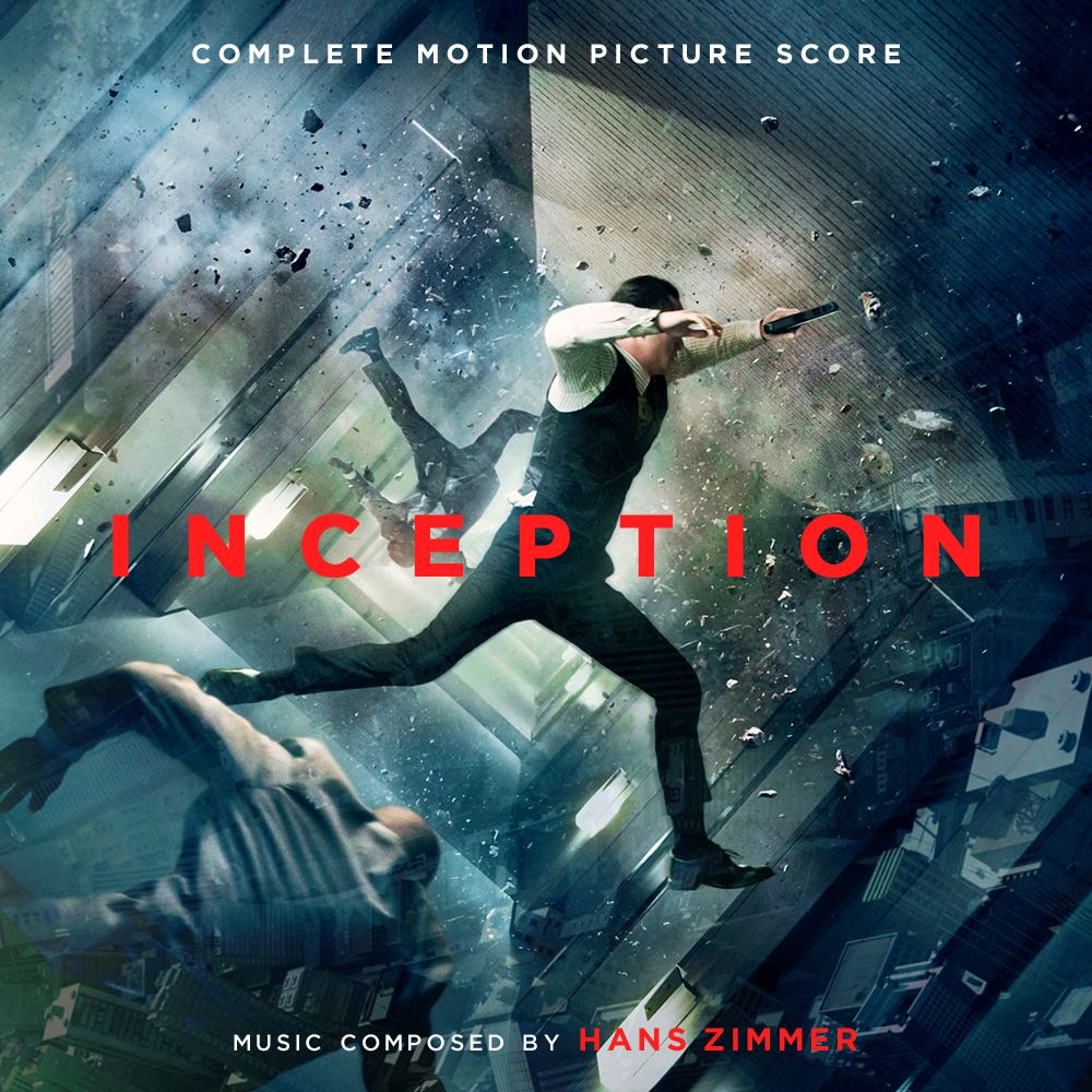
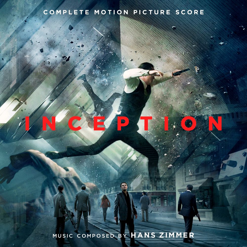
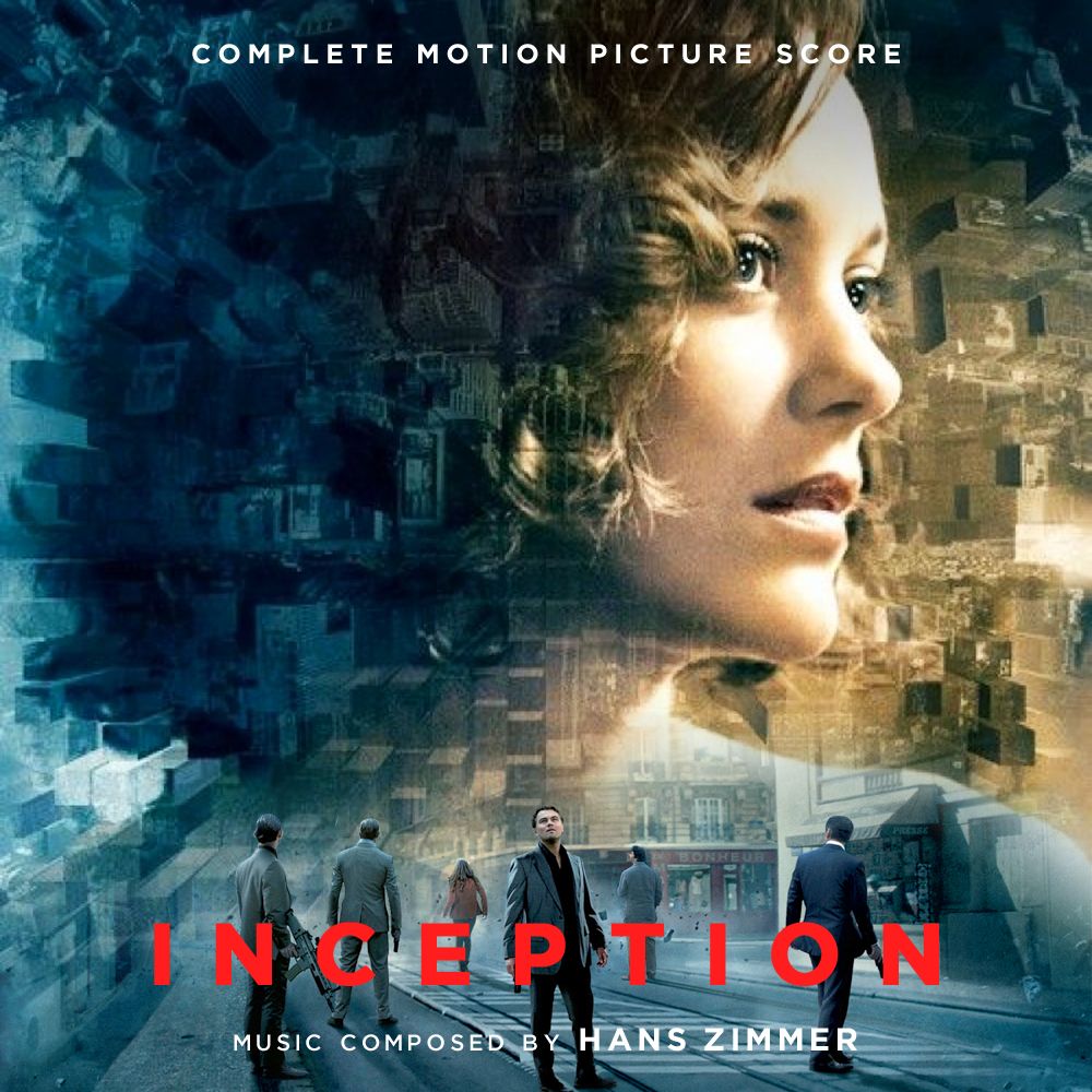
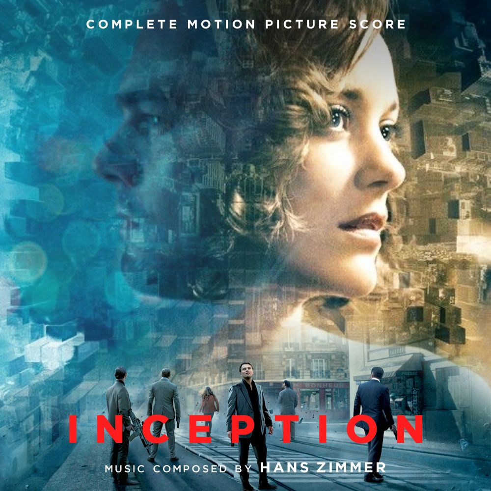
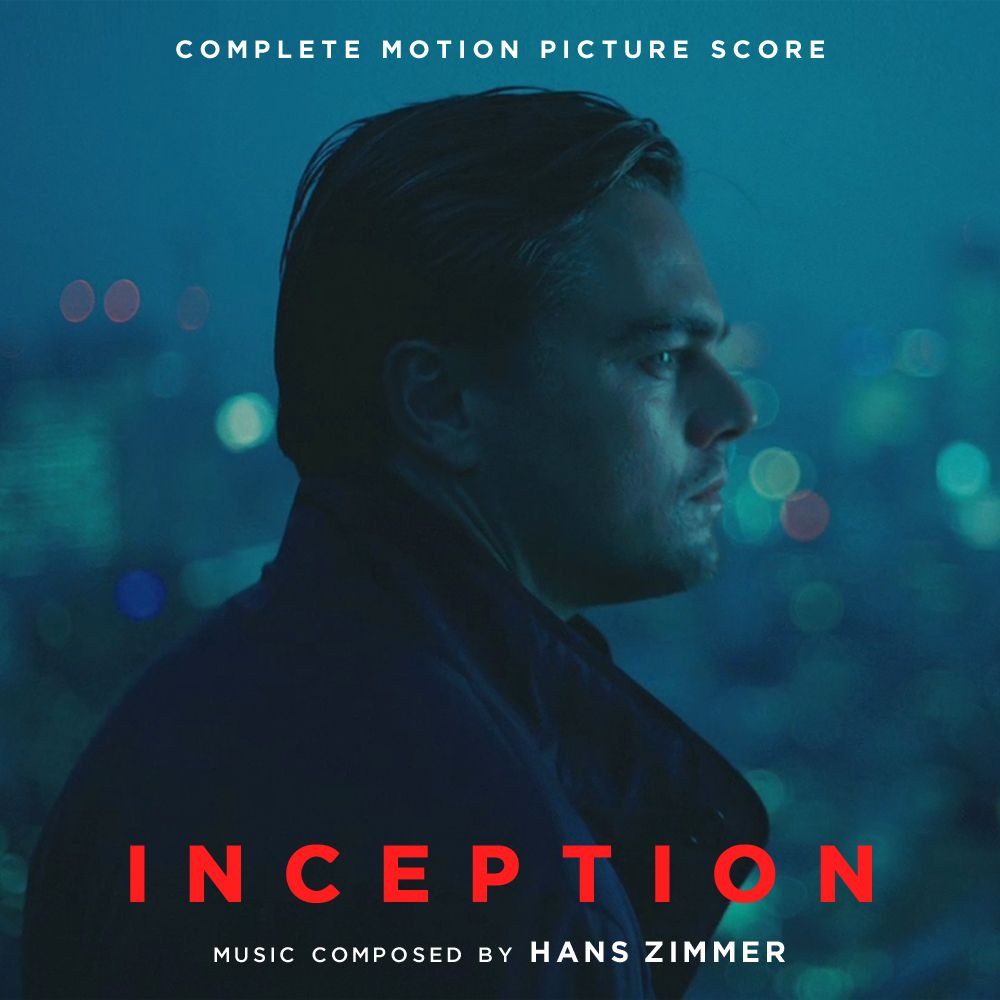
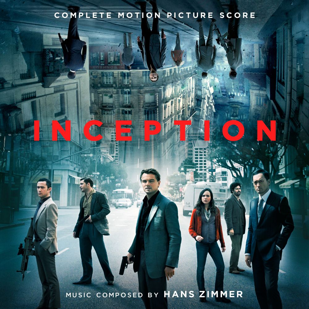
Here are some alternates i did for TylerakaSyn's Inception release (
Thread 210171). :)
<A HREF="
">
<IMG HEIGHT=300 WIDTH=300 SRC="

"></A>
<A HREF="
">
<IMG HEIGHT=300 WIDTH=300 SRC="

"></A>
<A HREF="
">
<IMG HEIGHT=300 WIDTH=300 SRC="

"></A>
<A HREF="
">
<IMG HEIGHT=300 WIDTH=300 SRC="

"></A>
<A HREF="
">
<IMG HEIGHT=300 WIDTH=300 SRC="

"></A>
<A HREF="
">
<IMG HEIGHT=300 WIDTH=300 SRC="

"></A>
gururu
09-24-2016, 07:07 PM
Mirren2
09-24-2016, 08:02 PM
Great covers Jasonjhn8. :)
Dave999
09-24-2016, 08:18 PM
Thanks Jason, definitely using one! :)
feedthecats
09-24-2016, 09:59 PM
As good as time as any for a face-lift…

(
http://imgur.com/6OcGqFe)
Nice! Now I feel inspired to revisit one of my old efforts for this, if I still have the elements...
gururu
09-24-2016, 10:12 PM
Nice! Now I feel inspired to revisit one of my old efforts for this, if I still have the elements...
No shit?!?
****
D'oh�and here I thought you were talkin' bout the score.
↓
feedthecats
09-24-2016, 10:49 PM
gururu
09-24-2016, 11:20 PM
Based on the Japanese poster…

(
http://imgur.com/GdPYXz1)
feedthecats
09-25-2016, 09:21 AM
D'oh…and here I thought you were talkin' bout the score.
I'm sorry I raised your hopes and then brutally crushed them :)
Smallville2106
09-25-2016, 02:39 PM
Great covers, any chance you can change them to say 'Original Motion Picture Score' please?
Dave999
09-25-2016, 02:51 PM
Great covers, any chance you can change them to say 'Original Motion Picture Score' please?
You'll probably have to specify who you're aiming this to. I assume you're talking about Jason's Inception covers?
May I suggest getting the film mix score instead of sticking with the original score you have? ;)
gururu
09-25-2016, 08:16 PM
Smallville2106
09-26-2016, 12:52 AM
You'll probably have to specify who you're aiming this to. I assume you're talking about Jason's Inception covers?
May I suggest getting the film mix score instead of sticking with the original score you have? ;)
Thanks for the tip. I have requested the link :)
I replied to the post but my reply just appeared like that. Didnt want to reply with quote as didn't want to waste space on the page. Not sure what happened.
Looking forward to getting the film mix, love the inception score :)
feedthecats
09-26-2016, 11:24 AM
Dave999
09-26-2016, 12:57 PM
Awesome work, feedthecats!
gururu
09-27-2016, 01:47 AM
This one posed a considerable challenge�

(
http://imgur.com/ERR0q0j)
Dave999
09-27-2016, 08:06 AM
This one posed a considerable challenge…
It looks great though :) What was the challenge?
James (The Disney Guy)
09-27-2016, 08:08 AM

Defently Usining This one Very Nice!
gururu
09-27-2016, 04:10 PM
It looks great though :) What was the challenge?
Dissecting elements of a composition designed for a vertical rectangle (the then standard one sheet ratio of 1:1.159)�

(
http://imgur.com/knVNGsl)
and re-compositing them to fit a 1:1 ratio (i.e. a square) without cropping or stretching�then repainting/reconstructing elements to fill in the gaps, and last, but not least, determining the placement of overlaid text (and which font) might better compliment the bisected angular composition itself.
That was the challenge.
gururu
09-27-2016, 05:47 PM
James (The Disney Guy)
09-27-2016, 06:18 PM
I Like This Aswell...... :ashine:
gururu
09-27-2016, 08:10 PM
Another western for the road…

(
http://imgur.com/EFgPXMd)
bondo321
09-27-2016, 10:22 PM
gururu
09-28-2016, 03:57 AM
bondo321
09-28-2016, 05:32 AM
gururu
09-28-2016, 06:16 AM
Dave999
09-28-2016, 09:05 AM
My turn�
Yeah, ok, screw it. I'm taking this one. LOVE IT!
heidl
09-28-2016, 09:45 AM
Dissecting elements of a composition designed for a vertical rectangle (the then standard one sheet ratio of 1:1.159)�

(
http://imgur.com/knVNGsl)
and re-compositing them to fit a 1:1 ratio (i.e. a square) without cropping or stretching�then repainting/reconstructing elements to fill in the gaps, and last, but not least, determining the placement of overlaid text (and which font) might better compliment the bisected angular composition itself.
That was the challenge.
I felt free to place your images on top of each other to uncover your edits. And what can I say other than... awesome job, dude!
http://i.imgur.com/8uoanNY.gif
gururu
09-28-2016, 02:05 PM
Groovy demonstration, heidl. Can I ask what GIF app you used?
Dave999
09-28-2016, 04:19 PM
I agree, looks amazing in comparison! #HatsOffToYou
James P.Sullivan
09-28-2016, 04:26 PM
Couldn't find a higher-res version of this image, but it looks fine in iTunes/iOS.
<A HREF="
http://customscorecovers.blogspot.jp/2016/09/blog-post_28.html"> <IMG HEIGHT=400 WIDTH=400 SRC="

"></A>
This one was just an idea:
<A HREF="
http://customscorecovers.blogspot.jp/2016/09/blog-post_75.html"> <IMG HEIGHT=400 WIDTH=400 SRC="

"></A>
Couldn't resist doing these, as I hadn't seen a cover with the first image, and I hadn't seen a cover with the same varient of the second image:
<A HREF="
http://customscorecovers.blogspot.jp/2016/09/blog-post_55.html"> <IMG HEIGHT=400 WIDTH=400 SRC="
"></A>
<A HREF="
http://customscorecovers.blogspot.jp/2016/09/blog-post_55.html"> <IMG HEIGHT=400 WIDTH=400 SRC="

"></A>
If anyone decides to use any of these, and has the old iTunes, I'd love to see screenshots of what they look like!
As usual, click for full size on my blog. :)
Recording
09-28-2016, 05:55 PM
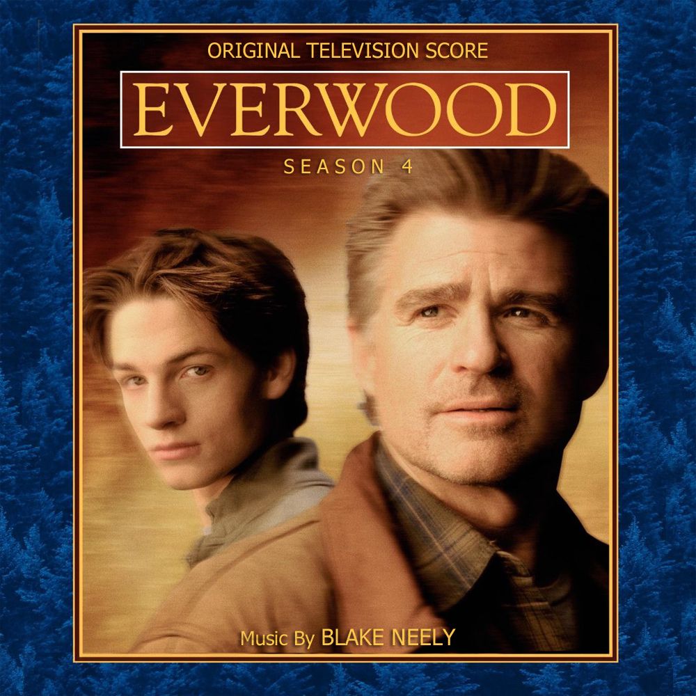
Hello guys, I search for the Everwood Season 3 & 4 covers by Blake Neely
Jasonjhn8
09-28-2016, 06:14 PM
Sully here's a quick preview for you mate. :)
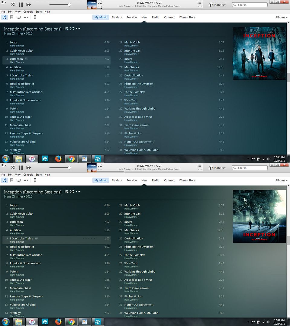
And for Recording, I made these FOREVER ago. I don't know if they'll work for you but it's worth a shot. :)
Season 1

Season 2

Season 3

Season 4
James P.Sullivan
09-28-2016, 06:36 PM
Sully here's a quick preview for you mate. :)

Thanks, mate! I'm pleasantly surprised how good they look! :D
Jasonjhn8
09-28-2016, 06:38 PM
Where is that "like" button when you need it... After all this time am i the only one still missing it? :/
AberZombi&Flesh
09-28-2016, 06:40 PM
No like button. Hell, after the last ffs fail, I don't even get emails anymore.
James P.Sullivan
09-28-2016, 06:49 PM
Where is that "like" button when you need it... After all this time am i the only one still missing it? :/
You're not. I think of it fairly often. Wish it would come back. It was fun seeing how many likes a post would get. I remember when Momonoki's HTTYD2 FYC thread got more likes than DAK's MoS complete thread lol :p
---------- Post added at 11:49 AM ---------- Previous post was at 11:45 AM ----------
I don't even get emails anymore.
You and me both, pal. :/
CLONEMASTER 6.53
09-28-2016, 09:05 PM
Revised covers for LEGO Jurassic World. The biggest alteration in particular, is the text placement on #1. I realized it didn't look that great, each "OVGS", and "Music Composed By, etc" were too close to each of the bottom and top (

). I know that the original doesn't look awful, but personally I was unsatisfied with the outcome. It wasn't until recently that I realized it.

(

)

(

)
Recording
09-28-2016, 09:16 PM
Sully here's a quick preview for you mate. :)

And for Recording, I made these FOREVER ago. I don't know if they'll work for you but it's worth a shot. :)
Season 1

Season 2

Season 3

Season 4

Great Thanks, did you also have the Brothers & Sisters Covers??
gururu
09-29-2016, 02:56 AM
Just for the hell of it…

(
http://imgur.com/WXoTmjK)
Jasonjhn8
09-29-2016, 04:35 AM
Great Thanks, did you also have the Brothers & Sisters Covers??
Yes indeed. Made a ton of Blake Neely TV covers for Amanda back in the day. :)
S1
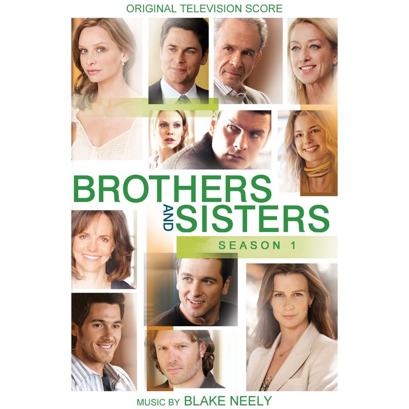
S2
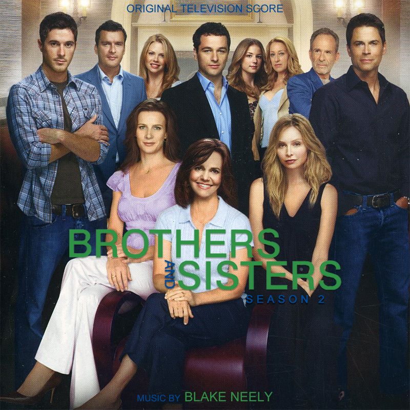
S3
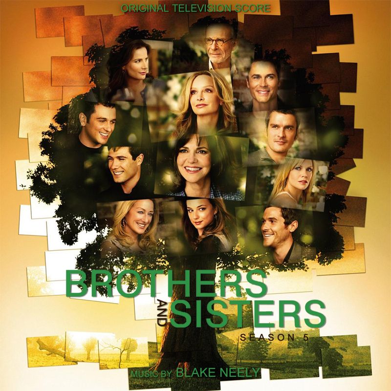
(it says season 5 on the cover for some weird reason must be a typo. I can fix it later)
S4
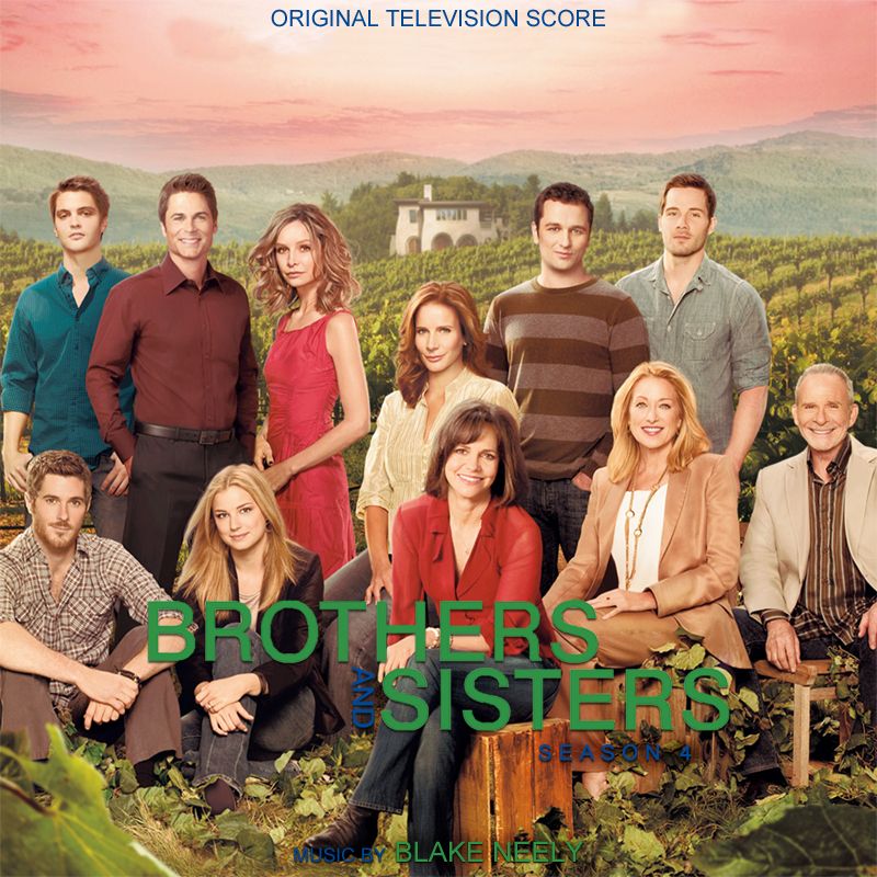
S5
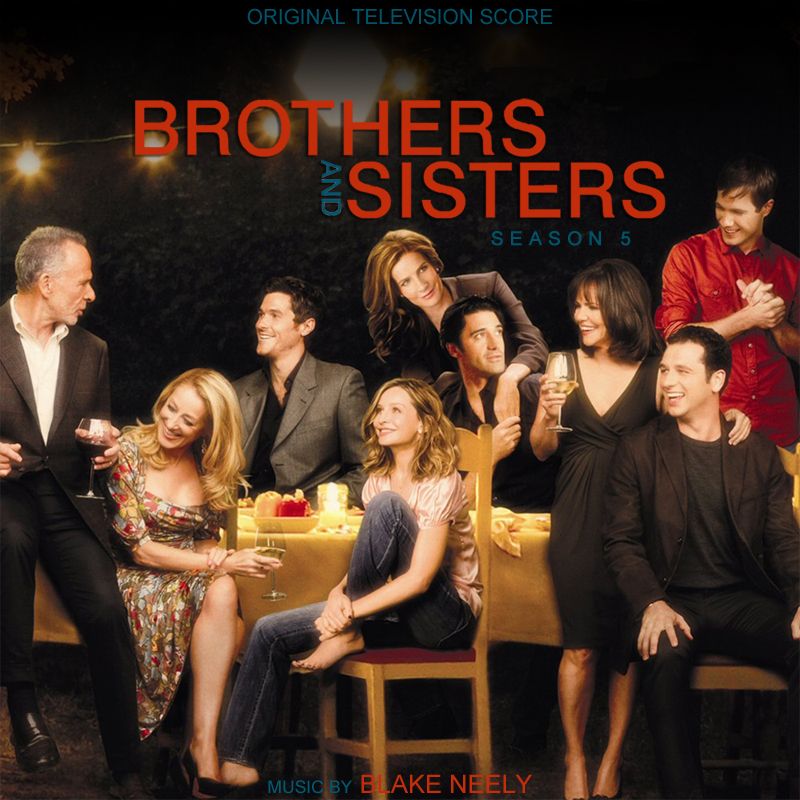
heidl
09-29-2016, 07:31 AM
Groovy demonstration, heidl. Can I ask what GIF app you used?
I have yet to find an application that creates smooth+full resolution GIFs. This one's made with Photoshop. Usually PS does its job, but more complex GIFs with transitions and a lot of different colours always get compressed to shit and I still haven't figured out why. Apparently no-one has.
No like button. Hell, after the last ffs fail, I don't even get emails anymore.
Holy shit you're right!! :-O
I didn't notice it at all, only now that you say it. What the hell is wrong with the FFS... how hard can it be to keep a board running as it should be?
gururu
09-29-2016, 07:35 AM
Just F'n around…

(
http://imgur.com/xA4iNjL)
A Streetcar Named Desire (1951)

(
http://imgur.com/mkCyzV3)

(
http://imgur.com/czvJvgY)
Viva Zapata (1952)
The Agony and the Ecstasy (1965)

(
http://imgur.com/a8Q2COO)

(
http://imgur.com/GGsrbXW)
Who's Afraid of Virginia Woolf? (1966)
2001: A Space Odyssey (1968)
Prince Jay
09-29-2016, 02:37 PM
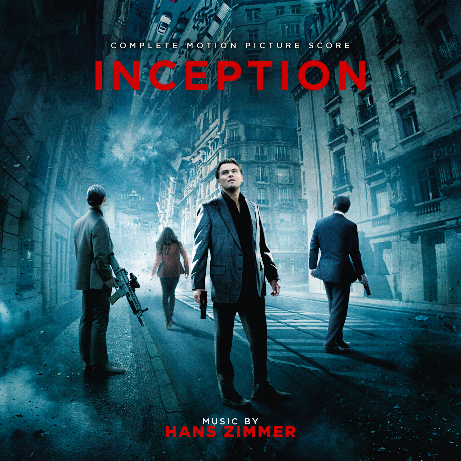
Inception: Complete Motion Picture Score by Hans Zimmer

nolomax
09-29-2016, 07:00 PM
@jayasaurus sweet inception cover ! perfect for the complete score of @Tylerakasyn !
gururu
09-29-2016, 11:40 PM
CLONEMASTER 6.53
09-30-2016, 03:19 AM
Dave999
09-30-2016, 08:02 AM
Clonemaster, mind making another one that says "isolated film score" ? :)
CLONEMASTER 6.53
09-30-2016, 06:06 PM
Post updated with requested variant. ;)
James (The Disney Guy)
10-01-2016, 12:34 AM
Doctor Strange
Original Motion Picture Soundtrack
Music Composed By Michael Giacchino
Without Marvel Logo
<A HREF="

"><IMG HEIGHT=300 WIDTH=300 SRC="

"></A> <A HREF="

"><IMG HEIGHT=300 WIDTH=300 SRC="

"></A> <A HREF="

"><IMG HEIGHT=300 WIDTH=300 SRC="

"></A><A HREF="

"><IMG HEIGHT=300 WIDTH=300 SRC="

"></A> <A HREF="

"><IMG HEIGHT=300 WIDTH=300 SRC="

"></A>
With Marvel Logo
<A HREF="

"><IMG HEIGHT=300 WIDTH=300 SRC="

"></A> <A HREF="

"><IMG HEIGHT=300 WIDTH=300 SRC="

"></A> <A HREF="

"><IMG HEIGHT=300 WIDTH=300 SRC="

"></A><A HREF="

"><IMG HEIGHT=300 WIDTH=300 SRC="

"></A> <A HREF="

"><IMG HEIGHT=300 WIDTH=300 SRC="

"></A>
Click To Enlarge
CLONEMASTER 6.53
10-01-2016, 05:44 AM
... - Harry Gregson-Williams, Stephen Barton, Hans Zimmer, Lorne Balfe, Brian Tyler
Call of Duty 4: Modern Warfare (2007) - Harry Gregson-Williams, Stephen Barton

(

)
Call of Duty: Modern Warfare 2 (2009) - Hans Zimmer, Lorne Balfe

(

)
Call of Duty: Modern Warfare 3 (2011) - Brain Tyler

(

)
Dave999
10-01-2016, 08:40 AM
Mr Gold, 3 & 4 are awesome :)
Dave999
10-01-2016, 09:58 AM
James P.Sullivan
10-02-2016, 09:35 AM
<A HREF="

"><IMG HEIGHT=100 WIDTH=100 SRC="

"></A> <A HREF="

"><IMG HEIGHT=100 WIDTH=100 SRC="

"></A> <A HREF="

"><IMG HEIGHT=100 WIDTH=100 SRC="

"></A><A HREF="

"><IMG HEIGHT=100 WIDTH=100 SRC="

"></A> <A HREF="

"><IMG HEIGHT=100 WIDTH=100 SRC="

"></A>
https://3.bp.blogspot.com/-XyJ4271kJNg/Vw3H0ZdpW6I/AAAAAAAAT9A/aNv7ZUR0D7oJC4W1JtM4xnJxfOVzQXSfQCLcB/s400/giphy-1.gif
^^That's me being blown away by how gorgeous those covers are. Great job, Gold!
One small request - could you add the new Marvel Studios logo above the main logo? Any Marvel movie logo looks incomplete with the Marvel Studios logo! :p
Exhibit A:

I frickin' love that poster, btw. It's absolutely incredible. And so awesome that London is so prominent! :D I hope there's a massive showdown somewhere in the proximity of the Shard.
James (The Disney Guy)
10-02-2016, 10:32 AM
https://3.bp.blogspot.com/-XyJ4271kJNg/Vw3H0ZdpW6I/AAAAAAAAT9A/aNv7ZUR0D7oJC4W1JtM4xnJxfOVzQXSfQCLcB/s400/giphy-1.gif
^^That's me being blown away by how gorgeous those covers are. Great job, Gold!
One small request - could you add the new Marvel Studios logo above the main logo? Any Marvel movie logo looks incomplete with the Marvel Studios logo! :p
Thread 90457
Updated.
rotane
10-02-2016, 11:31 AM
I have yet to find an application that creates smooth+full resolution GIFs. This one's made with Photoshop. Usually PS does its job, but more complex GIFs with transitions and a lot of different colours always get compressed to shit and I still haven't figured out why. Apparently no-one has.
That's the limitation of the gif format, rather than the app. Gifs are limited to 265 colours (8 bit per pixel), that's why transitions look so horrid.
gururu
10-03-2016, 08:42 PM
gururu
10-04-2016, 01:07 AM
This one's needed a new cover for about 15 years.

(
http://imgur.com/GKZW0z4)

(
http://imgur.com/qZ63Q9o)
Based on US Poster
Based on Spanish Poster
AberZombi&Flesh
10-04-2016, 03:18 AM
Looks nice gururu. Reminds me of the cover to the Soundtrack Library bootleg (same tite) I have. :)
gururu
10-04-2016, 05:51 AM
Dave999
10-04-2016, 08:24 AM
Looking at the "what are you listening to?" thread, I'd say you got it now? :D
AberZombi&Flesh
10-04-2016, 08:32 AM
What did he want?
gururu
10-04-2016, 08:36 AM
Looking at the "what are you listening to?" thread, I'd say you got it now? :D
Not that, Dave. Not the Varese+Rip(s). I'm wantin' the whole shebang with electronic overlays as recorded back in '77.
gururu
10-04-2016, 04:00 PM
Thought I'd give this one a revisit…

(
http://imgur.com/E79feFE)
Dave999
10-04-2016, 04:14 PM
Not that, Dave. Not the Varese+Rip(s). I'm wantin' the whole shebang with electronic overlays as recorded back in '77.
Ooooooh :)
Bart Oss
10-04-2016, 05:43 PM
Doctor Strange
Original Motion Picture Soundtrack
Ok GOLD ! For now, you more better work with sizes and fonts! Now i really like your covers.
You need to learn a relevant shadow for text, not do a stroke of text - it's will be perfectly
Thanks for covers !
tintacle
10-05-2016, 03:31 AM
heidl
10-05-2016, 06:25 PM
Hell yeah! My favourite film franchise. What are you cooking up, dude?
Jasonjhn8
10-05-2016, 07:06 PM
Been out of the game awhile but I'm trying to get back to it a little bit. :)
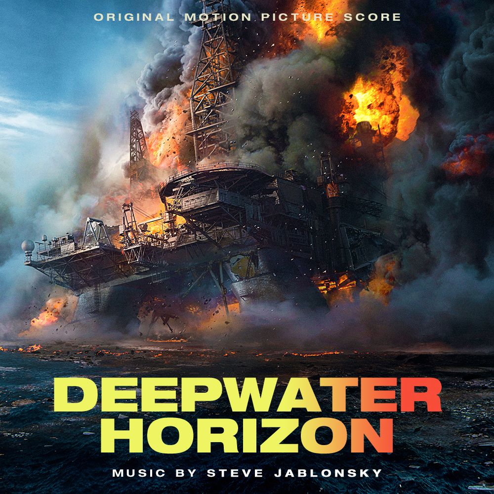
Deepwater Horizon (Original Motion Picture Score)
<a href="
" imageanchor="1" style="margin-left: 1em; margin-right: 1em;"><img border="0" height="500" src="

" width="500"
Check out all 9 covers for Deepwater Horizon on my blog (hint hint) ;)
http://custom-film-art.blogspot.com/2016/10/deepwater-horizon-original-motion.html
Bart Oss
10-05-2016, 10:48 PM
<a href="http://imgur.com/e1beUhY">

bondo321
10-05-2016, 11:47 PM
Those INFERNO covers are fantastic, especially the first one! That's going in my iTunes :D
gururu
10-06-2016, 04:17 AM
That LLL crop job they slapped together was an embarrassment, so…

(
http://imgur.com/UNfnqZP)

(
http://imgur.com/3gYygOS)
gururu
10-07-2016, 03:47 PM
I'm kinda iffy on the border, myself…

(
http://imgur.com/NUmsQXI)
Dave999
10-07-2016, 10:33 PM
Personally I think borderless looks better :)
suteki_da_ne0087
10-07-2016, 10:47 PM
I like the borderless too. It's very LLL/Intrada inspired, in my opinion.
gururu
10-07-2016, 10:53 PM
Borderless it is, then.
gururu
10-08-2016, 02:00 AM
gururu
10-08-2016, 04:24 AM
tintacle
10-08-2016, 05:02 PM
Hell yeah! My favourite film franchise. What are you cooking up, dude?
Something, somewhere, where no one can hear you scream...
http://i.imgur.com/rCaEWye.gif
Btw, what ever happened to your Prometheus (
Thread 90457) covers?
And what's going on with the site (
https://hqcovers.net/)? :)

(
http://imgur.com/ie2R9GE)
This is extremely well balanced, fantastic job gururu! :-D
Bart Oss
10-08-2016, 08:32 PM
<a href="http://imgur.com/UHKYdGm">

abryus1337
10-08-2016, 09:54 PM
-
Moonboy65
10-08-2016, 10:05 PM
still waiting on my covers for Mario Party 6, Digimon World: Dawn/Dusk and Donkey Kong Jungle Beat and Punch Out for Wii
Imperivm
10-08-2016, 10:44 PM
Yesterday it was announced the title for the Blade Runner sequel, directed by Denis Villeneuve, shot by veteran Roger Deakins and composed by J�hann J�hannsson.
Would any of you make a cover out of this picture? :) From the official Blade Runner FB page.
https://scontent-mxp1-1.xx.fbcdn.net/v/t1.0-9/14484637_1066900563425070_8264274503524718148_n.pn g?oh=7ed74d7ab87301cf9802e3ca1d16fabd&oe=58A7A7AD
Thanks in advance!
gururu
10-09-2016, 05:34 AM
Bart Oss
10-09-2016, 09:19 AM
Nice! Haven't seen yet, what the official cover looks like.
official cover not good for me...
<a href="http://imgur.com/b3sSXdv">

feedthecats
10-09-2016, 07:08 PM
corysun
10-09-2016, 07:19 PM
<a href="http://imgur.com/e1beUhY">

It's all better than the official version. :)
Who in the end is the approval of such an ugly official cover design?
abryus1337
10-09-2016, 08:49 PM
-
CLONEMASTER 6.53
10-10-2016, 01:24 AM
I ha(d)ve no idea what to do with this one...

(

)
gururu
10-10-2016, 02:05 AM
Strictly for novelty sake, I think…

(
http://imgur.com/CbMCz8j)
…and I just noticed I spelt conducted wrong. Mother f….
Smallville2106
10-10-2016, 02:13 AM
Hiya,
Could somebody please do a cover for this:
Thread 209439
DAKoftheOTA
10-10-2016, 03:09 AM
It's all better than the official version. :)
Who in the end is the approval of such an ugly official cover design?
The same person who approved the covers for Noah and Exodus.
heidl
10-10-2016, 12:53 PM
Something, somewhere, where no one can hear you scream...
http://i.imgur.com/rCaEWye.gif
Btw, what ever happened to your Prometheus (
Thread 90457) covers?
And what's going on with the site (
https://hqcovers.net/)? :)
My blog is taking a little break from everyday business and enjoys the charms of the Skandinavian coastline at the moment. It promised to be back soon and to send a message as soon as there's coverage.
Prometheus, I don't know. Probably joined in as well ;)
Yesterday it was announced the title for the Blade Runner sequel, directed by Denis Villeneuve, shot by veteran Roger Deakins and composed by J�hann J�hannsson.
Would any of you make a cover out of this picture? :) From the official Blade Runner FB page.
https://scontent-mxp1-1.xx.fbcdn.net/v/t1.0-9/14484637_1066900563425070_8264274503524718148_n.pn g?oh=7ed74d7ab87301cf9802e3ca1d16fabd&oe=58A7A7AD
Thanks in advance!
Definitely gonna tackla that one, but what do you need a cover for this early? Do you already have some music to use it with?
Strictly for novelty sake, I think�

(
http://imgur.com/CbMCz8j)
�and I just noticed I spelt conducted wrong. Mother f�.
Aaah I love this!!
Imperivm
10-10-2016, 03:09 PM
Definitely gonna tackla that one, but what do you need a cover for this early? Do you already have some music to use it with?
Of course not :) But we know who the composer will be, we know the title, we have an official artwork for the movie... all we need for an earliest-than-ever custom cover! :laugh:
I already made such early covers for Dunkirk and Justice League, as soon as official artworks were released, I'd love see one for Blade Runner 2049 too ;)
rotane
10-10-2016, 03:53 PM
Enderal � a total conversion for Skyrim.
<a href="http://hoffer.cx/albumart/albumart/1000/Elder-Scrolls_Enderal.jpg">

(click for 1000px)
You might remember, a couple months ago i teased a whole set for Elder Scrolls covers in this very style� Don't worry, they are still in the works, but i decided to release this one cover here in advance, because the music just got released.
gururu
10-10-2016, 11:24 PM

(
http://imgur.com/sCNESRF)

(
http://imgur.com/KYZMWTg)
The Neanderthal Man (1953)
The Amazing Colossal Man (1957)
SpaceMarin
10-11-2016, 03:12 PM
<a href="http://imageupload.co.uk/image/B4KL">

feedthecats
10-11-2016, 08:08 PM
Jasonjhn8
10-11-2016, 08:53 PM
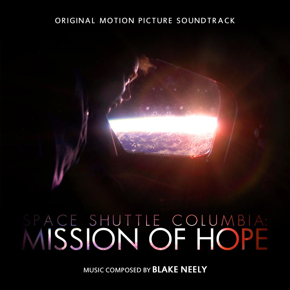
For the single most beautiful, and highest rated, album in my library. :)
Space Shuttle Columbia: Mission of Hope
<A HREF="
">
<IMG HEIGHT=500 WIDTH=500 SRC="

"></A>
Recording
10-11-2016, 11:09 PM
For the single most beautiful, and highest rated, album in my library. :)
Space Shuttle Columbia: Mission of Hope
<A HREF="

">
<IMG HEIGHT=500 WIDTH=500 SRC="

"></A>
This is looking really good, great thanks for this wonderful image :)
tintacle
10-12-2016, 03:07 PM
The Bride of Frankenstein
The one in black and white looks brilliant!
feedthecats
10-12-2016, 03:45 PM
The one in black and white looks brilliant!
Glad you like it :) It's funny how lack of colour is sometimes more effective.
Dave999
10-12-2016, 03:55 PM
For the single most beautiful, and highest rated, album in my library. :)
Space Shuttle Columbia: Mission of Hope
<A HREF="

">
<IMG HEIGHT=500 WIDTH=500 SRC="

"></A>
Where do I get it, where do I get it, and where do I get it?
feedthecats
10-12-2016, 06:56 PM
Recording
10-12-2016, 07:35 PM
Where do I get it, where do I get it, and where do I get it?
Did you mean this score??
Jasonjhn8
10-12-2016, 08:47 PM
Where do I get it, where do I get it, and where do I get it?
if you mean the score, you can download LQ MP3 off of his website. Though i'm pretty sure i downloaded FLAC from the shrine somewhere...
Dave999
10-13-2016, 08:23 AM
Did you mean this score??
if you mean the score, you can download LQ MP3 off of his website. Though i'm pretty sure i downloaded FLAC from the shrine somewhere...
Yes, the score :)
EDIT: FOUND IT. (
Thread 137745) Thanks for the tip, Jason! :)
P.S.: Does anyone have a cool LUKE CAGE cover to slap over the ugly yellow original? AKA NOT another yellow variant but something completely different?
P.S.2: How about an Alex North - Spartacus cover? Anyone happen to have something custom for that? Call me lazy. Otherwise I'll whip up something myself :)
SpaceMarin
10-13-2016, 08:48 AM
P.S.: Does anyone have a cool LUKE CAGE cover to slap over the ugly yellow original?
I didn't think I'd be sharing this with anyone, so I didn't bother to remove the 'vinyl' thing. Also, it's even more yellow :).
<a href="http://imageupload.co.uk/image/B4Mg">

Dave999
10-13-2016, 10:27 AM
lol very nice. Exactly what I was trying to avoid :p
SpaceMarin
10-13-2016, 12:11 PM
lol very nice. Exactly what I was trying to avoid :p
Let me know if you just want a 1000x1000px yellow square. :D
feedthecats
10-13-2016, 12:53 PM
gururu
10-13-2016, 03:49 PM
gururu
10-13-2016, 06:27 PM
gururu
10-13-2016, 10:18 PM
gururu
10-14-2016, 02:52 AM
tintacle
10-14-2016, 03:50 AM
Another preview, one of the many variations in my next series:

(
http://imgur.com/BSiuGOS)
My turn to make one of those fancy vinyl cover mockups
LeSamourai
10-14-2016, 04:59 AM
Another preview, one of the many variations in my next series:

(
http://imgur.com/BSiuGOS)
My turn to make one of those fancy vinyl cover mockups
Outstanding!
PeterJJ
10-14-2016, 08:21 AM
ooh...stunning...
gururu
10-14-2016, 08:00 PM
eggerty
10-14-2016, 08:08 PM
Another preview, one of the many variations in my next series:

(
http://imgur.com/BSiuGOS)
My turn to make one of those fancy vinyl cover mockups
Blimey Charlie. Love it.
gururu
10-15-2016, 03:41 AM
gururu
10-15-2016, 05:20 AM
Based on the German poster…

(
http://imgur.com/yGgExRb)
gururu
10-15-2016, 06:30 AM
gururu
10-15-2016, 08:34 AM
gururu
10-15-2016, 10:32 AM
Lord Squid
10-15-2016, 03:27 PM
Loving the Goldsmith covers gururu.
feedthecats
10-15-2016, 03:38 PM
Jasonjhn8
10-15-2016, 04:10 PM
Awesome to see so many artists still providing top notch covers! :D
__________________________________________________ ________
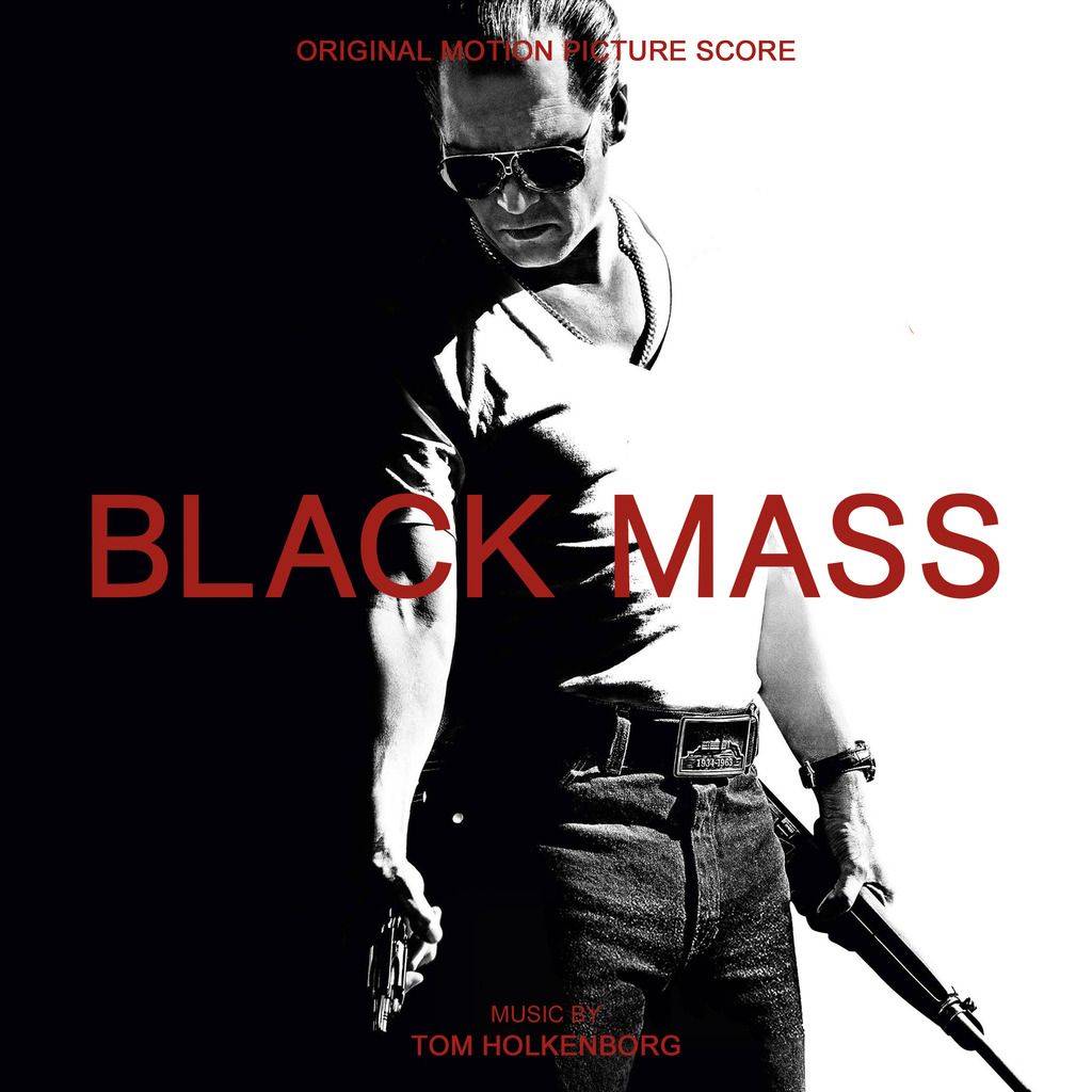
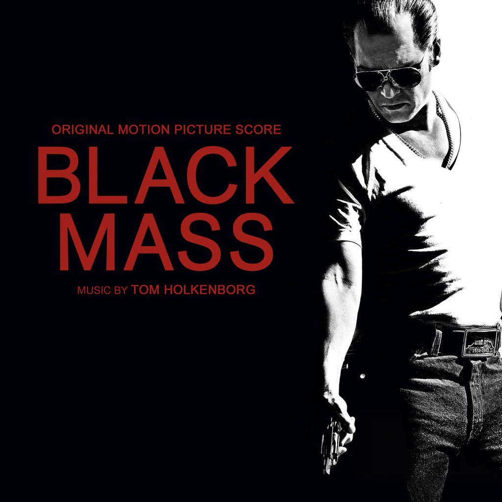
Black Mass (Original Motion Picture Score)
<A HREF="enter link">
<IMG HEIGHT=300 WIDTH=300 SRC="
"></A>
<A HREF="

">
<IMG HEIGHT=300 WIDTH=300 SRC="
"></A>
<A HREF="

">
You can check out those 2 and 3 more on my blog (
http://custom-film-art.blogspot.com/2016/10/black-mass.html). :p
gururu
10-15-2016, 11:17 PM
gururu
10-16-2016, 02:14 AM
CLONEMASTER 6.53
10-16-2016, 04:55 AM

(

)
SpaceMarin
10-16-2016, 02:19 PM
Not a cover per se, but I photoshopped some text out (as I was unable to find a textless version) just in case someone wanted to use this for something or other.
<a href="http://imageupload.co.uk/image/B4SF">

Click it to embiggen.
gururu
10-16-2016, 05:31 PM
feedthecats
10-16-2016, 05:32 PM
SpaceMarin
10-16-2016, 05:33 PM
Thanks to Rotane for inspiring this one.
<a href="http://imageupload.co.uk/image/B4aW">

gururu
10-16-2016, 08:58 PM
gururu
10-16-2016, 11:31 PM

(
http://imgur.com/3XFCGAm)
Prometheus Records 2005
gururu
10-17-2016, 01:42 AM
Dave999
10-17-2016, 08:18 AM
Not a cover per se, but I photoshopped some text out (as I was unable to find a textless version) just in case someone wanted to use this for something or other.
<a href="http://imageupload.co.uk/image/B4SF">

Click it to embiggen.
Pretty cool, but I'd make the DC logo a lot smaller :)
rotane
10-17-2016, 09:56 AM
Thanks to Rotane for inspiring this one.
<a href="http://imageupload.co.uk/image/B4aW">

Awesome!
SpaceMarin
10-17-2016, 10:47 AM
Pretty cool, but I'd make the DC logo a lot smaller :)
I had a feeling someone would mention that :D. That's how I found it, though. Shouldn't be too difficult for me to remove/replace.
Awesome!
Thanks!
gururu
10-18-2016, 07:41 AM
Covers to accompany scoreboss' voluminous "Big Silent Movie Score Thread (
Thread 187911)" as well wimpel69's various silent contributions….
Includes:
Der Student von Prag (1913), The Birth of a Nation (1915), Charlie Chaplin at Essanay (1915/16), Mutual Chaplin Specials (1916/17), Broken Blossoms (1919), The Cabinet of Dr. Caligari (1920), Der Golem (1920), The Four Horseman of the Apocalypse (1921), The Kid (1921), Dr. Mabuse der Spieler (1922), Nosferatu (1922), Our Hospitality (1923), Safety Last (1923), Battleship Potemkin (1924), The Iron Horse (1924), Die Nibelungen (1924), Greed (1924), The Thief of Bagdad (1924), The Big Parade (1925), The Eagle (1925), The Freshman (1925), The Gold Rush (1925), The Phantom of the Opera (1925), Zur Chronik von Grieshuus (1925), Faust (1926), Flesh and the Devil (1926), The Strong Man (1926), Kid Brother, The (1927), Metropolis (1927), Napol�on (1927), The Student Prince in Old Heidelberg (1927), The Crowd (1928), The Man Who Laughs (1928), October (1928), Show People (1928), Speedy (1928), The Wind (1928), The Godless Girl (1929), City Lights (1931), Modern Times (1936).

(
https://imgur.com/Ak8oQv3)

(
https://imgur.com/VdR9tze)

(
https://imgur.com/kXSWSHw)

(
https://imgur.com/1eNcqdB)

(
https://imgur.com/vOKWlbw)

(
https://imgur.com/n2Bj4p8)

(
https://imgur.com/JLE1Qtl)

(
https://imgur.com/4JuBDUF)

(
https://imgur.com/mNC97gF)

(
https://imgur.com/4JuBDUF)

(
https://imgur.com/zOW4TUW)

(
https://imgur.com/MAw5apc)

(
https://imgur.com/oyRzC10)

(
https://imgur.com/wCkLDXb)

(
https://imgur.com/Wmr9ZwQ)

(
https://imgur.com/OsC7jgQ)

(
https://imgur.com/KiplqL9)

(
https://imgur.com/JBdhXld)

(
https://imgur.com/g3r7ly1)

(
https://imgur.com/JTbUpxh)

(
https://imgur.com/0yZwr6Y)

(
https://imgur.com/zS2gfON)

(
https://imgur.com/lNFbPJ7)

(
https://imgur.com/VBFEBdp)

(
https://imgur.com/y8ZrOQk)

(
https://imgur.com/g72QdMY)

(
https://imgur.com/jkPV9RS)

(
https://imgur.com/O1uoe0S)

(
https://imgur.com/Q1dGzrQ)

(
https://imgur.com/2n5jraA)

(
https://imgur.com/d5zTjoq)

(
https://imgur.com/GelPXV0)

(
https://imgur.com/CKXt9Il)

(
https://imgur.com/wgkFMAQ)

(
https://imgur.com/eglJWBa)

(
https://imgur.com/LdKlnhb)

(
https://imgur.com/4WsFQ3y)

(
https://imgur.com/ZCNQ5aw)

(
https://imgur.com/t2QrlHA)

(
https://imgur.com/hf2po5J)

(
https://imgur.com/8cwNSDo)

(
https://imgur.com/kky1uTS)
AberZombi&Flesh
10-18-2016, 03:17 PM
More nice covers, gururu! :)
SonicAdventure
10-18-2016, 08:35 PM
So, this is my own take on 'Inferno'. I don't think that they are particularly good... but the official cover was surprisingly bad. I also don't like the advertising campaign this time. Some ideas work better as, well, ideas (the upside-down cover, for example). Anyway, here you go:

(
http://imgur.com/a/EGz7X)
James (The Disney Guy)
10-18-2016, 09:14 PM
I Love These Sonic!
Imperivm
10-18-2016, 09:35 PM
Nice take on Inferno! I like that the colours and contrast is more balanced
CLONEMASTER 6.53
10-19-2016, 04:52 AM
Left 4 Dead

(

)

(

)

(

)

(

)
Left 4 Dead 2

(

)

(

)
DAKoftheOTA
10-19-2016, 05:26 AM

"Complete Motion Picture Score" on top
"Music by Hans Zimmer" on the bottom. Preferably in the same font as the logo. Thanks :)
CLONEMASTER 6.53
10-19-2016, 06:32 AM
Eh... it ain't perfect.

(

)
feedthecats
10-19-2016, 12:26 PM
James (The Disney Guy)
10-19-2016, 01:03 PM
"Complete Motion Picture Score"
WHERE!???? :shock:
gururu
10-19-2016, 02:47 PM
James (The Disney Guy)
10-19-2016, 02:48 PM
:laugh:
Amazing!
James (The Disney Guy)
10-19-2016, 04:18 PM
Beauty & The Beast
The Complete Motion Picture Soundtrack
Original Songs By Howard Ashman
Original Score Composed By Alan Menken
<A HREF="

"><IMG HEIGHT=400 WIDTH=400 SRC="

"></A>
Click To Enlarge
DAKoftheOTA
10-19-2016, 04:42 PM
Eh... it ain't perfect.

(

)
Not quite. Too much black. Almost like gururu's except no crossed eyes on Mona Lisa.
WHERE!???? :shock:
For real?
Seek the Truth (
Thread 126655)
The slates aren't listed, but they're in my thread (
Thread 196285)
James (The Disney Guy)
10-19-2016, 04:49 PM
Honestly I Had No Idea. I Have Only Had A 14 Track Version This Whole Time.
DAKoftheOTA
10-19-2016, 04:51 PM
0_0
James (The Disney Guy)
10-19-2016, 04:53 PM
:erm:
Goes And Sits In The Corner.
DAKoftheOTA
10-19-2016, 05:21 PM
Pretty sure it's what Sonic used to make his Deluxe Edition. It is in FLAC after all...
James (The Disney Guy)
10-19-2016, 05:44 PM
Ah Yes! :p
I Had That One Aswell. :p
---------- Post added at 05:44 PM ---------- Previous post was at 05:27 PM ----------
<A HREF="

"><IMG HEIGHT=400 WIDTH=400 SRC="

"></A>
Click To Enlarge
Jasonjhn8
10-19-2016, 06:39 PM
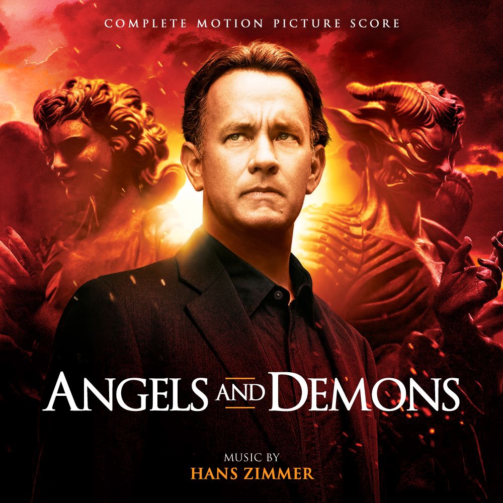
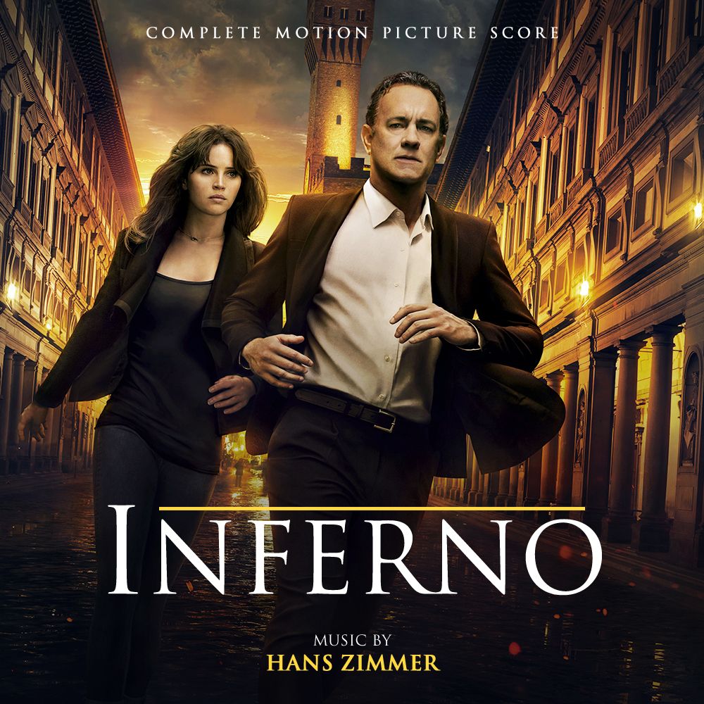
Not what DAK asked for, but it's what i had cooking so here it is. Eat it or leave it on the plate, entirely up to you. :D
<A HREF="

">
<IMG HEIGHT=400 WIDTH=400 SRC="

"></A>
<A HREF="
">
<IMG HEIGHT=400 WIDTH=400 SRC="

"></A>
<A HREF="
">
<IMG HEIGHT=400 WIDTH=400 SRC="

"></A>
Gotta say i'm very happy with all 3 of these. Especially A&D :D
DAKoftheOTA
10-19-2016, 07:19 PM
The A&D cover you made for my film mix is still my favorite. It's perfect.
Ah Yes! :p
I Had That One Aswell. :p
---------- Post added at 05:44 PM ---------- Previous post was at 05:27 PM ----------
<A HREF="

"><IMG HEIGHT=400 WIDTH=400 SRC="

"></A>
Click To Enlarge
I like, but I don't like how the font is centered like that. Also looks like it was thrown on top. Can you keep it the same color as the original?
gururu
10-19-2016, 07:23 PM
Ya know what really doesn't make these Da Vinci covers work? Tom isn't sexy enough.
James (The Disney Guy)
10-19-2016, 07:30 PM
I Have Actually Also Made This One :erm:
<A HREF="

"><IMG HEIGHT=400 WIDTH=400 SRC="

"></A>
Click To Enlarge
DAKoftheOTA
10-19-2016, 08:46 PM
Thanks Mr Gold!
Ya know what really doesn't make these Da Vinci covers work? Tom isn't sexy enough.
He has less hair in each film. Robert Langdon is aging...
SonicAdventure
10-20-2016, 01:14 AM
Pretty sure it's what Sonic used to make his Deluxe Edition. It is in FLAC after all...
Yes, that is the version Fink and I have used for our (very good^^) Deluxe Edition :)
Momonoki
10-20-2016, 02:29 AM
Has anyone got Heidl's covers for Game of Thrones? Heidl's website has changed... can't get them anymore..
roflrick
10-20-2016, 03:07 AM
Has anyone got Heidl's covers for Game of Thrones? Heidl's website has changed... can't get them anymore..
I've got them! If someone doesn't beat me to it, I'll send them your way.
Momonoki
10-20-2016, 03:14 AM
I've got them! If someone doesn't beat me to it, I'll send them your way.
I'd appreciate it if you could send them :) I'm rebuilding my library, and need some fantastic covers.. I love Heidl's work..
bondo321
10-20-2016, 03:49 AM
Dave999
10-20-2016, 08:18 AM
Since Robert Langdon seems to be all the rage right now.... :D
bondo, I want "complete score" versions of each cover. No, I'm not asking. Do it. Do it now.

JK, can you please make em? :)
SonicAdventure
10-20-2016, 01:15 PM
Since Robert Langdon seems to be all the rage right now.... :D
Hehe...

abryus1337
10-20-2016, 05:05 PM
-
gururu
10-20-2016, 05:37 PM
Attempt at reproduction of official album cover which isn't readily available�

(
http://imgur.com/B7DZGgJ)
Jasonjhn8
10-20-2016, 11:11 PM
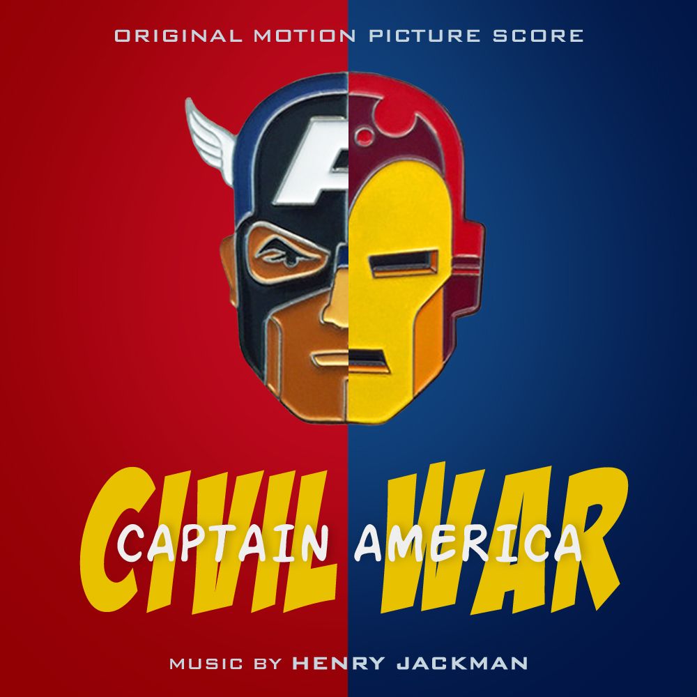
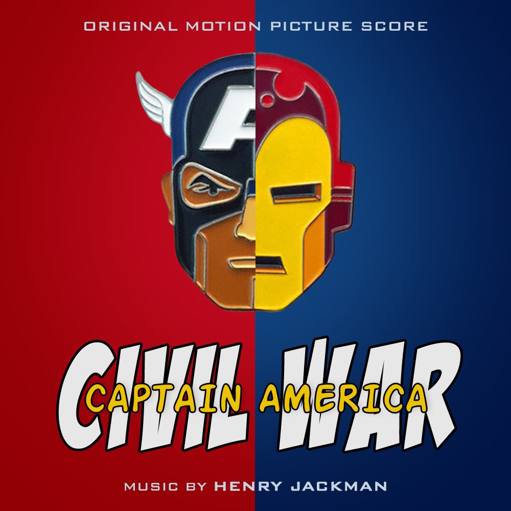
Props go to DAK for the entirety of the concept for these, as well as providing the source material. My only real contributions are the actual execution and the logo(s)
<A HREF="
">
<IMG HEIGHT=500 WIDTH=500 SRC="

"></A>
<A HREF="
">
<IMG HEIGHT=300 WIDTH=300 SRC="

"></A>
<A HREF="
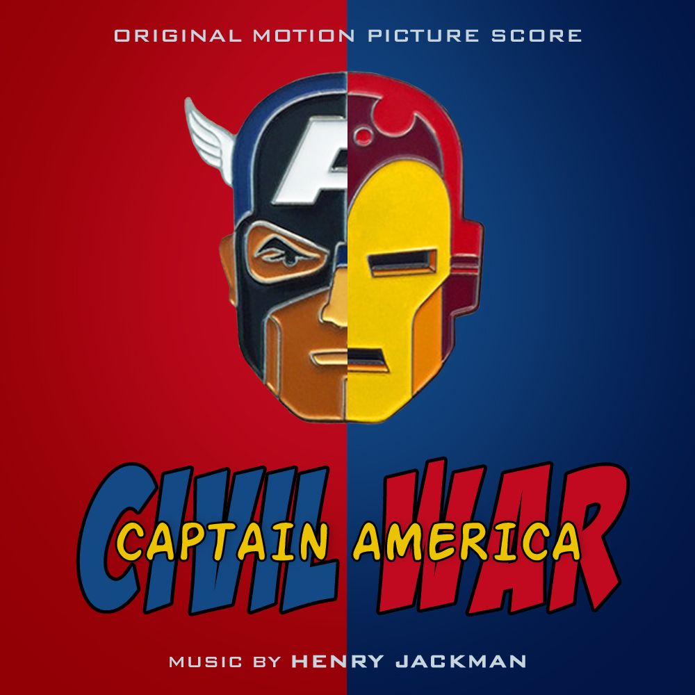
">
<IMG HEIGHT=300 WIDTH=300 SRC="

"></A>
DAKoftheOTA
10-20-2016, 11:15 PM
I'm really pleased with how it turned out. Exactly as I pictured it :D
Hehe...

It's coming! :D
amh1219
10-20-2016, 11:41 PM
I'm really pleased with how it turned out. Exactly as I pictured it :D
It's coming! :D
Sweet!!!!
suteki_da_ne0087
10-21-2016, 12:37 AM
Hehe...

I can't wait! :D
Prince Jay
10-21-2016, 03:49 AM
CLONEMASTER 6.53
10-21-2016, 08:02 AM
Was just something to do...

(

)
gururu
10-21-2016, 08:11 AM
Dave999
10-21-2016, 08:23 AM
HOLY COW! That's awesome! Do we have that here on the Shrine or is that another personal rip? :)
---------- Post added at 09:23 AM ---------- Previous post was at 09:20 AM ----------
Hehe...

Holy smokes! :)
heidl
10-21-2016, 11:03 AM
EX_MACHINA
With Ben Salisbury as a traditional film composer at the helm, his kindred collaborator here is Geoff Barrow who also happens to be a founding member of the alternative electronic band Portishead. So maybe you can see my intention to treat this custom design as an original band album rather than a soundtrack.
For this limited release concept I took the liberty to combine the two original discs onto one single disc. Mainly because I kept wondering where to house the bonus disc within this digipack design. I know there've been certain DVD cases, mainly steelbooks, that stack multiple discs on top of each other, however that would have been an atrocity to do. And considering the complete running time of 68 minutes, there's no need to produce two separate discs anyway. #greenplanet #savetheenvironment

(

)

(

)

(

)
Click for full size.
And go listen to this score on headphones. It's fucking mesmerizing!
NCFirebolt21
10-21-2016, 11:11 AM
Brilliant Ex Machina covers, heidl! <3
Can I request something? A custom cover for The Incredible Hulk by Craig Armstrong. The original one is just meh and I can't find UHD-sized promo art (like Avengers AoU or Civil War) to recreate one...
heidl
10-21-2016, 11:46 AM
Thanks! :)
And I hope that request is not particularly directed towards me? I'm not really into those Marvel scores, never was.
Also, this is Disney and they've been on a rampage lately to wipe out the whole internet from all of their high res promo art - as you can see here:
https://www.cinematerial.com/movies/the-incredible-hulk-i800080
Sadly this also applies to all upcoming Star Wars films, which is a total shame. I still don't know what to do with the upcoming Rogue One. It could become quite hard if not impossible to keep future Staw Wars covers in the same quality as TFA.
Marrk005
10-21-2016, 02:44 PM
Formerly Krafty--I thought there wouldn't be anymore of his. Hmmm.....
NCFirebolt21
10-21-2016, 11:03 PM
Thanks! :)
And I hope that request is not particularly directed towards me? I'm not really into those Marvel scores, never was.
Compliment was directed at you, request for The Incredible Hulk was for whoever wants to take a crack at it.
gururu
10-21-2016, 11:13 PM
I have a real pet peeve about covers that crop out
limbs appendages. So I'm giving James Woods et al their feet back.

(
http://imgur.com/gjTriGo)
WhatDoHowDo
10-22-2016, 05:41 AM
made this 2 months ago for the 1974 texas chainsaw massacre. i don't know how to do photoshop stuff but maybe someone will like it

(
http://imgur.com/Z6iLxHu)
Mike1959
10-22-2016, 10:28 AM
NCFirebolt21
10-22-2016, 10:47 AM
^ Awesome Underworld cover! :)
nolomax
10-22-2016, 06:05 PM
@Mike1959 sweet cover !
Mike1959
10-23-2016, 03:31 AM
gururu
10-23-2016, 03:32 AM
J0hN1986
10-23-2016, 05:12 AM
Any potential in a Fall of Cybertron cover for the Game-Rip?
CLONEMASTER 6.53
10-23-2016, 05:51 AM
Apologies if these are just a bit too similar to the rest. :p
The Da Vinci Code (2006)

(

)
Angels & Demons (2009)

(

)
Inferno (2016)

(

)
Mike1959
10-23-2016, 06:00 AM
gururu
10-23-2016, 06:18 AM
Apologies if these are just a bit too similar to the rest.
Anymore of those and I might be forced to go all out on the joke covers. :169:
CLONEMASTER 6.53
10-23-2016, 06:23 AM
I had made the Angels & Demons cover on the 14th, but never posted it... The Da Vinci Code and Inferno I made just today.
So I've been meaning to post the trilogy for a while, better late than never. :p
And man, some of these covers are just too... samey. What do ya do?
gururu
10-23-2016, 06:33 AM
In the case of this film series, not a whole hell of a lot given the entire marketing campaign revolves around Jimmy Stewart, Jr.. Same thing plagues key art for Tom Cruise films.
CLONEMASTER 6.53
10-23-2016, 06:35 AM
I'm actually speaking on account of cover design. Text placement, font usage, and such. I mean, I like these pretty well, but it can be kind of hard to be interesting sometimes.
gururu
10-23-2016, 06:45 AM
Well, take any portraiture and you run into the same problem. Unless you take a radical approach that ignores the strictures imposed by a subject which may occupy 2/3rds of the visual space, you're sort of stuck overlaying text in the same size in the same old places.
I mean, look above at Mike's first Jack Reacher. This is a pretty standard way in advertising of energizing a portrait image so it doesn't seem so inert and static like these banal Da Vinci covers which inadvertently make you focus on how young they try to make Hanks look.
CLONEMASTER 6.53
10-23-2016, 07:01 AM
For example, covers such as this (

), this (

), or this (

) and this (

), (I haven't posted the revised covers for this series, yet) they were a breath of fresh air, in a way, because I was able to style the design more diversely, because... well, because I had to. Seemingly, that's what the given material allowed me to do. But for this (

), I was never really content with. In that case, I thought I would know what to do, but as soon as I got to it, I found myself running into difficultly deciding on whichever font to use, individual weight and color, and whether or not to space the letters of the above OMPS. Even deciding on italics was a matter; all of this to make it less dull and more attractive. I think it really depends on a variety of factors, perhaps I may need more experience.
Or, maybe I just hyperbolize too often, I don't know, expectation of something that isn't too necessary.
gururu
10-23-2016, 07:31 AM
The biggest factor is balance.
The issue with your Wind and the Lion cover is that Connery, the movie title and your text occupy the central 1/3rd of the image while the other two thirds is just dead or negative space. The official cover, while it uses the exact same image, crops off 1/2 of that negative (side) space, thus increasing the size of the movie title, and then uses the over and under text in X fashion to have the eyes directed centrally inward to the movie title.
But bear in mind, George, that the majority of key art, i.e. movie posters, are designed for a rectangular visual space and not a square, so the the un-cropped image you used would balance out quite differently when the vertical space is greater than the horizontal, or vice versa.
UK poster: horizontal rectangle (
http://www.allposters.com/-sp/The-Wind-and-the-Lion-UK-Movie-Poster-1975-Posters_i6259461_.htm).
US poster: vertical rectangle (
https://www.filmaffinity.com/en/movieimage.php?imageId=747651713).
CLONEMASTER 6.53
10-23-2016, 07:47 AM
So, it's too open spaced between each element? Say, If I were to make it more close-quarters, by cropping it, or otherwise, similar to the official cover art, it would fare better?
gururu
10-23-2016, 07:51 AM
Whatever approach you decide to take the goal is the same: where is viewer attention supposed to be focused (customarily the movie title), and how do you ensure their eyes go where you want them to.
With your Wind and the Lion cover my eyes wander to the lonely "Original Motion Picture Score" hanging from the top edge.
CLONEMASTER 6.53
10-23-2016, 07:58 AM
But bear in mind, George, that the majority of key art, i.e. movie posters, are designed for a rectangular visual space and not a square, so the the un-cropped image you used would balance out quite differently when the vertical space is greater than the horizontal.
I completely understand.
---------- Post added at 01:58 AM ---------- Previous post was at 01:52 AM ----------
Whatever approach you decide to take the goal is the same: where is viewer attention supposed to be focused (customarily the movie title), and how do you ensure their eyes go where you want them to.
While there's every bit of truth there, I like to think that there's a little more to it. Text placement, font weight and color, etc can be suitably located, so as to compliment instead of distract from the source material, as you've described with my Wind and the Lion cover. Good that I now understand where I went wrong there.
gururu
10-23-2016, 08:01 AM
The colour, shape and size of elements in design are all part and parcel of forcing a viewers eyes where you want them to go. There's a reason why the advertising business is so insidious.
CLONEMASTER 6.53
10-23-2016, 08:13 AM
That's all too true. :p
As for my Da Vinci trilogy covers, I can't pinpoint anything wrong with them particularly, other than their very typical design (maybe I'm just rashly picking a bone with cover design 101). Sometimes you just can't escape the regulatory group of fonts... some instances it seems as though many covers will only work well with Trajan and Bank Gothic. :laugh: Arial has helped me quite a bit though, and I don't see that as often as some others. Expanding upon my font collection would help me in a lot of ways. I've seen certain fonts on your covers, and a number of others that would or would've been useful at times. I should search around.
gururu
10-23-2016, 08:19 AM
More fonts definitely help. Sometimes I'm spending more time looking for a font to match or approximate than working on the actual cover itself. Sometimes I have no choice to flatten the font and modify it as a bitmap image.
As for the Da Vinci covers; they're crap key art to begin with, so I wouldn't sweat it. I'd sooner work from an image I like than dislike anyway, which is why I haven't gone near them (apart from cross-eyed Mona and Inferno, which was more a test of removing the movie title from the image and repositioning it).
CLONEMASTER 6.53
10-23-2016, 08:37 AM
I personally like them (A&D and Inferno especially), I think those two as source material entity can make for some cool covers, partly on behalf that they're one of the few key art that I like to see Tom Hanks in, but when it comes down to working with them, design turns out very standard, but, I suppose they're as good as they can be. :)
---------- Post added at 02:37 AM ---------- Previous post was at 02:34 AM ----------
apart from cross-eyed Mona
Now, that one made me crack up. :laugh:
heidl
10-23-2016, 09:27 AM
For example, covers such as this (

), this (

), or this (

) and this (

), (I haven't posted the revised covers for this series, yet) they were a breath of fresh air, in a way, because I was able to style the design more diversely, because... well, because I had to. Seemingly, that's what the given material allowed me to do. But for this (

), I was never really content with. In that case, I thought I would know what to do, but as soon as I got to it, I found myself running into difficultly deciding on whichever font to use, individual weight and color, and whether or not to space the letters of the above OMPS. Even deciding on italics was a matter; all of this to make it less dull and more attractive. I think it really depends on a variety of factors, perhaps I may need more experience.
Or, maybe I just hyperbolize too often, I don't know, expectation of something that isn't too necessary.
Funnily enough, out of all your posted examples, I like your Wind and the Lion cover the most :)
Imho it's very well balanced and it made me stop scrolling and examining it further at first sight. Something the other covers didn't do.
CLONEMASTER 6.53
10-23-2016, 09:40 AM

(

)
---------- Post added at 03:40 AM ---------- Previous post was at 03:28 AM ----------
Funnily enough, out of all your posted examples, I like your Wind and the Lion cover the most :)
Imho it's very well balanced and it made me stop scrolling and examining it further at first sight. Something the other covers didn't do.
Huh, that is funny. I never thought it was a bad cover by any means, I was just never fully-satisfied with it. Glad you like it, though. :)
gururu
10-23-2016, 06:58 PM
Your attention is always drawn to a person's eyes, and you will instinctually always look in the direction they are.
So you can't have Connery's eyes, which are the prime focus of the image, lead to an empty corner with nowhere for the viewer to go. You have to bring them back to the title.
And because your eyes are naturally inclined to be attracted to
brightest light high contrast areas (e.g. white against black, black against white) you can lead them from one side of the page to the other and downward.
The composer credit at the bottom has to be of sufficient size and weight to balance the dark horizontal zones at both the 1/4 and 3/4 divisions (I'd even make the "Music Composed by" portion somewhat smaller so as not offset the movie title).

CLONEMASTER 6.53
10-23-2016, 07:53 PM
Quite insightful! I see that we are looking at a sort of cross grid, with four spaces. If you were to imagine this layout every instance of creating a cover, it can help bring some guidelines to what decisions you make. Only issue can be that not every piece of key art or source material allows for such formal design. Nonetheless, you've definitely well described bells and whistles to what works nicely.
Placing a logo at one of the four corners in one thing that crosses my mind occasionally whilst working on a cover, but barely ever so often. Doing so can suffice to bring balance to the design and placement dependent on the source material itself, and its own attributes. Such as in this case. If need be, or if you just want to anyway.
gururu
10-23-2016, 08:04 PM
The defining triangle is the most important aspect of the layout.
Yes, as I stated earlier, key art is designed for a vertical plane following the Y axis, which is why some of us, without breaking apart the image itself, end up having to expand upon a central image to fill the X axis. Or just falling back to cropping.
Also, it shouldn't be considered a given that all key art is a flawless example of composition either.
heidl
10-23-2016, 10:27 PM
Very insightful infos, thank you! You seem to be a real design gururu ;)
One question, do you plan and design your custom covers after that guideline or at least try to follow it as far as it's possible? Or is your analysis just an example for that specific cover?
It's really an interesting topic, because I never approach my custom covers that scientifically. I just dabble around until I say, yup, that looks nice.
gururu
10-24-2016, 12:08 AM
Firstly, let me say that I can go back over examples of my own work and easily pick them to pieces too. Believe me, a number of them are just merely OK, others misconceived, and then there are all those others that are just plain shit.
Sometimes the problem lay with me experiencing some sort of conceptual block or the problem lay with the source image itself. In fact, more often than not, I very well recognize that a problem area(s) still exist even while submitting them, but for reasons of expediency and/or impatience dealing with a particular problem (which I may have concluded could only be addressed by extensively overhauling the original image (time, time and more time)), I just surrender and say: "bleep it. It's not worth it".
Because it's not as if every single poster, LP, cassette, video or CD cover ever designed on the planet over the course of the past century are expressions of geometric beauty themselves (see Da Vinci or Michelangelo for examples of exacting mathematical design and layout).
****
As for the Wind and the Lion cover…
First, the original image presents a serious conundrum. Why did the artist use (or why was the artist asked to use) that particular image of Connery looking sidelong outside the image? Doesn't it strike you as odd that James Bond, the big star of the movie, is looking away from you and at nothing in particular. My contention is that presenting a masked Arab (Moroccan) staring straight at you would prove intimidating or scary, and since Connery is the actual protagonist of the movie, the studio did not want to give moviegoers the wrong impression of his role in the movie. "The eyes are the windows to the soul", and all that…. So he's looking away from the viewer, and consequently appears less menacing (particularly given the inclusion of that little WHITE WOMAN cloistered in flames below him).
So Connery's eye-line takes the viewer out of the image and you have to bring it back to centre.
BUT.
Review the American poster and the Intrada cover for a moment. As you can see in comparison to George's and my own, there's serious cropping of both the top and side, the fortuitous result being that Connery's eye-line becomes less problematic due to the loss of negative side and head space—less space for your eyes to wander—thus the viewer will almost spontaneously bounce off the edge and back to centre; no redirecting element required.
As for the rest of it, I just identify the angular pull of the image, i.e. where has the original artist established focus, and how do I keep it there. Unless, because I'm primarily pulling images from posters, where the angular pull is entirely vertical, the point of focus may depend on balancing elements that no longer exist because they now reside outside the perimeter of the square.
So, either you don't bother and just crop the fu**er and slap some text on it, or chop up the image and re-assemble the elements to achieve some kind of symmetry within said square. That, or delete portions of an image—which I'm often resistant to do, but which I probably should (or should have in the case of The Nun's Story cover).
gururu
10-24-2016, 07:07 PM
Dave999
10-24-2016, 08:29 PM
Fantastic, thanks gururu :)
CLONEMASTER 6.53
10-25-2016, 03:15 AM
...
Completely understood, duly noted, and hopefully retained for future practice, for what is definitely an art of cover art making. This has been very educational.
I've been contemplating this for a bit and decided to post it. Attempted to be a little more creative with the design... and I wanted to use this source material for a cover, because I like it.

(

)
Mike1959
10-25-2016, 01:06 PM

(

)
Powered by vBulletin® Version 4.2.4 Copyright © 2019 vBulletin Solutions, Inc. All rights reserved.
 (http://imgur.com/l65VEba)
  (http://imgur.com/wGw3oKq)

 (http://imgur.com/SVeB1JB)
  (http://imgur.com/VFEQLB3)
  (http://imgur.com/c6F7Mu2)
  (http://imgur.com/rCOLxJR)
 (http://imgur.com/FHzu0Gz)
  (http://imgur.com/uTQ3H28)
 (http://imgur.com/4fv7QBe)
  (http://imgur.com/loAMyim)

 "><IMG HEIGHT=800 WIDTH=800 SRC="
 "></A>
 "><IMG HEIGHT=800 WIDTH=800 SRC="
 "></A>
 "><IMG HEIGHT=800 WIDTH=800 SRC="
 "></A>
 "><IMG HEIGHT=800 WIDTH=800 SRC="
 "></A>
 "><IMG HEIGHT=800 WIDTH=800 SRC="
 "></A>
 "><IMG HEIGHT=230 WIDTH=230 SRC="
 "></A> <A HREF="
 "><IMG HEIGHT=230 WIDTH=230 SRC="
 "></A> <A HREF="
 "><IMG HEIGHT=230 WIDTH=230 SRC="
 "></A> <A HREF="
 "><IMG HEIGHT=230 WIDTH=230 SRC="
 "></A> <A HREF="
 "><IMG HEIGHT=230 WIDTH=230 SRC="
 "></A>
 "><IMG HEIGHT=230 WIDTH=230 SRC="
 "></A> <A HREF="
 "><IMG HEIGHT=230 WIDTH=230 SRC="
 "></A> <A HREF="
 "><IMG HEIGHT=230 WIDTH=230 SRC="
 "></A> <A HREF="
 "><IMG HEIGHT=230 WIDTH=230 SRC="
 "></A> <A HREF="
 "><IMG HEIGHT=230 WIDTH=230 SRC="
 "></A>
 ">
"> "></A>
 ">
"> "></A>
 ">
"> "></A>
 ">
"> "></A>
 ">
"> "></A>
 ">
"> "></A>
 (http://imgur.com/6OcGqFe)
 (http://imgur.com/knVNGsl)
 (http://imgur.com/knVNGsl)
 "></A>
 "></A>
 "></A>
 "></A>
 ). I know that the original doesn't look awful, but personally I was unsatisfied with the outcome. It wasn't until recently that I realized it.
  (
( )
)  (
( )
) (http://imgur.com/xA4iNjL)
 (http://imgur.com/mkCyzV3)
 (http://imgur.com/czvJvgY)
 (http://imgur.com/a8Q2COO)
 (http://imgur.com/GGsrbXW)
 "><IMG HEIGHT=300 WIDTH=300 SRC="
 "></A> <A HREF="
 "><IMG HEIGHT=300 WIDTH=300 SRC="
 "></A> <A HREF="
 "><IMG HEIGHT=300 WIDTH=300 SRC="
 "></A><A HREF="
 "><IMG HEIGHT=300 WIDTH=300 SRC="
 "></A> <A HREF="
 "><IMG HEIGHT=300 WIDTH=300 SRC="
 "></A>
 "><IMG HEIGHT=300 WIDTH=300 SRC="
 "></A> <A HREF="
 "><IMG HEIGHT=300 WIDTH=300 SRC="
 "></A> <A HREF="
 "><IMG HEIGHT=300 WIDTH=300 SRC="
 "></A><A HREF="
 "><IMG HEIGHT=300 WIDTH=300 SRC="
 "></A> <A HREF="
 "><IMG HEIGHT=300 WIDTH=300 SRC="
 "></A>
 "><IMG HEIGHT=100 WIDTH=100 SRC="
 "></A> <A HREF="
 "><IMG HEIGHT=100 WIDTH=100 SRC="
 "></A> <A HREF="
 "><IMG HEIGHT=100 WIDTH=100 SRC="
 "></A><A HREF="
 "><IMG HEIGHT=100 WIDTH=100 SRC="
 "></A> <A HREF="
 "><IMG HEIGHT=100 WIDTH=100 SRC="
 "></A>
 (http://imgur.com/GKZW0z4)
 (http://imgur.com/qZ63Q9o)
 (http://imgur.com/Hl3PwLH)
  (http://imgur.com/3pJxv4F)
  (http://imgur.com/HVDp1sF)
  (http://imgur.com/H6D17hN)
 " imageanchor="1" style="margin-left: 1em; margin-right: 1em;"><img border="0" height="500" src="
 " width="500"
 (http://imgur.com/UNfnqZP)
  (http://imgur.com/3gYygOS)
 (http://imgur.com/ie2R9GE)
 (http://imgur.com/CbMCz8j)
 (http://imgur.com/CbMCz8j)
 (http://imgur.com/sCNESRF)
 (http://imgur.com/KYZMWTg)
 (http://imgur.com/BSiuGOS)
 (http://imgur.com/BSiuGOS)
 (http://imgur.com/BSiuGOS)
 "></A>
 ">
"> "></A>
 ">
"> (https://imgur.com/Ak8oQv3)
  (https://imgur.com/VdR9tze)
  (https://imgur.com/kXSWSHw)
  (https://imgur.com/1eNcqdB)
  (https://imgur.com/vOKWlbw)
  (https://imgur.com/n2Bj4p8)
  (https://imgur.com/JLE1Qtl)
  (https://imgur.com/4JuBDUF)
  (https://imgur.com/mNC97gF)
  (https://imgur.com/4JuBDUF)
  (https://imgur.com/zOW4TUW)
  (https://imgur.com/MAw5apc)
  (https://imgur.com/oyRzC10)
  (https://imgur.com/wCkLDXb)
  (https://imgur.com/Wmr9ZwQ)
  (https://imgur.com/OsC7jgQ)
  (https://imgur.com/KiplqL9)
  (https://imgur.com/JBdhXld)
  (https://imgur.com/g3r7ly1)
  (https://imgur.com/JTbUpxh)
  (https://imgur.com/0yZwr6Y)
  (https://imgur.com/zS2gfON)
  (https://imgur.com/lNFbPJ7)
  (https://imgur.com/VBFEBdp)
  (https://imgur.com/y8ZrOQk)
  (https://imgur.com/g72QdMY)
  (https://imgur.com/jkPV9RS)
  (https://imgur.com/O1uoe0S)
  (https://imgur.com/Q1dGzrQ)
  (https://imgur.com/2n5jraA)
  (https://imgur.com/d5zTjoq)
  (https://imgur.com/GelPXV0)
  (https://imgur.com/CKXt9Il)
  (https://imgur.com/wgkFMAQ)
  (https://imgur.com/eglJWBa)
  (https://imgur.com/LdKlnhb)
  (https://imgur.com/4WsFQ3y)
  (https://imgur.com/ZCNQ5aw)
  (https://imgur.com/t2QrlHA)
  (https://imgur.com/hf2po5J)
  (https://imgur.com/8cwNSDo)
  (https://imgur.com/kky1uTS)
 (http://imgur.com/a/EGz7X)
 (
( )
) ">
"> "></A>
 ">
"> "></A>
 ">
"> "></A>
 "><IMG HEIGHT=400 WIDTH=400 SRC="
 "></A>
 (http://imgur.com/B7DZGgJ)
 ">
"> "></A>
 ">
"> "></A>
 ">
"> "></A>
 (
( )
) (
( )
) (
( )
) (http://imgur.com/gjTriGo)
 (http://imgur.com/Z6iLxHu)
 ), this (
 ), or this (
 ) and this (
 ), (I haven't posted the revised covers for this series, yet) they were a breath of fresh air, in a way, because I was able to style the design more diversely, because... well, because I had to. Seemingly, that's what the given material allowed me to do. But for this (
 ), I was never really content with. In that case, I thought I would know what to do, but as soon as I got to it, I found myself running into difficultly deciding on whichever font to use, individual weight and color, and whether or not to space the letters of the above OMPS. Even deciding on italics was a matter; all of this to make it less dull and more attractive. I think it really depends on a variety of factors, perhaps I may need more experience.
 ), this (
 ), or this (
 ) and this (
 ), (I haven't posted the revised covers for this series, yet) they were a breath of fresh air, in a way, because I was able to style the design more diversely, because... well, because I had to. Seemingly, that's what the given material allowed me to do. But for this (
 ), I was never really content with. In that case, I thought I would know what to do, but as soon as I got to it, I found myself running into difficultly deciding on whichever font to use, individual weight and color, and whether or not to space the letters of the above OMPS. Even deciding on italics was a matter; all of this to make it less dull and more attractive. I think it really depends on a variety of factors, perhaps I may need more experience.
 (
( )
)
 (
( )
)