Pages :
1
2
3
4
5
6
7
8
[
9]
10
11
12
13
Shinryudan
10-14-2005, 11:59 PM
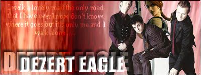
I agree with Huntress on your sig UFFFan. Though I think it is a world of improvement compared to some of the ones you were doing before.
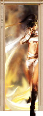
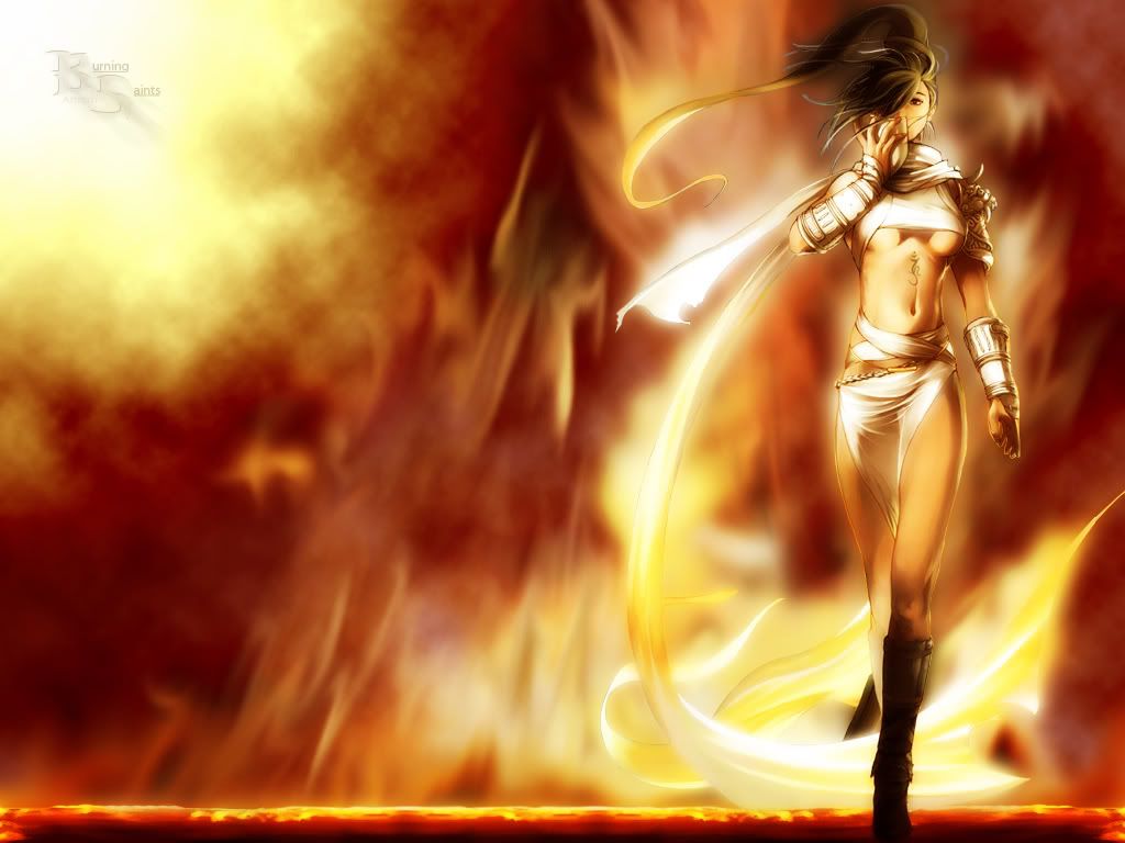
Also a new one. This was actually supposed to be a Tidus wallpaper, but well....yea it didn't work out.

Denny
10-15-2005, 12:00 AM
Excellent work like always. I never cease to be very impressed. ;)
Shinryudan
10-15-2005, 12:07 AM
Excellent work like always. I never cease to be very impressed. ;)
Thanks ^_^
Shinryudan
10-15-2005, 02:27 AM
I seem to be pumping them out today.
Definetely not my best(neo one) made for a req on another site, bored out of skull.
http://img402.imageshack.us/img402/9742/mcneo3an.gif

edit, oops sry for double post
Crimson X
10-15-2005, 06:49 AM
This sig was made by me. about one or so weeks ago...

Comments are welcome.
UltimateFFFan
10-15-2005, 07:45 AM
When did you start making, because it's very nicely blended, however there seems to be some other text under the Lina text. Whether that's just me or it's an underlining of some kind i'm not sure, so could you clarify that for me?
Shinryudan
10-15-2005, 02:35 PM
Looks like a copyright from someone's gallery to me. Maybe its a quote, heck if I know.
anyway, the quality of the sig is rather poor, though you saved it as a bigger file. The background looks like a resized picture, and the text is definetely messed up. Change the anti-aliasing to "strong" and then the stroke to outside instead of inside. 6/10, I prefer your current.
Anyways, just curious because of the text in your sig. Are you using File>Save for Web? If not, use it, all it does is let you toggle quality controls while seeing the outcome of the change. doing this you can get about exactly 50Kb on many sigs.
Light~Nimbo-stratus
10-15-2005, 05:18 PM
I'll have to try that too... With all my sigs I but the quality on the high setting (JPEG) and it almost never goes over 50KB, normally it's like 47.82KB.
UltimateFFFan
10-15-2005, 05:24 PM

Latest sig, critique please
EDIT:

Couldn't decide whether it was better with or without the writing, up to you
Danoth
10-15-2005, 05:53 PM
not bad at all UFFF, but the rose could have been blended in some way to better fit the overall colour scheme of the sig
7/10
UltimateFFFan
10-15-2005, 06:48 PM
Yeah I suppose, I just couldnt be bothered, it wasn't a request so I wasn't going to make it brilliant.
Light~Nimbo-stratus
10-15-2005, 07:01 PM
Lol.
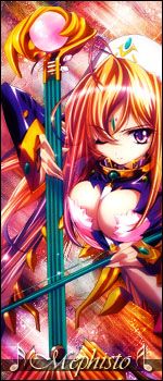
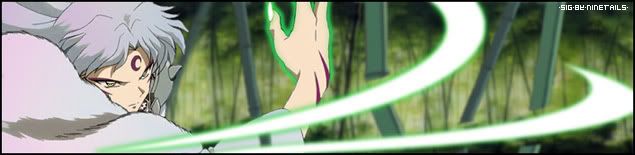
MePhIsTo
10-15-2005, 07:25 PM

and
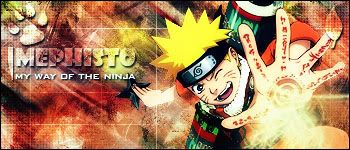
from naruto
Shinryudan
10-15-2005, 07:56 PM
Very nice with the vertical sig, although the bass cleff doesn't fit in with the theme. 8/10Could you tell me what brush pack you used for those.
I really like the Naruto one. The coloring matches the render verywell. Did you gaussian blur the render for color? Anyway, i rather like the dog paw in the sig.
MePhIsTo
10-15-2005, 07:59 PM
Brush pack I used for the background?
Crimson X
10-15-2005, 08:18 PM
When did you start making, because it's very nicely blended, however there seems to be some other text under the Lina text. Whether that's just me or it's an underlining of some kind i'm not sure, so could you clarify that for me?
I started some time in september.
Oh and thats just really tiny text, see?

the one with the red around it is the one I used.
Also I use Paint Shop Pro 9 for making sigs and stuff.
Shinryudan
10-15-2005, 08:28 PM
Brush pack I used for the background?
ya
and some fun time with imageready.
http://img147.imageshack.us/img147/7074/penguinownage3py.gif
btw, would someone C&C&R the 2 sigs I posted earlier
Light~Nimbo-stratus
10-15-2005, 10:39 PM
THAT OWNED SIG IS GREAT!!!!!!!!!!!!!!
Shinryudan
10-16-2005, 05:54 PM
This didn't come out as well as I expected.

the render took over 2 hrs to extract, it was huge.
yaya, I know there is know border, I forgot to put one on.
MePhIsTo
10-16-2005, 09:29 PM
Shinryudan
10-17-2005, 10:59 AM
Well it took me awhile to figure out exactly what the render was and what she was holding. I rather like the colours, they fit the render well. The brushing is pretty good.
8.5/10
Ok new one. Definetely breaks a few rules here.

Crimson X
10-18-2005, 04:34 AM
This one took me a long time to get it just right... but I did miss up on it a little :'(
http://img419.imageshack.us/img419/3127/cvss20iz.gif
Again comments are welcome.
Shinryudan
10-18-2005, 10:22 PM
Yes, more penguin stuff.
http://img430.imageshack.us/img430/5751/tux7wx.gif
I got bored, so I decided to make a Tux the penguin .gif
VerDjR
10-19-2005, 12:02 PM
Well, i havn't posted in here for 6 months. Its good to see FFS again and good to see some old faces.
This is one of my new ones:

And yes, am going to put it up as my sig in due time.
Enjoy
-TIDUS-
10-19-2005, 06:16 PM
This is my second sig ever so be nice
http://i18.photobucket.com/albums/b147/Tidus0613/Yuna-Sig.gif
Do you think you could give me some pointers for the next sig I make?
VerDjR
10-19-2005, 08:57 PM
Its not all that bad.
Maybe a bit more blending and better text, but i like the render and background. Keep it up and post some more
Oh, try using the size 350x120. It maybe look better. Have a try
EDIT: OMG. MePhIsTo, you come here too!!!!!
Shinryudan
10-19-2005, 09:00 PM
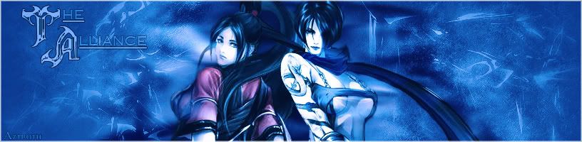
He's been here for awhile i do beleive, I'll rate your sig when I get back. Could you C&C my pegasus sig.
VerDjR
10-19-2005, 09:04 PM
I will do now.
Wow. I like it. Did you make it from the start or did you change somethings on it (am talking about the zzz pegasus). Anomtion (sp) is very nice and suits the picture.
I wouldn't call it a sig, more a website image. Non-the-less its great. Show more ^_^
-TIDUS-
10-20-2005, 04:36 AM
awesome sig shinryudan
Shinryudan
10-20-2005, 08:16 PM
I will do now.
Wow. I like it. Did you make it from the start or did you change somethings on it (am talking about the zzz pegasus). Anomtion (sp) is very nice and suits the picture.
I wouldn't call it a sig, more a website image. Non-the-less its great. Show more ^_^
I meant this pegasus.
but thanks anyway on the rating for the penguin. Yes, I made it from scratch.
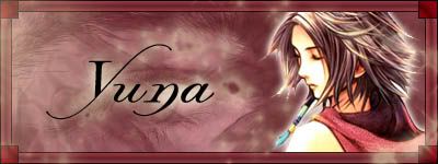
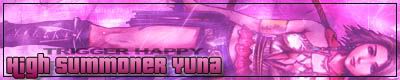
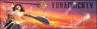
High Summoner Yuna
10-21-2005, 09:23 AM
Great sigs everyone. Shin, that Pegasus one is awesome.
Here's my new one:
UltimateFFFan
10-24-2005, 07:06 AM
Shin, do you mind if I use the wings from your pegasus on another image I'm making?
EDIT: If you still have the .psd, any chance you send it? MSN:
[email protected], else upload it, and PM me a link
HSY, nice. I especially like the font, which one is it. Nice border as well, could lose a couple of pixels on the outer glow of the render though. Overall, 9/10
High Summoner Yuna
10-24-2005, 07:48 AM
Thanks UFFFan. The font is called Lysandria.
Shinryudan
10-24-2005, 09:43 PM
sent it.
High Summoner Yuna
10-25-2005, 02:31 AM
Here' another one of mine:

Shinryudan
10-25-2005, 10:40 PM
tad bulky for me. I say change the main text to some kind of script. Also, possibly animate the text to come in from different directions at different speeds. Add border. Leave the pyrifly coloured imo, it would draw the eye to the sig better.
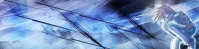
New one for a battle on a diff site. I am }SoC{Ryu there.

High Summoner Yuna
10-26-2005, 02:02 AM
I haven't got a clue on how to use ImageReady, lol.
That sig is fantastic, 10/10.
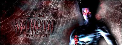
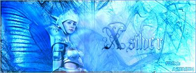
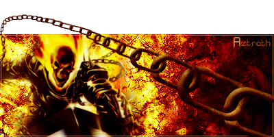
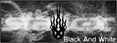
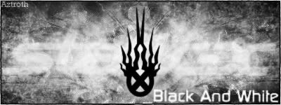
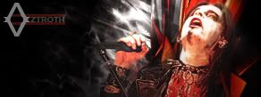
Aztroth
10-26-2005, 02:14 AM
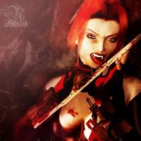
well it's been a while, and will continue to be a while, but I had a day off from work so I made a sig... what ya think?
tommytsk
10-26-2005, 02:49 AM
That's hot Azroth.
I just created my updated my sig and avvie today, what thinkst thou
Shinryudan
10-26-2005, 11:51 AM
I rather like it. The stroke is a bit much, but it contains all else in the sig. I especially like the texture. 9/10
aztroth. I don't much like the colours used, although I like the brushing. The text isn't that good. 6/10
Shinryudan
10-28-2005, 11:28 PM
New one. Master chief.

boba_medina2000
10-29-2005, 06:08 PM
Im starting to play around with Ulead, so far i have made 3. This one is the only pic of Fett with his helmet off, what do you think?
UltimateFFFan
10-30-2005, 08:03 AM
Not bad, but really it looks like just a photo manip to me, unless you've drawn the image yourself? If so very good!
If you've drawn it 8/10
Else 4/10 as all you've done is replaced whatever the original artist had him saying, with your username and added an effect to the surface layer.
Anyway guys after much debating, I've come to a conclusion. As all I do on the Shrine now is post in here or the Sig Workshop, my post count is'nt rising enough so I have decided to migrate and to make my own art forums. If any sig makers want to join, you don't have to leave the Shrine, but the link is here (
http://silenceandmotion.greatboard.com)
So really this is my final farewell, it's been good fun while it lasted, and a special thanks to the following for the help and support they've given me:
Shinryudan
Jasmijn
Huntress Krystle
Eric_g_08
Agent0042
Aztroth
Danoth
Azwethinkweiz
Der Konig
The Guy Watching You (Who helped me improve my sig making skills with all those sigs I made for him :rolleyes:)
So, here's to another prosperous year for the Shrine, no doubt it will continue to grow. Thanks for providing a free service like this Sarah, it's by far the most welcoming community I've ever been a part of, and Odin, thanks for making me laugh on occasions.
Other than that, so long, farewell, auf weidersehn, au revoir, ciao and goodbye!
EDIT: Almost forgot about this. Any work I have outstanding for people in the sig workshop can be taken by any sig maker.
Shinryudan
10-30-2005, 02:17 PM
Really wish you were not going, the shrine just be the same without you. By the way, post count doesn't mean a thing.
Agent0042
11-01-2005, 03:53 AM
Oh, I've been thanked here? You're welcome, then!
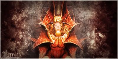
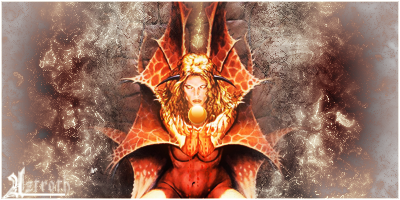
Aztroth
11-03-2005, 06:03 AM
ok something i made for a comp being held by a band called otep...
CLICK ME!!! (

)
Rabid Seahorse
11-03-2005, 01:27 PM
ok something i made for a comp being held by a band called otep...
CLICK ME!!! (
)
It's a tinch busy and the O looks startling like the O that the band Opeth uses however I like the colors a LOT and it's a fun effect.
Adding a 1 px border may make it look a little more professional ^_^ <3 lovely
My sig is...well it's in my signature...I don't see the point of posting the picture inside the actual post if it's right there anyway
tommytsk
11-04-2005, 12:57 AM
yeah, the O looks alot like the Opeth O. But it's still real purty like :D
Aztroth
11-04-2005, 01:45 AM
opeth... otep... are we possibly thinking of the same band here? and what O are you talking about? the swirly design thingy in the center?
Shinryudan
11-04-2005, 02:49 AM
I agree a bit jumbled up.
My first wallpaper. Made for my Halo PC clan called Soldiers of Christ.
http://img497.imageshack.us/img497/236/halotech5bz.th.gif (
http://img497.imageshack.us/my.php?image=halotech5bz.gif)
o and aztroth you know UFFFan is gone right.
Rabid Seahorse
11-04-2005, 02:50 AM
http://www.opeth.com/
http://www.otep.com/
No we're not speaking about the same group. Opeth=far superior :p
but the Opeth 'O' is very...vine filled and swirly, that's why it looks like the Opeth O in your gfx. ^_^ <3
Sephiroth_bad_angel
11-08-2005, 09:10 PM
Here is a sig made by one of my new friends and I wanted to see how everyone thought about it
Shinryudan
11-08-2005, 10:19 PM
Its nice, though it is just a lot of renders. Try some brushing. The colours don't match and the brightness/darkness levels don't match. 6-7/10
New one.
http://img182.imageshack.us/img182/7348/sandrock6lv.th.gif (
http://img182.imageshack.us/my.php?image=sandrock6lv.gif)
High Summoner Yuna
11-16-2005, 01:02 PM
Here's one of my new one's:
Agent0042
11-16-2005, 02:47 PM
Oh, that's very nice. I love the coloring.
High Summoner Yuna
11-17-2005, 04:39 AM
Thanks.
Here a couple more, these ones I made for AJ=TR and DE at the LCO forums.

Duality
11-17-2005, 09:47 PM
(this is my first try at making a sig)
http://hometown.aol.com/DP74656/FF/SIGS/NOT+SENT+SIG.PNG
what do you guys think?
Agent0042
11-17-2005, 11:22 PM
I think it's pretty sweet. Nice idea and caption.
Shinryudan
11-18-2005, 12:02 AM
HSY, the first one is rather well done. I like the colouring and the renders. 8/10
The second one I don't like to much. The quote is next to unreadable and is a bit overblended, also change the font. I like the effects on the main text, although the emboss doesn't go over so well. The background is a bit plain as well. 6/10
Knight sig. I am Ryu on another forum.
http://img112.imageshack.us/img112/7854/knightsig8va.gif
*Tifa*Aeris*lover*
11-18-2005, 04:52 AM
I don't have photo shop so might don't really have cool graphics like some other people but there still ok what do you think?

Agent0042
11-18-2005, 05:14 AM
The top Yuna one is absolutely adorable.
Duality
11-18-2005, 10:47 AM
i dont have photoshop either, and my program is very limited in what it can do, ie, crap font selection, no decent borders, but you seem to do really well. i agree with agent0042, the yuna one is beautiful :D
*Tifa*Aeris*lover*
11-18-2005, 11:34 AM
Thanks
Shinryudan
11-18-2005, 12:48 PM
Actually all this time I thought you did have photoshop. What are you running, GIMP?
*Tifa*Aeris*lover*
11-19-2005, 01:07 AM
i think......its Unlead or something but its an old one not the lastest one i downloaded PS CS2 but it wouldn't open :(
High Summoner Yuna
11-19-2005, 10:06 AM
I love the Yuna one.
Aztroth
11-19-2005, 08:53 PM
http://img520.imageshack.us/img520/8237/syzygy8wa.gif
thoughts? it was request, and the guys name is syzygy. and the render was what he supplied
Agent0042
11-20-2005, 03:00 AM
The image is haunting, the background coloring and effect is bright and eye-catching.
Aztroth
11-20-2005, 04:33 AM
well, c&c please? I tried a bit of a different style this time. I've never done a sig in this manner before, so im not sure whether it's good or bad, but ateast it's something.
Agent0042
11-20-2005, 04:38 AM
It looks nice enough, but it's really hard to read.
Sephiroth_bad_angel
11-21-2005, 12:48 AM
This is a new one

Duality
11-21-2005, 10:17 PM
looks good, especilly how you've merged cloud and sephiroth
this is a sig i've just made for another forum i'm on as the one i use here is apparantly to much of a spoiler, so what do people here think?
http://hometown.aol.com/DP74656/FF/SIGS/Airships.JPG
Tidus 66
11-22-2005, 12:26 AM
Duality
11-22-2005, 08:02 AM
I like the second one, the first one is shit
I disagree, the first i think is better than the second one
*Tifa*Aeris*lover*
11-22-2005, 09:57 AM
ditto!....the second one hurts my eyes a bit with it beating
Agent0042
11-22-2005, 04:34 PM
I totally agree. The first one I think is wonderful, the second --- meh-eh.
Shinryudan
11-23-2005, 12:12 AM
The first on is definetely the better of the two imo. You need to work a bit on your text though. Try using some different colours and effects to make it a bit easier to read. 8/10 for the first, 6/10 for the second.
New one.
http://img22.imageshack.us/img22/5629/signature11fp.gif
Aztroth
11-23-2005, 04:38 AM
thats a wierd combo... FFVII: AC and Devil May Cry III?
ok... but anyways, the sig looks good... nice to see a change from your usual man. the only thing I would say is that vincents head cuts off too abruptly over the blue bg. make it fade a bit more, like a 3-5 pixel feather or something. but thats all I can see wrong with it right now...
Shinryudan
11-23-2005, 03:08 PM
Ya, it was a request.... Any ways, I messed that layer up a bit too much so now I can't edit my render, oops...
Also if you still have it could you send me the link to where the brushes used in your current sig are from. Not the tattoo brush though.
*Tifa*Aeris*lover*
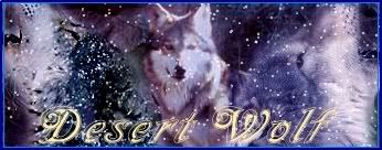
11-23-2005, 11:19 PM
I just made this for desert wolf in another forum what u think?

Aztroth
11-24-2005, 12:30 AM
it's good, but the right side of the av has a bit of uncovered bg.
@ shin I don't remember where I got them, but I could send you the set, if you want.
*Tifa*Aeris*lover*
11-24-2005, 12:35 AM
Whats Bg?
Shinryudan
11-24-2005, 01:19 AM
BG=background
FG=Foreground
He means the bit to the right of the dark blue border, its noticable.
Anyway, the ava seems to be a bit underquality. Also the the sig is a bit jumbled. other than that I like the theme and the snow.
6.5/10
*Tifa*Aeris*lover*
11-24-2005, 01:50 AM
Oh right i see it now oops lol
grn apple tree
11-24-2005, 10:21 AM
Made this one recently...

Shinryudan
11-24-2005, 03:05 PM
We have a lot more people on this site that know how to make their own stuff than I thought. O hey Crystal Sword, haven't seen yo for awhile.
Kie-- The colours go well with the render. The brushing and blending is nicely done, although there are a few too many black spots around the text. The background's levels should be raised just a bit in my opinion. Other than that I suggest you lighten the text colour and give it an effect such as a blending mode, also drop the bevel and emboss, it rarely looks good.
Wintermute
11-24-2005, 03:56 PM
I created this a couple minutes ago:

Shinryudan
11-26-2005, 02:33 AM
Well, I can't tell if there really is a render in there somewhere, though it looks like an eye on the right side. The quote is rather nice. I'm really not to partial to Grayscale signatures, unless they are simple. Add colour to the bg. Also the border could use some touching up, the shape and designs are nice, but the solid white doesn't work too well. Use the burn and dodge tools to create some depth and then add a texture or gradient to it. That will make it look a bit more "tech like." That, or get rid of the white altogether and save it as a .png with transparency. 6-7/10
New one, made it for a guy on another site.
http://img469.imageshack.us/img469/8091/sig7uf.gif
High Summoner Yuna
11-30-2005, 12:18 PM
MossY
12-04-2005, 01:12 AM
Guys what about my awesome sig! 10 out of 10 imo.
Tidus 66
12-04-2005, 01:23 AM
Where's Trotsky?! :(
MossY
12-04-2005, 01:28 AM
I HAVE NO UNCLE TROTSKY ( PARODY)
Aztroth
12-10-2005, 06:47 AM
these two are my latest... the second one was a request, and the first was a gift.
Duality
12-17-2005, 02:35 PM
Shinryudan
12-18-2005, 01:50 AM
Somebodies been busy, eh?
Auron's Ghost
1st-- Just a large jumble of images. Drop the glow from Tidus and clean up all the white stuff around the logo on the left. Make the text a bit more noticable. Keep away from the feather tool, it's not that great. 3/10
2nd-- Again, too many renders for the space provided. Also, don't use the feather tool on the entire outline of your renders, just brush over them a bit to blend them. Add a border and opaque the text a bit. 5/10
3rd-- The border is too big on this one, make it about 2-4px instead. Try out some bushing around the face in the background instead. Again, NO feather tool, it makes the edges look transparent, which is very very bad. 5-6/10
4th-- First of all, you've got more than one ship in the one, I beleive they may all be different models. The background fits the theme and is a good stab at it, but you should find a better tutorial than that. The quote should be a bit smaller and not block out so much of the sig. Also the text for your name needs a single pixel black stroke on it, this will make it easier to read and stick out a bit more. 4/10
5th-- Again with the....well I guess thats not a feather. The two renders in there shouldn't be colliding. Also, the background is way too plain, even just a few small stars of planets would do well in that. Get rid of the texture on the text and add a single pixel black stroke to it. Set the colour of the text to white and the blending mode to something like soft light or overlay. Add a border. Make your text a bit more sharp.
4.5/10
Aztroth
1st-- The colours and the render go together very well. Nice brushing, though it is a bit bright over on the right side of the sig (the border seems to dissapear here as well). The right side of the render is blended in a bit too well and I can determine any edges of the render there. Also tone down the blackness above the render, it doesn't fit the overall bright theme very well. The text is nicely done, and placed, it matches the brushes very well.
7.5/10
2nd-- The second one isn't as good as the first in my opinion. The colours in it are a bit dull. I can't seem to find much wrong with the signature, however it doesn't catch the eye that well at all. 6/10
High Summoner Yuna
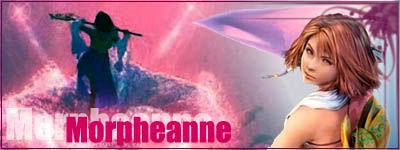
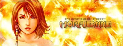
1st-- Straight off the bat I got one question, who's morpheanne. Anyways I'm guessing its you on another forum. Alright well the background is pretty nicely done and looks nice and clean, although the lens flare is a tad over bright near the render. For the main render itself, the one with transparency, you need to defringe it. This can be done using a single pixel feather (one of the few things that tool is good for) or by using the defringe tool which is who knows where... Anyway, that's all I can find that needs fixing in that one. 8/10
NOTE-- All things on deviantart.com are copyrighted to their creators and cannot be used in sigs or other edited graphics. Doing so would be breaking the law (a.k.a plagarism). I'm just warning people cause I lately got into some trouble over there for something along those lines.
Duality
12-18-2005, 09:55 PM
OMG, I just got owned. Oh well, I do them out of boredom mostly, never having done a tutorial for my software, but thanks for the advice. As for some of the techniques you mentioned, I have no idea what you're talking about, eg feathers (which I believe are the soft edges that I can put on with my software), brushes and blends, I dont have photoshop or anything spectacular like that, but thanks anyway :). I may have learnt something here today...
also, since i guess you're not a ST fan so i wouldnt expect you to know this, the 5th sig's background is supposed to be the context of their natural space, there are no stars or planets in there, so I didnt put any in (or I was at risk of getting torn into by all the eagle eyed people on that board for doing something against the known canon)
EDIT: I just got GIMP so hopefully, I may be able to do some better work :D
GreyMenace
12-19-2005, 07:47 AM
MePhIsTo
12-23-2005, 01:12 AM
envy me :P
Shinryudan
12-23-2005, 07:29 PM
Shinryudan
12-26-2005, 09:07 PM
*Tifa*Aeris*lover*
01-04-2006, 06:46 AM
Made this one recently i don't mind your thoughts
*Tifa*Aeris*lover*
01-04-2006, 07:03 AM
Made this one recently i don't mind your thoughts
Agent0042
01-05-2006, 01:10 AM
The text on the left is almost impossible to read (but I eventually figured it out), while the text around the rest of the edges is only barely readable, but I can make out. The image and effects are excellent though.
*Tifa*Aeris*lover*
01-05-2006, 01:14 AM
I kinda wanted the text to be barely readable to bring out the images more but at least people could read it.
thanks for your comments
*Tifa*Aeris*lover*
01-11-2006, 10:51 AM
I made this one recentley too.


Sharon Agathon
01-11-2006, 11:13 AM
I like the composition a lot but the text kind of dissappeared with the picture. Maybe a white outline around text?
Sharon Agathon
01-11-2006, 02:28 PM
Err.. here's my version of Kairi avatar/sig. Hope you guys like it. :)


Sorry for double post.
Metal Maniac
01-11-2006, 02:46 PM
Pretty awesome.
Landlord of Sector 7
06-14-2006, 06:20 AM
Shinryudan
06-14-2006, 11:28 AM
Nice, although the picture of the lightsaber has ad odd reddish outline on it. The clone trooper is a bit too bright for me.
Landlord of Sector 7
06-14-2006, 06:32 PM
yeah, when i was making the rest of anakin blue-ish (to give a hologram look) the lightsaber turned orange (i tried to fix it:()
btw first thing i've done in agessss
Shinryudan
06-14-2006, 08:43 PM
ahh. I wonder how this one looks on this forum. its made for a white background but it is a png.

Slash
06-14-2006, 11:24 PM
Guys what about my awesome sig! 10 out of 10 imo.
Lol....Is it a joke? or do you actualy hate prak? ive been away for awhile...need filling in :P
Aztroth
06-19-2006, 12:44 PM
well, my latest:
Starscream
06-22-2006, 08:16 PM
I thought this one that Kienshin made recently was pretty good, featuring Spawn and Starscream.

Slash
06-24-2006, 01:05 PM
What do people think of my new sig...thanks to kienshin
Sharon Agathon
06-25-2006, 02:06 PM
Shinryudan
06-29-2006, 06:29 PM
Version1 Meant for a white or grayish background.

Version2

I took some pictures of the flowers that are in my garden and worked with them in illustrator and photoshop. Some freehand as well. Which do you like better?
here is the original picture too

(

)
Sharon Agathon
06-29-2006, 06:38 PM
I like the first one but i can't help but wonder how it'll look like if you put the large 'Ryu' text of the second sig with a bit of alpha transparency and paste it on the background sky of the first sig.
Starscream
06-29-2006, 06:44 PM
Pretty Excellent.
Monkeydude
07-03-2006, 09:01 PM
Yo, i have made 3, they are my first signatures ever

(
http://imageshack.us)

(
http://imageshack.us)

(
http://imageshack.us)
what do you think about them?
Starscream
07-04-2006, 09:25 AM
Not bad, maybe add a bit more to the backgrounds or get the picture to take up more space.
Monkeydude
07-04-2006, 09:47 AM
I made 2 more

(
http://imageshack.us)

(
http://imageshack.us)
What do you think?? :)
Sharon Agathon
07-04-2006, 10:49 AM
What do you think? :)
The first sig has a nice contrast but it lacks border. The typeface for the second sig totally ruin the composition and is a little too close to the edge.
Monkeydude
07-04-2006, 12:53 PM
Made a new one

(
http://imageshack.us)
*EDIT* Here is another one :)

(
http://imageshack.us)
brotherhood619
07-08-2006, 09:49 AM
Heres one that i did on a diffrent program to photoshop (it doesnt have any text effects so...) anyway see what you think.

Monkeydude
07-08-2006, 05:08 PM
It's very good!!! I'll give it 8.5. Keep up the good work
matt1912
07-10-2006, 12:36 PM
heres one i did for someone on another site what do you think of it
http://i41.photobucket.com/albums/e277/matt1912/cloudbike.gif
brotherhood619
07-10-2006, 01:16 PM
It's very good!!! I'll give it 8.5. Keep up the good work
Thanks i didnt think it was as good as some of the ones on here.
Matt yours looks good nice work
Shinryudan
07-15-2006, 10:38 PM
First time I touched 'shop in 3 weeks. Added in some styles I learned from the GIMPers at my camp.

Monkeydude
07-15-2006, 11:04 PM
Ok i made this some time ago to another guy, which likes it very much.

(
http://imageshack.us)
Shinryudan
07-16-2006, 12:02 AM
Hmm try adding a border first of all. next the background grunge style is a bit grainy and has the look of parchment. The colours don't really fit that well....they don't have much depth that is. The text is very small and out of the way. The colours of the text also conflict a bit with the background. The multiple renders idea I like a lot, however some of them have been sized down a bit too much such as the far left and right ones. You don't need to show the entire body on it. For the renders try using the extraction or pen tools to get rid of the background instead of just blending it in with brushes. Or find some stock renders on gamerenders or chaosgfx or planetrenders. Overall it is ok, but from some of your other work that I have seen I think you could have done a bit better of a job.
matt1912
07-18-2006, 03:03 PM
heres one i did yesterday what do you guys think of it
Shinryudan
07-23-2006, 02:34 PM
Another one.

yunachick15
07-23-2006, 02:35 PM
I like Matt's and Shinryudan's!
miko_v3nus
07-23-2006, 03:17 PM
Uh... Hi everyone, I'm a newbie here but is a sigmaker...
I'm quite new to to sigmaking so here's a sig which some of my friends really loved it so I thought I''ll show it here to get other people's opinion...

Thanks
yunachick15
07-23-2006, 03:19 PM
I like both "sigs". What is a sig?
miko_v3nus
07-23-2006, 03:21 PM
oh um, I refer to signatures as "sigs" or "siggies / siggy"
And avatars as "avvy / avvies"
Shinryudan
07-23-2006, 07:26 PM
v1

v2

Shuryou
07-29-2006, 03:57 AM
http://img136.imageshack.us/img136/2213/topsigvq7.gif
This is my "forum signature" I use on most forums I'm on. But it's 44 pixels too wide to be used for this forum. Gotta make something new. D:
Crimson X
08-01-2006, 04:46 PM
First time I touched 'shop in 3 weeks. Added in some styles I learned from the GIMPers at my camp.
Wow! That is one awesome sig Ryu!
Would you mind making me one like that!?
MissMurder
08-02-2006, 02:28 AM
something just origenal and sorta plain
The Lost One
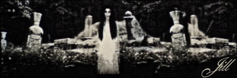
08-02-2006, 11:22 AM
Hw 'bout mine? Kinda wondering if other peeps like it, maybe i'll have to make a new one... But i can't help loving Kadaj so much...
MissMurder
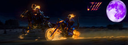
08-03-2006, 07:44 PM
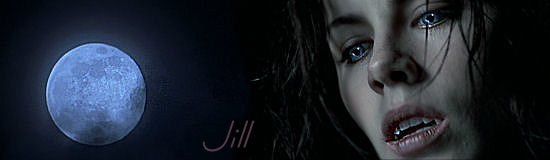
Alright, what do you think of mine?
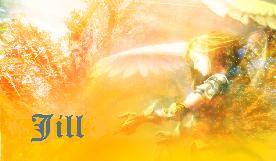
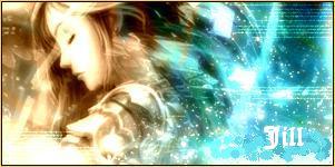
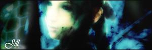
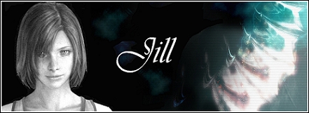
Jill made it. ^__^
DBZWWE
08-04-2006, 03:51 PM
The Lost One
08-05-2006, 04:01 PM
Very nice, do you use photoshop? If you do, it's quite easy to add some more lighting effects. Will make them even more alive!
High Summoner Yuna
08-05-2006, 05:17 PM
Hey people. I'm back, and I've got a couple of new sigs. Opinions please - I just learned the effects.
------------------------------------------
Ahh! Sorry about the double post - I thought the computer was being spastic again.
High Summoner Yuna
08-05-2006, 05:17 PM
Hey people. I'm back, and I've got a couple of new sigs. Opinions please - I just learned the effects.
The Lost One
08-05-2006, 05:27 PM
Looks very nice, but try adding another dark line on the outer border. (it may be there but can't see it because the dark skin of the board, nevermind me if you have a double border line;) ) Nice work!
High Summoner Yuna
08-05-2006, 05:46 PM
Thanks. I don't have a double borderline actually, lol. I never really put them in.
The Lost One
08-05-2006, 05:55 PM
Try it, makes the image much more clear;)
measter yazoo
08-05-2006, 11:06 PM
This is a new one
Finally someone has merged them i knew someone was goin to do it sometime but when
DBZWWE
08-06-2006, 03:06 AM
Very nice, do you use photoshop? If you do, it's quite easy to add some more lighting effects. Will make them even more alive!I use gimp.:)
High Summoner Yuna
08-06-2006, 03:31 AM
Finally someone has merged them i knew someone was goin to do it sometime but when
I made that. It was a request at my forum. :)
The Lost One
08-06-2006, 04:03 PM
I use gimp.:)
Hmmm well 't must be possible, but they look nice anyway;)
*Edit*
No need for a new post, but could someone tell me which sig they like better?
This one, or my current one?

dark phoenix
08-07-2006, 10:45 PM
could someone tell me how to improve my sig by borders and that i dont know how to do it. Also tell me how else i can improve it by
The Lost One
08-08-2006, 02:24 PM
U use photoshop? I can tell you if ya do.
dark phoenix
08-08-2006, 08:28 PM
U use photoshop? I can tell you if ya do.
Yeah i do it was far to expensive to.
MissMurder
08-08-2006, 08:32 PM
i have photoshop but an order version, 3.0, i cant find the image edit to make sigs.
Calgar
08-08-2006, 08:40 PM
man that most be really annoying
MissMurder
08-08-2006, 08:47 PM
it is but i think i found the answer......
nice av.
Calgar
08-08-2006, 08:50 PM
thx
The Lost One
08-09-2006, 02:40 PM
Yeah i do it was far to expensive to.
OK good, make a new layer which you put on top of all other layers.
Use the Magic Wand tool in that layer to select the entire image. Next go to
Edit->Stroke (assuming you have the english version) and select a nice color before doing so. Set the thickness of the line, and if ya want a double layer like me, select the entire new image except for the added rim (Magic Wand again) and continue on. (On 400x150 pics I suggest you use at least 2pix. lines)
Gentleman Ghost
08-10-2006, 10:57 AM
I wasn't really sure if anyone would read my Sig, so I posted it in here...
everybody in here has a very awesome sig i must add.
anyway I'll just describe it to you. (Is that what you have to do in this thread?)
1. It just shows how desperate I am to get suggestions for a new user name.
2. I shows my current usernames origin.
3. and I tried to use contrast or something to catch the forum reader's eye.
4. It has some lines pointing to the really important bits..
5. and thats the end of my signature.
Thanks for your time.
btw: did I have to describe my sig or not? because I just wasted One Minute and 34 seconds of my precious time to type that descripton.:smrt:
The Lost One
08-11-2006, 05:46 PM
Sephicloudret
Composed of 3 FF7 names:p
Sephiroth, Cloud, Barret
And I'll let you know if I come up with a serious suggestion, unless you (for some reason ) like the lame suggestion above.
The Lost One
08-11-2006, 05:46 PM
*EDIT*
damz another double post cuz my internet=lame.
Shinryudan
08-13-2006, 10:05 PM
v1

v2

Made these two for crimsonX. back in bussiness people.
dark phoenix
08-13-2006, 10:13 PM
Why were you gone?
Calgar
08-13-2006, 10:36 PM
yay your back
Shinryudan
08-14-2006, 12:57 AM
Did a summer of volunteering at a local cubscouting camp. In other words I was a CIT. I met a lot of GIMP users there and picked up the program and lots of tips.
Irvybabe
08-14-2006, 01:55 AM
Freya from Chobits
Shinryudan
08-15-2006, 02:52 PM
Looks like a picture that is cropped. Nothing else I see, correct me if I'm wrong.
Newest work.

Shuyin9
08-15-2006, 06:26 PM
check mine out bitch!
Irvybabe
08-15-2006, 06:58 PM
I've got a new one.
Shuyin9
08-15-2006, 07:13 PM
mine was of ummmmmm auron, ummm tidus na dummmmm sum other 1ns...
Laharu
08-16-2006, 06:53 AM
whee signatures!
Denny
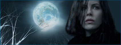
08-16-2006, 05:58 PM
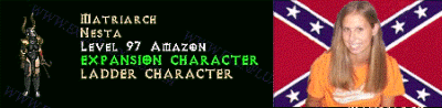
Some of them are nice but i`d stop parading the confederate flag tbh Jill. Apart from looking tacky as hell it`s not something everbody enjoys being shoved into their face.
Still, the latter of your sigs looks to be getting much better.
Irvybabe
08-16-2006, 05:59 PM
I like the Under world sig and the aeris sig they look sweet.
Black Paladin
08-16-2006, 06:00 PM
Well she's been banned so... NO MORE CONFEDERATE FLAG! YAY!
Some of them are nice but i`d stop parading the confederate flag tbh Jill. Apart from looking tacky as hell it`s not something everbody enjoys being shoved into their face.
Still, the latter of your sigs looks to be getting much better.Ya...I pretty much stopped the Confederate Battle Flags and showing my face. I made one more with the Stars & Bars. One thing about signatures..you can alter them. I had two designs of the same one.
http://browneyedgirl.homestead.com/jill29ja.gif
And
http://browneyedgirl.homestead.com/JillPrichardSignature.bmp
Black Paladin
08-16-2006, 06:39 PM
Welcome back, but FFS stop with all the Patriotism.
Razorbunny
08-16-2006, 09:29 PM
Welcome back, but FFS stop with all the Patriotism.
2
You american pig! your mother was a hamster and your father smellt of elderberries :p
Starscream
08-16-2006, 10:25 PM
Hey Razorbunny.
Atom Narmor
08-17-2006, 07:23 AM
I've never had a sig, ever.
Denny
08-17-2006, 05:37 PM
I've never had a sig, ever.
EL, i wouldn`t mind making you one.
Drop me a PM sometime.
Shinryudan
08-18-2006, 04:53 PM
This is what happens when I get ahold of a funny picture of a buddy. It's a guy from camp staff. I got the pic through another person on aim.

here is the stock.
http://i64.photobucket.com/albums/h177/Shinryudan/mark-stock.gif
added this too.

adding these as I go along..... not many replies, o well

vert sig

made a wallpaper.

This is becoming a regular old portfolio of my stuff.
cloudpj
08-27-2006, 06:09 AM
check out my sig
here (

)
Shinryudan
08-27-2006, 06:43 PM
Renders are squished down. Background is plain, text is plain. Its good for a first try, but try to retain the proportions of the renders.
 http://i64.photobucket.com/albums/h177/Shinryudan/halo_blue.gif

cloudpj
08-30-2006, 12:49 AM
[QUOTE=Shinryudan;637311]Renders are squished down. Background is plain, text is plain. Its good for a first try, but try to retain the proportions of the renders.
can you edit it to make it better thx
this is the link again
here (
)
Shinryudan
08-30-2006, 02:57 AM
I'd need the original files.
Also Jill,
most of the things are just cropped images with text on them. Other's are just a cut out with a stock behind it and text on it. Work on the text too. Did you make
http://browneyedgirl.homestead.com/JillsSignature3.JPG this because from the work you are showing us I don't know.
Laharu
08-30-2006, 03:56 AM
I love that "Just Data" siggy!
Shinryudan
08-31-2006, 03:00 PM
And more. These with some 3dsm and c4d renders I made.


an avatar too.

nother spatter sig
http://i64.photobucket.com/albums/h177/Shinryudan/megaman-splatter.gif
mtbanger
09-01-2006, 03:03 AM
I made these today.. i literally started making my fist sig about 4 hours ago.. these are my best ones,
and
this one was made for a friend on another forum.
and finally, for my emo friend
what you all think?
mtbanger
09-01-2006, 03:04 AM
Sorry for the double post
Spartan18
09-01-2006, 12:36 PM
I can't make signatures.So I get them off line.I don't have a program to make them.Unfortunately.I would love to make them though.Sounds fun.
Van Finel
09-02-2006, 12:25 AM
Ya...I pretty much stopped the Confederate Battle Flags and showing my face. I made one more with the Stars & Bars. One thing about signatures..you can alter them. I had two designs of the same one.
http://browneyedgirl.homestead.com/jill29ja.gif
And
http://browneyedgirl.homestead.com/JillPrichardSignature.bmp
the confederates suck! boooo
Laharu
09-02-2006, 12:35 AM
whee showing off siggy >_<
Shinryudan
09-02-2006, 01:52 AM
the confederates suck! boooo
which brings us to your sig...
Don't emboss a render, try to blend the background. Also get rid of the opacity on the title and just put 3 layers of it on softlight.
Ninetales
09-02-2006, 11:42 PM
jewess crabcake
09-03-2006, 01:09 AM
the confederates suck! boooo Yes, didn't you learn anything from Star Wars jill NEVER break away from the empire.
But the Empire lost in Star Wars...
jewess crabcake
09-03-2006, 04:52 PM
Yeah but not before a lot of bloodshed.
Hex Omega
09-03-2006, 06:49 PM
They still lost. :rolleyes:
Van Finel
09-04-2006, 01:53 AM
They still lost. :rolleyes:
Thats because they had Luke Skywalker and Jill sure as hell is no Luke Skywalker. Also the rebel's weren't red neck inbreds.
Okay, now I simply cannot let that slide. You obviously do not know the history of the war, so yammering about it is simply making you look idiotic to those of us who do know what the hell we're talking about.
rinoaswings
09-11-2006, 04:43 AM
But what do you think of the sig I have now, and of these creations?
Keep in mind I haven't made sigs in over two years, please. :P
BUT BE HARSH! (not really. :()
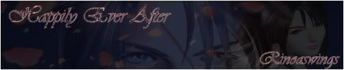
(This one i rather dislike. It was my first go in a while.)
I had many others (from other games and the like) on my other computer... makes me sick that they're all gone now. :(
Rhyfelwyr
09-11-2006, 04:47 AM
Well people always have to start somewhere so I don't think you've done a too bad job, but I would recommend checking out some tutorials ;p
Shinryudan
09-13-2006, 02:07 AM
And back on the topic.

No brushes, just filters and layer adjustments.

more smudge
rinoaswings
09-13-2006, 03:14 AM
Thanks... A tutorial actually helped and made me learn a few things. :)
Ninetales
09-14-2006, 03:27 PM
Rinoa: they're a nice try. Just my personal thoughts:
Would you consider signature to be artwork? Or maybe at least, some sort of image that holds a subject? I think perhaps focusing on "What is the subject of my piece" before jumping into filters and effects. You want the subject to stand out the most - the filters and the effects are to enhance the character to make the image even more striking, or to add a mood. In pertaining to the actual signatures: perhaps you may want to make the characters bolder, because the font is what my eye is drawn to. Maybe use the font to amplify the effect of the image, rather than making it the subject, hey?
Perhaps that wasn't your intention, but it was just my thought.
Shinryudan
09-14-2006, 09:04 PM
I used to hold to quite the same ideas when I started out. however after a while I kinda grew to a point where while I was making something I would let my mind wander and walk. Thus abstract became my favorite.
Ninetales
09-15-2006, 03:48 AM
Well, good abstract art/art manipulation would still have a subject or a dominant mood. It would be uninteresting if it didn't.
For Sakura:
rinoaswings
09-15-2006, 05:23 AM
Yeah, I never thought about it like that... I'll give it some more tries, after all, I just like to do it for fun, and that's what it's about, right? Learning and trying harder each time. :)
Shinryudan
09-15-2006, 08:55 PM
Dark Mage626
09-16-2006, 08:43 AM
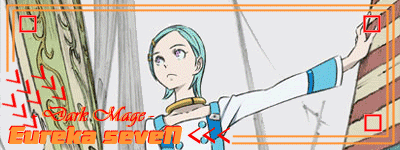
http://img.photobucket.com/albums/v623/dark_mage626/Final_Fantasy_IX_Sig3.gif
Damn: I spent ages on that - yes that's how crap I am. The Background was suppose to be transparent but I dont know what happened there. Comments on my style please. Just ignore the mistakes and talk about my style and what i should change or try. And can anyone reccommend me a tutorial. I use Paint Shop Pro 5.
http://img.photobucket.com/albums/v623/dark_mage626/Eureka_Sig_7.gif
IM A BEGINNER!!!! :(
Aztroth
09-26-2006, 10:05 PM
ok, my latest
(dont remember if I posted this one)

v1 -
v2 -
jpg -
png -
Monkeydude
09-30-2006, 09:58 AM
Ok, i made these 2 for my friends, what do you think?

(
http://imageshack.us)

(
http://imageshack.us)
Shinryudan
10-03-2006, 08:36 PM
Angel Kratos
10-08-2006, 09:40 PM
I'm new to sig making so please go easy.
How could I improve this one and where can I find some good text to go with it.
[IMG]
Shinryudan
10-09-2006, 01:20 AM
Well you should make the text yourself with the "T" tool. Hmm... Maybe try to take up more space than you have right now. Either make the render larger or crop the sig. Also try a border maybe? I don't know what type, just go with a 1px stroke for now.
Angel Kratos
10-09-2006, 04:54 PM
I mean style.
Shinryudan
10-16-2006, 01:40 AM
I can't tell you your style, you gotta get that on your own. If I make a robotic copy of myself, what is the real me worth exactly, get the point?
Woohoo, 8 bit power. Made with the pencil tool while I gazed upon a 16 bit version of the little guys, from the Four Swords Adventures. Only thing I didn't make was the font.

Sir Bartimeaus
10-16-2006, 05:20 PM
Meh, made it when I was bored.

mtbanger
10-20-2006, 06:05 PM

go oblivion
Link's Ocarina
11-11-2006, 12:49 AM
Haryuu, those signatures are awsome. i have a sig that'll be up soon :) I really like yours too banger
Shinryudan
12-04-2006, 03:06 AM
One more, first in months.

brotherhood619
12-04-2006, 09:52 PM
well im just going to show the one in my present sig for the moment
UltimateFFFan
12-04-2006, 10:02 PM
Nice work Shin, good to see you again. I should have some up soon I hope.
EDIT: Just finished one for myself. CnC people please.
Shinryudan
12-05-2006, 03:06 AM
And nice to see you again too jimi, been awhile.
UltimateFFFan
12-05-2006, 08:37 AM
Thanks Shin, but lets stay on topic. CnC on my work anyone?
Shinryudan
12-05-2006, 12:32 PM
A bit big for my tastes. Also, the background is a bit basic, just colours and clouds if I see correctly. The render doesn't really strike you that much so the focal point is hidden. Try bringing the render above all the other layers and just making a duplicate of it and smudging a bit to blend it in.
UltimateFFFan
12-05-2006, 04:37 PM
A bit big for my tastes. Also, the background is a bit basic, just colours and clouds if I see correctly. The render doesn't really strike you that much so the focal point is hidden. Try bringing the render above all the other layers and just making a duplicate of it and smudging a bit to blend it in.
Actually, the bg has no clouds at all :/ it's some double layer brushing. The render is on top of the other layers. May try the duplicate/smudge technique though.
brotherhood619
12-05-2006, 06:17 PM
i can see where shinryudan is coming from, it does look like clouds.
the sig looks a bit bare on the top right.
(smudge i might try that)
UltimateFFFan
12-05-2006, 06:23 PM
brotherhood619
12-05-2006, 09:15 PM
i like them all, seen that background (first) alot off u tho ;)
UltimateFFFan
12-05-2006, 10:35 PM
i like them all, seen that background (first) alot off u tho ;)
That's cuz hyperwiring is my specialty :P
Shinryudan
12-08-2006, 09:10 PM

nother

UltimateFFFan
12-09-2006, 01:46 AM
I like both of these. Very well done Shin.
Shinryudan
12-10-2006, 04:22 AM
Played around with an image of the James Bond watch. Found here (

)

magic slap
12-10-2006, 12:15 PM
i'm not that good, so if anyone has any suggestions,tips, hints or just comments please do post


brotherhood619
12-10-2006, 02:40 PM
i like ryus
magic slap, just blending in the renders mabey, i just use the blurs then change the blending settings, but keep an origional render copied incase u mess it up :)
Shinryudan
12-10-2006, 05:03 PM
Magic Slap
1st-
Try to get rid of the scan lines that are appearing above the border, just delete them to make the border more prominent. Also try lowering the overall opacity of the scanlines so that they are not so overbearing but still prominent. Take the render, duplicate it, blur or smudge the bottom one and then smudge just the outer edges of the top one to blend it. Try putting a stroke on your text to make it more visible. Also try to get something over those wings, or write your text on an angle inside the wings so that they are not the focal point.
2nd-
Add a border first of all, just a 1px black inside stroke is all. Second, sharpen up the text. The outer glow on this one, if you use it, shouldn't be white or black since that is what the background predominantly is. Make it some colour from your render, one that is lighter but still coloured. Try to get rid of that blueish hue on the renders and replace it with some motion blur, or duplicate the render, put a gaussian blur of 3 on the top one and then put that on soft light. Make a new layer and go to Image>Apply Image>Merged, then go to filter sharpen. Other than that maybe try out the curves or levels functions on it.
Aztroth
12-12-2006, 03:48 PM
Shinryudan
12-13-2006, 01:49 AM
whoa, I'll get back to you on those Az, nice to see you though.
Made for a white background if it isn't already completely obvious. Just text and blending modes. Odd hunh.

brotherhood619
12-13-2006, 05:03 PM
pretty freaky if you ask me
Mailbox
12-18-2006, 05:53 AM
Shinryudan
12-21-2006, 03:14 AM
Made this using the photoshop CS3 beta. New features used in this were the surface blur and a bit of messing with the "layer lighten" and "colour dark" blending modes. The original image was a brush stroke I made using the tablet, I then proceeded to to filters and blending modes and layer options on it.

The Beta is download able on the adobe site and requires a CS2 cd key to become "permanent," or it is a 30-day trial period.
Powered by vBulletin® Version 4.2.4 Copyright © 2019 vBulletin Solutions, Inc. All rights reserved.


