Pages :
1
2
[
3]
4
5
6
7
8
9
10
11
12
13
MogKnight
06-06-2004, 08:26 AM
Originally posted by MePhIsTo
geee....
You guys sure need practicing...
Someone actually agrees with me! :shock:
April
06-06-2004, 10:23 AM
And why do you think that, Hanh ?
Constructiveness people >:
It's what's for DINNER. No wait, you're what's for dinner.
MePhIsTo
06-06-2004, 03:22 PM
Originally posted by Vyvyan
And why do you think that, Hanh ?
Constructiveness people >:
It's what's for DINNER. No wait, you're what's for dinner.
It's better a comment like the one I've made than none at all, at least they know they need to practice...
They were just posting sigs non-stop in the thread with no-one commenting anything about them! What kind of help is that?
April
06-06-2004, 03:56 PM
Eh ? o_K I was talking to Mog, you know ?
Your revised comment was very helpful, Mephisto. And you're absolutely right, comments are definitely helpful rather than just an endless stream of sigs.
Hence my post :|
MePhIsTo
06-10-2004, 10:36 AM
No one posts here? :p omg...
Oh well...
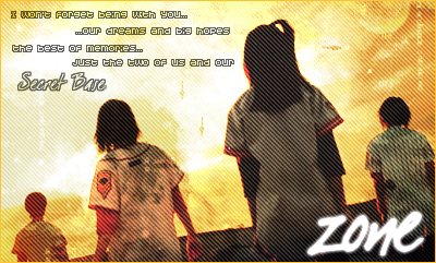
Opinions on my new sig please:

Azwethinkweiz
06-10-2004, 11:46 AM
That is one of the best pieces of art around here. You really are one of the best sig makers I have seen around here in a while. But where did you get that colour wash plug-in for free from?
MePhIsTo
06-10-2004, 12:07 PM
Originally posted by Azwethinkweiz
That is one of the best pieces of art around here. You really are one of the best sig makers I have seen around here in a while. But where did you get that colour wash plug-in for free from?
I don't use any plug-ins for photoshop!
That was a render that I made with bryce and worked it up in photoshop...
Azwethinkweiz
06-10-2004, 12:13 PM
I guess I am not as informed as much as you seeing as I have no clue what Bryce is. But either way great sig.
Chiriku
06-11-2004, 11:06 PM

so what do you think?
MePhIsTo
06-20-2004, 08:57 AM
Ross:
I don't like it, whatever you done to produce that effect, just don't do it anymore, it's ugly...

Comments are welcome....
Originally posted by MePhIsTo
Ross:
I don't like it, whatever you done to produce that effect, just don't do it anymore, it's ugly....
whatever.....
Masakari
06-22-2004, 02:05 AM
Originally posted by MePhIsTo
Ross:
I don't like it, whatever you done to produce that effect, just don't do it anymore, it's ugly...
Comments are welcome....
OK, firstly you have no justification for what you said to Ross.
If you're going to tell him that he's done something wrong at least try to explain the what and why parts. What is the effect you're talking about here? Why is it a problem?
Mephisto, your sig looks OK. The main problem I see is with the tentacles. It looks like they started off trying to be tentacles or something but then changed their mind and decided to be gradiented stringy blobs that look out of place. I think I've seen the effect that you were trying to come up with, but I also think you botched it. Also, they're not very smooth with only the outer glow. I find that it looks much smoother if you use both inner and outer glow. Also, your sigs, although extremely cool looking, get kinda boring after awhile. Why don't you try something different? Like...something simple and...rustic and rugged.
Ross, I think that the sig looks great compared to the previous ones you've made. My suggestions are to keep your border simple and visible, and to try to have more of a forground. The whole sig looks somewhat incomplete because you don't have anything that really stands out more than the rest. Although this is fine, it might look better if you brought up the contrast on one of the pictures more so that it stood out enough that you could tell that it's not in the background. Other than that I think you did a great job, despite what Mephisto might say.
There, that's my two bits.
Originally posted by Masakari
OK, firstly you have no justification for what you said to Ross.
If you're going to tell him that he's done something wrong at least try to explain the what and why parts. What is the effect you're talking about here? Why is it a problem?
Mephisto, your sig looks OK. The main problem I see is with the tentacles. It looks like they started off trying to be tentacles or something but then changed their mind and decided to be gradiented stringy blobs that look out of place. I think I've seen the effect that you were trying to come up with, but I also think you botched it. Also, they're not very smooth with only the outer glow. I find that it looks much smoother if you use both inner and outer glow. Also, your sigs, although extremely cool looking, get kinda boring after awhile. Why don't you try something different? Like...something simple and...rustic and rugged.
Ross, I think that the sig looks great compared to the previous ones you've made. My suggestions are to keep your border simple and visible, and to try to have more of a forground. The whole sig looks somewhat incomplete because you don't have anything that really stands out more than the rest. Although this is fine, it might look better if you brought up the contrast on one of the pictures more so that it stood out enough that you could tell that it's not in the background. Other than that I think you did a great job, despite what Mephisto might say.
There, that's my two bits.
thanx x2!
=D
Azwethinkweiz
06-22-2004, 03:13 AM
MePhIsTo
06-22-2004, 08:09 AM
baaahhhh you guys are so sentimental... omg!
Sorry if I was rude!
Anyways, Ross just try and make the background and adapt the images to the background and not the background to the images...
What I am trying to say is that you should start with a background, in which you blend the pictures, instead of having the pics and start making effects on top of them!
and I just said to don't do that yellow thingy again, it kinda ruins the sig since it ruins the images...
Man, I think you should try and read some tutorials for tha background, then apply the images you want, erase the images a bit on both sides with soft round eraser so the image blends better in the background and then try and color balance the image so it blends better in the background...
I know by tentacles suck, came out a little deformed, don't know why but I didn't like the sig anyways so I didn't bother to modify them...
They get boring? Man, everyone has a style on making sigs, and this is my style! I know guys who are masters in grunge, others in tech, others in vector, I like abstract!
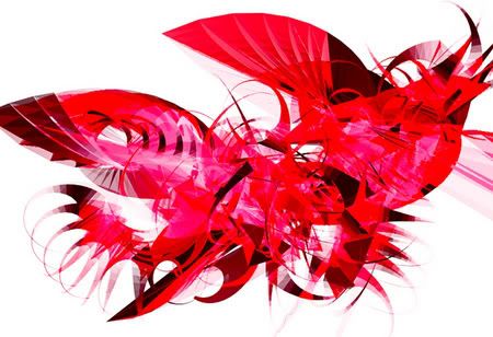
new sig:

Ok you can complain about the rectangles... :p
Originally posted by MePhIsTo
baaahhhh you guys are so sentimental... omg!
Sorry if I was rude!
Anyways, Ross just try and make the background and adapt the images to the background and not the background to the images...
What I am trying to say is that you should start with a background, in which you blend the pictures, instead of having the pics and start making effects on top of them!
and I just said to don't do that yellow thingy again, it kinda ruins the sig since it ruins the images...
Man, I think you should try and read some tutorials for tha background, then apply the images you want, erase the images a bit on both sides with soft round eraser so the image blends better in the background and then try and color balance the image so it blends better in the background...
thank you!
Masakari
06-22-2004, 12:03 PM
Azwethinkweiz: I love all the sigs except the third one and the last one. In the third one, it just looked back because there isn't much of a contrast between any of the pictures really, and I can't tell what any of the pictures are of either. In the last one the noise that you put on Duo looks bad. Other than that great job.
Nah, man, the rectangle looks fine. It's a cool sig, love the red swooshy stuff.
Azwethinkweiz
06-22-2004, 12:08 PM
Thanks, I thought I might need to define the pictures more in the third one.
And Mephisto, I always like the renders that you put into your sigs, it provides a nice contrast.
MePhIsTo
06-23-2004, 06:26 PM
More of the same....... or not....

Masakari
06-23-2004, 07:08 PM
I like this one alot. It has a happier feel to it becuase of the color usage. It's not like...evilish like some of the others you've done.
Great job.
Kitten
06-23-2004, 09:23 PM
For anyone who would remember, I use to be one of the......eh, I guess to say "better known" sig makers around here. (Hope that didn't come out as egotistical, because it wasn't meant so).
I don't have photoshop on my computer at the moment, so I actually havent made any in a few months, but before I did get my new computer, I did actually save a few.
Haven't used photoshop nearly as much as I use too since I left here, but here are three of the sigs I've made since then. Two for myself, and one for a friend. Maybe not as good as my old normal approaches, and maybe not as good, but I do still exist.


Much love to my friend who lets me use his site for uploading. ^^
Comments welcome, or not, up to you if you even remember me. XD
And after viewing over this thread, my advice to any of the newer sig makers is to not give up. You'd be suprised a some of the things you can learn by just sitting down and playing around for 30 minutes a day on photoshop. Never fear experimenting. You will improve.
MePhIsTo
06-23-2004, 10:58 PM
Originally posted by Kitten
For anyone who would remember, I use to be one of the......eh, I guess to say "better known" sig makers around here. (Hope that didn't come out as egotistical, because it wasn't meant so).
I don't have photoshop on my computer at the moment, so I actually havent made any in a few months, but before I did get my new computer, I did actually save a few.
Haven't used photoshop nearly as much as I use too since I left here, but here are three of the sigs I've made since then. Two for myself, and one for a friend. Maybe not as good as my old normal approaches, and maybe not as good, but I do still exist.
Much love to my friend who lets me use his site for uploading. ^^
Comments welcome, or not, up to you if you even remember me. XD
And after viewing over this thread, my advice to any of the newer sig makers is to not give up. You'd be suprised a some of the things you can learn by just sitting down and playing around for 30 minutes a day on photoshop. Never fear experimenting. You will improve.
yup! I always liked your style of sigs triple F!
You have your own way for making sigs, just like I have mine...
And I think everyone should train to have their own style and work on that style because graphics it's a HUGE thing, if we try to be masters in all styles we won't be master at none...
Just an advice...
Masakari, I LIKE EVILISH SIGS! MUAHAHAHAHAHA

well? :erm:
Azwethinkweiz
06-24-2004, 03:04 AM
I like your new one Ross, it is..well hard to explain but I like the texture and colours used.
Masakari
06-24-2004, 03:09 AM
I like the insanity.
What does it say? Because I've used font's like that before. Symbol fonts.
Originally posted by Masakari
I like the insanity.
What does it say? Because I've used font's like that before. Symbol fonts.
lmao!
The top says: I Love Insanity
LOL
and the bottom says something that I'm not going to say....:(
EDIT: and I made this!

what do you think?
Azwethinkweiz
06-25-2004, 03:34 AM
I hate to say it Ross but I can't see it.
Masakari
06-25-2004, 04:24 AM
I made my own sig for Nexopia:

Azwethinkweiz
06-25-2004, 11:44 AM
Originally posted by Ross
Nexopia?
MePhIsTo
06-26-2004, 08:18 AM
...

Azwethinkweiz
06-26-2004, 08:32 AM
Originally posted by MePhIsTo
...
(That was your cue to say "Nexopia?")
I like this too, a very sandy approach. Reminds me of a beach. It is too subtle for me though.
Masakari
06-26-2004, 03:59 PM
Nexopia (
http://www.nexopia.com)
I dunno Mephisto, I think your sigs would look better if they had some sort of...main theme to them.
MePhIsTo
06-29-2004, 10:38 AM
They kinda have Masakari....
Even though they are all abstract they all have a main theme...
Look "ice in space"...

Pysanyhk
06-30-2004, 09:34 PM
Hey. Newbie here.
I just wanted to say that all of you are amazing graphic artists!
Maybe sometime in the near or distant future one of you could make a sig for me?
We take mastercard, visa, and Discover. And on rare occasions, pussy....
=D
Pysanyhk
07-03-2004, 01:14 AM
Okay....
*Starts to back away slowly.*
Azwethinkweiz
07-03-2004, 03:53 AM
Nah, ignore ross he is always busy with sticking his penis up someones ass, We will make a sig for you, it doesn't matter how long you have been here.
Enigmatic Angel
07-18-2004, 04:16 AM
eehhehehe, i haven't made a sig in a while, so no new works here from me, but i did make a lot back a year ago or so they were rather umm crap though. So let me see. Mephisto has been making *some* good sigs, the green one isn't that good, simply because the bevel effect for the border is not that effective, it takes away from the sig and looks hmm just doesn't look very pro. The blue ice thing, taht was wonderfully done, the effects are well created, and the shapes and vectors are also well blended.
Perhaps most important is the ability to blend your stuff together fluently, and most of you are just not doing that.
Azwethinkweiz: you're massive post with a LOT of sigs, most of them did not blend *that* well, just learn to make sure there is more of a flow rather then just sticking the piccys on.
As for Kitten's work, I've always respected your work, this is no exception.
Eijiro
07-20-2004, 04:16 AM
Azwethinkweiz
07-20-2004, 04:29 AM
A very dominant Japanese theme there. I prefer the one you are using currently. The background in well produced and the picture has been outlined well. Overall a very good job :)
EDIT: A vash sig I made, it is too big for FFS though.
http://img61.photobucket.com/albums/v186/Azwethinkweizzz/Vash_sig_gif_finito.gif
and a crazy Asuka sig
http://img61.photobucket.com/albums/v186/Azwethinkweizzz/Asuka_sig.gif
Enigmatic Angel
07-24-2004, 01:41 PM
Aznwethinkweis: you're Asuka sig is actually ok, it just needs a little work, how can i put it, make it less rectangular, despite the fact you've cut out bits of it, it holds the rectangular shape bout it, which makes it, umm not so good, but otherwise its done rather well.
Eijiro: you're sig is good too, heheh i like the effects done on the background, subtle but it seems to work.
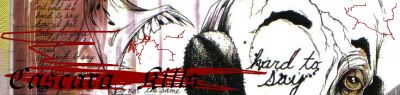
Cascara
07-25-2004, 11:46 PM
Ok here's a sig and ava I did...
Avatar

Signature

Well there ya have it... ;)
Hi I am new here... Hope someone can make me a sig plz?
I was wondering If anyone can...If anyone can heres what I want
People on the sig = Garnet Rinoa Yuna.
Names of the 3 or maybe..... Some very nice phrase
Colors = bluish/ Maroonish /Pinkish / anything that makes it really good
Try to make it big just not Too big
thx
Masakari
07-28-2004, 08:58 PM
MVP, this is a signature show off thread, made so that sig artists can show their work to other artists.
For now, you should post your request in this (
http://67.18.151.242/forums/showthread.php?s=&postid=246322#post246322) thread.
Also, there are several members here who you can PM for a sig.
ok thx you im a newbie here sorry for the inconvenience. Who are some good sig makers i can message for a sig?
Azwethinkweiz
07-29-2004, 09:23 AM
Me
Ross
Masakari
(In no order)
ducky-chan
07-31-2004, 03:12 PM
Could someone make me a GOOD sig out of this picture? And I mean make it good..With cool effects. If you can, make it say, "Cloud and Tifa are sexaaaay."

Azwethinkweiz
08-01-2004, 12:54 PM
I will get to it after I have done all the others but for future reference put your requests in this thread:
http://forums.ffshrine.org/showthread.php?s=&postid=249180#post249180
=)
fantasy_fan(josh)
08-07-2004, 09:18 AM
this is my first sig so dont be to harsh :(
Xyox2
08-08-2004, 06:53 PM
Kewl sig...
This is mine
Ac-ace0
08-08-2004, 07:00 PM
mine better work
Xyox2
08-08-2004, 07:15 PM
Im diggin ur sig Ace:D
Aerisfreak91
08-09-2004, 04:50 AM
Here's mine
fantasy_fan(josh)
08-09-2004, 09:40 AM
i thought this thread was for people who make their own sigs
Azwethinkweiz
08-09-2004, 09:53 AM
It can be for either.
Eijiro
08-09-2004, 10:27 AM
My latest banner/graphic... I didn't make this for use here, but at another forum
Azwethinkweiz
08-09-2004, 01:04 PM
You like your diagonal scanlines and see-through text. =)
Eijiro
08-09-2004, 10:24 PM
Originally posted by Azwethinkweiz
You like your diagonal scanlines and see-through text. =)
I sure do! I'll probably move on from them in a few days =P
Azwethinkweiz
08-10-2004, 10:42 AM
Yeah, different inspirational times. =)
EDIT: I have a question about photoshop...or rather a problem (This really isn't the place, but it is not worth starting a new thread over it) Anyway, Whenever I paste a picture it comes out transparent red, is there a problem?
carebeareater
08-11-2004, 09:47 PM
hre's my sig that ross made for me... alot of people have told me that its weird but i think its cool. opinions?
fantasy_fan(josh)
08-12-2004, 10:48 AM
i think the care bears look kewl
carebeareater
08-19-2004, 12:22 AM
new sig!!!! made by the awesome ross of course!! opinions?
Azwethinkweiz
08-19-2004, 08:26 AM
Who are they?
carebeareater
08-19-2004, 12:26 PM
Hogan
08-19-2004, 09:08 PM
Originally posted by Hogan
http://www.frontiernet.net/~hooly1/Zlad!.jpg
Zlad!
....erm...get a real sig, k?
Hogan
08-21-2004, 05:13 AM
How can you insult Zlad!
The Ricky
08-22-2004, 07:17 PM
Just look at my current sig on the bottom. I made it myself, I'm not that good at sig making yet. :(
carebeareater
08-22-2004, 11:26 PM
no offense man, but that is truly frightening.:shock: or...was that what you were going for? lol! o well... its pretty good work though.
The Ricky
08-23-2004, 12:15 AM
Originally posted by carebeareater
no offense man, but that is truly frightening.:shock: or...was that what you were going for? lol! o well... its pretty good work though.
Um actually, it's just a picture made by an artist name JK Potter. I just put Lord Abortion in there. Since that'll be my future name if it ever gets changed.
carebeareater
08-25-2004, 02:52 AM
ahhhh.... ok:o
Zephikast
08-26-2004, 03:38 PM
Originally posted by Eijiro
My latest banner/graphic... I didn't make this for use here, but at another forum
I have question, what is the name of that font (at teh top right) and where'd you get it from?
fantasy_fan(josh)
08-31-2004, 12:40 PM
this is my second show off sig of yuna
BizarroSephiroth
09-01-2004, 11:46 PM
.
SirBlood
09-03-2004, 09:07 PM
My sig and the sig I just made for a friend are both FF themed.
http://home.earthlink.net/~kjdfv44/sitebuildercontent/sitebuilderpictures/onlyonealive.gif
fantasy_fan(josh)
09-04-2004, 06:46 AM
ure very good i luve them here is ff7 sig that i made
SirBlood
09-04-2004, 09:59 AM
Different version of same sig..
http://home.earthlink.net/~kjdfv44/sitebuildercontent/sitebuilderpictures/only_1_alive.gif
I, personally, like the first one better.
But I gotta say, those look really good.
and I made my sig..btw..
SirBlood
09-06-2004, 12:12 AM
Heh yeah I like the first one better as well, but he asked me to put in the Diamond Weapon scene so....
He uses both though.
Awesome sig btw.

so?
SirBlood
09-11-2004, 06:48 AM
That's awesome dude, who is that character?
Just some girl..really dont' know who...
SirBlood
09-13-2004, 12:09 AM
Few of the sigs I have made.
http://home.earthlink.net/~kjdfv44/sitebuildercontent/sitebuilderpictures/snip3rman.gif
http://home.earthlink.net/~kjdfv44/sitebuildercontent/sitebuilderpictures/sherm.gif
http://home.earthlink.net/~kjdfv44/sitebuildercontent/sitebuilderpictures/firestorm1.jpg
http://home.earthlink.net/~kjdfv44/sitebuildercontent/sitebuilderpictures/medic1.jpg
http://home.earthlink.net/~kjdfv44/sitebuildercontent/sitebuilderpictures/bl00d.jpg
 http://mars.walagata.com/w/sirblood2/bloodaugust.gif
 http://mars.walagata.com/w/sirblood2/panthersig.gif
http://www.hborea.us/pics/brewski.gif
http://mars.walagata.com/w/sirblood2/panthersig.gif
http://www.hborea.us/pics/brewski.gif
ilovequistis
09-14-2004, 07:36 PM
testy...
Elvin Boy
09-19-2004, 10:28 AM
I made one really simple and it was too big :( and wouldn't always show up :notgood:
Hey all your sigs are awesome but i was wondering if somone could make me one im currently playin FF 11 my charcter's name is spikeycloud hes a hume thf/nin on the cebererus server
thanks in adavance
Elvin Boy
09-20-2004, 09:08 PM
jeto! heres a sig for you
Hey thanks alot man its a great sig but its not relli my style hey sir blood think yu can hook me up with a sig :D
~dead_angel_Lenne~
09-21-2004, 02:07 AM
Don't mean to come out of the blue but hey sir blood can u like make me a sig as amazing as urs? :puppydog:
Masakari
09-21-2004, 02:24 AM
I made a new sig. It's animated.
SirBlood
09-21-2004, 06:24 AM
Originally posted by ~dead_angel_Lenne~
Don't mean to come out of the blue but hey sir blood can u like make me a sig as amazing as urs? :puppydog:
Hmm possibly, I usually only make sigs for my clan members or friends.. Check out www.hborea.us there is a Signature Request thread in our Artwork forum. Post there and some other places and I just might :D
Just made myself a new sig.
http://home.earthlink.net/~kjdfv44/sitebuildercontent/sitebuilderpictures/chronoblood.gif
SirBlood
09-21-2004, 06:24 PM
Sure I could, but what is thf/nin? I will look for FF11 images tonight and get the basic layout done.
Thanks alot man I owe you one ooo ya n thf /nin means thief /ninja =)
Big_Rob
09-21-2004, 08:22 PM
Wow... those are pretty sweet...I was wonderinng if anyone could make me a Sig Focused aroung the FF bahamuts...the King of Dragons!!!
Freez3r
09-26-2004, 04:37 AM
t3st.... Just seeing if my banner is on
Azwethinkweiz
09-26-2004, 09:14 AM
I love Sirbloods' stuff, The animation is seriously good.
Here is some renders made in Cinema 4D.

(
http://img49.exs.cx/my.php?loc=img49&image=Pink2.jpg)
rel() zero
10-06-2004, 01:32 AM
*points down to siggeh* pwnage
Dragon9999
10-07-2004, 03:52 AM
what is cinema 4d
rel() zero
10-07-2004, 11:08 AM
A 3D graphics program.
Azwethinkweiz
10-07-2004, 11:16 AM
A great one at that, not sure how it compares to Bryce 5 though.
rel() zero
10-07-2004, 11:26 AM
Bryce is better for landscapes though. Not really for abstract desgins or anything. I still prefer 3DS Max 6 over everything else though.
Ac-ace0
10-08-2004, 07:03 PM
please comment on mine
Azwethinkweiz
10-08-2004, 09:10 PM
I have seen a few things made in 3D max, not a bad program, but Lightwave and all of those top designer ones would be nice to own. =)
rel() zero
10-08-2004, 09:43 PM
please comment on mine
Lensflare and obscured text. Really not my thing man. Work on it more and don't use that filter crap. 5/10
I've never really used lightwave. These days I'm spending more time coding and messing around with XML than graphics. I've been too lazy to develop my graphical style beyond what I have so far. It's a nice mix of 3D and other images with a tech-grunge effect in my opinion.
Azwethinkweiz
10-09-2004, 09:49 AM
That is what I would define your work as, but more grunge then Tech.
rel() zero
10-09-2004, 02:33 PM
This sig doesn't think so. xD
Azwethinkweiz
10-09-2004, 04:57 PM
I agree, alot. :p
Ac-ace0
10-09-2004, 08:34 PM
well its my first attempt
Extraction
10-09-2004, 10:00 PM
Well I just started making banners again. Here's the first one... btw, which formats are allowed on this forum? And does anyone know a really good host?
Dragon9999
10-10-2004, 05:17 AM
Azwethinkweiz
10-10-2004, 09:25 AM
Umm, this site takes whatever you can get hosted I think aslong as it is 150x400 and not over 50,000kb. You could try www.photobucket.com or www.imageshack.us
I like it D9999, especially the green dragon from DnD in your avatar, but it is a bit plain.
Dragon9999
10-11-2004, 02:45 PM
i know*sigh*
it says dragon9999 king of dragons if u cant read it
new one (
http://img54.exs.cx/my.php?loc=img54&image=newsigforme.gif)
rel() zero
10-11-2004, 11:17 PM
It's all negativeized and crap. ._. And I can't read the text for shit.
Extraction
10-12-2004, 01:50 PM
What about my banner? Is it ok?
Azwethinkweiz
10-12-2004, 05:34 PM
Yeah I like the text the most though and the border. You should change your avatar to say "Pwned", it would be moire funny.
What about my banner? Is it ok?
crimes
10-15-2004, 03:26 AM
Not sigs but art. These are parts from a set i did called auraflow
Auraflow2

Auraflow3

----
And heres a sig i did like last week

rel() zero
10-15-2004, 03:46 AM
Pat, that Auraflow crap is like... from fuckin FFDistrict. That's like... 3 - 5 months old. o_o

Tis teh ass kicker!
rel() zero
10-15-2004, 03:54 AM
Bevel's teh fug. As is text. But bg's inestin.
Bevel's teh fug. As is text. But bg's inestin.
fuk dat, teh bg si teh fo shizzle!
rel() zero
10-15-2004, 04:27 AM
inestin = a good thing you dolt.
Cascara
10-15-2004, 08:57 AM
Here's my current sig and ava I did...


Azwethinkweiz
10-15-2004, 09:44 AM
I got none onf that.
Nice Casc, what program did you use.
One I made, but is to long =(

November
10-16-2004, 02:02 AM
I just messed around with some stuff tdoay and made this piece...
erm no there is no image cut outs used for it....I kinda don't have the patience to sit and cut things out of its original setting...so I make it myself... :)
comment away yah.
Azwethinkweiz
10-16-2004, 11:32 AM
It seems to be missiong the bottom of your stroke...don't know whether that was on purpose though.
November
10-16-2004, 02:35 PM
yeah...i didn't put a border at the bottom on purpose...Never been a big fan of borders. So i did just enough to make myself happy...3/4th of a border...(usually it's 1/2 of a border)
Hogan
10-16-2004, 05:29 PM
My newest sig I couldn't decide if I liked it better with the cross or without, thoughts.


Edit: The reduced quality hurts my eyes.
Cascara
10-17-2004, 06:28 PM
I got none onf that.
Nice Casc, what program did you use.
One I made, but is to long =(
Oh I used this crappy editor. I'm kinda scared of getting anything else like photoshop or something because my time these days is rather limited and I know I'll end up putting off important crap and spend too much time on my computer.
Anyway I really like your sig. Even though its kinda long.
Azwethinkweiz
10-17-2004, 08:59 PM
Reason being I couldn't use it for this board ;]
Well, it was a good sig for the program, you should stick at it.
withered
10-20-2004, 05:51 PM
Someone can rate my sig. I only made it recentlly :)
miyavi
10-25-2004, 01:05 AM
Hogan
10-25-2004, 04:20 AM
Someone can rate my sig. I only made it recentlly :)
I rate your sig 500*150.
grn apple tree
10-25-2004, 04:37 AM
A very dominant Japanese theme there. I prefer the one you are using currently. The background in well produced and the picture has been outlined well. Overall a very good job :)
EDIT: A vash sig I made, it is too big for FFS though.
http://img61.photobucket.com/albums/v186/Azwethinkweizzz/Vash_sig_gif_finito.gif
and a crazy Asuka sig
http://img61.photobucket.com/albums/v186/Azwethinkweizzz/Asuka_sig.gif
seven is korean
Azwethinkweiz
10-25-2004, 09:19 AM
What? Seven is korean??? WTF.
Rikku_Love
10-25-2004, 11:26 AM
ad_022
10-25-2004, 05:17 PM
Mine's alright...
Huntress Krystle
10-26-2004, 01:29 PM
Ross, Relo Zero, Azwethinkweiz, your works are brilliant! *hands down* you three are like the masters of sigmaking. cant praise u enough >_<
rikku love: like what i said before, yours are cute! keep up the good work!
miyavi: yours are pretty too. ^_^ i especially love the avatar!
withered: i rate your sig a 9/10. it's awesome
here's the latest set that i made. it's ashe from ff12. i wish some of u could give me tips as to how to improve on my works. keep it up, guys!
http://img.photobucket.com/albums/v404/kitel/ashe_ava.gif
http://img.photobucket.com/albums/v404/kitel/pretty_ashe.gif
Azwethinkweiz
10-26-2004, 08:07 PM
Thanks, Well, your stuff is good, the way it makes use of blurring images, and transparity. Try to do it without Bevel once, though, see if it is an improvement. O:]
Cascara
10-26-2004, 08:33 PM


Nice!
Masakari
10-26-2004, 09:07 PM
Wow, look at me and my animated Avatar and sig combo. In yer face.
Azwethinkweiz
10-26-2004, 09:47 PM
Back too nameless sniper it seems. =-O
Rikku_Love
10-27-2004, 07:50 PM
Wow, look at me and my animated Avatar and sig combo. In yer face.
good one ^_^
Cascara
10-28-2004, 10:58 PM
Someone rate my new ava/sig combo. Actually if you can rate any sig I've posted here.
http://forums.ffshrine.org/customavatars/avatar9620_2.gif
Masakari
10-29-2004, 07:44 AM
Back too nameless sniper it seems. =-O
Chya! 'n' I had Armonis there for awhile. Ah, the names of yore.
Rikku_Love
10-29-2004, 05:23 PM
Someone rate my new ava/sig combo. Actually if you can rate any sig I've posted here.
http://forums.ffshrine.org/customavatars/avatar9620_2.gif
nice! scarey and demented, but nice! ^_^
Alchemist
11-02-2004, 11:37 PM
Avatar: Made in MS Paint, blur effect done with Ultimate Paint.
Signature: Pieced togeather in MS paint, blurred once again with ultimate. Banner for my site.
Angelic Aeris
11-02-2004, 11:49 PM
here we are..not that good but umm okay...


okay so they aren't that good :-(
Rikku_Love
11-02-2004, 11:52 PM
i just find piccy's and put words in LOL not the greatest sig maker in the world!
Angelic Aeris! those are good! ^_^ nice aeris ones
Azwethinkweiz
11-03-2004, 07:00 PM
That first one Aeris was awesome, when you can make sigs like that you should use them.
Adamski
11-03-2004, 10:07 PM
I think that i can make OK sigs, i made my own and my made some others for people called Tevinhead, Selphie and god is dead, and they havent complained...
Havent made an avatar yet o_O
Rikku_Love
11-03-2004, 10:17 PM
i'm not-so-good hehe i actully suck! but i try ^_^
Huntress Krystle
11-03-2004, 10:18 PM
angelic aeris: why dont u use the first one? it's very cute!! ^_^
RaineLoire
11-09-2004, 11:01 PM
Here's mine! Thankyou Huntress Krystal!
Hats off to (MINE!) Laguna! HE follows me around all day *sigh*......what......who are you?...
Rikku_Love
11-09-2004, 11:30 PM
hehe i like you'res, HK does good work
RaineLoire
11-10-2004, 12:59 AM
I would reccomend her work!
ducky-chan
11-11-2004, 02:27 PM
I would like a dark and sexy sig this time.

[/IMG]

I want it to have a nice blue effect that is nice and dark and reflects teh mood.
EDIT: WOOPS. Wrong thread. But I hope I got the message across anyway.
Azwethinkweiz
11-11-2004, 05:01 PM
Umm, can you post that in the sig workshop for clarity' sake.
joel90
11-13-2004, 10:10 PM
How's my current sig of tidus?
Danielsan246
11-15-2004, 08:33 PM
Berserk!
joel90
11-21-2004, 09:40 PM
here's a new sig. It's Alex from golden sun.

What do you guys think ? not to bad for my second sig

Adamski
11-22-2004, 04:14 PM
its ok i suppose, its hard to read and damages my eyes >_<
lol sry dude ill try n change the font up a bit
Darth Pepper
11-22-2004, 04:43 PM

I'm showing off.....
Yo barret changed the color up a bit better ?

grn apple tree
11-23-2004, 02:03 AM
here's mine thanks to Relestial... it's my current sig the kenshin one (green not hard to miss)
Hogan
11-23-2004, 05:37 AM
What do you guys think ? not to bad for my second sig
I think it is to big and ms Painty but that is just me. You should keep trying though and stuff...
(It's funny because I am really bad at making sigs too.)
Huntress Krystle
11-23-2004, 08:30 AM
wow x 100 @ relestial & joel's works o_O
assclown, your sig is cute. how'd u do that??
November
11-23-2004, 09:54 PM
i dunno this looks whoa out out place. I mean I think the choice in text isn't neccessarily bad, but it make it hard to read, even with the outline. The boys pic seems to have been cut a bit short...It's erm decent for a beginner i suppect tho....
Edit: Oh and I know a lot of people here kinda got this thing about a border of some sort. To tell you the truth, I only think a border is in good use when what you want to do is close in the sig. If you don't want it to be, then no border...In this case... I think a border may have helped because the background doesn't seem to end, and it's not clear enough to make out...a bit blurry if you will...so borderd...imo
Rikku_Love
11-23-2004, 10:13 PM
your's is great! mine suck lol, i just like looking at ones others have made because they're goodie ^_^
Adamski
11-23-2004, 10:33 PM
Yo barret changed the color up a bit better ?
Much better :D
Rikku_Love
11-24-2004, 12:02 AM
ooo coolie ^_^ vash is cool
Rikku_Love
11-24-2004, 12:09 AM
hehe np! but i would advise you to resize it, it's alittle on the big side...i think? lol maybe it just looks big because it's so colourful lol
gotta make sure it's 400x150 (400 width, 150 height) k'z?
hehe
Azwethinkweiz
11-24-2004, 08:25 AM
Huntress Krystle
11-24-2004, 11:18 AM
nice new sig, jeto :)
and azwethinkweiz, your works are awesome, as usual. keep it up!
im trying to put an animated gif on a sig but it automatically defaults at the upper left corner is there a way i can move all the frames to a certain place at the same time or do i have to do it one by one ?
Azwethinkweiz
11-24-2004, 06:00 PM
Umm, you have to lock all of the layers together in the layer window then move. I usually put it into photoshop first to size it up and you should use a program that lets you view it screen by screen so that imageready can handle the video.
k ty lol this is much easier the nmovin them one by one
oo ya n one more q is there a way i can put in 2 snimated gifs n have them playin at the same time but different speeds ?
Rikku_Love
11-24-2004, 10:06 PM
k rikku just for you ^^
http://img28.exs.cx/img28/8872/trigun-sigsmall.gif
aww that's so cute, thankies ^_^
i don't know much about that (that's obvious because i can't make a sig to save myself ><) sorry
Azwethinkweiz
11-24-2004, 10:12 PM
You just have to change the speeds in the Slice window. To have them playing at the same time just make the different leyers in the same sliceor skip a slcie or two if you want them at different speeds. (Its hard to explain)
Rikku_Love
11-24-2004, 10:21 PM
sounds complicated -.-'
what is the program you're using?
Azwethinkweiz
11-24-2004, 10:39 PM
Photoshop Cs/7
Rikku_Love
11-24-2004, 10:45 PM
ahh i might begettin a version of photoshop for my christmas, i hope so ^_^ it's so good!
Darth Pepper
11-24-2004, 10:47 PM
ahh i might begettin a version of photoshop for my christmas, i hope so ^_^ it's so good!
Don't ever buy photoshop, its $300.00+ dollars, burn it off a friend.
Azwethinkweiz
11-24-2004, 10:48 PM
Umm �600. Check Amazon, thats where I got it.
grn apple tree
11-26-2004, 10:55 AM
Azwethinkweiz you're too good man
Rikku_Love
11-26-2004, 01:11 PM
Umm �600. Check Amazon, thats where I got it.
the photoshop i might be getting is �75.99 :laugh:
Relestial: i don't know anyone that has it, here where i am
Azwethinkweiz
11-26-2004, 05:09 PM
I suppose you could most likely get it for about �70 In Thailand, if you can speak the langauge and barter well.
Rikku_Love
11-26-2004, 10:05 PM
hehe well i can't lol, i'm in the uk you see, and the one i'm getting is from comet lol
*Shows off sig/ava*
Ava's a bit small. I was uninspired.
Azwethinkweiz
11-28-2004, 09:22 PM
AT you sly dog. Very grungy and GREEN Love the style used, especially the teal colours. No suggestions except change the text.
Rikku_Love
11-28-2004, 11:18 PM
*Shows off sig/ava*
Ava's a bit small. I was uninspired.
nice ^_^
Dragon9999
11-29-2004, 02:59 AM
i am back with a new sig what do ya think
http://img103.exs.cx/img103/5418/copy2.gif
Rikku_Love
11-29-2004, 04:50 PM
ooo! snazzy :cool:
You just have to change the speeds in the Slice window. To have them playing at the same time just make the different leyers in the same sliceor skip a slcie or two if you want them at different speeds. (Its hard to explain)
ya uhh aswethink .... im completly lost i have never used the slice tool before >< i went to photoshop "help" but that didnt help much either I no its hard for u to explain but can u try lol ?
Rikku_Love
11-30-2004, 01:54 PM
Azwethinkweiz
12-01-2004, 05:33 PM
It is in Imageready, not photoshop.
Rikku_Love
12-02-2004, 12:33 PM
that's a lovely siggy ^_^ like the soft greens and blues ^_^
Adamski
12-02-2004, 12:55 PM
Rikku_Love
12-02-2004, 12:58 PM
like the rocklover one, and the BW one is coolie too ^_^
Except for the fact that Huntress Krystle has done that type of border to death, so it looks really generic. Then again, I was never really fond of it.
Adamski
12-02-2004, 01:04 PM
Well iv always used borders that, I Think that they looked different, and it adds to the personality of the sig.
But i suppose everyones entitled to their opinions.
Rikku_Love
12-02-2004, 01:11 PM
yeh i guess so, i quite like that look, it makes the sig look better, than just having a picture (i.e mine! lol)
not that there's anything wrong with that, the border just gives it a nicer effect i think
Azwethinkweiz
12-02-2004, 06:02 PM
Bevel Sucks :( Why do you use the same picture every time? And why is the text so pixely.
Nice going Assclown, love the sig.
Hogan
12-03-2004, 12:24 AM
ooo! snazzy :cool:
Hogan wannabe mir.
Rikku_Love
12-03-2004, 12:39 AM
hehe yeh right :laugh:
i like my ava
Zephikast
12-04-2004, 09:13 AM
Here is one of my recent works,

Hope ya like it =)
Nice effects. :) Simple but effective. The only thing I don'r really like is the grainyness on the squiggly lines, but that's the effect so it's all good. :D
*STRUT*

Azwethinkweiz
12-04-2004, 07:43 PM
Very contrasting AT, ZOE? or Rahxephon?
Ac-ace0
12-06-2004, 12:05 AM
here
Trajet
12-06-2004, 03:57 AM
Adamski
12-06-2004, 03:53 PM
I prefer the second one to the first one, but both of the backgrounds are very messy and dont seem to have a style to them.
Also, the text in the second one is hard to make out.
Bright blue writing on a red background is very painful to the eyes >_<
Rikku_Love
12-06-2004, 05:30 PM
Itachi uchiha bad ass
http://uploads.bestupload.com/redir/12335.gif
wat do u think ?
nice ;)
ZOE, I dont know what Raxewhatever is :P
@ Jeto the animation is nice, but the image isnt very well blended
@ Trajet; the first's alright, but there's no real blending and the bg is a bit messy, and the second one, same applies.
*EDIT*
ZoE OF series
(Zone of the Enders Orbital Frame series, for those uneducated fools :P) I couldnt be arsed doing Jehuty because I already have one of him, and these were kinda inspiration for an RP me and AV2're setting up.
Yes they are very similar, that's the idea.
Bad Guys


Good Guys

And then my sig v
lol nice to no i have a fan rikku ^^ hehe im workin on a wolfwood sig now its turnin out pretti good ill keep u guys posted
btw yur sigs look great AT

Too much white

Too basic

Knew I forgot something, quality.
Yeah, I'm not great, in fact, I suck, but meh.
ok not my best piece of work but u gotta love the border lol :)

Rikku_Love
12-07-2004, 12:25 AM
yeh it's nice ^_^
mine suck lol :laugh:
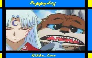
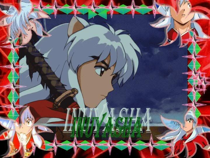
they arent bad they just need a lil bit of work ... i like the borders ^^
hmmm if u want i could make u a sig ? lol i need a new project ne way :laugh: n i like inuysha cool show
Rikku_Love
12-07-2004, 01:00 AM
hehe thankies ^_^
hehe gotta love tat monk hes a pimp ^^
do u want a animated gif on sig ?
Rikku_Love
12-07-2004, 01:11 AM
who me? sure ^_^
lol miroku? yeh he's a perv...a nice...perv..lol funnie.....perv....lol
i like him, and shippo ^_^
lmao ya miroku is one of a kind ^^
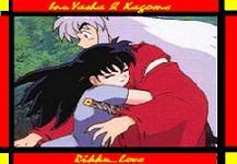
im lookin for a good inuysha and kagome pic... the sig should turn out good :)
Rikku_Love
12-07-2004, 01:23 AM
hehe goodie ^_^ thank you very much
Trajet
12-07-2004, 09:36 PM
Rikku_Love
12-07-2004, 09:57 PM
nice siggy
Trajet
12-07-2004, 10:15 PM
Thanks very much.
Rikku_Love
12-07-2004, 10:21 PM
np, it's cool, lol any siggys are better than mine ^_^ but you're are good ^_^
ok rikku here it is i couldnt fit in an animated gif >< but it still looks pretti good

lol tried to make it look as girly as possible
Rikku_Love
12-07-2004, 11:13 PM
lol why? :laugh:
i'm a tomboy :D
it's nice! thank you ^_^
hehe np lol had no idea were a townboy >< would have made it easier on me
Rikku_Love
12-08-2004, 12:09 AM
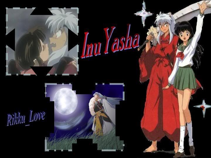
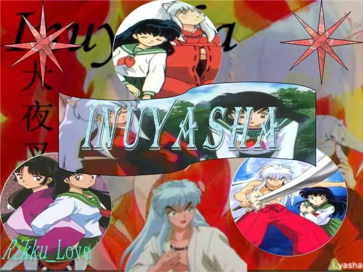
haha maybe for next time lol
i just did this siggy
http://img.photobucket.com/albums/v399/ninako_kimhara/Picture4.gif
i resized it, the original is bigger
nice you should prob make the background of the shippo pic transparent so u dont see the clouds it makes it look better ^^
Rikku_Love
12-08-2004, 01:06 AM
i don't know how to do that :|
lol i like my ava LOL poor shippo ^_^
Aerith Gainsborough
12-08-2004, 11:07 AM
New sig, too bad I can't use it.

<---I hope your not using IE.
This one looks pretty good. I really like it. :)
Rikku_Love
12-08-2004, 04:48 PM
New sig, too bad I can't use it.
<---I hope your not using IE.
can't you just resize it?
Azwethinkweiz
12-08-2004, 05:54 PM
Switch too Mozilla, thats why it looks crap (IE Sucks).
Wonderful, was this this brushes andopacity changes and so on, because I love it. (Damn IE users, makes me want to stop using Mozilla because of there comments on the "Blue Lines")
Rikku_Love
12-08-2004, 05:57 PM
what is Mozilla?
April
12-08-2004, 06:06 PM
It's a web browser that's a million times better than Internet Explorer.
Rikku_Love
12-08-2004, 06:07 PM
coolie ^_^
Powered by vBulletin® Version 4.2.4 Copyright © 2019 vBulletin Solutions, Inc. All rights reserved.


