Pages :
1
2
3
4
5
[
6]
7
8
9
10
11
12
13
Jasmijn
03-30-2005, 08:20 PM
Wow!! Thanks Slash!!
Sujin
03-30-2005, 11:45 PM
very good, the only thing i can say is that you could use some other colors.
StarTsubasa
03-31-2005, 12:04 AM
I love it, Jasmijin! ^_^ 10/10
clanotheduck
04-05-2005, 02:06 AM
I was directed here by crystal sword when i showed off my signatures in a new topic, so..here are some signatures i did, just curious of peoples thoughts, and if there is a place for me to improve, please mention it. =)
this is the one of the first banners i did, i'm a big fan of vincent, so i did him.
http://www.geocities.com/lots_of_duckys2000/banner.gif
This one is like the second one i did, and its of yuffie, its also my current signature.
http://www.geocities.com/lots_of_duckys2000/yuffie_banner.gif
i'm new to the signature making thing, and i'm sure their will be place to improve!
grn apple tree
04-05-2005, 02:17 AM
^^' Heh heh.
Well I like your sigs especially your Vincent one. 8/10 for your vincent sig and 7.8 ish/10 for your Yuffie one. I don't really like it for some reason.
Slash
04-05-2005, 01:43 PM
Wow nice job clanotheduck
8.5/10 for the vincent sig easily and 8/10 for the yuffie...nice job!
Shinryudan
04-06-2005, 09:30 PM
New one, just got bored and started playing around with the things saved on my computer. C&C plz

Sujin
04-08-2005, 01:31 AM
pretty good colors, but i would reccomend changing the text on the right.
Slash
04-08-2005, 11:26 PM
i wouldnt looks great as it is....
8.5/10
Enigmatic Angel
04-09-2005, 03:25 PM
Shinryudan: I must say, not bad, its been a while since i have seen a sig i'd say is worthy of "good", and that is really rather good, the colour is a bit eeky, but kinda fits, don't ask why. The only critique i have is, it doesn't look like anything is going on, its too boring, and the pic is just *begging* to have more stuff done, it doesn't seem like the type of picture that is beautifully simply, i dunno, i just think you need to do a little more, either not too bad, in fact good.
One_Winged_Angel
04-10-2005, 10:41 PM
What do all of you think of my new Sig. It is modeled after my favorite movie. Obvious title. :)
By the way, you should use that one as your sig, Shinryudan.
Slash
04-12-2005, 08:27 AM
wow nice job owa although i didnt think much of chicago not my sort of film but good job on the sig...speaking of which how do you like my new one?
mine is the best!! tell me what you think
i was so bored so i made 1!!! what do you think???
owww its not working :(
ok ok, is it working now???
Aniki
04-12-2005, 11:47 AM
It's not bad, but needs more working.
ok, how can i improve it, it took me a whle to make it but what more can i do??
Aniki
04-12-2005, 11:55 AM
I'm not an expert on sigs, but you should show it to the sigmakers. They'll probably improve it
yea, id rather have a sig of my own work, i dont want to have someone elses work on it, well if you could give me ti[s of how to improve it i would like to hear from you, although i dont want anyone else to start tampering with it. thanks a lot
bilz
Shinryudan
04-13-2005, 01:37 AM
if u r using photoshop set ur antialiasing on ur text to none, take the text out of italics, make a stroke border, and the pics seem a tad stretched.
One_Winged_Angel
04-13-2005, 01:43 AM
yeah...what Shinryudan said.
Also, make your text a little more complex and organize it better. It seems to be all over the place. One more thing, your pictures look digitalized. Find bigger versions of them and size them down to whatever you want. Never try to make a small picture bigger.
Shinryudan
04-13-2005, 12:07 PM
unless u have CS, then u can load your pics from file as smartpictures. That way they will resize without losing quality.
Sujin
04-15-2005, 07:39 AM
Shinryudan
04-15-2005, 08:28 PM
i loveareis= found that pic online all you did was resize it and add text. Don't rip, you didn't make that don't take the credit. rather bad resizing too. here is the original image (
http://itserver.footscray.vic.edu.au/vetit2003/Gabriel/personal%20site/images/FF%20-%20Aeris,%20Cloud,%20tifa%20&%20Sephiroth.jpg) 1/10
sujin= its a bit wide, i like the animation though. you should blend the render a bit, and the border seems a bit to large. the left side seems a little bit empty. overall an OK job though 7/10
Sujin
04-15-2005, 11:10 PM
k thx here's another one (im not making these):

very good, hummmmmm................and im sure everyone elses they even made the photo of the charcter from scap? im sure they did, dont really need a 1 out of 10, seemed a bit harsh anyways, you just hate me because im me
Sujin; I dont like it. It's pretty boring, really. Boring background, no blending on the character, the idea of using a lower-transparency itachi (?) on the right behind the text is silly, but the text is alright. 5/10. :E
Jasmijn
04-16-2005, 08:24 PM
@ Sujin: I think it looks okey.. I like the background.. Hm... I think... 7/10...
Shiori
04-16-2005, 09:14 PM
Iloveaeris: Just looks a bit choppy. Smoothing it out somehow would make it a lot better. I have no idea on how to fix anything like that though..
Sujin: I like it alot! i guess it could be more exciting, but not all sigs need to jump out at people and give them heart attcks.
Slash
04-17-2005, 04:33 PM
hello? did anyone read my post? what do you think of my new sig?
edit : i rele like sujins 8/10
nice job of riping off sum1 else's sig iloveaeris 1/10
Sujin
04-17-2005, 07:02 PM
awesome sig. however, I would reccomend getting your name on it, but make sure it's very small, so it doesn't ruin the effect.
Shinryudan
04-19-2005, 09:01 PM
very good, hummmmmm................and im sure everyone elses they even made the photo of the charcter from scap? im sure they did, dont really need a 1 out of 10, seemed a bit harsh anyways, you just hate me because im me
u dont seem to get the idea of making a sig or even that of ripping. we may use the renders but we make our own backgrounds effects and such. If we do not make the signature we give credit to those who did. it would have been ok if you hadn't taken credit for something not of your work (give credit where credit is due). i dont hate you anyways, just i hate ripping.
edit: sujin- its an ok sig, but i must agree with AT on this one. the render needs some feathering done to it, the bg is just clouds with some lightning brushes done to it, the text needs some work imo kill the anti-aliasing on it cause it looks a little pixely to me
edit: for slash's sig it is all renders and pictures i only resized sdtuff and blended
made a new sig, when i tried to do a stroke for a border it didnt seem to do anything, disregarding that flaw plz C&C, thx

clanotheduck
04-24-2005, 02:39 PM
hello every one! i just finished my latest and greatest sig and avatar combo, what do you guys think?
http://www.geocities.com/lots_of_duckys2000/vincentbanenereer.gif
edit: Shinryudan's new sig thing looks fancy and cool. i'd say a 9 out of 10.
Shinryudan
04-24-2005, 03:53 PM
instead of reducing the opacity of vincent you should try feathering him. the ripped boder didn't work very well because some parts that should have been cut out were not. your name in the corner shouldn't be crossed out, use a pixel(proggy) font for it, also it passes outside of the border. vincents face looks like it is on color burn? might want to try using the burn and dodge tools on it. the text is not too bad but you dont really need ...-vincent valentine... there cause people know what you're talking about from the render. the bg looks like clouds and extracted chains, i think its too plain, add some brushing. you could add a few color balance layers and then make a clouds in their layer masks to multicolor it. overall
4.25/10
not one of your best imo
clanotheduck
04-25-2005, 06:19 PM
instead of reducing the opacity of vincent you should try feathering him. the ripped boder didn't work very well because some parts that should have been cut out were not. your name in the corner shouldn't be crossed out, use a pixel(proggy) font for it, also it passes outside of the border. vincents face looks like it is on color burn? might want to try using the burn and dodge tools on it. the text is not too bad but you dont really need ...-vincent valentine... there cause people know what you're talking about from the render. the bg looks like clouds and extracted chains, i think its too plain, add some brushing. you could add a few color balance layers and then make a clouds in their layer masks to multicolor it. overall
4.25/10
not one of your best imo
oh dear...i didn't know there were so many things wrong with it. the only things that i might change now would be the strikeout of my name and i would redo the border...
edit: i edited it a bit...i doubt it will get any better of a score...but oh well...i didn't want to change much of it.
http://www.geocities.com/lots_of_duckys2000/vincentbanenereer2.gif
Slash
04-26-2005, 10:10 PM
yeah i agree with shinryu on that one duck speaking of which nice job on the sig shinryu
9.5/10 love the colours.
Shiori
04-26-2005, 11:10 PM
The new one looks much better! except i cant see your name on it.. =/
8/10
Memento Mori
04-27-2005, 12:06 AM
I miss my Adobe... Anyways, y'all can rate my current one if you'd like...
clanotheduck
04-27-2005, 03:49 AM
The new one looks much better! except i cant see your name on it.. =/
8/10
i didn't want my name to be too much of a distraction from the rest of my sig, so i made it small...
Krelian: very intresting...nice texture...i'd say 7 / 10
Shinryudan
04-27-2005, 08:45 PM
Its a nice signature, the render is well done and the text matches. Is that a blur spot on the left or another render... anyway I can't tell 8/10
shadow_cammy
04-27-2005, 10:26 PM
Shinryudan
04-27-2005, 11:18 PM
pretty good, the bg on the right side looks a little plain but still a nice job.
9.5/10
clanotheduck
04-28-2005, 01:48 PM
i made a sig for this person named "BellaMorte"
what do you guys think of it?
http://www.geocities.com/lots_of_duckys2000/sillyness1.gif
(he/she made up the qoute, and he/she wanted vincents eyes to glow)
shadow cammy: i personaly don't find him attractive, but i agree with shinryudan,
9.5/10
shadow_cammy
04-28-2005, 02:10 PM
0_O wow u dont find damon attractive.........^_^ more 4 me
i like the layout of youre sige however the text is very hard to make out perhaps a more suttle transition of colour would help but pretty cool id give it 7/10
wow i got pretty good rattings..sadly tho im giving up my sig making not enuf time
Shiori
04-29-2005, 01:06 AM
Bellamorte's sig that you made is pretty good!I like the shape alot! except the eye thing.. I dont know why they wanted that. o.o
9/10
~~By the way, anyone wishing to add comments on my current sig, feel free!
diablos15301
04-29-2005, 01:11 AM
heres my damn sig
PLACE SIG HERE
Shinryudan
04-29-2005, 01:14 AM
clanotheduck-
its pretty good, your definitely improved since the original vincent yuffie one you had.
the text is kind of hard to read and i think you should look into learning some grunge and/or abstract techniques to improve your skill, right at the moment all of your sigs seem to have rendered bg's
7/10
diablo....-
actually put something that we can grade, this is for graphics not text sigs also
also this is a banner that im making for a site, i cant think of a text font to fit it well. the site is final graphics

clanotheduck
04-29-2005, 02:11 AM
looks great shinryudan, although i have no idea of what is going on, its pleasing for the eyes, 8/10
i'm not sure what font would look good, but all i can suggest is
http://www.1001freefonts.com/
its where i download all of my fonts!
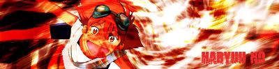
haryuu no
04-29-2005, 04:18 AM
9/10
As Clanoftheduck said its pleasing to the eyes. Also it seems balanced envenly, and i like that. What i mean by that is that sometimes there are things that catch a person's attention as soon as they see it. This banner makes it so that a person isnt diverted to one part as soon as they look at it.
This is just a sig that i made for myself:

clanotheduck
04-29-2005, 03:34 PM
i like the text...the "honey comb" looking background has been used alot...but its got a very catchy look, i'll say 8/10
Jasmijn
04-29-2005, 07:16 PM
It busts the crap out of the sig limits. :(
Shinryudan
04-29-2005, 08:57 PM
jasmijn-
the text fits the sig perfectly but the bg is too plain for my tastes. I like the pattern to the left side but in the right hand corner you can see the default photoshop bg which doesn't fit very well. Also the foreground needs some blending done to it with the colors. overall about a
6.5/10, not your best imo
clanotheduck
04-30-2005, 06:49 AM
intresting sig, but it is like 70KB, much higher then the sig limits say your alowed, the text looks great, it has an intresting flow to it, but it seems a bit too "chopy", 7/10
haryuu no
04-30-2005, 07:14 AM

a sig that i made for someone at another forum...
Shinryudan
04-30-2005, 06:10 PM
Its pretty good, you should add a pixel border and blend the edges off the inuyahsa a little bit. overall i give it a 7/10
btw where do you get your brushes?
Slash
05-01-2005, 10:19 PM
jasmijn nice job 10/10 def....mmmmm hilaryduff mmmm *trools*
Sujin
05-02-2005, 03:48 AM
GRRR jasmijn's sig doesn't show right now...
Jasmijn
05-06-2005, 09:05 PM
but in the right hand corner you can see the default photoshop bg
That is a pattern too..
Btw.. I made a new set..
grn apple tree
05-07-2005, 11:14 PM
Looks great.
8.5/10 I think it needs a border though.
a sig that i made for someone at another forum...
that's really good
New ava/sig combo. Any comments?
clanotheduck
05-09-2005, 09:37 PM
jasmijn: looks nice! needs border....
8.8/10
Haryuu No: nice job, 9-10, great texture!
AT: i like it! very "dooms day!" themed...but nice...8/10
Shinryudan
05-09-2005, 09:57 PM
AT: I like this a lot more than your last one, the text fits the signature very well. The line through the center gets your title to stand out more. Also the text and quotes in the bg give it a book burning look. overall
9.5/10 imo
how did you get the fire effect, I never can find one that looks that good.
nice work jeto, really nice
Squiggly
05-11-2005, 11:25 AM
Cool Jeto.
My sig: Its my second sig so don't go too hard on me.
Jasmijn
05-11-2005, 09:04 PM
Jeto: I think the colors are kinda annoying.. Because at first I thought it was just an abstract art.. I didn't see the character..
Squiggly: It's okey .. For a beginner.. ^_~
Shinryudan
05-11-2005, 09:35 PM
jeto
you should feather the edges of the render if only a little bit to blend it in, otherwise I give it a 9/10
squiggly
some advice for someone new to photoshop. go to www.good-tutorials.com or another tutorial database and try out some background tutorials. Many Backgrounds that you make will look a lot better with the render than another picture will.
otherwise its ok.....
5.5/10
haryuu no
05-12-2005, 02:32 AM
My newest sets...well that ive made for myself.

-normal


-inverted
I personnally prefer the inverted one over the normal one. =)
clanotheduck
05-12-2005, 05:31 AM
the normal looks much more...normal...@
[email protected] good not to make signatures too complicated, or else they look like a giant mess...i hate the inverted, too messy, the normal one is easy to see whats going on, and looks much better.
8.9/10 for the normal
6/10 for the inverted
..but hey, art is in the eye of the beholder, which ever you like!
Sujin
05-12-2005, 06:31 AM
very very nice, I love the background (how it's blended)
the inverted is just a tad bright:
normal-
9.5/10
inverted-
8.5/10
Cpt_Yossarian
05-13-2005, 08:33 PM
Watch yo-yo ride the dino then look closely at my avatar. They're dandy inmho. Also looks way better if your viewing in vbulletin v3 style.
DinoSig:
http://i2.photobucket.com/albums/y24/cptyossarian/dinoyoyosig.gif
Edit: Didn't check but its WAY over 50kb so this wont be my sig but this is what is was. BTW I used animation master rendered frames only and then converted to gif. ProgamI used for conversion was very medicore if anyone knows a good gif batch conversion program that would help immensely.
Shinryudan
05-13-2005, 10:16 PM
I like it, the dinosaur is well made. What did you use for the signature, blender, maxon??
haryuu no(finally figured where your name is from)
WAY to bright for me :shock: the inverted gets the same.
tone down the whiteness and it would be pretty good in my book.
normal 6/10 inverted7/10
I like the normal one but the inverted one is to in your face you gotta add a bit more darkness to it.
Normal 9/10
Inverted 5/10 sry
Sujin
05-14-2005, 02:27 AM
new banner. (not made by me)

Its a nice banner but a bit plain
7/10
Shinryudan
05-14-2005, 03:02 AM
like selphie says, it's just too plain also I don't think the text fits that well. 6/10
Sujin
05-14-2005, 03:22 AM
k.
here's a new one:

I like the one with rinoa in it its got some nice effects.
But the one above it is to bright you can barely see the people and the text isnt a very good choice
Rinoa
8.5/10
Blue one
5.5/10
Sujin
05-14-2005, 04:57 PM
Hehe I was gonna ask what you thought of rinoa next.
Shiori
05-14-2005, 07:35 PM
I agree with selphie.but i like the text on the top one ^^
Rinoa one- 10/10
upper one 6/10
k.
here's a new one:
nice work
Sujin
05-14-2005, 10:07 PM
nice work
I'm not makin these :-P
my friend(s) on another forum is/are
Aztroth
05-15-2005, 02:50 AM
Shinryudan
05-15-2005, 03:48 AM
It looks like all of your bg's are the same, it kinde looks like clouds over gradients or difference clouds.
1st--- I like the effects done to the border, what I don't like about it is that it doesn't stand out at all and is in fact see through. Also the text you used for your name doesn't appear very well at all against the bg, I suggest making it BOLD.
7.5/10
2nd--- The text fits well. The head of the render is a little overblended I think, one side is lighter than the other because of too much of the bg showing through.
6.5/10
3rd--- This one has a very plain look to me. The bg doesn't look that good and the renders look like the opacity has only been toggled with and no blending has been done. This one just really doesn't appeal to me.
4.5/10
4th--- This one is my favorite out of the lot. The bg is kind of plain but it also matches the render well. The text's color could be darkened a shade or two, but it is not that bad. The texture/pattern on the text fits the words and theme well. I like how the animation seems to be flashing in and out like a half-dead light bulb, though it doesn't match the theme very well and seems to just be space filler. 8/10
Aztroth
05-15-2005, 03:58 AM
lol... I should've stated the circumstances behind each first but your opions are very much appreciated.
1.) This was a request, so my name is acctually a watermark.
2.) That is a tatoo on his head. I may have matched the bg a little too well if it looks like the head is see through. and the bg isn't clouds or otherwise... It is some flames I cut outta a dif pic.
3.) Yeah your pretty much right about this one, lol...
4.) another request... don't know why, but he said he wanted the ^..^ with any kinda animation. so it's not really a space filler.
do you think you could give your opinion on my current sig too?
Sujin
05-15-2005, 07:05 AM
current: i don't really like it, just a bit too red for me. the text is a little bloody, but depending on your taste, others might like it.
it's good, but not something i like.
7.5/10
(i liked your old ones more)
Shinryudan
05-15-2005, 02:05 PM
I think I see the tatoo now, is it the same guy in your current sig on the left as in the 2nd sig?
current sig--- the bg fits in with the text very well, both seem bloody. The characters look like they're standing in a room, the guy on the right seems to be standing closer because of perspective. In my opinion this one is best. 8-9/10
Aztroth
05-15-2005, 06:36 PM
yeah it's the same guy... the game is God Of War...
Just a friendly reminder, Aztroth: 400x150 50kb max.
Aztroth
05-15-2005, 06:48 PM
oops... sry, forgot about that... haven't been on this forum in a while lol... :-\
oh well here are two more... (are verts allowed?)


Shinryudan
05-16-2005, 12:29 AM
You probably cant have a vert in your sig, it takes up too mush page space. also if it is not interlaced like a .png it takes a heck of a long time to load
(will rate these later, feeling really out of it now)
Sujin
05-16-2005, 01:14 AM
1- great, i love how the design is blended with the BG
2- also good, but.. can't put my finger on what's missing.
both are lacking a border.
haryuu no
05-16-2005, 01:24 AM
1. I like the BG and like sujin mentioned, the blend of the BG and the design looks really good.
2. I think this one is good also. Im just not a big fan of vert stuff XD

-Trying something new =)
Shinryudan
05-16-2005, 01:32 AM
plz rate my new sig for me.
Aztroth
05-16-2005, 03:31 AM
8/10... I like it but none of the themes seem to go together... tech w/ anime? and then you've got whats his name from naruto with rainbow colors? none of it goes together, but it does look good...
how bout mine? lol...
and this sig too: (I just did it for a request)
Sujin
05-16-2005, 05:58 AM
Shinryu- very nice border and background, 9/10
Aztroth- what's up with all the sudden skull and bloody banners?
but even tho i don't like it, it's good.
9/10
Lu I like ur one nice effects 9/10
Az A bit bloody but nice effects 8/10
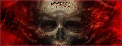
haryuu no
05-17-2005, 10:00 PM
I like the text that seems to be inscribed on the forehead of the skull. The way its blended is also pretty cool - 9/10

-My newest
Shinryudan
05-17-2005, 11:14 PM
The text and the render need to stand out a little more, I originally thought the render was a water/filter effect
7/10
Shiori
05-17-2005, 11:51 PM
What do you all think of my new sig made by shinryudan^^

Sujin
05-17-2005, 11:51 PM
Nice!
but needs a border.
8/10
Shinryudan
05-18-2005, 12:29 AM
there is a double line border on it sujin......
I can't really vote on this one
Sujin
05-18-2005, 01:03 AM
Sorry, I meant Haryuu No's.
So anyways, for Shiori- very nice BG, and nice border and pic.
8.5/10
Memento Mori
05-18-2005, 06:43 AM
here's another one to look at, and rate...
<img src=
http://www.thesolarian.com/images/tronik3.jpg>
Sujin
05-18-2005, 06:44 AM
Not bad, but it's a bit mono-colored.
8/10
Aztroth
05-18-2005, 03:56 PM
how bout this one I made for final heaven?

Krealian thats a brilliant signiture great effects used. 9/10
Aztroth its an interesting concept but I dont really like the cracked mirror look but still a good siggy
7.5/10
Shinryudan
05-18-2005, 10:32 PM
aztroth-
I like the glass lood, but the text is cracked and pulled away too much and is hard to read. Also the render is hard to make out, what exactly is it?
Aztroth
05-19-2005, 12:24 AM
it's supposed to be the side of zells face... and distorted is the point...
I could tell it was zell aztroth. But with the effect not one of your best signitures by far.
Sujin
05-19-2005, 09:31 PM
It could use a little more color, and a little bit of clarity.
7/10
You can't mark something down because of it's style.
I think it's probably your best work Aztroth. The background render looks awesome, I realise you're not meant to be able to work out what it is, it's just meant to look good and it looks awesome, great blending on the Zell as well, to get it to blend so well with the background is also awesome. The transparency on the bottom left text is good, but the font isn't great, and the other text is again alright, but the font itself is pretty naff.
9/10 because great bg, great blending, and rainbow colours are lame
Aztroth
05-20-2005, 02:32 PM
thnx man... Im glad sum1 is rating quality not style... lol...
Animegoil
05-20-2005, 10:15 PM
Wow, these are awesome signatures ^^ Very cool
Well aztroth I didnt knock the quality it is a good siggy.
haryuu no
05-21-2005, 04:41 AM

My newest sig =)

Inverting things is fun to me =)
Squiggly
05-21-2005, 05:08 AM
Excellent Huryuu. That's from Paper Mario, isn't it? *shudder*
Normal-
9.5/10 Good background, text and pic. Just had to take that .5 because I hate PM.
Inverted- 5/10 I don't like it.
clanotheduck
05-22-2005, 01:18 AM
i'm leaving this place soon, due to my lack of time...but before i go, i wanted my most recent sig to be reviewed...it was for some one named "The Adam" on a different forum...
http://www.geocities.com/lots_of_duckys2000/adam_sig5.gif
Lu the normal one very good. Goombas are great nice effects. 9/10
I dont like the inverted style siggys. but still a good one 7/10
Purrr
05-23-2005, 05:35 AM
http://s10.************.com/final_fire/index.php?act=Attach&type=post&id=228935
A .hack one a made a while ago. o_O
clanotheduck
05-23-2005, 02:45 PM
yeah...i plan to be leaveig soon...and i'm getting bored of checking back everyday...so...could some one say something about my signature...
Purr thats a good signiture. I like the picture you have used. The font is also a good choice and works well with this siggy.
8.5/10
Clanoftheduck. Not the best signiture I have seen. It is very dark. To dark for me but apart from that nice effects 7/10
Shinryudan
05-24-2005, 11:37 PM
cotd-- the bg is supposed to be blood I take it but you used a very bad splatter brush. Also other than a few brush strokes the bg is gray, its just to plain for me. The text needs to be enlarged and the stroke needs to be tuned down to about 1 or 2 pixels. That way the text will be readable, turn the anti-aliasing to strong. The render should be resized to fit the signature a little better (what is it a render of???). The blending between the bg and the render is horrible, I'm sorry but it looks like clouds are their.
4.5/10
haryuu no
05-28-2005, 04:28 AM
My newest sig...featuring one of my FFXI Characters =)
Aztroth
05-28-2005, 06:42 AM
I like it but the whle tech theme doesn't seem to go with a taru-taru from ffxi... but well made... 8/10...
how bout my current set?
Lu I like the effects on that siggy. 8/10
Aztaroth nice signiture. The picture matches the background well and nice colours to.
I just dont like the font type sorry.
9.5/10
Denny
05-29-2005, 02:42 PM
Maybe someday you will join too..........
Aztroth
05-29-2005, 05:03 PM
huh?
Slash
06-04-2005, 06:19 PM
Maybe someday you will join too..........
come again?
VerDjR
06-04-2005, 07:22 PM
LOL. Hi. My work? You want to see it? Ok here it is

As a matter of fact, WE DON'T WANT TO SEE IT. SO THERE.
Slash
06-04-2005, 07:24 PM
nice sig 8/10 ^_^
VerDjR
06-04-2005, 07:27 PM
As a matter of fact, WE DON'T WANT TO SEE IT. SO THERE.
Mmm...well well. I hope others are as nice as Slashi i made the ava as well. If you want to see more do tell. I will give you a link to my website ^_^
I hope others are as nice as Slash
Nope. We're all vicious, blood-sucking, soul-eating monsters here.
VerDjR
06-04-2005, 07:34 PM
HA. God i remeber getting welcomes from the other forums that were better than THAT. HAHAHA. Anyway
http://k.1asphost.com/danielroch/Sig%20shop.html
have a look
It's broken.
Here is some of my junk. There's quite a lot of it since I last posted here but I don't care.
 http://img.photobucket.com/albums/v31/Apocalyptic-Tiamat/gargamel.pnghttp
://img.photobucket.com/albums/v31/Apocalyptic-Tiamat/Gargamelava.png
 http://img.photobucket.com/albums/v31/Apocalyptic-Tiamat/realmcopy.pnghttp
://img.photobucket.com/albums/v31/Apocalyptic-Tiamat/realmava.png
http://img.photobucket.com/albums/v31/Apocalyptic-Tiamat/arionavapurplecopy.jpghttp://img.photobucket.com/albums/v31/Apocalyptic-Tiamat/apostlerionpurplecopy.png

I need to change my style.
Denny
06-05-2005, 02:24 PM
come again?
Come again??
Pervert. :)
Maybe someday you will join too..........
he is just a twat ignore him
Shinryudan
06-05-2005, 06:08 PM
Dirge- dont' spam up the thread please.
AT- your brushing is very nice. For the last three of them with the naruto character the qoute is not so well done. either you need a smaller quote or you need to get a better font/less pixelation for the text.

c&c
300
Aztroth
06-07-2005, 02:11 AM
ummm... they're all the same? the've got different hues, but thats it...
Shinryudan
06-07-2005, 12:14 PM
The first actual signature I have made for fun in about a month.

r&c&c plz
ummm... they're all the same? the've got different hues, but thats it...
clever you
Shinryudan; looks prty good, except there ain't much in there O_o
Shinryudan
06-12-2005, 12:09 AM
new one, rate and C&C plz

Shin I like the colour of the banner and image is nicely blended even though I cantt tell what it is still good.
7.5/10
Shinryudan
06-12-2005, 07:36 PM
the image is this.

I like everything bar the font. So 9/10 O_o
Denny
06-14-2005, 08:09 PM
My Vincent Valentine sig is pretty neato

Shinryudan
06-14-2005, 08:35 PM
Well at least you didn't say "someday maybe you will join too..."
anyway Some of the designs that you made binary are pretty nice, though the musical symbols stand out a bit to me. The blending is pretty good though it would look better if the bg was not a render.
8.5/10 imo
Were you one of the guys from the shinra-shrine? If so what is it for.
btw what program do you use for the 3d models. c4d, blender?
Denny
06-14-2005, 08:40 PM
Well at least you didn't say "someday maybe you will join too..."
anyway Some of the designs that you made binary are pretty nice, though the musical symbols stand out a bit to me. The blending is pretty good though it would look better if the bg was not a render.
8.5/10 imo
Were you one of the guys from the shinra-shrine? If so what is it for.
btw what program do you use for the 3d models. c4d, blender?
Yeah i`m one of the "shinra guys", but we decided to have diffrent sigs.
I use 3DSMAX.:)
haryuu no
06-14-2005, 10:19 PM
I tried the 3d rendering stuff for awhile. Lets leave it at this: not good.


My latest creations >_>
=)
Shiori
06-16-2005, 05:59 PM
haryuu, i really like the ava and sig! 10/10 for each^^
Shinryudan
06-16-2005, 10:35 PM
well its better than I can do, what program do you use I'm trying to figure out what to buy.
Everything seems to have this haze over it, I'm taking a guess and saying clouds on overlay? I like the 3d render but I don't think that the cartoon render is that good. None of it is very well blended in my opinion. The text needs work. I don't like the ava at all, the text is not well done and the render is badly blended in my opinion. 6/10
Your current set is a bit plain in bg but the symbol and the render are well done/ extracted. The brush set I recognize as metal-CX's abstract.(used them for shiori's)
7.5/10
Slash
06-17-2005, 05:53 PM
although i no very little about sig making because i sucked and gave up a very long time ago...i agree with shinryu however Shiori i love ur sig 9/10
Shinryudan
06-18-2005, 01:25 PM
Slash
06-19-2005, 11:09 AM
all amazing! but in my opinion the last ones the best
9.5/10 but over all for everysig there 10/10...i also think that your possibly the best sig maker on the site
Shinryudan
06-19-2005, 01:52 PM
O.o well thanks slash, but the other guys are just as good and better than me imo.
Aztroth
06-19-2005, 03:03 PM
Denny
06-19-2005, 03:12 PM
WOW, the very first one is excellent. Good work :)
grn apple tree
06-19-2005, 04:03 PM
WOW, the very first one is excellent. Good work :)
But the font needs a little work. Overall a
8.9/10 for the whole work.
Shinryudan: Your sigs are amazingly done. I personally like the Gundam sig. It's incredible. Also of course the H.O.T sig has to be my favorite ^^ a 9/10 overall in my opinion.
Haryuu No: Man Lu you're getting better :/ I like this sig the best out of all you have made/ shown me 8.5 ~ 9/ 10.
Shinryudan
06-19-2005, 07:30 PM
The first and 3rd ones are really incredible, is the 3rd one binary or is it just coloured in that way. I don't really like the text for any of them but then again I am not one to judge with text issues....
Dotman12
06-19-2005, 09:36 PM
Fantastic Sig keep up the good work.
Shiori
06-19-2005, 11:26 PM
Yay my sig is on shinryu's best sig list haha..
Aztroth
06-20-2005, 04:02 AM
I made this one for a comp... thoughts please...

Shinryudan
06-20-2005, 01:51 PM
Don't know what you mean by that it is made for a comp. But anyway The text doesn't fit the signature that well. The render is blended rather nicely in my opinion and the fire on the blade is wonderfully done. The bg fits the color scheme and the render well so overall I give it a 8.5~9/10
How did you make that fire on the sword, most fire I have seen made looks really bad.
Aztroth
06-20-2005, 03:22 PM
yeah I couldn't find ANYTHING that matched text wise... so i took the closest thing that looked good... and as far as the flames go, well, i can't say, lol
EDIT: oh and what mean by comp is that I made it for a competition
Shinryudan
06-21-2005, 02:37 AM
I'm just putting my good ones from the request thread on here cause they are about all I make anymore.

UltimateFFFan
06-21-2005, 08:49 AM
My sigs are crap compared to the other sig makers, but here's some of my best works. They're mostly all sig requests, because I very rarely make myself one, as I get the feeling it's not good enough:


I have more, but I've lost the links, so I'll post them when I find them
Shinryudan
06-21-2005, 03:20 PM
^ If your using photoshop you should really try fooing around with the filter effects, you may find something that looks good. Also you should try one or two grungr tutorials, all of my sigs looked like those about 2 months ago, that was before I started to use brushes. Also join a graphics site, there are hundreds of good ones about, the people on them will usually be happy to help.
because they are all renders, I cannot rate it that well.
Denny
06-21-2005, 08:44 PM
Just a question, my new avatar, good?? bad??
Slash
06-21-2005, 08:59 PM
good
UltimateFFFan
06-21-2005, 09:16 PM
^ If your using photoshop you should really try fooing around with the filter effects, you may find something that looks good. Also you should try one or two grungr tutorials, all of my sigs looked like those about 2 months ago, that was before I started to use brushes. Also join a graphics site, there are hundreds of good ones about, the people on them will usually be happy to help.
because they are all renders, I cannot rate it that well.
Currently, I'm not using Photoshop, because this computer's too slow. I'm currently using a program called Tempest GraphicsGale. Basically, its only slightly better than Paint, and I mainly use it for creating sprites for my games, but it also works with sigs. I'm getting Photoshop soon, as my computer's having an overhaul this weekend. Going from 64MB Ram to over 2GB. And a 286 Processor to an AMD Athlon. Told you I was overhauling it. Thanks for the tips Shinryudan, I'll take a look when I get it
Sephiroth Has Pure Power
06-22-2005, 08:45 PM
I'm a sig maker in training and this is my latest piece of crap

Sephiroth Has Pure Power
06-22-2005, 09:55 PM
This is the latest now

Sephiroth Has Pure Power
06-23-2005, 02:02 AM
I found a picture of the guy in this pic on the internet, and with an online guidebook, I produced this
http://www.geocities.com/dooragman/SignatureMaker.html?1119488271132
Sephiroth Has Pure Power
06-23-2005, 02:05 AM
[IMG]C:\Documents and Settings\Jeremiah\My Documents\My Pictures\Backgrounds\sujinsiggycopy.jpg[IMG] *
Sephiroth Has Pure Power
06-23-2005, 02:05 AM
DAMN IT
Aztroth
06-23-2005, 02:43 AM
my latest...

and seph please don't post multiple times... just edit your previous post... and I gotta say that honestly those aren't that good if you're using photoshop... if you're using paint, then well... idk i've never used paint...
April
06-23-2005, 02:48 AM
Sephiroth Has Pure Power - quit posting a bunch of times in a row. In the bottom, right corner of your post there is an edit button. Make use of it, please.
Also, look up aspect ratio.
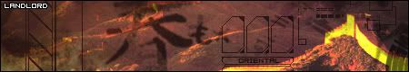
Landlord of Sector 7
06-23-2005, 04:56 AM
Sephiroth Has Pure Power
06-23-2005, 07:14 PM
Srry, I'm used to AIM, and other chats. I've been working on getting better, I only have a photoshop trial (The real thing costs to much!) I haven't even found an online guidebook yet (I suck at google...and life in general).
Denny
06-23-2005, 07:16 PM
Very nice :) I personaly can`t see any faults.
April
06-23-2005, 07:27 PM
Sephiroth -
http://www.good-tutorials.com/
My favourite Photoshop tutorial site, have look at that.
Denny
06-23-2005, 09:11 PM
Sephiroth -
http://www.good-tutorials.com/
My favourite Photoshop tutorial site, have look at that.
That`s a pretty cool site.
grn apple tree
06-23-2005, 09:47 PM
That looks great man. 9/10
Slash
06-23-2005, 09:50 PM
Very nice :) I personaly can`t see any faults.
well i can..i think the front colour should be a different colour...but thats about it very good
9.5/10
Denny
06-23-2005, 09:53 PM
well i can..i think the front colour should be a different colour...but thats about it very good
9.5/10
Why should it have been a different colour and what colour should it have been??
Slash
06-23-2005, 09:57 PM
well im no good with colours because im colour blind...but i dont think it should of been white
Denny
06-23-2005, 09:58 PM
well im no good with colours because im colour blind...but i dont think it should of been white
There`s nothing "White" about it.
Slash
06-23-2005, 10:08 PM
There`s nothing "White" about it.
what colour is the text then!?
Denny
06-23-2005, 10:11 PM
what colour is the text then!?
My apologies, i didn`t see it, sorry :/
But anyway, it`s ok, it stands out perfectly...
Landlord of Sector 7
06-24-2005, 12:16 AM
well the text in the upper left corner is white, and the "oriental" text is black.
pretty good
Sujin
06-24-2005, 04:07 PM
Sephiroth Has Pure Power
06-24-2005, 06:03 PM
i just made this this morning:

Aztroth
06-24-2005, 06:24 PM
my latest...
how come no1 wants to comment on mine? lol...
Sephiroth Has Pure Power
06-24-2005, 06:32 PM
8.5/10 for yours aztroth, what you think about my aeris/cloud in the water one?
Aztroth
06-24-2005, 06:36 PM
it's better than some of your others but all it is is a skewed picture with some text over it...
Sephiroth Has Pure Power
06-24-2005, 06:39 PM
O really??? Well, for all those who think my sigs are really crappy, guess what, I'M JUST STARTING MIDDLE-SCHOOL!!! HAHAHAHA So, You can't expect me to be some awsome sig maker who is UNDERAGE and JUST STARTED...J.K. about the just starting middle school thing, I'm 14, But still, I just started, so I'm not exactly the best, but I'm improving from what I did with MSPaint. After a couple months I should be getting a lot better. By the way, what when can I get a render?
Shinryudan
06-25-2005, 03:37 AM
^ and with you're little tantrum there my answer is YES I CAN. The guy that introduced me to graphics is in 4th grade but anyway.
ok.... you need some work. I forget are you using photoshop and if so what version. If so try some of the tutorials by razgriz or the kaleidoscope one by me on this site, they are relatively simple.
http://www.finalgraphics.cjb.net/
Also a render is any picture that is put into a signature. That last sig had NO render, only a bg and text. A render would be the picture of the skull in aztroth's current sig(incredible might I add).
aztroth--
I myself am one for the more vivd colours of the spectrum so a pure black and white signature does not appeal to me in the least. The signature itself looks kind of plain and empty in some areas. The render is too faint. The text matches the sig well, it looks like it was scratched into a blackboard, so does the rest of the sig. Not your best in my own opinion.
5.25/10
sephiroth has pure power--(phew, long name)
The background pic is distorted and stretched too much. That "..." after every line does not need to be there, also the text is too fuzzy to make out clearly enough. The areas around the text are very pixelated and in some areas the colour spots(red, green, and blue) are showing through. On my grading scale this receives a 2/10 because it is just a resized pic. I'm not trying to be harsh or anything but this borders on MY sense of ripping(no offense intended).
Two of mine that I have recently completed.
The blitzking one is one of my best to date imo.
and

make that three

Sephiroth Has Pure Power
06-25-2005, 06:11 AM
i suck with graphics and all that fansy shmansy stuff...know where i can get a good tutorial?
Landlord of Sector 7
06-25-2005, 07:50 AM
Shinryudan, all of your sigs look exactly the same. Mix them up plz
Shinryudan
06-25-2005, 03:22 PM
i suck with graphics and all that fansy shmansy stuff...know where i can get a good tutorial?
see previous post, that and good-tutorials
Aztroth
06-25-2005, 05:41 PM
A render would be the picture of the skull in aztroth's current sig(incredible might I add).
lmfao... just so you know that skull isn't a render... lol, it's a brush I made, lol... I've got a set that I have posted on deviantart...
but I like your sigs shinryudan, but he has a point, they do get to where they all start to look the same... try some new brushes (
http://www.8nero.net/brushes/), and fonts (
http://dafont.com/en/). And as far as renders go you seem to have that under control.
fantapants
06-25-2005, 07:42 PM
I made this signature today. Took me about half an hour but it'll do for now!

Landlord of Sector 7
06-25-2005, 10:04 PM
Shinryudan, all of your sigs look exactly the same. Mix them up plz
also, you plagiarized that avatar from a tutorial, AND YOU CALL YOURSELF AN ARTIST!
Shinryudan
06-26-2005, 02:24 AM
also, you plagiarized that avatar from a tutorial, AND YOU CALL YOURSELF AN ARTIST!
Want the .psd file of the ava? Or possibly the original signature from which the I used the marquee tool to get the ava? I didn't rip it, I made it. Sorry if that came off sounding a little harsh, I'm pissed.

there's proof that it is mine, I posted the original signature back in this thread, post #1230
By the way, post the link to the tutorial. I'd like to see who has been using my work.
Landlord of Sector 7
06-26-2005, 03:09 AM
My mistake, you just raped a tutorial to the max. You could have at least used a different image.
http://www.greycobra.com/tutorials.php?tutorial=view&id=73
So, Shinryudan your sigs all look alike.
I made this signature today. Took me about half an hour but it'll do for now!
really nice
fantapants
06-26-2005, 06:56 PM
Cheers Jiro!
Dark Mage626
06-27-2005, 10:05 AM
I like the second one that Shinryudan did and I like Sujins one. =)
Slash
06-27-2005, 05:20 PM
jiros sig is rather cool i have to say
haryuu no
06-27-2005, 07:25 PM
This:

This:
And my current set are my latest works =)
Dr Mambo
06-27-2005, 09:06 PM
I like me sig, rub my herpes-ridden, festering dick please.
Landlord of Sector 7
06-28-2005, 01:01 AM
haryuu no, those are nice but try adding a 1px black border
Landlord of Sector 7
06-28-2005, 09:19 PM
Slash
06-28-2005, 09:59 PM
landlord shame on you out of all the people here you would of thought you would of known about the double post rule tut tut...and nice job on the sig 9/10
but still nice sig could use a little work, but nice
Landlord of Sector 7
06-29-2005, 08:47 PM
Landlord of Sector 7
07-01-2005, 07:28 AM
The first banner look better than the second
Squallmrr
07-08-2005, 04:28 AM
this is mine
mac_mogul
07-13-2005, 09:43 PM
Just a couple of mine that I have laying around...


Plus my sig that I'm using now :)
Denny
07-13-2005, 09:45 PM
Oh, i forgot to show everyone my "Lost" sig.
darkcloud
07-14-2005, 12:32 AM
can someone make me a final fantasy sig if you can ill be thankful for what you did any character will do from final fantasy
Tidus 66
07-14-2005, 12:35 AM
darkcloud it's not here that you ask for a sig ot ava! is in the sig workshop on the questions, feedback's and assistance forum, ask over there
btw: they're having many requests now and two of the sig makers are in vacation so it will take a while
darkcloud
07-14-2005, 12:38 AM
ok thanks
Shinryudan
07-28-2005, 03:04 AM
I'm back, so I'm not really on vacation anymore.
Also.... new sig, I'm thinking of changing the text and adding some grunge to the pixel stretch.
C&C please

Sephiroth Has Pure Power
07-28-2005, 11:42 PM
I thought I heard someone say they wanted a sig with this picture, so I decided to mess around with it in Photoshop, so I added a few things here and there (so don't say 'That's just a resized picture with a text over it'). The guy that put the picture ups name is on it. Any opinions on how to make it look better?

Shinryudan
07-29-2005, 01:41 AM
make a bg using brushes and or filter effects, and blend in the picture.
You took away my first impression of it though.....
Sephiroth Has Pure Power
07-29-2005, 05:06 AM
I did that on purpose, I knew you would say that, that's why I put in that little bit up there about not saying that. I hope I'm improving with my attempts at sig making, I really wish I was better though, I'll never be up there with you Official Sig Makers. Do you know where the Amatuer Signature Makers Club is? I can't find it.
numerrik
07-29-2005, 05:13 AM
what do you think of mine?
Sephiroth Has Pure Power
07-29-2005, 05:26 AM
I like yours, very, Classic, what program did you use? word then paint? photoshop?
numerrik
07-29-2005, 05:40 AM
well the saying parody is from a show called code lyoko. the ronin thing is a pre-coded thing from a quiz. click the ronin thing to take the quiz yourself.
(i hope you were talking to me.)
Jasmijn
07-29-2005, 08:19 PM
What do you all think of my signutere..?
Rhyfelwyr
07-29-2005, 08:23 PM
Very nice, good work :D
Jasmijn
07-29-2005, 08:25 PM
Thank you! XD
Shinryudan
07-30-2005, 02:43 AM
Jasmijn-- The multicoloring is very well done, and I like how the border is colored too. The embossed squares are a nice addition too. Parts of the text are cut off by the black borders, which in my opinion are to wide. All in all I like it a lot. 8/10
Also could someone rate my new one.
Light~Nimbo-stratus
07-30-2005, 03:19 AM
well the saying parody is from a show called code lyoko. the ronin thing is a pre-coded thing from a quiz. click the ronin thing to take the quiz yourself.
(i hope you were talking to me.) I was talking to you, I have seen that show too. Shinyrudan (spelling?), I like your new sig, you make so many with your name on them but you keep the one you have right now. Did I just give away who I was when I was talking to you numerrik?
Shinryudan
07-30-2005, 02:41 PM
what do you mean by "spelling?" If you mean my name its spelled "shinryudan"
LostEgyptianSoul
07-30-2005, 04:09 PM
well, interesting, a plce to show off
Jasmijn
07-30-2005, 04:52 PM
Uuh Yeah, hope you're not being sarcastic..
Anyways, how about this signature?
Shinryudan
07-30-2005, 08:35 PM
I like the embossed border again. Other than that I think the sig is way too crowded, the background is O.K. I say change the font for the large quote to an old script font. Also the font for the short quotes is meant to be a larger size to show properly so use a different one since that one is too hard to read. The font used for your text should be changed, that text is pixelated and the font doesn't match the sig. With the bottom quote the part that says "...time girls" is darkened too much, I suggest highlighting the text, moving to the render and dodge the area. Overall pretty bad in my opinion with all the text problems and crowding.
4.25/10
Jasmijn
07-30-2005, 08:50 PM
Okey, well thanks for being so honest.. =)
grn apple tree
07-30-2005, 08:58 PM
your new sig is nice, but the text is kind of hard to read. otherwise i say 8 or
8.5/ 10 nice work.
Jasmijn
07-30-2005, 09:12 PM
Okey thanks,
I actually wanted the text to be hard to read, Just so ppl would look at the pics more, but I guess those are hard to see because of the text.. lol..
haryuu no
07-30-2005, 10:37 PM
How's this:

And my current sig?
UltimateFFFan
07-31-2005, 11:27 AM
Powered by vBulletin® Version 4.2.4 Copyright © 2019 vBulletin Solutions, Inc. All rights reserved.


