Pages :
1
2
3
[
4]
5
6
7
8
9
10
11
12
13
Rikku_Love
12-08-2004, 06:20 PM
it'd be coolie if it was ^_^
Azwethinkweiz
12-08-2004, 06:24 PM
www.mozilla.com A browser.
just got it its not bad at all much faster than explorer
Rikku_Love
12-08-2004, 11:15 PM
coolie! it's good!
like you're ava Jeto
hehe thanks hun had to make it a bit smaller >< it was to big
Rikku_Love
12-08-2004, 11:30 PM
it's still good lol who is he?
itachi uchiha - this guy is worse then the devil himself lol hes from a show Naruto
read this
http://www.absoluteanime.com/naruto/itachi.htm
Rikku_Love
12-08-2004, 11:41 PM
orichamariu .. lol i no i didnt spell that rite
n here is r image ^^
http://uploads.bestupload.com/redir/14536.gif
its 128x128 rite ?
Rikku_Love
12-08-2004, 11:49 PM
is he a goodie? he looks kind of sinister licking his lips like that lol
actully it's 125x125 :laugh: sorry
lol nooooo that guy is very very bad ... unfornately hes turnin sasuke into a bad guy too
k this should do it
http://uploads.bestupload.com/redir/14543.gif
Rikku_Love
12-08-2004, 11:59 PM
oo thank you ^_^ but it still wont accept it, it says its and invalid format :'(
oh no! sauke! don't turn bad!!
Rikku_Love
12-09-2004, 12:46 AM
You're so nice ^_^ but it still doesn't work
'The uploaded file is not a valid GIF, JPG, or PNG file. Please ensure that it is and try again.'
that's the message i'm getting when i try to upload it
its not sayin that for me its sayin its to big i dont no wats goin on >< .. sry i have major headache ill figure it out later
Aerith Gainsborough
12-09-2004, 01:49 PM
Switch too Mozilla, thats why it looks crap (IE Sucks).
Wonderful, was this this brushes andopacity changes and so on, because I love it. (Damn IE users, makes me want to stop using Mozilla because of there comments on the "Blue Lines")
I'm using IE, and I don't think it looks crap...... :confused:
Azwethinkweiz
12-09-2004, 05:57 PM
Avatars have to be GIF, JPG. I suggest Gif Because the file size will be smaller, also that avatar must be 100x100 or it wont let you upload it. I meant that the sig before that Assclown made looks like it has a light blue background in IE where as in Mozilla it has a see-through background and looks that much better. Also if you would like a moving Anime avatar, I can make one, just name the part in the episode that you would like it from and I can make it. With your name. Or any other type of Moving avatar, make sure you post the request in the ava/sig workshop thread however.
Avatars have to be GIF, JPG. I suggest Gif Because the file size will be smaller, also that avatar must be 100x100 or it wont let you upload it. I meant that the sig before that Assclown made looks like it has a light blue background in IE where as in Mozilla it has a see-through background and looks that much better. Also if you would like a moving Anime avatar, I can make one, just name the part in the episode that you would like it from and I can make it. With your name. Or any other type of Moving avatar, make sure you post the request in the ava/sig workshop thread however.
What program would u use to get a certain part of the eps ? is it free =)
Azwethinkweiz
12-09-2004, 06:58 PM
I use FLASH, and no, not free. :(
Fantastic use of the PS brushes there Assclown. Thank god im using mozilla.
lol had a feeling it was flash >< ...
Trajet
12-10-2004, 01:59 AM
Rikku_Love
12-10-2004, 05:03 AM
ooo that's a nice siggy! gj ^_^
i like the sig trajet its awesome heres a new one i just made
http://uploads.bestupload.com/redir/17023.gif
Azwethinkweiz
12-11-2004, 05:16 PM
Very good Jeto, try changing the Stroke on the border to Black though and covering up some of the space, and rub off those straight lines behind Kakshi too, good effort.
do u see those white edges arount the shraingan ( the red thing ) lol i erased it but when ever i play it it keeps comming bac i dont no wats rong
Azwethinkweiz
12-11-2004, 05:48 PM
Make sure you erase them from each slice.
hmm not relli using slices but i figured out wat was rong had to erase the edges in photoshop
http://uploads.bestupload.com/redir/17137.gif
Rikku_Love
12-11-2004, 11:52 PM
ooo! i like that kakashi siggy! i love kakashi, he reads dirty books LOL oh well ^_^, lol nice borders
i'm am a crappy sig maker, therfore i will not embaress myself by posting any :D i'll just make comments ^_^
lol thanks youll get better just practice ^^
Rikku_Love
12-12-2004, 02:10 AM
lol haha i wish ^_^ thankies

did this one
40k Tarnag Dark Assasin
12-12-2004, 03:08 AM

plus my current
yes i suck but i'll learn more now
Huntress Krystle
12-12-2004, 09:58 AM
Great job, jeto. Keep it up.
Rikku Love: I really love that pic in your sig. It makes me feel...calm ^_^
Trajet
12-12-2004, 10:14 AM
grn apple tree
12-12-2004, 10:19 AM
Nice sigs hey just wondering where are those guys from? The people in your sigs cause i've seen them before but I can't remember where.
Trajet
12-12-2004, 10:44 AM
I got both of them from
http://www.gamerenders.com
I don't know where the soldier is from, but the old guy i the second one is from Silent Hill.
grn apple tree
12-12-2004, 11:06 AM
Cool.
Rikku_Love
12-12-2004, 10:11 PM
I recognize the silent hill guy yeh from 3 i think, not the soldier...seen him though
Nice siggy's anyways Trajet
Aerith Gainsborough
12-13-2004, 12:45 PM
http://www.freewebs.com/dreamerssigs/fadeinout.GIF
http://www.freewebs.com/dreamersrp1/guy.GIF
Comments please.
Hey, they look cool. :)
Is that suppose to be rain on the second one? Looks really good.
Adamski
12-13-2004, 12:49 PM
http://www.freewebs.com/dreamerssigs/fadeinout.GIF
http://www.freewebs.com/dreamersrp1/guy.GIF
Comments please.
You seem to be good at animation, i'll give you credit for that, animation is very time consuming.
The only thing I could recommend is make the backgrounds stand out a bit more, other then that, there's nothing wrong with them.
Keep it up...^_^
Azwethinkweiz
12-13-2004, 05:54 PM
Needs a border. A 1px one would be fine I think. And as for the soldier it is Ocelot from MGS3.
Trajet
12-14-2004, 01:42 AM
Hey, they look cool. :)
Is that suppose to be rain on the second one? Looks really good.
Yeah, it's rain.
Needs a border. A 1px one would be fine I think. And as for the soldier it is Ocelot from MGS3.
I'll try that out later.
New sig:
http://www.freewebs.com/dreamerssigs/fable.JPG
Rikku_Love
12-14-2004, 08:41 AM
That's a cool one! GJ :D
Like the backround!
Aerith Gainsborough
12-14-2004, 12:31 PM
That's a good one, too. But I liked the other ones better. This one is a little bit 'too red' in my opinion. I still like it though. ;)
StarTsubasa
12-14-2004, 04:43 PM
It's nothing special, but what do you think of this banner?
http://mercury.walagata.com/w/startsubasa/Shido_banner.gif
Azwethinkweiz
12-14-2004, 04:59 PM
Nice going there, like the work :)
Especially the current sig, it really does heave elegance.
StarTsubasa
12-14-2004, 05:07 PM
Thanks, I do try to make good stuff. However, the banner that I'm currently using was made by someone else. ^^
Rikku_Love
12-14-2004, 09:32 PM
It's nothing special, but what do you think of this banner?
http://mercury.walagata.com/w/startsubasa/Shido_banner.gif
Nice siggy ^_^ GJ!
Adamski
12-14-2004, 09:35 PM
Rikku_Love
12-14-2004, 09:39 PM
oooo!! Me likes ^_^ you've done well
It's nothing special, but what do you think of this banner?
http://mercury.walagata.com/w/startsubasa/Shido_banner.gif
wow better than me nice
StarTsubasa
12-15-2004, 02:59 PM
wow better than me nice
Thanks. ^^ I like your avatar and signature, too.
Aerith Gainsborough
12-15-2004, 04:33 PM
http://img.photobucket.com/albums/v622/barretwallace/Halosig.gif
My first attempt at animation...thoughts?
Yep, looks good. I just hope, it doesn't start raining on too many sigs now... :laugh:
Azwethinkweiz
12-15-2004, 05:20 PM
Is that a 3D render in the background Barret?, its good attempt, just don't like moving sigs much. :(
Adamski
12-15-2004, 05:37 PM
Yeah it is a 3D render, I don't really like moving sigs that much either, but I thought I'd just give it a try. I think I'll stick with regular sigs =/
StarTsubasa
12-16-2004, 06:27 PM
I like both, actually. Sometimes I use regular banners and other times I use moving ones.

or
http://mercury.walagata.com/w/startsubasa/Shido_banner.gif
See??
Azwethinkweiz
12-16-2004, 07:33 PM
Assclown, you inspired me with your sig earlier, here is my attempt:

Fucking too big for here though :/
You should post your 3D art here Barret.Wallace or at least show me to your deviantART account if you have one.
Rikku_Love
12-16-2004, 11:18 PM
Assclown, you inspired me with your sig earlier, here is my attempt:
Fucking too big for here though :/
You should post your 3D art here Barret.Wallace or at least show me to your deviantART account if you have one.
Nice ;) good work ^_^
StarTsubasa
12-17-2004, 08:48 PM
Assclown, you inspired me with your sig earlier, here is my attempt:
Fucking too big for here though :/
You should post your 3D art here Barret.Wallace or at least show me to your deviantART account if you have one.
It looks great, really. ^_^
Rikku_Love
12-17-2004, 08:52 PM
Yeh it's good ^_^, really good
Adamski
12-17-2004, 10:02 PM
Assclown, you inspired me with your sig earlier, here is my attempt:
Fucking too big for here though :/
You should post your 3D art here Barret.Wallace or at least show me to your deviantART account if you have one.
Ok, will do...^_^ I haven't registerd for a deviantART account, but I will now. Arn't you Hitake...?
Aerith Gainsborough
12-20-2004, 02:56 PM
I like both, actually. Sometimes I use regular banners and other times I use moving ones.
Assclown, you inspired me with your sig earlier, here is my attempt:
Fucking too big for here though :/
I like these two ..... :)
Azwethinkweiz
12-20-2004, 03:02 PM
Yes, I am Hitake, there is a link in my Sig.

messing around with brushes
StarTsubasa
12-20-2004, 05:33 PM
The avatar and signature I have now were made for me as a Secret Santa present. ^___^
Azwethinkweiz
12-20-2004, 06:52 PM
Love that one AT, your best ever, I think it should be framed.
Blank89
12-20-2004, 11:06 PM
i made my sig in Paint =)
and im wicked proud of it. haha
Rikku_Love
12-21-2004, 08:43 AM
lol yours is nice, little vivi
mines is nothing special
Aerith Gainsborough
12-21-2004, 10:50 AM
mines is nothing special
But I like it.... :)
This one I mean:
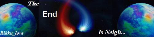
Aside from the fact that Nigh is misspelled.
Rikku_Love
12-21-2004, 11:38 AM
so? it's the best sig i've done! lol
i have these pics, but it's hard to resize them, could someone do it for me?
Azwethinkweiz
12-21-2004, 12:33 PM
If you tell me what you want them to be resized too.
I think you want 450 by 150 rite?
well here is is


hope this is what you wanted =)
Rikku_Love
12-21-2004, 06:50 PM
Ooooo thank you very much!!! ^_^
*giggles insanely* Hehe thanks ^_^
WarriorX
12-22-2004, 03:16 AM
Heres a crappy avatar i found on my computer (my bro or me mustve made it) I like it tho- Im gunna keep it :-D
Aerith Gainsborough
12-23-2004, 02:20 PM
Hmm.... :(
Adamski
12-23-2004, 04:23 PM
Heres a crappy avatar i found on my computer (my bro or me mustve made it) I like it tho- Im gunna keep it :-D
How does that have anything to do with showing off a signature...=/
How does that have anything to do with showing off a signature...=/
Good point
WarriorX
12-23-2004, 06:56 PM
it said sig or avatar and im just SHOWING my avatar. Theres your point
Azwethinkweiz
12-23-2004, 07:24 PM
Well, same type of topic really avatar signature thats fine.
joel90
12-23-2004, 08:00 PM
how do u like my Kingdom Hearts sig

Adamski
12-23-2004, 08:04 PM
Hm... I like it. The background is subtle and doesn't overtake the main objects, so it blends well together.
Good job...^_^
Also, the URL in your signature is wrong, you might wanna sort that out. :-D
Rikku_Love
12-23-2004, 08:06 PM
how do u like my Kingdom Hearts sig
nice :-D GJ
Adamski
12-23-2004, 08:14 PM

...thoughts?
Wonderer_Nick
12-23-2004, 08:17 PM
awesome master chief sig...did u beat halo 2 yet?
my sigs not that great
Darth Pepper
12-23-2004, 08:18 PM
@Barret
You need to improve on your text. They are horrid, and ruin all your banners. Also matching colors, you seem to pick colors at random.
Rikku_Love
12-23-2004, 08:24 PM
...thoughts?
nice ^)^ g/w the words could be fixed though
Adamski
12-23-2004, 08:25 PM
@Barret
You need to improve on your text. They are horrid, and ruin all your banners. Also matching colors, you seem to pick colors at random.
Matching colours...? I'm not quite sure what you mean, the background is space...=/
I totally agree with you on the text, It's always my worst part in all of my sigs. I can never seem to get it right.
Thanks for the comments Relestial and Wonderer Nick, I'l try to improve...^_^
April
12-23-2004, 09:04 PM
I think Relestial means the colour of the text ?
You seem to have picked a random light blue for the text and whilst it stands out making it easy to read it doesn't co-ordinate with the other colours.
It's better to pick a colour from the picture (the dropper tool thing is useful for this and seems fairly standard in all arty programs) that both stands out and works with the scheme of the picture.
Azwethinkweiz
12-23-2004, 09:12 PM
Some sigs I made Via PM:


Need firefox for the one above.
StarTsubasa
12-23-2004, 11:20 PM
Some sigs I made Via PM:
Need firefox for the one above.
Those are awesome! Wow! I'm so impressed!
Rikku_Love
12-26-2004, 04:26 AM
^.^ so many good siggys!
GJ everyone!!
omg, this took over two hours to make X_______x Use Firefox so you can see it transparent, dont you dare look at it in IE o_o
Optical Blueberries
12-27-2004, 12:10 AM
I've recently decided to work harder with Photoshop 7.0, and began producing banners, each one better than the one before it.
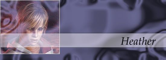
This is my very first banner ever using Photoshop, and I made it using some basic tools. It's a banner of Heather, from Silent Hill 3. Took me roughly two hours to make. Looks horrible. I made it December 23rd.

This is the second banner I ever made, which was created yesterday on Christmas Eve. I tried to go for a simple approach and out came this. It's a banner of a great singer, Kelly Clarkson.

My latest one, made just half an hour ago. I really tried to combine the best of my skills to create it, and again tried for a more simpler approach, and added lots of brush strokes and more layers than I did before. Took me about twenty minutes.
fantasy_fan(josh)
12-28-2004, 05:31 AM
Aerith Gainsborough
12-28-2004, 10:35 PM
fantasy_fan(josh)
12-29-2004, 03:34 AM
Thank you aeris ^_6 they dont work very good on black
The Ricky
12-29-2004, 05:35 PM
Anyone laughing at my sig, or does it just get blank stares for it's stupidity?
Azwethinkweiz
12-29-2004, 06:00 PM
Anyone laughing at my sig, or does it just get blank stares for it's stupidity?
It provoked a manly giggle.
joel90
12-29-2004, 11:00 PM
check this sig out every

Aerith Gainsborough
12-29-2004, 11:14 PM
check this sig out every
It's nice. It could be a little bigger though. ;)
Ac-ace0
12-30-2004, 12:39 AM
nah it looks cool as it is
joel90
12-30-2004, 03:40 AM
yeah because if i make it bigger there would be empty spaces.
fantasy_fan(josh)
12-30-2004, 12:20 PM
I like it , itd really good
Azwethinkweiz
12-30-2004, 12:21 PM
Size isn't everything. I think it is good as 400x100 any sig bigger then that is usually not so great.
fantasy_fan(josh)
12-30-2004, 02:04 PM
check this sig out every
.. o_O I just noticed that I've joined your forum totally randomly.
._.
Great sig though, love the colours a lot :)
and ffan, it's nice, the border's a bit bright but it's not too bad, and your blending is looking ok too.
Azwethinkweiz
12-30-2004, 03:24 PM
You are getting better at using Paintshop.
fantasy_fan(josh)
12-30-2004, 03:38 PM
Who uses paint shop ? my friend might be giving it to me

strut.
Adamski
12-30-2004, 10:39 PM
strut.
The only thing I could recommend for this is to tone the colours down a bit.
You seem to have a great blending technique AT, all of your work looks nicely put together and nothing seems to be out of place. Keep it up ^_^

Criticisms welcome.
Aerith Gainsborough
12-30-2004, 10:51 PM
strut.
I like it, especially the colours. But the same here, it could be a bit bigger in my opinion. ;)
Shinryudan
12-31-2004, 04:00 AM
OK i'm new at sig making and i only have 1 question what program do u guys use for making the ava's/sig's
Concinnity
12-31-2004, 04:01 AM
So, what d'ya think?
Azwethinkweiz
12-31-2004, 12:19 PM
Mainly Photoshop, but some use Paint shop pro, I would suggest photoshop if you can afford it though. :(
OK i'm new at sig making and i only have 1 question what program do u guys use for making the ava's/sig's
joel90
12-31-2004, 03:10 PM
i use photoshop. never use PSP. is it a good program?
Lunatic HighVII
12-31-2004, 03:48 PM
The only thing I could recommend for this is to tone the colours down a bit.
You seem to have a great blending technique AT, all of your work looks nicely put together and nothing seems to be out of place. Keep it up ^_^
Criticisms welcome.
Hey, it looks good. :) The only thing I would suggest is the letter coloring. It's kind of hard to read, but I like the colors you used. Maybe you should make the lletters brighter, maybe blend some brighter colors or something into them.
I love your sigs, though. ;)
Lostsoul
12-31-2004, 05:10 PM
im just posting myan for fun just take a quick look for me and post me back how i can improve or how good it lopoks its not realy good ok have fun
hi im posting this one for fun just post me back on how i could improve on it or just tell me how it looke thx fur taking your time
oops how it looks
Lostsoul
12-31-2004, 07:37 PM
HOW DO I GET PICS UP ON SCREEN i have no clue i have tried a lot of thinges plz help me
joel90
01-01-2005, 01:17 AM
write this. urlf of sig
ok made this yuffie sig just recently.

Trajet
01-01-2005, 03:12 AM
Azwethinkweiz
01-01-2005, 12:55 PM
Too much space left behind, lower the text and make the height to about 100px and you should have a good sig there.
Darth Pepper
01-01-2005, 01:01 PM
Trajet
01-01-2005, 01:04 PM
chewey
01-01-2005, 01:06 PM
those were cool Trajet
fantasy_fan(josh)
01-01-2005, 02:38 PM
Yeah , those are asome my'n look really bad comperd to youres
http://img.photobucket.com/albums/v416/jt5/lenne.gif
Adamski
01-01-2005, 03:30 PM
Trajet your sigs are always nice, they blend well together and nothing stands out too much.
I could only recommend one thing on the scorpion sig, its a bit badly cut out.
Scorpion, that is.
Fantasy fan josh, you seem to have good ideas, but the program you use is holding you back frmo your full potential.
Maybe you should get photoshop or paint shop pro...?
Lunatic HighVII
01-01-2005, 03:55 PM
write this. urlf of sig
ok made this yuffie sig just recently.
I really like this sig. It's plain, yet not too plain. I like how you used the colors, and everything looks great!
Azwethinkweiz
01-01-2005, 05:14 PM
I really like that one Relestial, its really "Tokyo" suits Naruto perfect. ^^
so do we just show sigs in this thread?
Shinryudan
01-01-2005, 07:01 PM
OK my first sig its on heero yue and his gundam from Gundam Wing Endless Waltz
r&c plz

Azwethinkweiz
01-01-2005, 07:24 PM
Are you sure it is [img] -Insert Link- [*/img] without the star? Just do whatever is in your sig, because that seemed to work.
Adamski
01-01-2005, 07:31 PM
[/img]
ok made this yuffie sig just recently.
Very nice. Nothing looks out of place. Btw, what font do you use...?
Shinryudan
01-01-2005, 07:37 PM
well that was weird my computer was set with not allowing images from this site WEIRD
Azwethinkweiz
01-01-2005, 08:19 PM
I made this one for a personal request, any opinions?

Aerith Gainsborough
01-01-2005, 09:31 PM
I made this one for a personal request, any opinions?
It's nice and very interesting.... :)
Adamski
01-01-2005, 10:04 PM
Aerith Gainsborough
01-01-2005, 11:22 PM

Any thoughts on this one?
Trajet
01-02-2005, 01:29 AM
I think this will be my last MK sig for a while, I haven't even been trying to do other sigs. So, here's the latest MK sig.
http://www.freewebs.com./dreamerssigs/cyrax2.JPG
http://www.freewebs.com/dreamerssigs/halo.JPG
joel90
01-02-2005, 02:54 PM
barret.wallace the font i use is the An Unfortunate Events Dewarped font. you can find it at www.dafont.com.
Azwethinkweiz
01-02-2005, 05:39 PM
The FF font on offer at dafont is seriously warped though =/
Not bad Trajet, you just need to work on your sizes alot.
joel90
01-02-2005, 05:53 PM
another yuffie sig

fantasy_fan(josh)
01-03-2005, 07:01 AM
I LOIVE IT !!!!!! Now here is my crappy crappy sigs ,

well that was weird my computer was set with not allowing images from this site WEIRD
*flames*
All your sigs look good Joel, they kinda look soft and blurry :P I cant mimic that effect, though it'd be nice to see some effects on the objects in the sig,
Trajet
01-04-2005, 08:45 AM
I think this one turned out kind of crappy.
http://www.freewebs.com/dreamerssigs/welder.JPG
comments?
fantasy_fan(josh)
01-04-2005, 11:18 AM
I dont really like it as much as youre other ones
Azwethinkweiz
01-04-2005, 04:18 PM
Desaturate the image first Trajet, and then colour balance it.
Adamski
01-04-2005, 11:02 PM
I made this sig for my other username on a different forum...thoughts?
http://img.photobucket.com/albums/v622/barretwallace/0c6093bb.gif
joel90
01-05-2005, 12:11 AM
this is a 3d abstract sig.

This is my new sig i no the font is a bit shakey what are your thoughts ? ( If you are wondering i also made my avatar ^^)

Azwethinkweiz
01-06-2005, 05:18 PM
Can I point out the typo, its AlUcard. =)
That aside, it needs a border, but I like the background and gothic feel, but the Bevel really doesnt fit the style of the sig.
Shiori
01-07-2005, 01:22 AM
joel90 u are a really good sig maker! i love how ur sigs are so nicely colored and easy on the eyes ^.^
joel90
01-07-2005, 01:54 AM
thx. i really like making sigs that are lightly colored since i hate dark colors.
Rikku_Love
01-08-2005, 12:00 AM
This is my new sig i no the font is a bit shakey what are your thoughts ? ( If you are wondering i also made my avatar ^^)
Whoa Jeto! you're getting good buddy ^_^ wish i could make sigs, but can't haven't got the right program, what do you use?
joel90
01-08-2005, 01:09 AM
jeto probably uses photoshop or paint shop pro.
Squall_Bahamut
01-08-2005, 01:20 AM
i love that rinoa sig!! it is the best!!!
fantasy_fan(josh)
01-08-2005, 04:29 AM
I like them !
Crimson X
01-08-2005, 10:49 AM
what r you guys talking about?????
Azwethinkweiz
01-08-2005, 11:07 AM
Please read the first post of the thread to understand what this thread is about. -_-
Adamski
01-08-2005, 02:12 PM
what r you guys talking about?????
Dont post if you dont understand.
fantasy_fan(josh)
01-08-2005, 03:37 PM
I made this for some where else but meh

thanks rikku i use photoshop and imagready ^^ btw nice sig you got there josh
Trajet
01-08-2005, 11:12 PM
Adamski
01-08-2005, 11:53 PM
Hm, it's very dark and seems a bit...plain.
You have the right idea, but I think you should use brighter colours, your work is always easy on the eyes though.
Trajet
01-09-2005, 04:19 AM
fantasy_fan(josh)
01-09-2005, 04:28 AM
I like the text but it has to be darker if you now what i mean
Trajet
01-09-2005, 09:41 AM
fantasy_fan(josh)
01-10-2005, 05:15 AM
Very good i like the sora one
Crimson X
01-10-2005, 05:25 AM
go sora,
Just made this wolfwood sig let me know what you think

heres another one first time using brushes turned out pretti awesome
http://img105.exs.cx/img105/1199/1stbrushsigcopynin2yb.gif
fantasy_fan(josh)
01-14-2005, 11:52 AM
yeah it did , its way better then the other one
ok im not done with this sig yet im stuck on something is there a way i can put another animation in while the rain animation is going on ?
http://img86.exs.cx/img86/9253/uchihasig6pb.gif
fantasy_fan(josh)
01-16-2005, 04:08 PM
try blend that image in a bit better
i cant ne more i merged the image in with the sig >.<
Shiori
01-16-2005, 06:55 PM
I think it looks good the way it is!
April
01-16-2005, 06:59 PM
Jeto, it's spelt wrongly.
It should be 'You're' not 'Your'.
Looks okay though.
ty shiori and vyvyan i know is spelled youre but i had no space :(
Fruit-Loopz007
01-17-2005, 08:07 AM
Well itz obvious my sigz the best.
its alrite fruit loops and guns dont really mix tho :-P
Adamski
01-18-2005, 02:50 PM
good stuff barret I really like the bg on both of em
Aerith Gainsborough
01-18-2005, 03:59 PM
Kemtach2999
01-18-2005, 05:25 PM
Yeah I agree with Jeto :P.
http://img.photobucket.com/albums/v622/barretwallace/godisdead.gif
http://img.photobucket.com/albums/v622/barretwallace/Ts2sig.gif
...thoughts?
theyre both pretty cool, but i'd personally stick with the one you've got at the minute ;)
heres a new one for you guys
http://img14.exs.cx/img14/3059/sasukesigremake3pz.gif
i know its a bit on the simple side but let me know what you think
Adamski
01-19-2005, 04:27 PM
It's ok, a bit simple, but nice to look at.
You're good at making sigs that are easy on the eyes, but maybe you should experiment with some brighter colours and complicated backgrounds.
Azwethinkweiz
01-20-2005, 04:44 PM
Hmmm, lose the animation, but the background is new, which is good. The picture is a Little too small. Good job however.
when you say pic u mean the render itself or the sig ?
Trajet
01-21-2005, 08:13 AM
Adamski
01-21-2005, 01:07 PM
It's nice, subtle, easy on the eyes.
Something's missing, I can't quite put my finger on it. Maybe it needs something to make it stand out, maybe a bit more colour or bigger text, not sure...=/
Azwethinkweiz
01-21-2005, 05:53 PM
The images don't really fit, It's just a random 3D object, maybe brush the render heavily and make the images a little bigger.
joel90
01-22-2005, 12:02 PM

c&c please.
Azwethinkweiz
01-22-2005, 05:37 PM
The border is a little overbearing. But good.
chewey
01-22-2005, 05:40 PM
can anybody tell me how much Photoshop costs?
Shinryudan
01-23-2005, 04:14 AM
New one of San from "Princess Mononoke"

Hogan
01-23-2005, 04:54 AM
can anybody tell me how much Photoshop costs?
A lot of money usaully between 400 and 800 dollars depending on what version you get.
Trajet
01-24-2005, 04:04 AM
can anybody tell me how much Photoshop costs?
A lot of money usaully between 400 and 800 dollars depending on what version you get.
Like Hogan said, alot of money. But you know, you could always ask the nice users on Kazaa to give you a copy. :p
Azwethinkweiz
01-25-2005, 06:22 PM
Don't be stupid. You should buy your software, its professional not for someone to just make sigs with. And Kazaa has sooo much spyware, I would never touch it.
Trajet
01-27-2005, 03:17 AM
good work man i like the border and text but i relli dont no wat the hell is goin on with ur bg lol maybe its just me tho
ok here is another one my first vg sig ^^ couldnt fit ne text tho >.<
c and c please
http://www.thefilebin.com/./userfiles/Jeto/Nore-sig.gif
The Ricky
01-28-2005, 01:05 AM
Comments please.
I like that sig. Very gloomy.
What you all think of my new one?

i like it lord its real easy on the eyes who is that character btw ?
The Ricky
01-28-2005, 03:47 AM
Ryu from Breath of Fire IV. I wanted to put Fou-Lu in there, but I couldn't find a good pic to do it.
Adamski
01-28-2005, 12:32 PM
What program do you use...?
The Ricky
01-28-2005, 10:25 PM
What program do you use...?
MS Paint
One Fantasy
01-29-2005, 01:12 AM
Can't say mine is as good as anyone elses, but I like it!
Trajet
02-03-2005, 04:59 AM
The text seems a little off.
There isn't a question mark, which doesn't make a big difference
You spelled choose wrong. two o's
Other than that, I like the background. Nice and smooth
slave_boy
02-03-2005, 05:02 AM
wo cares about the ?
thanks for the typo dude didnt see that >.< as for the ? mark i didnt really want it just didnt look right
http://www.thefilebin.com/./userfiles/Jeto/destiny sig 1.jpg
Crimson X
02-03-2005, 05:21 AM
i love it
really good
Neko_Kitten
02-03-2005, 05:56 AM
my sig is my sig... i made it... well edited things together and made my self what i like to call my sis.. it's nto fancy, but it's me wich seems now to be too big.. *growls and goes to fix it *
This is probably one of my best works i hope you like it
http://www.thefilebin.com/./userfiles/Jeto/final spike sig.gif
Crimson X
02-04-2005, 01:47 AM
COOL ^_^ i like it
Shiori
02-04-2005, 01:50 AM
Oooh! cooliez! its too large to use for a ffshrine sig tho. But its very awesome!
ty ^^ i wish it were allowed >.<
I shrinked my sig down to 278x225 yet one of the administrators erased it why ? i mean its below 400x150 what is the big deal then ?
well anyway ... just finished this sig for ff8 rocks
http://www.thefilebin.com/./userfiles/Jeto/kof sig.jpg
Crimson X
02-04-2005, 01:42 PM
thank you Jeto
martha
02-05-2005, 05:05 PM
first time i have ever posted in this but as much as i loved my naked mia i now have marth vader for a bit so behold it in all its glory and check just how well i merged the images, you'd never guess ha ha ha ha ha ha ha ha ha
oh dear
chewey
02-05-2005, 05:08 PM
that marth vader is a stylin bitch!
Azwethinkweiz
02-06-2005, 11:41 PM
WTF, triple posting, it takes LESS effort to edit your last post, my god.
There is a sig and avatar thread for requests.
yuffie_91
02-08-2005, 04:31 PM
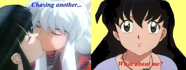
I like this Itachi Uchiha pic............................................... .
grn apple tree
02-09-2005, 02:37 AM
how do u like my Kingdom Hearts sig
I like your style of sig making.
Also jeto nice. I like the one you just posted.
Adamski
02-09-2005, 01:44 PM
I like your style Jeto, but maybe you should try something different.
You're sigs look nice, but they are all basically the same.
Your itachi uchiha sig is a bit too crazy, the backgrounds messy and you cant see the character very well.Although I do like the text.
Criticism will help you more then praise.:)
chewey
02-09-2005, 01:48 PM
yeah what about my sig. Isnt it awesome?
ice!~neko
02-09-2005, 04:06 PM
I was bored with a wacom tablet, and felt like trying something different.
Jasmijn
02-09-2005, 08:04 PM
What do you guys think of my signature?
Not bad ^^ i would remove the grid tho
grn apple tree
02-10-2005, 01:24 AM
What do you guys think of my signature?
Looks really cool I like your style as well.
Jasmijn
02-10-2005, 08:23 PM
Thanks guys...and no..I won't remove the grid..i might change it a bit..
gr8slayer
02-10-2005, 10:40 PM
heres mine
Jasmijn
02-10-2005, 11:04 PM
It's tooooo Big...
but apart from that...it's okey...^^
growlanser Rocks
02-11-2005, 02:21 AM
here goes nuthin
Adamski
02-11-2005, 11:36 AM
The backgrounds intense, but the text has let you down.
Change the style of the text, overlaying a gradient isn't your friend in this case.
Jasmijn
02-11-2005, 07:05 PM
Adamski
02-11-2005, 07:06 PM
Yuffie isn't blended that well, shes got all bits on her, the text doesnt fit the sig either.
The outside isn't all that either, sorry...=/
Powered by vBulletin® Version 4.2.4 Copyright © 2019 vBulletin Solutions, Inc. All rights reserved.


