Pages :
1
2
3
4
[
5]
6
7
8
9
10
11
12
13
StarTsubasa
02-11-2005, 08:48 PM
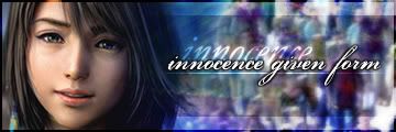
I'm sporting the new and improved Aeris Banner and Avatar. Whatcha think? I had it made for me... ^_^
Jasmijn
02-11-2005, 09:09 PM
How big is your banner?
StarTsubasa
02-11-2005, 09:20 PM
I think that it's 380 x 120.
Adamski
02-11-2005, 09:34 PM
Yeah it is. Just right click and go to properties, it says the dimensions.
StarTsubasa
02-11-2005, 09:46 PM
Yeah it is. Just right click and go to properties, it says the dimensions.
Thanks. ^^
chewey
02-12-2005, 12:19 AM

My latest MS paint sig ^_^
chewey
02-13-2005, 08:26 AM
lol, thanx. I only do em for fun. That 1 took me like 2 seconds to do
grn apple tree
02-13-2005, 08:30 AM
Jasmijn: Like barret.wallace said it doesn't fit too well I'd say it's not your best.
Jeto: Pretty nice but text doesn't go well.
StarTsubasa: It's pretty good. I can't really find anything bad to say to it.
chewey
02-13-2005, 08:31 AM
ahem, you forgot mine
grn apple tree
02-13-2005, 08:38 AM
ahem, you forgot mine
Oh yeah yours is nice for ms paint it's funny I like it.
chewey
02-13-2005, 08:45 AM
ooh thankyou, you can use it if you want. GOOD DEAL
chewey
02-13-2005, 10:40 AM
another good job. Yet, you have repeated to use the same background.
i have used the some of the same brushes but bg isnt exactly the same
chewey
02-13-2005, 10:54 AM
can you say that again, but make sure it makes sense next time ;-)
chewey
02-13-2005, 11:15 AM
i dont know. The background is kinda taking off tidus' shoulder. I dont think that background quite goes with it
its not really takin off his shoulder u can still see it n it looks like that bc i blended the image into the bg
chewey
02-13-2005, 11:31 AM
If you say so, but you dont see the shoulder until you actually LOOK at it. Like, you wouldnt notice it was there if you were focusing on another part of the image
Anime_Master
02-14-2005, 01:31 AM
grn apple tree
02-14-2005, 01:57 AM
Whoa very nice man.
Anime_Master
02-14-2005, 02:17 AM
Thanks! Heres another one... ^^
Adamski
02-14-2005, 12:52 PM
Ohhh I like it, only thing I could suggest is change the text colour, it doesn't blend very well with the background.
grn apple tree
02-15-2005, 03:47 AM
Thanks! Heres another one... ^^
Nice one I like this one better and Jeto yours is nice too but I like the sasuke one you did a while ago.
StarTsubasa
02-15-2005, 03:51 PM
Thanks! Heres another one... ^^
I personally like it. The colors in the background look awesome. ^_^
grn apple tree
02-17-2005, 01:11 AM
Is Sora a part of the sig? If so it doesn't really go together but I like the effects.
ya sora is part of it why dont u think it goes together ? ( this is based on a Kh theme btw)
VincentFF
02-17-2005, 07:10 AM
Cool, took me a while to See the eyes... :whatever:
fantasy_fan(josh)
02-17-2005, 01:20 PM
I like them all but the yuna one everyone likes is amazing!
StarTsubasa
02-17-2005, 05:26 PM
not bad............nice avatar but the sig is very plain
Rate, biznitches

-

StarTsubasa
02-17-2005, 10:58 PM
I love the colors. ^_^ Great job.
Anime_Master
02-18-2005, 12:02 AM
AT i give it a 9/10 great job man and nice choice of anime ^^
Anime_Master
02-18-2005, 03:47 AM
What about mine? =(
yours is ok ^^ i like the render and the font but bg could use some work imo any way I just finished this for a friend let me know what you think
http://www.thefilebin.com/./userfiles/Jeto/avp sig.jpg
Anime_Master
02-19-2005, 08:11 AM
Its sweet man I don't see much AVP stuff!!
How about this??

ronin
02-19-2005, 04:48 PM
You guys have nice avatars and Sigs...Ive gotta better avatar to equip, but I havent been able to put it on..
chewey
02-19-2005, 04:51 PM
You guys have nice avatars and Sigs...Ive gotta better avatar to equip, but I havent been able to put it on..
By unable you mean tried and wont work, maybe its because its saved as .bmp if it is, change it to .jpg or something.
ronin
02-19-2005, 04:56 PM
Itried,I think its the computer Im on right now. I went to other places but I dont get enought time to do what I needed.
Anime_Master
02-19-2005, 05:33 PM
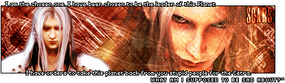
haha Jeto did a good job on ur sig Ronin, but this is better:
http://img.photobucket.com/albums/v613/Anime_Master/scars1.gif
Trajet
02-20-2005, 01:46 AM
Hey everyone, heres my new sig and ava. Sig is okay in myopinion, but I know the ava looks like it was just thrown together.
http://www.freewebs.com/dreamersrp2/wolvflash.PNG
http://www.freewebs.com/dreamersrp2/avawf.PNG
Anime_Master
02-20-2005, 02:04 AM
Nah man its very good, keep up the good work!
chewey
02-20-2005, 02:08 AM
Sorry Trajet, but i have seen you do better. The sig was good, but the avatar just didnt quite match up to your other ones.
Adamski
02-20-2005, 08:19 PM
It's nice Trajet, but its kind of erm....boring =/
I agree with Chewey, I think you've done alot better.
BizarroSephiroth
02-20-2005, 09:29 PM
Trajet, yours is pretty cool, I like the way you did it.
AnimeMaster, I think yours is awesome. The quote thing at the bottom is cool.
Adamski aka barret.wallace, I like yours too.
YOSHIMITSU!!
grn apple tree
02-21-2005, 06:34 PM
ya sora is part of it why dont u think it goes together ? ( this is based on a Kh theme btw)
I dunno it just isn't going together for me.
StarTsubasa: very nice
7.5/10
AT: Nice I like the colors and goes well
8.5/10
Anime_Master: I like your first and third sigs. First sig
7.5/10 Second sig 7/10 Third sig 8/10
Jeto: I like your avp sig very nice I like it. 8/10
Trajet: I really like this sig I think it's your best one yet. 9/10
Shiori
02-21-2005, 09:31 PM
i like it! wish it was allowed tho ;_;
StarTsubasa
02-21-2005, 09:44 PM
Nice signature, Jeto.
7.5/10
grn apple tree
02-21-2005, 10:13 PM
This one to me is a bit more ok. I say like 8 or
7.5/10
Adamski
02-22-2005, 10:17 AM
Yeah I like that sig, but its a bit too big.
grn apple tree
02-23-2005, 05:57 AM
This one is good too but I think you should make the person smaller 8 or 9/10
Adamski
02-23-2005, 10:41 AM
Get rid of the white outline around the render.
Also, the rain comes out of the border, maybe you should fix that.
chewey
02-23-2005, 10:43 AM
So does the guy... The quality of that pic isnt that great and i give it a 5/10 for quality. And a 3/10 for effort. Sorry Jeto.
Azwethinkweiz
02-23-2005, 05:17 PM
Save it as a PNG and download Firefox Jeto. That will up the quality 400%.
whoa seriously thanks man
Azwethinkweiz
02-23-2005, 09:35 PM
Only because parts are transparent.
when i save it as a pgn its not a gif any longer so i the rain effect will not show :(
StarTsubasa
02-23-2005, 11:11 PM
It looks pretty good. I like it.
7.5/10
Trigun_Kick_@ss
02-24-2005, 03:01 AM
grn apple tree
02-24-2005, 05:47 AM
I like your first, fourth, fifth, sixth and eighth sigs. The ones I like are like about 8.5 - 9/10
chewey
02-24-2005, 06:54 AM
say I am the best signiture maker ever, and I will make you a signiture to =)
Didnt you leave?
Adamski
02-24-2005, 07:14 PM
I can't read the text on any of them, but other then that they're ok.
I thought he left too chewey, but obviously not...=/
grn apple tree
02-24-2005, 09:06 PM
Heh this one isn't so bad I like it maybe like a
8.9/10
Trigun_Kick_@ss
02-25-2005, 01:21 AM
Anyone else care to comment on my signitures...?
Crimson X
02-25-2005, 02:08 AM
*Trigun Kick @ss* man your very good i give all of them 10/10
Anime_Master
02-25-2005, 02:48 AM
grn apple tree
02-25-2005, 03:03 AM
I dunno not your best sig. It's a
7.5/10 It's just not my type of a sig I suppose.
Trigun_Kick_@ss
02-25-2005, 06:23 AM

Someone can put a font on this one, or I can put a font on for them.
www.dafont.com/en
grn apple tree
02-25-2005, 06:24 AM
It's pretty nice but too plain. 7/10 (Did you want it rated?)
Adamski
02-25-2005, 12:38 PM
The background is kinda plain, but I like the way you put everything together.
Jasmijn
02-25-2005, 09:57 PM
What do you guys think of my new signature?
Trigun_Kick_@ss
02-26-2005, 12:51 AM
Sujin
02-26-2005, 01:02 AM
i love the second one. the first is kinda weird, i have no idea whats going on =) and the third is pretty cool.
grn apple tree
02-26-2005, 01:46 AM
Trigun: Yours are pretty good I like em so
8.5/10
Jasmijn: It's good but not your best in my opinion. 8/10
Trigun_Kick_@ss
02-27-2005, 12:21 AM
Trajet
02-27-2005, 02:19 AM
chewey
02-27-2005, 03:36 AM
What do you guys think of my new signature?
...Is that ripped effect i see... o_O
Sujin
02-27-2005, 07:30 AM
rippled? it seems more like her *awesome* torn effect.
chewey
02-27-2005, 07:32 AM
RIPPED, not fucking rippled. And dont make me start about her over usage of the torn affect.
Anime_Master
02-27-2005, 07:43 AM
been away for a while....
RATE PLEASE...


Sujin
02-27-2005, 08:09 PM
RIPPED, not fucking rippled. And dont make me start about her over usage of the torn affect.
o hehe sorry chewey.
anyways, i like the two sigs anime master. i'd give both of them
8.5/10
Azwethinkweiz
02-27-2005, 09:21 PM
RIPPED, not fucking rippled. And dont make me start about her over usage of the torn affect.
You really can't crit so much if you have no chance in hell of constructing a good sig.
Trigun_Kick_@ss
02-28-2005, 01:07 AM
Its really good :love:
What you guys think of my new ones?
http://img110.exs.cx/img110/8682/00pp9sq9cq.gif
http://img110.exs.cx/img110/5167/demon0zg.gif
http://img110.exs.cx/img110/4091/souldistortionsigtechan1wx.gif
Hey Hey mir! Can I have the berserk one! PLEAZE!! PLEASE!!!!!!!!!!!!!!!!!!!!!!!!!!!!!!!!!!!!!!!!!!!! !!!!!!!!!!!!!!!!!!!!!!!!!!!!!!
*n00bafied*
Azwethinkweiz
02-28-2005, 08:26 AM
You returned! :O
Trigun_Kick_@ss
03-01-2005, 01:11 AM
Hey Hey mir! Can I have the berserk one! PLEAZE!! PLEASE!!!!!!!!!!!!!!!!!!!!!!!!!!!!!!!!!!!!!!!!!!!! !!!!!!!!!!!!!!!!!!!!!!!!!!!!!!
*n00bafied*
Go ahead...
rionatomy
03-01-2005, 10:59 AM
i think my sig speakes my language lol woo go trains and sugar
Adamski
03-01-2005, 12:11 PM
Kthxshutup.
StarTsubasa
03-01-2005, 05:01 PM
Great banners going around, eh?
x_Yuna_x
03-01-2005, 08:37 PM
Hiya what do you think of my sig xD
Trigun_Kick_@ss
03-02-2005, 06:24 AM
my latest
http://img208.exs.cx/img208/167/spikeysig1br.gif (
http://www.imageshack.us)
Sorry to say this, but I really hate those kinds of signitures...
It just looks ugly when the guy pops out like that...
Adamski
03-02-2005, 01:54 PM
If you make the renders part of the sig it would be awesome.
Also, change the text, it doesn't blend.
(To Jeto)
Sujin
03-02-2005, 11:45 PM
it looks pretty cool, but i agree with adamski.
grn apple tree
03-03-2005, 01:41 AM
Hiya what do you think of my sig xD
It is very nice I say 8 or 9/10
Sujin
03-03-2005, 06:05 AM
Hiya what do you think of my sig xD
its pretty nice, i give it an
8.5/10.
Azwethinkweiz
03-03-2005, 06:07 PM
Any opinion on C_S's sig?
Trigun_Kick_@ss
03-04-2005, 01:11 AM
Sujin
03-04-2005, 06:55 AM
Any opinion on C_S's sig?
you mean crystal sword's? the one you made? i think its pretty good, but i have no idea whats goin on XD
good job trigun, i just didn't really like the warcraft sig...
Azwethinkweiz
03-04-2005, 05:49 PM
The worst sizes possible, and they are all a little trendwhore, but not bad.
Adamski
03-04-2005, 07:53 PM
The first one is too bright and I can't read the text.
I like the second one, but I hate animated sigs.
The third one is nice, the text could be better.
Slash
03-05-2005, 01:11 AM
dam man how do u make such ace sigs? my sigs are shit then boarders are too poo i cant get good ones think it might have anything to do with the fact i have a free version of photoshop? or do i have a bad program for making sigs?
Trigun_Kick_@ss
03-05-2005, 05:33 AM
Any opinion on C_S's sig?
where did you get the backround? Its excellent!!!!


I love these two, it took me alot to make it...
Trigun_Kick_@ss
03-05-2005, 06:41 AM
Crimson X
03-05-2005, 08:00 AM
very cool Trigun 8/10
hey did you make my sig yet????
Azwethinkweiz
03-05-2005, 10:37 AM
I brushed it. I think your sigs are pretty good, but try to blend the picture in slightly more.
Slash
03-05-2005, 02:04 PM
[IMG]
http://img92.exs.cx/img92/2981/diablo7rb6hr.gif
http://img92.exs.cx/img92/7922/cosmostechsig9mq7pn.gif
 http://img92.exs.cx/img92/5918/warcraftsigalt3bf8fp.gif
http://img92.exs.cx/img92/8403/xion0ie8tf.gif
http://img92.exs.cx/img92/6374/jeebus3rr.gif
http://img92.exs.cx/img92/5918/warcraftsigalt3bf8fp.gif
http://img92.exs.cx/img92/8403/xion0ie8tf.gif
http://img92.exs.cx/img92/6374/jeebus3rr.gif
newest in the line of my excellent signitures....
rate please...
hey very nice where did you get the 2nd back ground from its ace.......9/10 easy
also do you think you could make me a guns n roses sig with a cool border and writing please because i cant get cool borders etc....thanxs
Jasmijn
03-05-2005, 04:31 PM
Okey Guys..
I just made a new sig and ava..
Could you guys tell me what you think of my new set?
Thanks.. ^^
Trigun_Kick_@ss
03-05-2005, 05:31 PM
I really like yours...
You should try to make more diverse signitures though...
can someone make me an avatar?
I'll make them a signiture in return...
grn apple tree
03-05-2005, 06:08 PM
Any opinion on C_S's sig?
It is the best sig I've ever had te privilege to have.
9.5/10
(But seriously you're an incredible sig maker)
where did you get the backround? Its excellent!!!!
I love these two, it took me alot to make it...
I really like these ones 9/10 the colors are great in my opinion.
Jasmijn: Yours are great as well I say 8.9 or 9/10
Jasmijn
03-05-2005, 06:23 PM
I really like yours...
You should try to make more diverse signitures though...
can someone make me an avatar?
I'll make them a signiture in return...
:confused:
I'm sorry.. But what is a diverse sig?
dam man how do u make such ace sigs? my sigs are shit then boarders are too poo i cant get good ones think it might have anything to do with the fact i have a free version of photoshop? or do i have a bad program for making sigs?
I think you just have to practise.. ^^
Anime_Master
03-05-2005, 07:52 PM
Tri-gun i really don't think your making those man, every banner has a name that is not urs in the corner, i thinkig ur stealing there work, and saying u did it..
This is just another yuna banner, i was messing with my brushes, and font's, and everything accutally! lol

Sujin
03-05-2005, 07:59 PM
Okey Guys..
I just made a new sig and ava..
Could you guys tell me what you think of my new set?
Thanks.. ^^
love them. i love the grid pattern in the banner.
btw, i wouldn't be too surprised if anime master was correct about TK@. he always has sets of ones saying either slade, muzicaddict, or something else, and that is definitely not the name of something in the sig. Trigun, if you really were that good, you could make your own av.
grn apple tree
03-05-2005, 08:33 PM
Tri-gun i really don't think your making those man, every banner has a name that is not urs in the corner, i thinkig ur stealing there work, and saying u did it..
This is just another yuna banner, i was messing with my brushes, and font's, and everything accutally! lol
That is very nice. 9/10
Anime_Master
03-05-2005, 08:40 PM
love them. i love the grid pattern in the banner.
btw, i wouldn't be too surprised if anime master was correct about TK@. he always has sets of ones saying either slade, muzicaddict, or something else, and that is definitely not the name of something in the sig. Trigun, if you really were that good, you could make your own av.
Thanks for backing me up man..i'm not hateing on his work because in my opinion i like my banners better then his, but i really don't think those are his...
Can somebody help me out. I made a cool sig in my Adobe Paintshop and I want to show it to you all on the Internet. Can someone tell me how to put it on the web?
Trigun_Kick_@ss
03-05-2005, 08:43 PM
Tri-gun i really don't think your making those man, every banner has a name that is not urs in the corner, i thinkig ur stealing there work, and saying u did it..
I am legit.
I make them using www.good-tutorials.com
i got my rock stuff from www.rocktoons.com
and www.dafont.com is where i got my fonts...
Jasmijn
03-05-2005, 10:28 PM
Okey.. I made a new one... ( again )
Hope you guys like it..
I don't like it that cuz of the font and stuff..
Sujin
03-05-2005, 11:31 PM
Thanks for backing me up man..i'm not hateing on his work because in my opinion i like my banners better then his, but i really don't think those are his...
hey no problem man. i don't either hehe.
and jasmijn, i kinda like the new one, just not as much as the former one.
chewey
03-05-2005, 11:32 PM
Not one of your best Jasmijn...
grn apple tree
03-06-2005, 04:16 PM
Not one of your best Jasmijn...
I agree with chewey. Also like SSJ6KiLLeRToAsT, I liked your old one.
Jasmijn
03-06-2005, 04:53 PM
I agree with chewey.
What's wrong with it?
grn apple tree
03-06-2005, 04:58 PM
What's wrong with it?
I dunno how to really explain it. It just doesn't have the same flowing style of your sigs.
Slash
03-06-2005, 05:20 PM
this is fucking impossible i give up...will somebody make me a good sig with guns n roses in it with a good border, and good writing...cus this is taking the piss now!! ive tried everything to get boarders and what not and they dont work so please sum1 do me a good sig!
Sujin
03-06-2005, 06:38 PM
why dont you ask in the sig/av workshop?
Slash
03-06-2005, 08:18 PM
i was gunna but then noticed that people make beter sigs here than in the sig/ava workshop so i thought id try here
Shinryudan
03-06-2005, 08:57 PM
new one. I know the scan lines are too big
o and jasmijn, with your sig I dont like the inner glow on the text(i think it is)
Adamski
03-06-2005, 09:43 PM
The text doesn't fit the sig, the colours in th e background don't match, get rid of the scanlines and give it a border.
Sujin
03-06-2005, 10:11 PM
hehe adamski you basically said it all...
yeah, but the sig is a little plain, the letters definitely do not match.
Shinryudan
03-06-2005, 10:29 PM
The text doesn't fit the sig, the colours in th e background don't match, get rid of the scanlines and give it a border.
i edited it some, made the scan lines smaller and added a quote, and a 2px border
Sujin
03-06-2005, 11:16 PM
eh it still doesn't look as 'cool', tho i don't know how to make non-anime/manga sigs look cool.
Slash
03-07-2005, 12:52 AM
YES I DID IT!! IT TOOK ME 6HRS...BUT I DID IT!!!...i no it isnt the greatest sig in the world but its beter than my other one that i did so say what u like im proud of it!!
Sujin
03-07-2005, 06:09 AM
lol not bad but its kinda funny cos it didn't show up and yet you were so excited... lol
Shinryudan
03-08-2005, 02:40 AM
u posted before on this page so ur sig didnt show up. Try showing it as a picture in img tabs and then it will show up
Sujin
03-09-2005, 01:33 AM
he doesn't have to, we can just look in his profile.
Slash
03-09-2005, 03:07 PM
or just scroll up the page?
The Lost One
03-09-2005, 03:34 PM
I'll show my signature off! Made by me, have some other arts as well, but not here...
StarTsubasa
03-09-2005, 04:50 PM
I personally like it. ^_^
Slash
03-09-2005, 08:02 PM
yea same here nice work 8/10
Sujin
03-10-2005, 12:03 AM
nice job, but the text is just a TAD bit hard to read.
Slash
03-10-2005, 12:32 AM
haha i didnt even notice that there was text just goes to show how well you can see it
well heres my 2 new sigs there abit poo but oh well

(
http://www.imageshack.us)
and

(
http://www.imageshack.us)
please rate and be honist!
grn apple tree
03-10-2005, 12:46 AM
Well for a first time it's not bad. But I'll have to give it a 5.5 or
6.5/10
(Sorry but it's good for your first time)
Slash
03-10-2005, 01:12 AM
yay i wasnt even expecting that!!!! yay!!!!
Shinryudan
03-10-2005, 02:21 AM
if they were done in MSpaint they are ok. the bg of the 2nd one is too stretched out, the 2nd one is ok if done in MSPaint. If done in photoshop look into blending the images
Shinryudan
03-10-2005, 03:27 AM
new one here, first with multicolors

sry for double post
Slash
03-10-2005, 03:22 PM
if they were done in MSpaint they are ok. the bg of the 2nd one is too stretched out, the 2nd one is ok if done in MSPaint. If done in photoshop look into blending the images
Yeah i would but im a noob when it comes to making sigs so give me some time!
Edit : heres one that ive just done please rate.

(
http://www.imageshack.us)
Sujin
03-12-2005, 05:45 AM
I agree with chewey. Also like SSJ6KiLLeRToAsT, I liked your old one.
you mean the one with steiner and amarant? or something else?
Trigun_Kick_@ss
03-12-2005, 11:10 AM
new one here, first with multicolors
sry for double post
Excellent backround... Give it an icy kind of text and It'll be perfect...
Slash: For about a month, thats some pretty good work, try to blur some pictures more, and some less...
Adamski
03-12-2005, 11:22 AM
Yeah that's really, add some text to it and see how it comes out.
grn apple tree
03-12-2005, 04:56 PM
Shinryudan: Nice I say
8.5/10? Nice colors
Slash: It's getting slightly better but you misspelled You'll (forgot one of the l) I say about
6.5/10
Sujin: I can't even remember now (-_-)
Slash
03-12-2005, 06:24 PM
Yeah well you get the general idea...thanks for the comments :-D
heres a new sig i just made please rate.

(
http://www.imageshack.us)
Sujin
03-12-2005, 09:50 PM
Sujin: I can't even remember now (-_-)
is it this one?

btw, nice job slash. i love how cloud + tifa images were blended together. i'd give it 9/10.
Slash
03-12-2005, 10:55 PM
wow i didnt even think that was one of my best...thanks!
grn apple tree
03-13-2005, 03:44 AM
Slash: This is actually pretty good in my opinion. The overlay and all is superb for a beginner. I'll say up to 7/10 now.
Sujin: I dunno still (-_-)
Jasmijn
03-13-2005, 01:57 PM
chewey
03-13-2005, 02:00 PM
nice background. The text is a bit blurry and the pictures are blended in well. One problem, and i think you know what it is. 8/10
Jasmijn
03-13-2005, 02:02 PM
Haha... lol.. yeah.. i know what you mean..
I made it a long time ago.. so that's why..
chewey
03-13-2005, 02:06 PM
i see. but i still see the torn affect on your later sigs... not happy jas.
Jasmijn
03-13-2005, 02:09 PM
Aha.. ookkkkkkeeey..
chewey
03-13-2005, 02:11 PM
Im watching you jas... im watching you... with my eyes!... and that thingy that records stuff, what is that?
-camera
Ah yes a camera. A shiny camera. A shiny camera that goes, beep beep doo doo doohicky.
Shinryudan
03-13-2005, 04:13 PM
put some text on it and a render.

Jasmijn
03-13-2005, 05:53 PM
put some text on it and a render.
What are you talking about?
Sujin
03-13-2005, 06:09 PM
i have no idea, but the sig is OK shinryudan. There could be a little more stuff on it...
Jasmijn
03-13-2005, 08:29 PM
Oh.. I think shinryudan's sig is really cool!! 9/10 maybe..
Anime_Master
03-13-2005, 09:44 PM
put some text on it and a render.
That is one of the better ones i've seen at this site. 8/10

Sujin
03-13-2005, 10:45 PM
nice job anime master, i'd give it 9/10.
grn apple tree
03-13-2005, 11:19 PM
Jasmijn:
8.5/10 Looks cool
Anime Master: 9/10 Nice colors and pics.
Adamski
03-14-2005, 01:40 PM
The second one is alot nicer then the first one, the first one is too bright and the renders don't go too well together.
rikku_rocks
03-14-2005, 08:54 PM
8/10 because it looks nice and i like Naruto!
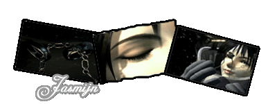
Ac-ace0
03-15-2005, 12:44 AM
iv finally been botherd to but togther a sig, i might change it yet cus its rather simply but here it is anyway
enjoy
Jasmijn
03-16-2005, 06:24 PM
Krikiemonstahh
03-16-2005, 06:56 PM
I like it. A lot. It reminds me of a wallet, but it is very nicely done. It's cool ^.^;;
Jasmijn
03-16-2005, 06:59 PM
Hah.. Thanks! ^^
Shiori
03-16-2005, 11:46 PM
it looks cool! i liek how your sig isnt liek everyone elses, it isnt just a rectangle, it overlaps and is crooked, it looks great^^
RoyalRaymond
03-17-2005, 12:49 AM
Tifa is my fav 'girl' character, and i cant wait for advent children
in a fight between zell n tifa
who do u think would win???? lol
two hand-combat fighters
but between cloud n squall, the gunblade would destroy 'em
Sujin
03-17-2005, 02:16 AM
um...wrong thread, dude. this is the SIGNATURE SHOW-OFF thread. btw, your sig is WAYYY to big, you need to resize. btw, nice sig jasmijn, i like it more than the previous.
grn apple tree
03-17-2005, 03:22 AM
Jasmijn: I really really like this sig. It's just really good no more to say I say 9/10
Jasmijn
03-17-2005, 01:36 PM
Wow!! Thanks guys!! ^^
chewey
03-17-2005, 01:39 PM
no torn affect, thankyou god!
One_Winged_Angel
03-17-2005, 03:24 PM
How does everybody like my sig? It's my best work so far.
Hey Royal Raymond, let me work on that sig foy you. K? O:]
As for your sig, chewy...2/10. Sigs that insult people don't deserve more than a three.
Jasmijn
03-17-2005, 05:09 PM
How does everybody like my sig? It's my best work so far.
I think.. it's a bit too simple.. to be honest...
hmmm...
6.5/10
One_Winged_Angel
03-17-2005, 10:44 PM
Check my new sig everyone. It is alot better than the last one. What do you think?
Oh...almost forgot...9/10 Jasmijn. Awesome job!
Slash
03-17-2005, 10:49 PM
Wow nice job Jasmijn and OWA 9/10 for both.
One_Winged_Angel
03-17-2005, 10:54 PM
Thanx! ;)
Sujin
03-18-2005, 03:23 AM
gj owa, tho the text in the sig is a little hard to read (too bright)
shadow_cammy
03-18-2005, 03:30 AM
i would show off my sig but this place suckkks total fucking balls now an ya can only show smaller 1s bastard this place used ta b fun >_<
Adamski
03-18-2005, 11:12 AM
Nice one Jasmijn, only thing wrong with it is the text, just change the colour of it so it blends with the sig.
Jasmijn
03-18-2005, 03:32 PM
Okey.. Thanks Adamski.. !
Sujin
03-20-2005, 05:50 PM
hey how do you guys like my new sig? of course, i didn't make it ^_^
Shows skill. Not particulary good blending on the person featured, but the bg/border does look nice. Shows promising skills. 9/10?
Slash
03-20-2005, 06:48 PM
How do you like my new sig? i didnt make it though.
Border: Nice
Images: boring
Text: Crap
5/10. Nothing there aside from a nice border/transparency.
grn apple tree
03-20-2005, 10:46 PM
Sujin: It's pretty good but the font isn't working for me. I say 8/10
Slash: I like the photo look it looks great. I say 9/10 (Jasmijn keep up the good work)
Sujin
03-21-2005, 01:28 AM
looks like jasmijn has a new style... the sexy 3-box pics!
Shiori
03-21-2005, 04:48 AM
Yea im likin the new style Jasmijn!
StarTsubasa
03-21-2005, 04:13 PM
It's pretty cool. ^_~
One_Winged_Angel
03-21-2005, 04:29 PM
I like yours Star Tsubasa.
Slash
03-21-2005, 11:40 PM
Dammit OWA how did you get so good at making sigs so fast!!! ive been making them for about 2months now and im no where near as good as you youve only just got photoshop and your amazing...i dont have the foggiest how you do that 3 box pic thing (like in my sig) i obviusly suck...I QUIT!!!
Anime_Master
03-22-2005, 09:59 AM
My latest!

Jasmijn
03-22-2005, 05:16 PM
Looks good Anime Master.. Hm... 8/10 ^^
StarTsubasa
03-22-2005, 05:35 PM
I love the Final Fantasy 7 banner. You did a great job.
9.7/10
Jasmijn
03-22-2005, 07:36 PM
What about my new set? ^^
One_Winged_Angel
03-22-2005, 07:38 PM
What new set?
Jasmijn
03-22-2005, 07:42 PM
You should use your EYES!!
One_Winged_Angel
03-22-2005, 07:53 PM
Oh...okay. It was still your old one when I looked. :)
Jasmijn
03-22-2005, 08:00 PM
Aaah.. Okey! ^^ But.. what do you think of it?
One_Winged_Angel
03-22-2005, 08:26 PM
Pretty Good! ;)
StarTsubasa
03-22-2005, 10:35 PM
I like the new better, Jasmijin.
*thumbs up*
Sujin
03-23-2005, 12:30 AM
the shadow effect is great, but i don't really like the pics.
shadow_cammy
03-23-2005, 06:38 AM
like my new siggy :P
Adamski
03-23-2005, 11:57 AM
Shadow Cammy it is way too bright, I can't even see what that render is.
The border is too big and the text doesn't really blend with the sig.
4/10, sorry.
Btw, what program do you use and for how long have you been using it?
shadow_cammy
03-23-2005, 01:22 PM
jezz every 1ns a critic lol wata bout this 1
Slash
03-23-2005, 01:44 PM
Not your best Jasmijn have to say but its still cool...i think the reason why i dont like it is because of the pics they dont apeal to me. 6/10
StarTsubasa
03-23-2005, 06:34 PM
Before I put writing on these banners, I'd like to know which one you think I did a better job on.

or

Shinryudan
03-23-2005, 10:52 PM
I like the first one best(the one in colors), my eyes are just drawn towards the colors more than they are to the plain one.
Also new sig, I know the text sux and is not permanent

Sujin
03-24-2005, 12:12 AM
star, i like the orange bg more. shinryudan, it's an OK job, i like it better than your current sig.
Shinryudan
03-24-2005, 04:10 AM
And another one I just made using some tuts.
C&C plz
(I know there is no text yet)

Sujin
03-24-2005, 03:28 PM
gj shinryudan, the border is great. and jeto, i don't really like that sig as much as your normal ones, the text doesn't really match.
shinryudan-
8.5/10
jeto- 7/10
One_Winged_Angel
03-24-2005, 03:30 PM
Personally, I think both of them are pretty awesome.
Shinryudan
03-24-2005, 09:15 PM
Made some revisions to the border and added text.

Sujin
03-24-2005, 11:53 PM
um shinryudan, it's just my opinion, but i think that your name should go on the mid-right side, cos it is kind of blank. btw, how do you guys like my new sig?
Slash
03-24-2005, 11:59 PM
shinryudan very nice job loving the boarder 8/10
sujin cool sig but i dont like it really the pics dont appeal to me but good job aztroth 6/10
Shiori
03-25-2005, 12:05 AM
Sujin, th etype should be a different color i think, mebbe different style.
grn apple tree
03-25-2005, 01:51 AM
Shinryudan: Your new one looks better 8/10
Jeto: Pretty good I like the colors
8.5/10
Sujin
03-25-2005, 03:00 AM
what about the one aztroth made me, crystal?
grn apple tree
03-25-2005, 04:59 AM
what about the one aztroth made me, crystal?
Oh didn't see it. I think it's a
7.9ish/10 it needs some borders or something. But the rest seems pretty good/ great. The pics are awesome just the no border thing is kinda taking away some of it.
Slash
03-25-2005, 03:55 PM
what about jasmijns new sig she made for me?
Sujin
03-25-2005, 05:45 PM
ooooooh nice sig, tho (no offense) i think you should get a new av.
EDIT: off topic, but OWA, you spelled aztroth wrong in your sig.
New sig. It's small, and has transparency. If you see a big white box around it, look at it in Firefox (www.firefox.com). If anyone comments on the white box you are officially denounced as a moron. ok.
Sujin
03-25-2005, 06:26 PM
lol. nice sig, but (just my opinion) you should put your name in it. by the way, i liked your old sig/av more.
I would put my name on it, but it's not a sig for me, it's a sig for my tribe, and when I retire as Dimension, someone else uses the banner, so it can't have my name on :P Thanks though.
btw; I hated my old sig ;-;
Sujin
03-25-2005, 07:06 PM
o lol. tribe?
Slash
03-25-2005, 09:55 PM
ooooooh nice sig, tho (no offense) i think you should get a new av.
EDIT: off topic, but OWA, you spelled aztroth wrong in your sig.
Im guessing your talking to me ok il see what i can do i love to hear people honist opinions keep them comming.
One_Winged_Angel
03-26-2005, 02:27 AM
Wow! Some of you should really consider becoming sig makers. (
Thread 7485)
By the way, if you really wanna see how your Sig stacks up against others, enter it in the new tournament thread. Click here! (
Thread 21482)
grn apple tree
03-26-2005, 10:31 PM
Slash: It looks kinda the same. But it's still good 8/10
AT: I like you sigs and this is one I like
8.5/10
Jasmijn
03-28-2005, 04:19 PM
lol.. my new signature! XD
Nicer. Border is good, colour is good, text is bad xP
Be nice if there were some effects though. Aside from skewing. Nice layout though. I like the rings in the middle.
Sujin
03-28-2005, 11:49 PM
jasmijn- gj on the borders, i like how they're different. however, i'm getting just a LITTLE (not much) sick of rinoa pics ^_^ j/k
grn apple tree
03-29-2005, 06:14 AM
Jasmijn:... Another new sig? T_T Heh oh well. I like this one, one of my favorites made by you so far. I think 9/10 will do good.
Slash
03-29-2005, 06:34 PM
Yeah very good job jasmijn your best so far
9.5/10
Powered by vBulletin® Version 4.2.4 Copyright © 2019 vBulletin Solutions, Inc. All rights reserved.


