Pages :
1
2
3
4
5
6
7
[
8]
9
10
11
12
13
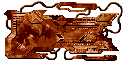
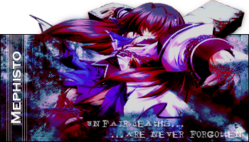
MePhIsTo
09-09-2005, 04:22 AM
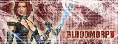
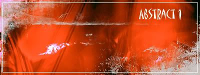
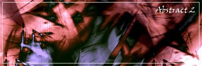
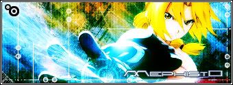
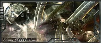
Well I have 2 sigs to give away since my idea wasn't aknowledged by any mod...


*Tifa*Aeris*lover*
09-09-2005, 04:26 AM
your idea was good......
Light~Nimbo-stratus
09-09-2005, 04:53 AM
How DO you do that thing with the edges? I like them, they fine sigs. 8/10 over all
High Summoner Yuna
09-09-2005, 06:35 AM
Awesome sigs Mephisto!
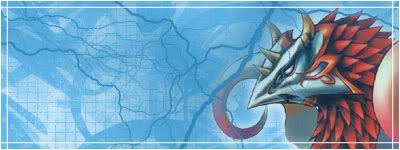
Here's another one of mine:
Rikku's hair is a little dodgy, lol.
http://img.photobucket.com/albums/v465/Morpheanne/Sigs/d057e9a1.gif
*Tifa*Aeris*lover*
09-09-2005, 07:17 AM
I like that one of Rikku it's cool i like how she is out of the sig
High Summoner Yuna
09-09-2005, 08:08 AM
Thanks.
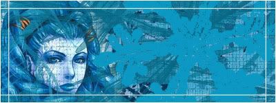
I just made this one to use at a BloodRayne forum:
Killer white specks, mwahaha, lol.
*Tifa*Aeris*lover*
09-09-2005, 08:57 AM
thats pretty cool 2
Shinryudan
09-09-2005, 11:52 AM
For getting rid of the pixelation at the edges of the render in sig #1, select the render and then do a 1px feather on it. This will get rid of the pixelation on that part of the render as well as any small bits of the rest.
As Mephisto said, the first one really catches the eye well but the other ones don't.
Personally I am not a big fan of a render for a background. MY favorite of them all is your sig that you are using. Mostly I like this one the best because of the brushing, but the glow on the text is a bit much.
Light~Nimbo-stratus
09-09-2005, 06:17 PM
How DO you do that thing with the edges? I like them, they fine sigs. 8/10 over all
MePhIsTo
09-09-2005, 07:48 PM
Good Yuna! your improving a lot on backgrounds, you need to reduce the opacity of the pattern in the bloodrayne sig...
Also try doing more techniques, try a bit with text, the outer glow begins to be a bit too repetitive...
Shinryudan
09-09-2005, 08:05 PM
Dont understand your question Dark~Cloud, elaborate a little please.
Light~Nimbo-stratus
09-09-2005, 10:29 PM
That thing where the edges get pressed down, the thing that HSY used to do with his/her sigs.
MePhIsTo
09-09-2005, 10:34 PM
That thing where the edges get pressed down, the thing that HSU used to do with his/her sigs.
Inner Bevel
Do u like that?!
Slash
09-09-2005, 10:56 PM
all pretty good in general
High Summoner Yuna
09-10-2005, 03:28 AM
That thing where the edges get pressed down, the thing that HSU used to do with his/her sigs.
Her sigs, lol. It's called Bevel and Emboss, you have to go to the bases layer options.
Good Yuna! your improving a lot on backgrounds, you need to reduce the opacity of the pattern in the bloodrayne sig...
Thanks! Yeah I know, I liked it before, but now I think I'll change it a bit.
Also try doing more techniques, try a bit with text, the outer glow begins to be a bit too repetitive...
I'm starting to get sick of the glow myself, lol.
I need to install these new fonts.
Light~Nimbo-stratus
09-10-2005, 05:54 AM
I reccomend this site. (
http://www.dafont.com/) Just download the font, move the font file itself into (if your using Windows) Windows>Fonts.
High Summoner Yuna
09-10-2005, 06:24 AM
Yeah, that's where I downloaded them, lol. Thanks anyway.
Light~Nimbo-stratus
09-10-2005, 06:32 AM
I wouldn't use anywhere else.
High Summoner Yuna
09-10-2005, 06:42 AM
Me either, they're the best I've seen.
Okay, how are these?

UltimateFFFan
09-10-2005, 07:34 AM
Nice, though I prefer the Valefor one personally, 7/10 for the Anima one 8/10 for the Valefor
EDIT: Here's a sig I've just done, critique please:

EDIT2: Decided to make it a set while I was at it

High Summoner Yuna
09-10-2005, 09:46 AM
That looks great! 9/10
Here's a couple more I've done:
UltimateFFFan
09-10-2005, 09:50 AM

Here's another one I made earlier
High Summoner Yuna
09-10-2005, 10:07 AM
I love the blending in that!
UltimateFFFan
09-10-2005, 10:12 AM
I have to admit, it is good, I'm thinking about starting up a sig making competition, with set rules, I'll make a new topic when I've thought about it some more
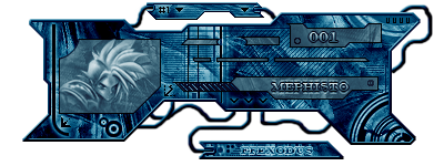
MePhIsTo
09-10-2005, 01:39 PM
I have to admit, it is good, I'm thinking about starting up a sig making competition, with set rules, I'll make a new topic when I've thought about it some more
That would be great!
Ur sigs are surely much better now btw ^^
Shinryudan
09-10-2005, 01:44 PM
There are enough people that can actually make something in photoshop that we could have an SOTW(sig of the week) now.
MePhIsTo
09-10-2005, 01:47 PM
Yeah, that'd be cool, each week a theme is given and all people make a sig about that theme, want to use a judge or vote system?
Shinryudan
09-10-2005, 02:19 PM
I say a vote system, competitors cannot vote. Set up one person as a judge to collect votes or use a poll.
High Summoner Yuna
09-10-2005, 03:30 PM
A sig making competition would be great! I've won one before, lol. :D
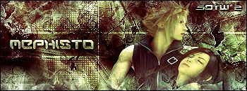
MePhIsTo
09-10-2005, 03:55 PM
New sig I done with the tutorial I made on this site...
http://i23.photobucket.com/albums/b358/Mephret/FFIContSig.gif
btw, I can help organize the SOTW if there's need people for that!
Light~Nimbo-stratus
09-10-2005, 04:15 PM
Nice one, MePhIsTo, 8/10
High Summoner Yuna
09-10-2005, 04:49 PM
Lookin' good Meph! 9/10
Light~Nimbo-stratus
09-10-2005, 05:06 PM
Heh, congratz on the 57 posts, HSY.
High Summoner Yuna
09-10-2005, 05:09 PM
Thanks. :D
MePhIsTo
09-10-2005, 05:22 PM
I was gonna purpose a new kind of voting I've seen in a graphics forum...
The votation would be done by members of the Shrine in the following way:
Favourite Sig: 3 points
2nd Favourite: 2 points
3rd Favourite: 1 point
In the end the sig with most points would win!
This is a cool way to vote because sometimes it's hard to just say one because there are some sigs that are both goods and it's kinda unfair one have 1 vote and the other nothing even though they are both good!
High Summoner Yuna
09-10-2005, 05:26 PM
That's a good idea.
grn apple tree
09-10-2005, 06:56 PM
Sig made for a contest...

hey nice job on the sig
8.5/10 also whose hyung tae kim? i'm pretty sure it's a korean name but i've never heard of it before... also the sig on the this page is nice, the picture doesn't look so clear but it's a nice job 9/10
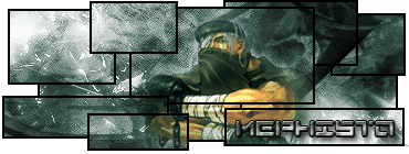
MePhIsTo
09-10-2005, 07:04 PM
He's the guy who draw that render, he has some pretty awesome renders for sigs, nice characters and all!
UltimateFFFan
09-10-2005, 08:24 PM
Hey, my mouse isn't working at the moment, so I'm using MouseKeys, not exactly the most useful of windows functions, anyway, I like the idea, we could do a SOTW thread, or perhaps a sig rumble, we'd need enough people to take part though, or enough sigs if you're allowing multiple entries, but each person enters an equal number of sigs. Meph, I like the idea of voting like that, sometimes it's hard to choose between 2 sigs. I prefer a vote system to be honest, makes the idea of democracy seem more attractive.
Looks like I'll be laying off the sigs for a bit anyway, at least until I get my mouse fixed, brushing's a lot harder with MouseKeys
Light~Nimbo-stratus
09-10-2005, 11:03 PM
Sucks to be you.
Shinryudan
09-10-2005, 11:28 PM
If you make an SOTW/competition I suggest NO multiple entries. I also suggest a basic render that everyone must use or some other theme. Also for it I suggest that you can't use an existing sig but have to make a new one for the contest.
Light~Nimbo-stratus
09-10-2005, 11:53 PM
What do you ppl think about my new sig? It's my first time to use a border so, the border sucks.
MePhIsTo
09-11-2005, 12:08 AM
Why do u did that border? there are 3 different border tuts in this site! that one just sucks!
the background is way too plain, just a clouds render colorized green and the render is bad imo...
Light~Nimbo-stratus
09-11-2005, 12:10 AM
Because, your tut doesn't work. Well, I was too lazy to make a bg, I just wanted a different text in it, my old one didn't even have a bg.
MePhIsTo
09-11-2005, 12:25 AM
Doens't work?! Reread it carefully and see what step ur missing!
have any problem just PM ME!
I think the tut was easy enough to follow... odd :S
Light~Nimbo-stratus
09-11-2005, 04:47 AM
Well, all it does when I do the Stroke is does a border around the render instead of the whole thing, solutions?
UltimateFFFan
09-11-2005, 09:08 AM
He's right, I've just tried it and you only get a border around the render, I tried using the Edit>Stroke command as well, but only to the same effect. The only other way I can think of doing a border is to draw it.
Shinryu, I like the idea, though no real life renders, mainly because so many people can't do them
MePhIsTo
09-11-2005, 10:47 AM
You didn't merge the layers after the sig was done!
Read Step 2 and FOLLOW IT, can't u guys follow a simple tutorial?
UltimateFFFan
09-11-2005, 11:12 AM
I merged the layers, still got the same effect
Slash
09-11-2005, 01:59 PM
yeah dark cloud i know nothing about sig making...but that sig sucks...plain and simple...it sucks....and also didnt there used to be a sig rumble? or was that a competition?
Shinryudan
09-11-2005, 03:00 PM
You didn't merge the layers after the sig was done!
Read Step 2 and FOLLOW IT, can't u guys follow a simple tutorial?
Merging the layers is NOT mandatory, if you make the border on a NEW layer then the hole layer will be outlined, make sure that the whole sig is highlighted and not just the render.
Also one that is up for grabs, I just need a rating on it.
http://img212.imageshack.us/img212/2188/sephirothfire19vb.gif
I found a tut on g2graphics, for the brushing. I can't seem to get the brushes to load onto my photoshop. Though the sparkle brushes are compatible for PS7 and up my version say "not compatible with this version of Photoshop" Really this is all directed toward Mephisto, because I know he got them to work(nice sasuke sig btw). Do you know what might be wrong with my version, or why I can't use the brushes?
UltimateFFFan
09-11-2005, 04:06 PM
Hey guys, I have a crappy mouse whilst mine's being repaired, but I can still do sig work with it, I like the sig Shin, though the bg looks too sharp to me. Other than that, I like it, 8/10
Light~Nimbo-stratus
09-11-2005, 04:19 PM
I like it, 8/10. I really like the bg and render
Light~Nimbo-stratus
09-11-2005, 04:23 PM
I know the sig sucks, I wanted a change. I just like the text. I'd make a new one, I just can't remember the text effects I used on it. SHITE, srry about the double post, I forgot I had already posted :X
Shinryudan
09-11-2005, 05:03 PM
Hey guys, I have a crappy mouse whilst mine's being repaired, but I can still do sig work with it, I like the sig Shin, though the bg looks too sharp to me. Other than that, I like it, 8/10
I used a set of brushes akin to what the tutorial based their's off of, sadly the ones they used had a bit of a mist near the actual brush mine didn't.
Light~Nimbo-stratus
09-11-2005, 08:29 PM
My new sig.
MePhIsTo
09-11-2005, 08:30 PM
Merging the layers is NOT mandatory, if you make the border on a NEW layer then the hole layer will be outlined, make sure that the whole sig is highlighted and not just the render.
Also one that is up for grabs, I just need a rating on it.
http://img212.imageshack.us/img212/2188/sephirothfire19vb.gif
I found a tut on g2graphics, for the brushing. I can't seem to get the brushes to load onto my photoshop. Though the sparkle brushes are compatible for PS7 and up my version say "not compatible with this version of Photoshop" Really this is all directed toward Mephisto, because I know he got them to work(nice sasuke sig btw). Do you know what might be wrong with my version, or why I can't use the brushes?
I actually don't like it! The background colour is too intense, the text is crap and the render could be blended better... you can do lots better shinryu! 6/10
I'm not sure what's wrong with your ps, never experienced that, you sure u put the brushes on the correct spot?
Shinryudan
09-11-2005, 08:44 PM
I actually don't like it! The background colour is too intense, the text is crap and the render could be blended better... you can do lots better shinryu! 6/10
I'm not sure what's wrong with your ps, never experienced that, you sure u put the brushes on the correct spot?
You're right, that's about the worst work that I've done in the past month. Also the brushes are in the right spot, but i need to update first. Conveniently the update center for adobe is under construction.
Light~Nimbo-stratus
09-11-2005, 08:47 PM
My new sig. Anyone out there???
Calgar
09-11-2005, 09:10 PM
good sig dark cloud
Light~Nimbo-stratus
09-11-2005, 11:04 PM
Thx, anyone else? And DON'T say it's extemely simple.
MossY
09-12-2005, 12:14 AM
jesus, your sigs are coming on great. I really like it 8/10
Edit: I'm not a big fan of the font though
Shinryudan
09-12-2005, 12:22 AM
^ God, I just realized who you are...
Anyways, new sig from me. This is one I made on requests, though I should have another one up in a few.

Here is my new one, CnC plz
http://img395.imageshack.us/img395/948/ashersig6gy.gif
Light~Nimbo-stratus
09-12-2005, 12:55 AM
Good one, shin,
8.5/10. What do you think about my new one?
High Summoner Yuna
09-12-2005, 03:14 AM
Your sig really looks great DC! 8/10
Shin, they're great! 9/10
Light~Nimbo-stratus
09-12-2005, 04:05 AM
looks like shin is getting into the smaller sigs.
High Summoner Yuna
09-12-2005, 04:09 AM
lol
I give you 8/10 MePhIsTo good job
Light~Nimbo-stratus
09-12-2005, 04:24 AM
What do you think of mine, Jiro?
*Tifa*Aeris*lover*
09-12-2005, 01:31 PM
I think your one is okay DK 6-7/10
brotherhood619
09-12-2005, 06:44 PM
Dark Clouds looks good.
I would make my own but i dont have a clue what program to use.
Light~Nimbo-stratus
09-12-2005, 08:15 PM
Thanks, you use like, Photoshop or some other programs, don't remember any others.
Slash
09-12-2005, 09:45 PM
yes but they cost a bomb load of money
Light~Nimbo-stratus
09-12-2005, 10:27 PM
Ya got that right.
Shinryudan
09-12-2005, 10:36 PM
yes but they cost a bomb load of money
650 to 1,250 US dollars. someone in a previous thread said 150, I wanna know where they were buying it that cheap.
MossY
09-13-2005, 12:00 AM
Holy crap! Its that expensive! mine was on my PC when I got it
Light~Nimbo-stratus
09-13-2005, 01:37 AM
Lol, lucky you.
Shinryudan
09-13-2005, 01:39 AM
Need any critiques I can get on this.

as you can see it is a rough draft.
Its a web template, for a site.
Light~Nimbo-stratus
09-13-2005, 02:33 AM
What are we supposed to be critiquing
Sujin
09-13-2005, 06:16 AM
cloud guy: sorry I'm late about critiquing.
anyways, I think your new banner is better than other ones you've made. but, it would help if you could add a border...
and if you could get multiple pics to be blended, that could make it even better... kind of like this one:

(that was made by Aztroth... before he started doing borders)
Light~Nimbo-stratus
09-13-2005, 06:39 AM
That sig's kind of hard to see what's in it.
Masakari
09-13-2005, 08:11 PM
Wow. The ancient sig thread is alive still. Nice sigs, y'all. Brings back sig-making memories.
Light~Nimbo-stratus
09-13-2005, 08:51 PM
Lol, I hardly ever see you around.
EDIT: My first EVER sig with a decent border on it. Critique please.
Aztroth
09-14-2005, 01:59 PM
ok, I've noticed this in a couple threads...
People seem to think that gif is the only format that saves things as transparent. WRONG! png is much better becaus eit saves transparent and it doesn't make the edges all dodgey. you can actually have something like this:

however the only problem is that ie doesn't show it properly, so firefox is your best bet... its all I use anyways. and if you don't want to bother with the png, you could always just fill the background the same color as the posts for the forum.
oh and I don't know if i've showed it already, but could someone please rate the sig I just showed?
Sujin
09-14-2005, 03:36 PM
It looks really great! I like how your name is put in.
I can't find anything wrong with it...
10/10
Light~Nimbo-stratus
09-14-2005, 05:31 PM
What do you think of my first decently bordered sig? (look at down)
Sujin
09-14-2005, 11:41 PM
You did a pretty good job, but I don't like the color.... and it seems a bit too.... simple, maybe?
like, it seems like it's just a resized pic with a border.
Light~Nimbo-stratus
09-15-2005, 12:43 AM
What about the animated ava?
Tidus 66
09-15-2005, 01:04 AM
The Effects are good and gives to the eye a great effect imo
Elvanna
09-15-2005, 01:09 AM
Yeah i really like it.It's original!
Light~Nimbo-stratus
09-15-2005, 01:17 AM
Thank you, people say it'll give some people siezures.
It's pretty ugly IMO. Making something animated just for the sake of it being animated never has good results.
Light~Nimbo-stratus
09-15-2005, 01:43 AM
I'm pretty ugly IMO.
Prak, stop making fun of yourself.
Aztroth
09-15-2005, 02:02 AM
ummm... I was just gonna agree with the seizure comment...
it's too grainy (unless that was intended) and it's way too abrupt. Im not usually one to toot my own horn, but I think I know a thing or two about animation, so take this advice as just that, advice. not bashing.
Aztroth
09-15-2005, 02:03 AM
wtf? my comp didn't load the next page, so I clicked submit again, and now it did two posts... oh well...
Prak, stop making fun of yourself.
o i c wut u did there
ur so clevar
Light~Nimbo-stratus
09-15-2005, 02:13 AM
It was intended to be grainy. It is after all my first animation so, it's not supposed to be perfect.
chewey
09-15-2005, 02:18 AM
Elvanna
09-15-2005, 02:20 AM
It was intended to be grainy. It is after all my first animation so, it's not supposed to be perfect.
i think the grainy effect is nice,it puts a touch of originality.
*Tifa*Aeris*lover*
09-15-2005, 03:41 AM
I don't like it much to tell the truth it hurts my eyes
Light~Nimbo-stratus
09-15-2005, 04:48 AM
Well, you'll just have to deal with the burning, hahaha.
*Tifa*Aeris*lover*
09-15-2005, 05:30 AM
or complain hahaha
Light~Nimbo-stratus
09-15-2005, 06:13 AM
...
Pretty well done on sujin's avatar and banner, Shinryudan.
Shinryudan
09-15-2005, 11:19 AM
You should slow down the animations.
Edit: Thank you Jiro.
Light~Nimbo-stratus
09-15-2005, 04:48 PM
Hmmm, maybe I'll try 0.2 secs
Slash
09-15-2005, 04:54 PM
slower i think its too fast and hurts the eyes
Light~Nimbo-stratus
09-15-2005, 05:48 PM
At least it's doing one of the things I made it to do.
Dark~Cloud
09-15-2005, 09:58 PM
Is that the origional Dark~Cloud? I can tell by the signature.
Slash
09-15-2005, 10:26 PM
yeah it is
Dark~Cloud
09-15-2005, 11:02 PM
Hmm, this is unusual, perhaps I need a name change.
Light~Nimbo-stratus
09-15-2005, 11:30 PM
I need critique on my new sig/ava, the border is better this time.
MePhIsTo
09-15-2005, 11:37 PM
I need critique on my new sig/ava, the border is better this time.
The background isnt bad but the font is sooo ugly, don't use that bevel effect, it really doesn't look good! Besides don't put letters out of the border!
Light~Nimbo-stratus
09-16-2005, 01:32 AM
That happened on accident
Shinryudan
09-16-2005, 01:38 AM
mephisto, would you mind checking out my new ones in the request thread. I cant post them right now, not enough time.
Light~Nimbo-stratus
09-16-2005, 01:39 AM
What do you think of my new ones shin?
MePhIsTo
09-16-2005, 02:16 AM
mephisto, would you mind checking out my new ones in the request thread. I cant post them right now, not enough time.
Man I'm not really in the mood to check previous pages and all But I can comment ur current!
I like it, good brushing and all, a bit too bright though, there's one major flaw, the black line is visible on the render! try to erase it a bit so that part disappears! maybe a little more work on the text, an overlay effect or something, it seems a bit plain! Other than that it's cool! ^^
Light Nimbo ur sig is too plain, just a background, besides, too much outer glow on the text!
Light~Nimbo-stratus
09-16-2005, 05:01 AM
I am not light nimbo, I'm Dark~Cloud.
Sujin
09-16-2005, 07:04 AM
Well, I think the avatar is a bit weird... but just my opinion >.>
*Tifa*Aeris*lover*
09-16-2005, 07:06 AM
well i would just like to know what it is? lol
Light~Nimbo-stratus
09-16-2005, 04:39 PM
It is electric plasthma.
Tidus 66
09-16-2005, 05:26 PM
I am not light nimbo, I'm Dark~Cloud.
Oh Light~Nimbo you say funny thing's sometimes... :rolleyes:
Light~Nimbo-stratus
09-16-2005, 05:46 PM
It's true, I refuse to be called Light~Nimbo, because I am Dark~Cloud no matter what you guys change my name to.
Shinryudan
09-16-2005, 07:59 PM
If you guys wanna bitch and fight on FFS DO IT SOMEWHERE ELSE
btw mephisto, here is one of them.

MePhIsTo
09-16-2005, 09:45 PM
If you guys wanna bitch and fight on FFS DO IT SOMEWHERE ELSE
btw mephisto, here is one of them.
That one is really good! Even thought I'm not very fond of images getting out of the sig that one was a good job! Good background and font blending!
Shinryudan
09-16-2005, 11:27 PM
Thanks, I'm not too fond of how that bit of him turned out either but I do like how the bg came out.
Light~Nimbo-stratus
09-17-2005, 01:05 AM
I didn't want to fight, but the STUPID people on the shrine make people angry for fun because they're mean, motherfucking assholes.
Shinryudan
09-17-2005, 04:07 AM
I didn't want to fight, but the STUPID people on the shrine make people angry for fun because they're mean, motherfucking assholes.
Please bitch somewhere else.
http://www.myhiddentreasure.net/no.gif
Can anybody tell me what they think about my current sig?? :)
*#YunasWill#*
09-17-2005, 08:12 AM
i like its cool
8/10 good job!
Slash
09-17-2005, 11:45 AM
I didn't want to fight, but the STUPID people on the shrine make people angry for fun because they're mean, motherfucking assholes.
ok il stop after this i just need to no something....why fucking have a go at me!? i had fucking jack shit to do with it i just found it funny
but back onto subject i quite like yours lush 8/10
Aztroth
09-17-2005, 06:07 PM
Light~Nimbo-stratus
09-17-2005, 08:04 PM
They're nice, 9/10 on all of them.
Edna: I made my current sig. So any thoughts?
Zulu: I MADE it! >:O
Edna: LIES!
Slash
09-17-2005, 11:42 PM
ok im lost but its a cool sig so 8/10 from me
Shinryudan
09-18-2005, 01:27 AM
Personally, I hate it. Really it is a bad picture with a filter effect on it. Next time try "glowing edges" instead of "find edges" imo it only deserves a 4/10 at the most.
Light~Nimbo-stratus
09-18-2005, 08:05 PM
Yeah, I've tried glowing edges on one of my recent Dark~Cloud sigs, it made his mouth look bad so I did some other stuff to it, the background on Sepiroth Has Pure Power's sig was just me experimenting, don't know how I did it anymore, lol. I do remember doing Filter>Render>Cloud and then Find Edges and then some other random filter that I forgot.
EDIT: I just came out of my workshop with my first ever attemt at brushing.

Slash
09-18-2005, 10:09 PM
what do people think of my new sig? made my shin
Elvanna
09-18-2005, 10:13 PM
what do people think of my new sig? made my shin
It's nice!
MePhIsTo
09-18-2005, 11:19 PM
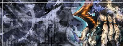
New sig from me:
Light~Nimbo-stratus
09-18-2005, 11:45 PM
That's just freaky, MePhIsTo.
My latest work is Omni's sig (and possibly his avatar if he's applied it).
MePhIsTo
09-18-2005, 11:52 PM
That's just freaky, MePhIsTo.
My latest work is Omni's sig (and possibly his avatar if he's applied it).
Lol, What do u mean by freaky?
heres my sig and avatar thanks to Light~Nimbo-stratus, i think there awsome
Light~Nimbo-stratus
09-18-2005, 11:57 PM
I mean it's freaky by 'it's freaky'
New Brushing Sig and Ava for Anyone:
Avatar:

Signature:

*Tifa*Aeris*lover*
09-19-2005, 08:21 AM
wow Light nimbo stratus i like that Sig and Avatar you done for Omni thats awesome
High Summoner Yuna
09-19-2005, 04:08 PM
My new sig:

Slash
09-19-2005, 04:19 PM
i like it mephisto its different so its cool in my books 9/10, light nimbo that sig and ava are boring as hell 3/10 and high summoner yuna i like it 8/10
MePhIsTo
09-19-2005, 05:04 PM
High Summoner Yuna that's very good! I like it!
7.5/10
new sig, same style...
Light~Nimbo-stratus
09-19-2005, 05:09 PM
That's because there isn't a render or text yet, idiot. Thanks for the compliment, T*A*L.
High Summoner Yuna
09-19-2005, 05:23 PM
Thanks Meph and Slash. =)
Light~Nimbo-stratus
09-19-2005, 05:56 PM
You like that render, don't you? And you like outerglow on your renders. That border is really light and hard to see on the right -----> side.
Slash
09-19-2005, 07:17 PM
High Summoner Yuna that's very good! I like it!
7.5/10
new sig, same style...
i like it i prefere it the other i have to say
9.5/10
chewey
09-19-2005, 07:17 PM
CHEWEY FTW
Slash
09-19-2005, 07:20 PM
oh btw what do people think of my new sig?
Shinryudan
09-19-2005, 09:22 PM
High Summoner Yuna that's very good! I like it!
7.5/10
new sig, same style...
Either refer me to the tut where you learned that or make one.... NOW!!!!
I really like the style of that. It is one of the best that I have seen on the shrine.
Light~Nimbo-stratus
09-19-2005, 09:57 PM
This is another one I made by fusing different tuts together:

*Tifa*Aeris*lover*
09-19-2005, 10:32 PM
light nimbo that sig and ava are boring as hell 3/10
I think its cool alot better than Some people can make at least your able to make sigs and avatars 7-8/10 for your redXIII set
Tidus 66
09-19-2005, 10:34 PM
Light nimbo you're sigs are only backgrounds...
1.5/10
MePhIsTo
09-19-2005, 11:11 PM
Either refer me to the tut where you learned that or make one.... NOW!!!!
I really like the style of that. It is one of the best that I have seen on the shrine.
Kinda lame I can't use any of those sigs in the shrine because since they're in .png format and that's a high quality format which is almost impossible to keep under 50kb...
Anyways you can find the tut on Gamerenders.com , just mess up with it!
Slash
09-19-2005, 11:12 PM
Light nimbo you're sigs are only backgrounds...
1.5/10
light nimbo that sig and ava are boring as hell 3/10
Aztroth
09-20-2005, 02:19 AM
well what do you guys think of my latest?

EDIT:

ok which one is better?
Light~Nimbo-stratus
09-20-2005, 04:24 AM
They're both good, I like them. Though, the first one's font is kinda hard to make out at points. What do you think of the one's I've made lately? I haven't put renders in them yet so people can choose what they want in them.
Shinryudan
09-20-2005, 11:49 AM
I say change the text on the 1st one so it is more readable. Also lighten up the border a tad. The first is definetly betterimo
1--- 9/10
2--- 7/10
Slash
09-20-2005, 02:23 PM
i think the text is easier to read in the second one but i prefere the 1st so 9/10 for the first and 8/10 for second
Light~Nimbo-stratus
09-21-2005, 05:16 AM
Yeaaahhh, what they gave. *blinks*
EDIT: Animated sig (I hope it isn't too grainy)
http://i19.photobucket.com/albums/b153/-Sephiroth-/User.gif
I got the idea for the text on a comercial that was on when I was putting the text in, lol.
chewey
09-22-2005, 09:33 AM
NEW SIG. \/
*Tifa*Aeris*lover*
09-22-2005, 09:38 AM
heh nice sig chewey
Slash
09-22-2005, 11:50 PM
NEW SIG. \/
lol
Danoth
09-23-2005, 05:54 PM
Hi all. Im kinda new here. I'v made myself a basic sig. What do you think?
Slash
09-23-2005, 09:39 PM
i like it apart from the text
Danoth
09-24-2005, 02:25 AM
what kind of text do you think would have suited it?
UltimateFFFan
09-24-2005, 06:12 AM
Perhaps a fire font to match the bg or even an blending effect on it. I've done some more work on SOTW Shin, I'll make the thread soon, and hope it gets stickied
EDIT: Latest Sig

May make it into a set if someone likes it, critique please
Slash
09-24-2005, 12:27 PM
wow thats pretty cool 9/10 although i think the text would look better in on of the corners
Jasmijn
09-24-2005, 08:42 PM
My new signature.. Any comments..?
UltimateFFFan
09-25-2005, 10:18 AM
wow thats pretty cool 9/10 although i think the text would look better in on of the corners
Well, the text is actually transparent, so there was the only place it could be seen, otherwise it would appear as black on black making it very hard to see, thanks for the rating though
Jasmijn, looks good, I'm not too keen on the colours though, 9/10, I'm thinking maybe all the sig makers on the Shrine should make a new gfx clan.
Anyway, I'm starting SOTW from tomorrow, all entries must be in by Friday 30th September. PM All entries to me, I'll then add them in the thread. To qualify for this competition, you must have made at least 5 sigs for the Shrine. Please PM me with queries
Slash
09-26-2005, 11:06 AM
My new signature.. Any comments..?
i like it its different from the rest of your work ^_^ 9/10
chewey
09-28-2005, 01:17 PM
duh.
Light~Nimbo-stratus
09-29-2005, 09:19 PM
4GET IT!!!
AmericanCommie7
09-30-2005, 02:42 AM
I have two that I don't use nearly as much as I should:


Light~Nimbo-stratus
09-30-2005, 07:15 AM
Good job, not my size, though.
8.5/10
My new sig/ava. *Points to da left and down, oh oh oh oh oh, to da left, and down, oh oh oh oh*
Tidus 66
10-01-2005, 05:20 PM
What do you think of my first sig? also is it according to the rules?
Denny
10-01-2005, 05:21 PM
Nice design and yeah i think it`s in the rules.
Elvanna
10-01-2005, 05:24 PM
wow! amazing! i like it tidus 66! nice job!
Tidus 66
10-02-2005, 12:02 AM
Thanks, i started making them today what do you think of my firsts?

(
http://imageshack.us)

(
http://imageshack.us)

(
http://imageshack.us)

(
http://imageshack.us)
Are they pretty bad??:P I still need to learn how to make borders and how to use brushes, and they're small :'(, but what do you think for starters?
UltimateFFFan
10-02-2005, 01:31 AM
Nice Tidus 66, they looked better than my firsts remember? I suggest you use game-tutorials and/or greycobra for your borders and brushes. Also, take a look at gamerenders, they may have some good tuts.
Just decided to get myself on deviantART, and this is my current gallery:
http://jimif.deviantart.com. Take a look, critique is always welcome, but please ask before using an image. Also, been using Terragen lately..... it's not too hard to use. The pass was created with it. It's basically a TERRAin GENerator as the name impies, I'm going to start on some sunsets soon, and perhaps get my hands on a copy of Bryce, similar to Terragen but better
Tidus 66
10-02-2005, 01:37 AM
The psychotic neurosis is already my pc wallpaper i love it, the Pass is also great, thanks for the advice, i think in a while i'll enter the devianart
btw what does terragen bring new?
Light~Nimbo-stratus
10-02-2005, 02:19 AM
Ahem
My new sig/ava.
Shinryudan
10-02-2005, 02:36 AM
could someone point me to where I can get terragen. Also dirge, could you send me a link or too for tutorials to 3D MAX, I may come into possesion of one soon.
And could someone rate LNT's sig, I'm not in the mood.
oh and here is a new template for a site I am doing, I'll edit in the finished copy when i am done.

UltimateFFFan
10-02-2005, 07:56 AM
http://www.planetside.co.uk/terragen/
That's the official download site, it's free for non-commercial use as well, so happy making lol.
EDIT: Here's a link to the latest world I've made on Terragen
http://www.deviantart.com/deviation/23566168/
Tidus 66
10-02-2005, 11:22 AM
Great sunrise there ;)
Shinryudan
10-02-2005, 01:29 PM
o I think I'm gonna love this program...
and yes, I love the light in that one.
Well I got a new sig, I'll animate this one soon probably.

UltimateFFFan
10-02-2005, 04:39 PM
Nice sig shin, 7/10 at the moment, I'll reserve final judgement until it's animated though.
Just made a desktop bg, using some new brushes, and this is the result:
http://www.deviantart.com/deviation/23576256/
It's a rather large file, so don't expect it to load too quickly
Shinryudan
10-03-2005, 10:10 PM
A revised form of my website that I posted a while back. This time I used a color scheme generator.

Slash
10-04-2005, 12:20 AM
Thanks, i started making them today what do you think of my firsts?
(
http://imageshack.us)
(
http://imageshack.us)
(
http://imageshack.us)
(
http://imageshack.us)
Are they pretty bad??:P I still need to learn how to make borders and how to use brushes, and they're small :'(, but what do you think for starters?
i like them....the sephiroth one more than the rest....nice job !
Light~Nimbo-stratus
10-04-2005, 02:05 AM
So your class of 2009 shin? Good job on the sig and other stuff. I'm class of 2047. jk
I can't figure out how to save my image in 3D on Terragen, how do you do it?
Heero Avaren
10-04-2005, 08:41 AM
Made this really quick. Not much, but I think it's better than no avatar, right?
Light~Nimbo-stratus
10-04-2005, 04:14 PM
How did you make it?
Shinryudan
10-04-2005, 11:11 PM
he took a pic, cropped it and stuck a border on it.
also was digging around my old files today found my first sig.

makes me go wow...
Oh and an animation I just figured out from a comercial
http://img45.imageshack.us/img45/7661/movingpeices8mg.gif
And another one with my name.
http://img185.imageshack.us/img185/6331/movingpeicesname7rq.gif
Light~Nimbo-stratus
10-05-2005, 01:33 AM
Good animations. I see that lots of people didn't know how to put borders on pics.
High Summoner Yuna
10-06-2005, 04:14 AM
Another of mine, this isn't anything special, just a screenie with some lyrics on it, lol.

High Summoner Yuna
10-06-2005, 04:15 AM
Another of mine, this isn't anything special, just a screenie with some lyrics on it, lol.
Bugger, double post. Sorry, the computer lagged.
UltimateFFFan
10-06-2005, 04:14 PM
Nice, 8/10, shame it extends beyond the border though, try doing a 321 border, do edit>stroke 3px in white, then edit>stroke 2px in black and finally edit>stroke 1px in white, makes a nice simple border.
I've got some more images on jimif.deviantart.com, take a look
Tidus 66
10-06-2005, 07:50 PM
New sig, used borders and made a background what do you think?

(
http://imageshack.us)
I still need to re-size it...
Shinryudan
10-06-2005, 08:01 PM
Nice, 8/10, shame it extends beyond the border though, try doing a 321 border, do edit>stroke 3px in white, then edit>stroke 2px in black and finally edit>stroke 1px in white, makes a nice simple border.
I've got some more images on jimif.deviantart.com, take a look
Hehehe, you mixed that up a bit, that gets you an odd white border. Look at the tut in artdiscussion for it.
UltimateFFFan
10-06-2005, 08:11 PM
Oh yeah, sorry I havent used one in a while, what with making all my desktops, I've not had to use a stroke in while.
Light~Nimbo-stratus
10-07-2005, 05:38 PM
Hmmm, maybe I should make a different one that isn't as simple as my current...I KNOW!!! I'll use my second tut I made to make it a abstract nightvisionish sig, this time I'll use a render of something too.
Good one hsy, I like how the text goes beyond the border,
8.5/10
Tidus 66, if I still liked you, I would say it was good, but I don't anymore, you asshole...
Tidus 66
10-07-2005, 05:40 PM
I did nothing to you i just sayed to stop being an asshole to everybody
Danoth
10-07-2005, 06:02 PM
Woo. New sig image people.
Check it. I think it looks the part.
Edit: Added a border as per UFFF's Comment
NEW SIG
Added another sig so thought i may as well show off in the same place.
BOW DOWN TO CHE!

UltimateFFFan
10-07-2005, 06:05 PM
Looks good Danoth, perhaps add a border?
Danoth
10-07-2005, 07:37 PM
Made a new sig again. On a roll tonight lol
Here it is
Danoth
10-07-2005, 09:46 PM
and another :P
Slash
10-07-2005, 11:31 PM
woah nice danoth...very nice
Danoth
10-07-2005, 11:38 PM
on a roll man. Need requests now lol
Slash
10-07-2005, 11:44 PM
Danoth
10-07-2005, 11:51 PM
I think i may just do that. What do you think of the sigs then?
MePhIsTo
10-07-2005, 11:59 PM
Slash
10-08-2005, 12:01 AM
wow there all great but i like the last one the most out of all of them
Danoth
10-08-2005, 12:14 AM
nice. very nice, like the 3rd most
MossY
10-08-2005, 12:38 AM
You know MePhIsTo, you're unbelievably good at sig making
Danoth
10-08-2005, 12:54 AM
how bout my sigs?
MossY
10-08-2005, 01:03 AM
Kind of gothicy but I'm impressed by all of them, although the one saying abstract was a little plain. The Che Guevara one and the Roses Are Red ones are brilliant though
UltimateFFFan
10-08-2005, 02:13 AM
I Agree
Danoth
10-08-2005, 02:14 AM
Thanks :)
Light~Nimbo-stratus
10-08-2005, 05:53 AM
I did nothing to you i just sayed to stop being an asshole to everybody
Read some of the other posts I've made about you in other threads, then you'll know why I don't like half of the people of FFS anymore, like Slash, and the leader of the people I dislike and changer of my name, Sarah.
UltimateFFFan
10-08-2005, 07:07 AM
If you're lucky, you'll recieve a ban. If you're not, you will have your posts removed as well......
Danoth, what I'd like to know is how you added a comment from me when I was no longer at your house :p
Not that I'm bothered
Anyway, heres another by me, up for grabs if anyone wants it:

Slash
10-08-2005, 10:10 AM
Read some of the other posts I've made about you in other threads, then you'll know why I don't like half of the people of FFS anymore, like Slash, and the leader of the people I dislike and changer of my name, Sarah.
lol and would you please post a link to these 'threads' i would like to see what youve wrote about me...i find that quite ironic because no one likes you either
Danoth
10-08-2005, 01:57 PM
this thread started as Sig Showoff, lets keep it that way eh?
Don't turn it into the "Bitch comment of the month" thread.
Danoth
10-08-2005, 02:19 PM
Heres another sig of mine
made just. Im getting back into this.
Shinryudan
10-08-2005, 05:17 PM
Hmmm I don't much like the colours in that one. It looks like it is on soft or hard light effects, I say change that. It seems really plain and I think the border is pushed way too far into the
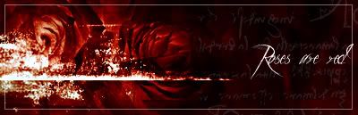
sig.6/10
I personally love the red roses signature. The renders and colors blend in very well and the the white grunge adds taste to it nicely.
8.5/10
MePhIsTo
10-08-2005, 07:34 PM
NEW:
UltimateFFFan
10-08-2005, 10:42 PM
Danoth, try not to double post, use edit if you want to say something else
EDIT: Like so, nice new sigs btw, and Mephisto, another nice sig from you.
Danoth
10-08-2005, 11:07 PM
very nice. like it
Slash
10-08-2005, 11:56 PM
nice sig for meph and danoth
Shinryudan
10-09-2005, 12:21 AM
Ok, this didn't turn out too well for what it was intended as. This was my test run on CS2.

If anyone can see this, please tell me. I can't see it so either the link is dead or my comp is...
Danoth
10-09-2005, 12:47 AM
Another new sig. Decided take some work off LNS's hands. Hope doesnt mind :P
here

Shinryudan
10-09-2005, 02:04 AM
^ already gave my two cents in other thread, it just seems to near grayish to me.
new one for kadaj

and the one I posted before.

UltimateFFFan
10-09-2005, 06:07 AM
Ok, this didn't turn out too well for what it was intended as. This was my test run on CS2.
If anyone can see this, please tell me. I can't see it so either the link is dead or my comp is...
See what......
Danoth, nice sig, I'm going to start making some more again, I've had enough of desktop bg's
Shinryudan
10-09-2005, 04:16 PM
See what......
Danoth, nice sig, I'm going to start making some more again, I've had enough of desktop bg's
One of my uploading sites wasn't working. I reposted it.
Slash
10-09-2005, 06:35 PM
nice shin i like the 2nd one the most...good job!
High Summoner Yuna
10-12-2005, 01:53 AM
suteki da ne
10-12-2005, 08:32 PM
okay so I'm new here so I thought let's post sum art of mine ... but since the computer crashed I can only post one sig and an animation cause the rest has vanished
 http://img323.imageshack.us/img323/4435/animation20zu.gif
Shinryudan
10-12-2005, 08:33 PM
Really like the photo style, though I have seen it done(was it huntress?) before. The edges of the photos have a rather sharp feel so I think you should add a touch of feathering. Also its hard to discern between the different picture frames so you should add a tiny bit of shadowing. Also you may want to consider setting some old paper over it on overlay to give it an old photo type feel.
7/10 from me.
Personally I much prefer your current sig because the blending of images is so nicely done.
9/10 for that one
The one that you showed of is way too light or white for my tastes. Also the text doesn't much match the signature. The pixel font typed "Yuna" in the upper right-hand corner leads some to beleive that that is the creater. I'd just make the size a bit bigger. Also on the bottome of the sig there is a small stretch of pixels which are jutting out of the main sig. Because of how your sigs are made you don't need a border in my opinion. 6/10
If the animtion is part of the sig then it is too tall and doesn't match the sig size. Also it seems to just be a repeating movie, I cannot pass judgement however for I have not as of yet put any movies into my sigs.
And a nice large list of my current portfolio of favorites.
http://img423.imageshack.us/img423/6056/ashersig6lx.gif

 http://img408.imageshack.us/img408/4056/movingpeicesname4kd.gif


 http://img408.imageshack.us/img408/520/sig1tw.gif


suteki da ne
10-12-2005, 08:52 PM
thx for the comment :) I dunno how that cut out pixel thingy came cuz it wasn't in there before... i guess imageshack messed it up... I actually did not make my current set someone I know made it for me. also the animation was an avatar of mine on a different forum so that's why it probably doesn't match the sig :D thnq for the commenting though :D
Shinryudan
10-12-2005, 08:59 PM
Drop by the sig workshop if your looking for something to do.
suteki da ne
10-12-2005, 09:03 PM
Drop by the sig workshop if your looking for something to do.
I will as soon as I get my computer back... and installed ps and psp again ;)
Sujin
10-13-2005, 05:49 PM
was it huntress?
No, jasmijn was the one that did the 3-box style.
UltimateFFFan
10-14-2005, 04:57 PM
Yeah, didn't RaineLoire have one made by huntress though, very similar to that?

My new sig, and the first I've tried with CS2. Comments Please.
Huntress Krystle
10-14-2005, 11:19 PM
Sujin: I believe I was the one who started the 3 slanted box thingies here. I made one for ff gurl late last year :)
UltimateFFFan: I only made one sig for raineloire and that's the raine/laguna sig she's using :P
As for your sig, I like everything about it except for the border :(
Light~Nimbo-stratus
10-14-2005, 11:48 PM
I like all of the sigs recently posted, 'specially Shinryudan's sigs.
Powered by vBulletin® Version 4.2.4 Copyright © 2019 vBulletin Solutions, Inc. All rights reserved.
