Pages :
1
2
3
4
5
6
7
8
9
10
11
[
12]
13
jewess crabcake
10-23-2007, 11:23 PM
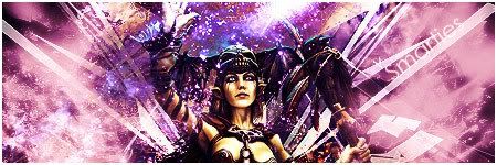
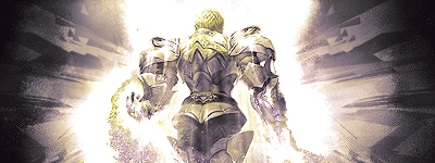
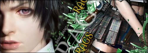
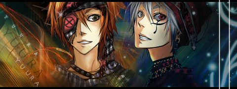
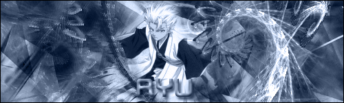
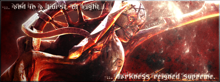
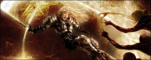
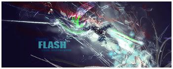
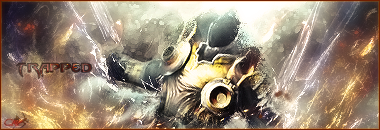
new one, had to keep the thread alive.

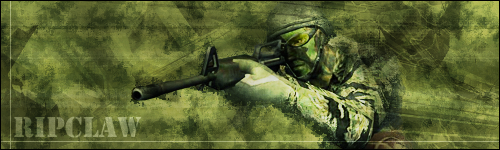
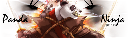
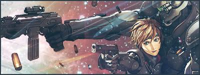
brotherhood619
10-23-2007, 11:25 PM
now thats cool
where did you learn to sig something like that
is it all one render
jewess crabcake
10-23-2007, 11:34 PM
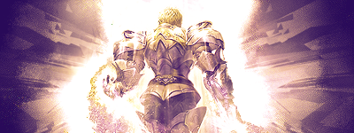
wow that's fast!:)
It's a ut3 render, a c4d set to soft light, and a bit of sharpening and to add a 3d illusion. And a sparkle brush b/g with a bit of hue and contrasting.
Wow that sounds more difficult than it actually was.
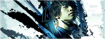
mtbanger
10-24-2007, 01:39 AM
Heya... I was here a while back (I think requesting sigs), none of you will remeber me (I barely posted) but I since decided to start making sigs myself:
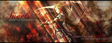
- Latest.
comments or crit?
jewess crabcake
10-24-2007, 03:34 AM
nice! the focal gets lost in the lighting and b/g though, but such is expected in a sprite sig.
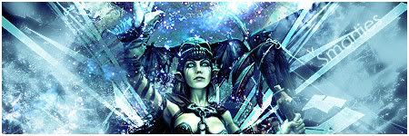
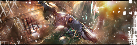
new UT sig
jewess crabcake
10-25-2007, 04:47 PM
any comments?
shadukai
10-26-2007, 07:09 PM
Is that a c4d on front of the gun?
jewess crabcake
10-26-2007, 07:39 PM
mmhmm I merged the c4d to look like it comes out the gun
brotherhood619
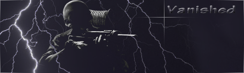
10-26-2007, 08:01 PM
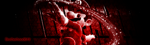
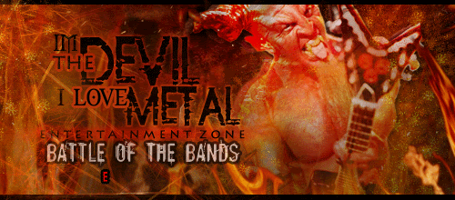
thought id post this one that was done as a request

smarties add a bit of a brigtness/contrast to it and it will look good
mtbanger
10-26-2007, 10:10 PM
Only problems are the text and render.. I dunno if you can do anything about the render (was it specifically requested?) But as for the text, just change blending modes, or the raw text's colour. Maybe scale it doen, and put it just above the renders shoulder.
---
Comments on this one?
jewess crabcake
10-26-2007, 11:42 PM
Both are super but it looks like some conflicting lighting, BH the lighting is hitting the chest when his face has a lot of shading, and mtbanger, the lighting on the neck, try moving it up and to the left.
mtbanger
10-27-2007, 02:52 AM
Mm, I had that thought, but I did some dodgey stuff on the layers above, which meant that the lighting would be cut off sharply if I moved it up there.
That'll teach me for taking the easy road >.<
J. Peterman
10-28-2007, 02:59 AM
My signature is awesome.
stenchlord
11-09-2007, 06:33 PM
I got bored so put together one for my anime list.
Click to see my anime collection :) Yes the link is also posted above the sig in case people don't read the text on the signature :p
shadukai
11-21-2007, 02:10 AM
Looks alright, the background is kinda too dark though.
I made a cd cover for a project in class. The girl is my girlfriend, and I can upload the cd for you guys if you want. Tell me what you think, and be honest.


stenchlord
11-21-2007, 02:29 AM
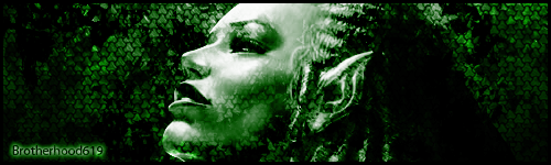
I made another signature for another forum since the maximum size here was too small.
 http://i195.photobucket.com/albums/z302/stenchlord/LSsig2-1.pnghttp
://myanimelist.net/signature/stenchlord.png


(
http://myanimelist.net/animelist/stenchlord&sclick=1)
The recently watched list updates when I change my anime list. It obviously gets changed after I watch something. The signature is four images around the ever updating last watched anime list.
So looks like this :
[Image1]
[Image2][animelist updates][Image3]
[Image4]
I quite like this one :D
shadukai
11-21-2007, 02:43 AM
No one's gonna critique your work unless you critique ours.
J. Peterman
11-21-2007, 03:07 AM
STENCHLORD AWESOME A+!
stenchlord
11-22-2007, 07:34 AM
No one's gonna critique your work unless you critique ours.
Have a look at my posts carefully. No where does it say that I want people to "critique" my work. If people want to comment they can, if not then that's fine.
This is the "Signature Show-off Thread" not the "Critique my Signature Thread".
STENCHLORD AWESOME A+!
Thanks dude, I was thinking about making a pokemon one :p
brotherhood619
11-22-2007, 11:30 AM
Have a look at my posts carefully. No where does it say that I want people to "critique" my work. If people want to comment they can, if not then that's fine.
This is the "Signature Show-off Thread" not the "Critique my Signature Thread".
that as the case may be but there are people here that want to get better and they usually get the better tips from the first post (because nobody else has said anything at the moment) but by just posting yours and not commenting it sortof steals the limelight. commenting & critique has become general practice here.
Shad: The album cover is ok but i think the main problem is everything is colourful except the girl (dont worry im not saying any thing bad about her!). the way she is dressed doesnt match the album cover. :S i had to tread carfully there lol.
stench: its ok but wont it be a bit tedious having to change it everytime?
stenchlord
11-22-2007, 02:17 PM
that as the case may be but there are people here that want to get better and they usually get the better tips from the first post (because nobody else has said anything at the moment) but by just posting yours and not commenting it sortof steals the limelight. commenting & critique has become general practice here.
Shad: The album cover is ok but i think the main problem is everything is colourful except the girl (dont worry im not saying any thing bad about her!). the way she is dressed doesnt match the album cover. :S i had to tread carfully there lol.
stench: its ok but wont it be a bit tedious having to change it everytime?
Cheers for that mate, I can totally understand and it's more than fair enough. To be honest I merely don't post anything since I really can't be bothered. It's nothing personal against the forum members I'm just lazy. It's cause of this that it doesn't matter if someone comments on mine or not or whether they pay attention or not.
As for the being tedious changing it all the time I'm not sure what you mean? The anime updates takes care of itself. The actual anime updates that happen on it are automatic when I change my animelist :)
You can sign up for it too -
http://myanimelist.net
When you add something to your list e.g. You've watched another episode of Naruto so you go to your site ( mine -
http://myanimelist.net/animelist/stenchlord ) edit your anime list to include the new episode you've just watched. That episode then appears automatically on the table I've got in the sig.
brotherhood619
11-22-2007, 08:54 PM
Cheers for that mate, I can totally understand and it's more than fair enough. To be honest I merely don't post anything since I really can't be bothered. It's nothing personal against the forum members I'm just lazy. It's cause of this that it doesn't matter if someone comments on mine or not or whether they pay attention or not.
As for the being tedious changing it all the time I'm not sure what you mean? The anime updates takes care of itself. The actual anime updates that happen on it are automatic when I change my animelist :)
You can sign up for it too -
http://myanimelist.net
When you add something to your list e.g. You've watched another episode of Naruto so you go to your site ( mine -
http://myanimelist.net/animelist/stenchlord ) edit your anime list to include the new episode you've just watched. That episode then appears automatically on the table I've got in the sig.
So you upload the signiture with the images you want on it then it will edit the image and change it everytime
i dont watch enough anime to warrent me signing up, im more a comedy man meself
stenchlord
11-23-2007, 03:25 AM
I'll show you lol.

That updates itself, the pictures surrounding it remain the same.
e.g. I'm now going to update my list to include the next episode of minami-ke that I've just watched.
Here's a couple of my own that I've done over time;


Some from my dA;


Yeah they're not all that great yet, but I'm trying. And also this is sorta unrelated but I do requests.
J. Peterman
11-27-2007, 03:48 AM
WOW YOU GUYS MAKE AWESOME SIGNATURES ESPECIALLY THAT ONE WITH A FIREBALL!
mojox13x
11-27-2007, 04:07 AM
*skips directly to last page*
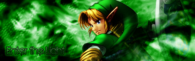
Kuroe-Chan, i love how your Zelda sig "sticks out".
J. Peterman
11-27-2007, 11:33 PM
LOOK AT THIS BANNER I JUST MADE!

brotherhood619
11-27-2007, 11:35 PM
Here's a couple of my own that I've done over time;
Some from my dA;
Yeah they're not all that great yet, but I'm trying. And also this is sorta unrelated but I do requests.
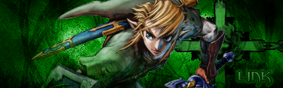
the zelda one hit it right on the head me thinks Good Work
Ash: Why do you even bother?
J. Peterman
11-27-2007, 11:38 PM
IT IS AWESOME WORK!
brotherhood619
11-27-2007, 11:41 PM
but thats a critique's field day!
atleast make it look like you tried to make something relatitvly decent.
J. Peterman
11-27-2007, 11:42 PM
MAN THAT TOOK ME FIVE HOURS!
J. Peterman
11-28-2007, 08:05 AM
hasbandxsnbcxnas nnabn cdsavc dxgh
!!!
Many thanks everyone. If anyone wants to know how to make a "pop out" sig I would gladly tell. =)
stenchlord
12-02-2007, 06:48 PM

I love this one :D
KimmehWolfwood
12-02-2007, 08:02 PM
The one I'm using for my sig now is the latest of mine.
I'm thinking of making more.. Hm.
I really like the Zelda pop-out one.
thanks.
Beat yours are amazing =)
jewess crabcake
12-03-2007, 01:15 AM
New sigs been about 3 months since I made one, but I like 'em
v1
v2
v3
The first one is very nice. A little too bright at the top, imo. But they're so nice.
Hayden
12-03-2007, 09:41 AM
sup guys, new sig i made for my friend (ps. first post lol).

My newest is the one I'm currently using. It's kinda light, I admit.
jewess crabcake
12-03-2007, 10:12 PM
You don't have a pic in your sig.
Wtf, that's weird, okay here:

KimmehWolfwood
12-03-2007, 10:35 PM
Try making your sigs in a format other than jpeg. It makes it look fuzzy/blurry.
.gif or .png work wonders. =]
Thanks but that's how I decided to make the backround of my sig. ^^;;
Unless you mean Link too, then we have a problem.
KimmehWolfwood
12-03-2007, 10:51 PM
Ah well if that's the way you intended it, haha. Don't mind me.
Link's a little fuzzy, but I guess I'm just used to .PNG now.
Too bad those files are huge though.. That's why I use a .GIF sig on here. Everywhere else I have .PNG file sigs.
Shinryudan
12-07-2007, 01:38 AM
Contrary to what some people might have thought, I didn't die. I just forgot about photoshop and started using illustrator a lot more.
some new stuff.


and a template I am working on for a friend.

stenchlord
12-07-2007, 08:57 AM
The metroid one is pretty cool. I think I'd have liked to see more contrast in it and have it in a little sharper.
I got bored with mine so made a new one for some other forums. I wish I could use them here but alas I can't :(
 http://i195.photobucket.com/albums/z302/stenchlord/ichigo2.pnghttp
://myanimelist.net/signature/stenchlord.png


(
http://myanimelist.net/animelist/stenchlord&sclick=1)
shadukai
12-16-2007, 04:26 AM
New sigs been about 3 months since I made one, but I like 'em
v1
v2
v3
V1 or V2 is better, simply because single color sigs are ugly. If I were you I'd look into color harmonies, and if possible edit one of those to follow it. Then it'd be even better than it already is.
7/10
sup guys, new sig i made for my friend (ps. first post lol).
Looks like a tutorial result, to be honest. Really nice though, I just wish the picture of the girl was better. 6/10
Contrary to what some people might have thought, I didn't die. I just forgot about photoshop and started using illustrator a lot more.
some new stuff.
and a template I am working on for a friend.
You're over-sharpening on some parts, avoid doing that so it doesn't look as tacky. The metiod one is really creative, I like it! I really like the lighthouse one too, it's purdy.
1st 9/10
2nd 7/10
3rd 6/10
---------------
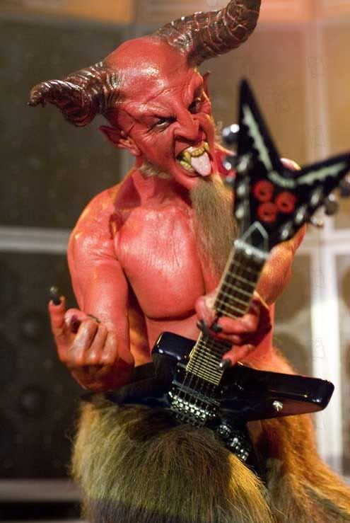
Here's on I made of a friend. It's not a sig, I know, but I love how it turned out.
Shinryudan
12-25-2007, 01:43 AM

Another request for someone in the SoC gaming clan. MC on the left and Arbiter on the right. My name is on there somewhere towards the center in a pixel font. made for on 'alyshora.'

Yeah this is one of my newer ones (had a commission lately) so I was bored and made this one. It's Searchman. Yeah I know the text is kind of impossible to read.
jewess crabcake
01-02-2008, 05:21 AM
Megaman.exe is so great. And that sig is beautiful. Anywhoo here are my recent endeavors

v1
v2

v3
v4
Those look great to me, the only thing is they need just a little more bloom.
I have to ask you, do you use Gradient Maps, Ultra? If you did you did a great job. I only used 3 on that one I did and it didn't come out quite the way I hoped!
Fantastic job, V4 looks the best to me!
jewess crabcake
01-06-2008, 10:55 PM
Thanks, and yes I use gradient maps as well as other layer enhancements, Brightness/Contrast and curves and .etc.
Seriously you've got to tell me how you made that sig. It appears to be a motion blur/ Gaussian Blur with a different layer blend and some pen tooling. Mir?
jewess crabcake
01-11-2008, 03:53 AM
My latest sig per someone's request.
Amon666
01-11-2008, 03:06 PM
My latest sig per someone's request.
nice sig, just change the border, and try to find better font...the rest is pretty cool :D
jewess crabcake
01-11-2008, 06:19 PM
thanks, but I couldn't Find a text to go with that theme.
jewess crabcake
01-18-2008, 01:42 AM
A new sig I did via request I'm quite fond of the outcome.
brotherhood619
01-18-2008, 01:31 PM
i think im just gonna go back to calling you smarties cos you are always changing your name lol
that does look good smarties well done
ok i think i might aswell post what ive been doing scince i last posted here

They are all for requests so i havent put as much thought into them as i could have done
This one was for me:
and im not sure if ive shown this one :S but its my best so far:
jewess crabcake
01-18-2008, 03:54 PM
I love the last two, and the first one could use a bit of lighting.
Shinryudan
02-03-2008, 09:12 PM

As a request for a guy on another forums. Played around with some effects on the render. The original stock can be found on www.crimsonjassic.com
1Tz XGen
02-04-2008, 01:39 AM
I didnt think the one i'm using as my defualt would stick out so much (The black and the lighter black)
But hey i'm a noob to photoshop.
And yours is beautiful.

(
http://imageshack.us)

(
http://imageshack.us)

(
http://g.imageshack.us/g.php?h=502&i=sig2mj8.jpg)
jewess crabcake
02-10-2008, 08:44 AM
Nice job Itz Gen, just try more effects, and a better background.
My first vert sig
H8472
02-16-2008, 03:40 PM
Very great signatures!
UltimateFFFan
02-16-2008, 04:25 PM

First I've done in a while
Well no one's seen me in a long time!
So here's a requested pop-out sig! I actually like this quite a lot, except for the text. =/

jewess crabcake
02-22-2008, 06:58 AM
That's very good, but you should try adding a bit of blue, because there is color clash with your blending. Also instead of blending use depth, i.e. blur the bottom steadily decreasing the blur then slowly start sharpening to add distance.
Rainbow Boogers
02-22-2008, 07:13 AM
jewess crabcake
02-22-2008, 12:45 PM
I like your first vector sig, the rest are good I just don't know what I'd do to them. Good job though.
all_we_know
02-23-2008, 02:16 AM
ah you guys are awesome. i've always wanted to learn how to make sigs and graphics, but idt i have the patience for it :erm:
but is there a thread where i can make a request for a sig or can i just PM someone willing too?
valve
02-23-2008, 07:03 AM
well i do alot of photoshop for people and i was playing dead rising so i got a a hold of there web designer and he sent me all kinds of blank background images so i made one with me in it lol looks like im up to my neck in zombies i do photoshop pics for any one that asks ive even made silent hill fan cd covers and the half life opposing force and blue shift covers among others
jewess crabcake
02-23-2008, 07:24 AM
that sig is huge. it'll be removed. it's good but check your lighting.
valve
02-23-2008, 07:41 AM
that sig is huge. it'll be removed. it's good but check your lighting.
Ya i wasent really concernd with that lighting it was just a simple drag and drop blood effects but i thought it would look cool as if the sun was beaming in from th doors maybe i kinda over lighted it but whatever thanks tho
Starscream
02-23-2008, 02:19 PM
Your work has really come on Jeff. Last I checked you donned a rather amateurish style but I'm far more impressed with what's begin produced now.
Nice work.
jewess crabcake
02-23-2008, 03:32 PM
Thanks I've been trying to redo my style, but there is always room for improvement. Recently I made a web template for my new domain I'll show it when my site is up.
UltimateFFFan
02-24-2008, 01:28 AM
ah you guys are awesome. i've always wanted to learn how to make sigs and graphics, but idt i have the patience for it :erm:
but is there a thread where i can make a request for a sig or can i just PM someone willing too?
PM any sigmaker, or post in the Sig Workshop. It's found in Questions, Feedback, Assistance
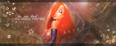
Lillithiel
03-02-2008, 09:38 AM
Most of my work is too big to use here because it was designed for friends on a different forum... but I'll link anyone who has a curious eye ^^ that I dont get in trouble for being new a posting images 500x350 that might not be allowed.
Sig 1 (
) w/ Ava (
)
Sig 2 (

) w/ Ava (

)
Sig 3 (

) w/ Ava (

)
Sig 4 (
) w/ Ava (

)
And of coarse I made the DMC set that Im sporting now just earlier tonight. :D
I've got a bunch more, but I wont bore you with them all at once.
And if anyone would like to see the original images or renders, I'll be happy to post those too. ^^
H8472
03-02-2008, 10:33 AM
They look very professional!
How much time do you needed?
Lillithiel
03-02-2008, 10:38 AM
They look very professional!
How much time do you needed?
Wow, Thanks ^^
about 2 hours usually, give or take depending on the image(s) and what Im wanting to do with it.
jewess crabcake
03-02-2008, 12:59 PM
I like your style, I can never get brush sigs down, mine always look so flat. Your sigs are great, but you should add a few effects. Paint sigs are good but adding a little flare makes it great.
Lillithiel
03-02-2008, 07:43 PM
Thanks for the advice Jeff - I'll try that. I tend to over clutter my sigs with images and brush effects and leave no room for a cool effect background, or if I have a cool effect background I cover it up. XP Still working on that.
Perhaps you can offer me a few more pointers? I work on Ps CS2 at the moment.
jewess crabcake
03-02-2008, 08:09 PM
A simple way to get nice effects is to use C4Ds, go to PlanetRenders.net they have quite a selection. you'll have to join though (it's free).
Lillithiel
03-02-2008, 08:44 PM
I checked it out! Thats kickin! Thanks much Jeff!
To return the favor, check out getbrushes.com for a wide variety of cool effect brushes-- its free too and I've never caught anything bad from downloading there. Im sure you know your stuff, but a few friendly tips are still cool to share, right? ;) To help keep your brushes from looking flat try adjusting the opacity and mess around with your layer settings. I use outer glow and bevel probably the most with brushes. Put each brush effect on a different layer so that you can change the settings to find a nice blend of different effects. And of coarse changing the direction of the image or brush by using the free transform too can give a totally different look to it too.
Thanks again for the link!
Lillithiel
03-03-2008, 07:25 AM
I made this one tonight and tried to apply more effects. Its hard trying to break into a new style. Whatchya think? any better?
MaschineScreams
03-03-2008, 03:30 PM
Awesome!
I love the sense of duality you managed to convey through the content, tones and colors. I also like how the layered text on the left helps balance out the image, so the CG clutter on the right doesn't totally dominate everything...it's still somewhat distracting though.
Maybe you could use the screen or overlay tool over the bottom-right portion so it isn't the only crisp part of the image?
But that's just a friendly suggestion. ^^
Lillithiel
03-03-2008, 09:14 PM
Hey thanks.
Yea I was worried that piece might have made the image too busy, but when I removed it or flattened it the space became to empty and then Dante's side was then too dominate. I think I'll mess with it a little bit more. Im not displeased in how it turned out but I dont think Ive hit the nail on the head either. My goal was to create an image that showed the differences and similarities between these two characters while using the game/character theme colors. Im glad to see you liked that. ^^
I appreciate the critique. The more feedback you all give me, the better off I am at making something of better quality. My thanks again.
jewess crabcake
03-03-2008, 10:09 PM
Vey good! It looks really nice you may want to tone down the b/g, because your images aren't sitting together right. Try some blending, and get some lighting in there.
Lillithiel
03-03-2008, 10:57 PM
Thanks Jeff ^^
yea its lacking a focus point, isnt it? The main image (where they are pointing guns at one another) was really dark to begin with, I actually added a lot of light but maybe changing the angles will help. I'll mess with it more tonight. ;)
I look forward to seeing more of your images, I think you're quite good.
J. Peterman
03-07-2008, 05:36 AM
here is a signature i made for myself

Shinryudan
03-17-2008, 11:24 PM

Did some decal and scarring to it.
brotherhood619
03-17-2008, 11:25 PM
cant even see what it is
jewess crabcake
03-17-2008, 11:27 PM
yeah it is a bit hard to make out.
Shinryudan
03-17-2008, 11:46 PM
Its a Gundam. A gundam with really big guns.
Made a plank with my tablet. The bottom is the only part I really like on it, where I got the textures down. Took me 2.5 hours.

Lillithiel
03-18-2008, 07:03 AM
It looks pretty cool to me. I love using Adobe Illustrator for things such as that-- then you can always pop it into Photoshop for some last minutes details. And actually the bottom looks pretty good, the side of the plank could use a small hint of black to cast a stronger shadow to indicate the dimention a little more, but other than that, its pretty snappy.
I do alot of graphic work and sig requests on another forum... here's some of my latest for a few friends...
Avatar and Sigs:

brotherhood619
03-18-2008, 09:40 AM
well youve certainly got a way with text, thats the problem with mine most of the time
the bg doesnt seem to fit the top one tho
jewess crabcake
03-18-2008, 01:17 PM
Its a Gundam. A gundam with really big guns.
Made a plank with my tablet. The bottom is the only part I really like on it, where I got the textures down. Took me 2.5 hours.
That is very good, my only complaint is around the end it seems as though it's gets bulgy and round.
It looks pretty cool to me. I love using Adobe Illustrator for things such as that-- then you can always pop it into Photoshop for some last minutes details. And actually the bottom looks pretty good, the side of the plank could use a small hint of black to cast a stronger shadow to indicate the dimention a little more, but other than that, its pretty snappy.
I do alot of graphic work and sig requests on another forum... here's some of my latest for a few friends...
Avatar and Sigs:
I see you are using the C4D's now. Your sigs are very good, what you need to add now is:
1)Lighting- This can make your picture seem very realistic if it is used correctly, and it adds a bit of subtle shading
2)Gradient Maps-This can dull out the color or give it some gentle hue, if you want to see these used to their fullest put a few Gradient maps and play around with the layer mode. Photo filters help as well
3)Blending- Your focals stick out too much.
4)Adding Depth- Use the sharpen tool on your focal and the blur tool, not too much though, on your back ground. Keep doing that until when you look at it your eyes see some distance. Use the sharpen tool until you start to see noise then go back a step. Sharpen tool really helps.
brotherhood619
03-18-2008, 06:57 PM
damn smarties/ultra/jeff i remember when i was in my prime and you was just starting now your startin to make me feel like a beginner
jewess crabcake
03-18-2008, 07:00 PM
lol, you still have some primo stuff BH619.
Shinryudan
03-18-2008, 07:53 PM
damn smarties/ultra/jeff i remember when i was in my prime and you was just starting now your startin to make me feel like a beginner
Welcome to the club.
J. Peterman
03-18-2008, 08:17 PM
Lillithiel
03-18-2008, 10:42 PM
I see you are using the C4D's now. Your sigs are very good, what you need to add now is:
1)Lighting- This can make your picture seem very realistic if it is used correctly, and it adds a bit of subtle shading
2)Gradient Maps-This can dull out the color or give it some gentle hue, if you want to see these used to their fullest put a few Gradient maps and play around with the layer mode. Photo filters help as well
3)Blending- Your focals stick out too much.
4)Adding Depth- Use the sharpen tool on your focal and the blur tool, not too much though, on your back ground. Keep doing that until when you look at it your eyes see some distance. Use the sharpen tool until you start to see noise then go back a step. Sharpen tool really helps.
Jeff is going to turn me into a GFXer yet. Thanks so much for the notes. I'll put 'em to use and then come back for some more, hahaha
Shinryudan
03-19-2008, 02:34 AM
As far as C4D work goes, if you're going to use them, at least try to use your own. Their nice, and usually free to use, but its not really all yours if you know what I mean. Personally, I think the more you can create in an image and still keep the focus, the better.
jewess crabcake
03-19-2008, 02:39 AM
Yeah, I've been meaning to try my own, but I don't know what program to "get".
Landlord of Sector 7
03-19-2008, 03:27 AM
how about the program C4D ;)
jewess crabcake
03-19-2008, 03:29 AM
It's actually called C4D? Oh yeah, man I feel stupid, lol.
Shinryudan
03-19-2008, 03:41 AM
It's actually called C4D? Oh yeah, man I feel stupid, lol.
Good programs would be:
Cinema 4th Dimension (C4D)
3D Studio Max
Blender (cheap, free, mediocre)
jewess crabcake
03-19-2008, 03:50 AM
Thanks I'll check this out.
Landlord of Sector 7
03-19-2008, 05:32 AM
who calls it cinema 4th dimension?
Cinema4D ok
brotherhood619
03-19-2008, 08:35 AM
why the hell do i allways call them CD4's (i know its cos its easier to say it like that)
i dont use cd4's much just the odd time when the shape will give me a good effect.
Shinryudan
03-22-2008, 05:19 AM
and another much more simplistic approach.

jewess crabcake
03-22-2008, 07:11 AM
is that with illustrator? because I have it, you have to tell me how to use it. Is a pen tablet mandatory?
Shinryudan
03-22-2008, 03:19 PM
That was photoshop actually. Illustrator would probably be the same for most of the idea, just more textures. I really hate the illustrator brush sets. Tablet is never mandatory, its just an enabler; it makes this about ten times easier.
Here is a tutorial, though I haven't tried it yet, that I found at biorust.
http://biorust.com/tutorials/detail/90/en/
jewess crabcake
03-22-2008, 07:54 PM
i've always wanted to do tablet art but mine never come out looking good, I gota buy a tablet and give it try at home.
Shinryudan
03-22-2008, 09:32 PM
i've always wanted to do tablet art but mine never come out looking good, I gota buy a tablet and give it try at home.
I know the feeling, I'm still in the shock and awe phase that I can actually make these. Reminds me of my first signatures.
jewess crabcake
03-22-2008, 10:23 PM
lol. Yeah, I guess it just takes practice. Eventually it becomes as easy as breathing.
Shachou
03-22-2008, 11:12 PM
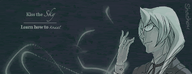
http://i174.photobucket.com/albums/w97/esto_perpetua_x/LiveJournal/lemmetry.gif
My first attempt at a signature in forever. D: I hope it's decent, ne? I actually used alot of layers for this, and it was a pain to get under the 50KB size required for the forum. I'm not sure if it was necessary to post a link to it, considering it's in my signature already, but since everyone else was, I thought it might not hurt.
-FLAUNTS- :3
jewess crabcake
03-22-2008, 11:58 PM
It's good, it has nice text. Only thing is the effects are minimal, the entire sig is too dark, try adding some lighting to make the darkness prevalent where you want it. try to get some varying colors, monotone sigs rarely come out as great as they could be. Try some sharpening your focal looks a bit choppy. But that may be because it's a .gif. Hope I've been helpful/
Shachou
03-23-2008, 12:04 AM
Yeah, I had to .gif it to make it sizeable for the forum. x.x; But thank you, this advice has been taken into mind for next time. :3
jewess crabcake
03-23-2008, 01:54 AM

(
http://img237.imageshack.us/my.php?image=bleachlargeartmv4.jpg)
I know it's not really a "sig" but I thought you guys would appreciate it.
I made the snow, the shadow, the effects in the sky, and the sun.
Shachou
03-23-2008, 04:12 AM
Wow... that's really amazing, sig or not.
I'm going to have to look up some tutorials, I have so far to go. >w<
Nonetheless, the effects are amazing. What program do you use? I'm sure it's been asked before, I'm sorry for asking again. -really bad at skimming pages-
jewess crabcake
03-23-2008, 04:24 AM
Just Photoshop. I plan on using some more programs down the line though. And thank you.
Lycorus
04-02-2008, 07:19 PM
I just started using PS CS3 about a week ago. I dont use it often because it doesnt seem to work on my computer currently. Its there yet not at the same time. But after fooling around with the program for a few days and looking at the simplest tutorials I could I decided to try something.
I came up with my current Signature. its the first thing I've made. I dont know how to cut pictures well right now, as you can see in my sig the girl I used has a basic outline that I did with the magic wand.
So if anyone can think of any neat and soft outline cutting tools I want to know!
Also I;d like some input on my first sig xD
brotherhood619
04-02-2008, 09:03 PM
JoJoJack
04-13-2008, 11:15 AM
I like the last three, filter/effect/texture overkill. But it works, so it's good ;)
And I've always liked these thin avatars, these are pretty nice too. Funny how you put focus on these eyes so much, but it's probably the most recognizable character feature in such a tiny space.
@Lycorus: Nice, cute! As said, especially the colors match well. And you've found a way to fit a large picture in a small space, I like that too. I'm not too fond of embossing, but it doesn't really bother me here.
And now you should do about a couple of hundred of these things and your skill will rise like a, uh, something!
I did some things to, by the way, might anyone be interested. Like, my own avatar and signature. And since we're posting big stuff here, I'd be happy to show you my last big Photoshop project: *my new year card* (
http://EndlessDepths.deviantart.com/art/The-Rise-of-Downfall-2008-73592580)
Featuring zombies and Chicago and friends as well. And me! I'm the blue eyed good lookin' boy up front. Hope you like it - you'd better like it.
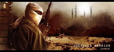
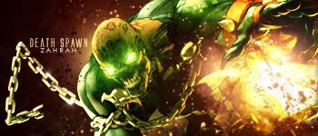
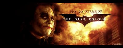
Zahrah
05-06-2008, 06:14 PM
J. Peterman
05-06-2008, 07:42 PM
Roadkill2007
05-07-2008, 04:04 AM
how do i upload image here ??
J. Peterman
05-07-2008, 06:32 PM
use like photobucket account or something
Lillithiel
05-15-2008, 09:18 PM
I havent made anything new in a few weeks.... so I messed around for about an hour or two last night and came up with these two...
Lillithiel
05-15-2008, 09:25 PM
how do i upload image here ??
There's a few different ways to host images.
you can create a free account at www.photobucket.com and host images (its explanatory once you go to the site pretty much). Or you go to
http://my.imageshack.us/ and host something without creating an account.
The good thing about photobucket, is that your account is actually an album that you can revisit in case you want to host images repeatedly. Image Shack, you have to re-host it each time.
OR...
you can just click the attachment icon in your advanced post options and load the file directly from your computer, but there are size limitations with that, if I recall correctly. Its a bit different on each forum.
Hope that helps. ;)
jewess crabcake
05-15-2008, 09:31 PM
I really like the first one, but it seems a little bit too plain y'know.
The second one... the embossed blood kills it, it's too dark (you can barely see the focal) and that C4D is too noticeable.
Well seeing as someone brought this back up I'll show my latest work.

and a banner
http://i134.photobucket.com/albums/q92/Holysoldier000/banner-1.gif
Lillithiel
05-15-2008, 09:37 PM
wow that was quick.
Yea, I had the same thoughts about the two, Jeff.
I dig the Ghost Rider sig, but the Banner is really basic... what happened? D:
Not that I have room to talk, I made a banner awhile ago and got too clutter happy with it. XP
see?
I dig them both. Love the K' one though...mainly cause he's badass.
jewess crabcake
05-16-2008, 01:34 AM
Well banners have never really been my style and I hate working with "people" focals.
non-canon sousaphone
05-16-2008, 04:09 AM
here's a few. :roll:


jewess crabcake
05-23-2008, 11:47 PM
...I don't understand.
non-canon sousaphone
05-24-2008, 05:00 AM
...I don't understand.
i go my Professor Raine on other sites
Devil's Sorrow
05-24-2008, 09:26 AM
J. Peterman
05-24-2008, 10:18 AM
jewess crabcake
05-24-2008, 03:12 PM
Devil's Sorrow
05-24-2008, 08:13 PM
jewess crabcake
05-24-2008, 09:42 PM
you're account is on private.
J. Peterman
05-29-2008, 03:03 AM
OMG AMAZING WORK!
Devil's Sorrow
05-31-2008, 03:31 AM
you're account is on private.
oh hehe whoops I'm not sure how to unprivate it but I'll try...
http://s252.photobucket.com/albums/hh25/ratsbane1/sigsandavvys/?start=all
now try...
jewess crabcake
05-31-2008, 03:48 AM
Not bad but you've still got a ways to go.
execrable gumwrapper
05-31-2008, 03:50 AM
MY SIGNATURE IS AMAZING
I didn't make it though.
jewess crabcake
05-31-2008, 03:53 AM
Yes Garamond does good work.
J. Peterman
05-31-2008, 03:53 AM
here is some of my amazing work :

that is like my first banner i made i think
Leon Belmont
05-31-2008, 06:54 PM
jewess crabcake
05-31-2008, 07:35 PM
Nice use of scan lines and polygons. Your second Link sig is the best though. You seem to have an inconsistency with blending, either you have too much blending or not enough.
Slavka
06-01-2008, 12:02 AM
My sig is really basic... I don't have any graphic editing programs, so I have to use Paint, which sucks.
J. Peterman
06-01-2008, 12:16 AM
paint sucks man i agree
Leon Belmont
06-01-2008, 12:41 AM
It may be Paint, but it's good, and There is a program out called Gimp, It's free and I use both it and Photoshop cs
J. Peterman
06-01-2008, 12:52 AM
paint sucks man i agree
Devil's Sorrow
06-01-2008, 02:16 AM
jewess crabcake
06-01-2008, 02:21 AM
Not necessarily, you can use GIMP or PaintShop Pro. to get those effects.
Leon Belmont
06-01-2008, 02:42 AM
Actually I have Photoshop 8.0 Creative Suites and Gimp 2.4
Devil's Sorrow
06-01-2008, 02:45 AM
Not necessarily, you can use GIMP or PaintShop Pro. to get those effects.
well then could you explain how then because I've experimented with everything in the version of gimp I have and I think I have the latest version but maybe not...
jewess crabcake
06-01-2008, 02:46 AM
Oh ok, good work though. It could still use some work.
jewess crabcake
06-01-2008, 02:47 AM
I'm not a GIMPer, but go to Planetrenders.net they have a few tutorials up. As well as people who can help.
Leon Belmont
06-01-2008, 03:23 AM
Goren
06-01-2008, 03:25 AM
Cool Haseo Signature man
J. Peterman
06-14-2008, 05:45 AM
brotherhood619
06-26-2008, 06:34 PM
Hey not sure who will remember me here (mabey jeff) but i used to take requests here.
just thought id pop back and show some things that i made up:

The Above is Watermarked
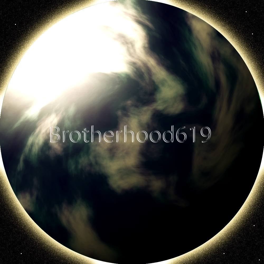
The Above is 1000 by 1000px so beware
As usual comment and critique requested
jewess crabcake
06-26-2008, 06:46 PM
Nice sig man cool stuff. As for the large art, cool concept. Your lighting is a bit off though. Your light source (the sun in your case) is apparently to the upper left and behind the planet. You CAN use 2 light sources but those are too extreme to co-exist. Also the lighting is too strong and the planet is too dark. You should try making it look like there is some land below, by creating another layer and tweaking the opacity.
Here's my latest:
(
http://img237.imageshack.us/my.php?image=bleachlargeartmv4.jpg)
Sidebar: Man why don't you stick around there are like no GFXers anymore, you UFFF, Shinryudan all left at like the same time.
brotherhood619
06-26-2008, 07:06 PM
First one looks good but there doesnt seem to be any type of blending so the render sticks out loads.
sorry i cant really comment about the second one because i cant tell whats yours and what was on the orignal? i can see the c4d and mabey the water and the sun and of course the text. what am i missing?
yea we did kinda, i just needed to go away from making for other people because it was never my best work
jewess crabcake
06-26-2008, 07:16 PM
well I made the snow, the character from bleach isn't supposed to be there, I made his drop shadow, I made the sun with brushing and smudging, and the text of course. All that I started out with was like the Glacier and that's it.
As far as the sig, it looked awkward when I blended it so I left that out.
brotherhood619
06-26-2008, 07:18 PM
Well for that then the only thing i can say that looks out of place is the c4d the rest looks good
btw seen your render on image shack, nice work
jewess crabcake
06-26-2008, 07:24 PM
Thanks, renders take up way too much time though. I don't know how people like render the effects, I tried it's like impossible.
brotherhood619
06-26-2008, 07:26 PM
haha its all about feathers, but yea it is hard the special effects usually have to be rebuilt.
jewess crabcake
06-26-2008, 07:37 PM
That the only sig you made recently?
Roadkill2007
06-26-2008, 08:20 PM
jewess crabcake
06-26-2008, 08:22 PM
Nice drawing but I don't understand.
brotherhood619
06-26-2008, 09:21 PM
not the only one but the best one out of the recents
jewess crabcake
06-26-2008, 09:22 PM
oh I see.
Roadkill2007
06-26-2008, 11:33 PM
are you guys talking to each other or giving comments to my sig ??
Aztroth
06-27-2008, 12:59 AM
Lillithiel
06-28-2008, 02:03 AM
Here's the most recent (requests) Ive made.. . still working on coming into a new style. >.< I also went ahead and linked the original images so you can kind of see more of the transformation. ^^
ORIGINAL IMAGE USED: HERE (
)
 http://i204.photobucket.com/albums/bb52/TheCourageofArya/Siggies/MetalDevil-sig1.gif
ORIGINAL IMAGE USED: HERE (
)
jewess crabcake
06-28-2008, 02:16 AM
You've gotten really better! You still have a knack for cluttering your sigs though. There is such a thing as too much effects. Second one is awesome, good depth lighting and everything. Really awesome.
Lillithiel
06-28-2008, 02:36 AM
Thanks Jeff. ^^ your tips are paying off.
I'll keep working on the clutter XD I think it will get better the more I work in this direction, I still havent quite found the balance Im wanting, but thats what practice is for. :)
UltimateFFFan
06-29-2008, 02:41 PM
Aztroth
06-29-2008, 07:32 PM
lol, I know what you mean... I just recently got back into it... Im actually in the middle of making a gfx site atm... its gonna be mostly Graphic and Web Design though. not much with sigs and avs
brotherhood619
06-29-2008, 07:37 PM
are you guys talking to each other or giving comments to my sig ??
talking to each other
Lillithiel
07-04-2008, 08:09 AM
You've gotten really better! You still have a knack for cluttering your sigs though. There is such a thing as too much effects. Second one is awesome, good depth lighting and everything. Really awesome.
Did this last night--- I spun off some ideas given by a friend. Hopefully it's less cluttered. ^^ Whatchya think, Jeff?
jewess crabcake
07-04-2008, 08:18 AM
Nice job. Looks really good.
Your motion blur is hella strong. Decrease the opacity a bit. Like 80% and down.
Lillithiel
07-04-2008, 09:49 AM

tonights project.
also, you're always on here. @@ Are you a robot?
Jonipoon
07-04-2008, 02:49 PM
You guys are really good at this.
jewess crabcake
07-04-2008, 03:30 PM
tonights project.
also, you're always on here. @@ Are you a robot?
i can't see it. And I wish I was a robot, a lot more things would make sense.
Lillithiel
07-04-2008, 07:22 PM
D: Heeeey it was there, I swear.
Hopefully it will work this time.
Here's the link just in case HERE (
)
UltimateFFFan
07-04-2008, 10:26 PM
wow,these sigs sux
Well, as you've posted nothing to show us your "1337 skillz" with sig making, I believe I will have to tell you to GTFO and take your fail with you.
J. Peterman
07-04-2008, 10:55 PM
wow,these sigs sux
HOW ABOUT THIS ONE???
jewess crabcake
07-04-2008, 11:26 PM
D: Heeeey it was there, I swear.
Hopefully it will work this time.
Here's the link just in case HERE (
)
it's not bad. Your colors conflict a bit, looks like you used a lot of negatives or exclusion.
Zahrah
07-24-2008, 12:04 PM
Aztroth
08-16-2008, 01:35 PM
yhette
08-20-2008, 11:34 AM
Aztroth
08-20-2008, 12:37 PM

dude, pain, wtf are you doing here!? lmao
yhette
08-21-2008, 10:23 AM
of course i'm on here dude, if u look carefully at my SC sig, u'll find 4 arrows pointin 2 a link to here :P
Aztroth
08-21-2008, 11:30 AM
lmao, never knew dude. never seen you around. thought maybe I was the only one on DT who knew about this little hidey hole.
Gift for Jeff, because he makes awesome sigs, so I think it's time he deserves one;

My latest. Not the greatest, but it was fun to make! Enjoy, Jeff!
jewess crabcake
09-19-2008, 08:40 PM
Thanks a lot! That is miles better than any of the things I have ever made.
Tchesco
10-04-2008, 02:40 AM
Nice sig, Jeff.
BrokenPhantasm
10-11-2008, 09:38 AM
jewess crabcake
10-11-2008, 02:30 PM
Great stuff man, just work on adding more color, and your lighting a lot of your stuff has conflicting lighting. It looks like you used the lighting effects filter, and casted shadows on your art as well, too much I mean to say. But the Lucy, and the one under Lucy are the best.
The Burning one would look awesome if it wasn't so dark on the right.
Overall tho...those are pretty good.
BrokenPhantasm
10-12-2008, 03:23 AM
@Jeff I don't enjoy adding a lot of color, to me it takes off the 2 main focus colors. I aim for only a light and dark color. I don't prefer anything too colorful, and for the lighting source, I used a brush for it.
jewess crabcake
10-12-2008, 03:32 AM
Oh I only use about 3 colors max, I use photofilters to add a bit of hue but that's it.
MikhailG
10-22-2008, 01:59 PM
Hop804
10-26-2008, 09:04 PM

Very simple Sister Princess sig with Hina and Aria.
jalvarez82
10-27-2008, 01:54 AM
Would anyone here be willing to make me a Thunder Force series (TFIII-IV-V-VI) av and sig set?
RaineLoire
11-06-2008, 04:46 AM
Anyone interested in making a Laguna Sig for me?
Roadkill2007
11-06-2008, 05:23 AM
Shinryudan
12-24-2008, 05:56 PM
Mornin. Probably no one on here remembers me, except maybe jeff. Been awhile since I was here, I'll just leave some recent goodies.


I've gone much more heavily into the webwork aspect of graphics, so signatures have taken a backseat. Honestly I've only made about 10 in the last year. Granted I've made about 30 or more websites, they pay more really.
As to the last post with some nice graphics in it, BrokenPhantasm. Did you make the C4Ds yourself, or were they packed?
jewess crabcake
12-24-2008, 06:08 PM
Really awesome work man, I love the Halo banner.
Tchesco
12-25-2008, 05:51 AM
I like the Halo one.
ILL ViLLaiN
03-03-2009, 03:36 AM
So ok. There's a lot of damn good sigs in here, and you guys have given me some ideas on how to be creative when creating one. Thanks a million. Anyways here's a few beginner sigs I've created. Hope you all like.
http://i26.photobucket.com/albums/c103/chinito_boii/Signature.gif
 http://i26.photobucket.com/albums/c103/chinito_boii/CasshernSIG2.gif
The third one came out slow. Don't know why but I tried. :(
jewess crabcake
03-03-2009, 05:03 AM
You use GIMP I'm guessing. Cool stuff btw.
brotherhood619
03-03-2009, 10:14 AM
I actually quite like the 3rd one... if you are using gimp to make it a bit faster look in the layers that you are using you should have a number that is something like (300ms) which means 300 milliseconds.
if you lower that number the layer will change to the next one faster making the animation fun faster... however you will need to change the number for all the layers not just 1.
jewess crabcake
03-04-2009, 12:59 AM
Holy shit BH <3333
My sentiments exactly! Man the art community here died :-\
ILL ViLLaiN
03-04-2009, 09:01 PM
I actually quite like the 3rd one... if you are using gimp to make it a bit faster look in the layers that you are using you should have a number that is something like (300ms) which means 300 milliseconds.
if you lower that number the layer will change to the next one faster making the animation fun faster... however you will need to change the number for all the layers not just 1.
Ok. Well I've never used GIMP, but I'm already reading up about it thru web search. I've made this on PhotoShop CS3, and that part you're telling me about the (300ms) that should be the seconds delay right? It automatically starts out as 0.03. I change it to no delay 0.00 and it'll move the correct speed afterwards. But when I create it to a gif file. It goes back to being 0.03 and moves at the speed you see now. I wanted to edit the name as well, but I wanted to figure out the problem with the speed first. I'll use the tips you've given me so far. If you have anymore I would be so thankful to you. Thanks for the help.
brotherhood619
03-22-2009, 02:58 PM
Sorry for the late reply, i have a subscription to this thread for instant notification but it only works in like 1/10 posts.
Actually the (300ms) means 3 hundred milliseconds.
In Photoshop CS3, well thats a bit of a pickle, its 0.03 as standard? hmmm mine is always 0.00 as standard :S. In photoshop you dont need to change the name you just use the animation window (window>animation), you then change the number below the image, but im guessing you know that because your using no delay. If this is what your using and it still doesnt work then, id suggest look though your prefrences, but i cant really help you there.
sorry :(
ILL ViLLaiN
03-23-2009, 11:42 PM
Don't worry about the late reply. I'm in the middle of ripping & tagging super pang collection, and doing some finishing touches with Strider Hiryu PC-Engine version before I upload them to this site. Plus I'm gonna make some new sigs with Wesker and one with Hiryu, so I'll be late as well.
Anyways 0.03 is my default, but I usually just select all, then put no delay on the frames. I'm starting to think its the size since it is a gif file I guess. Because I was in my photobucket account and the sig moved at the speed it was supposed to at the smaller size show in my photo album.
You think I should try out that GIMP program? Or if anything I'll try to set the milliseconds to 0.00 as the default.
Earnest
04-01-2009, 04:21 AM
This is excellent BrokenPhantasm! I just finished watching Elfen Lied a few weeks ago and what a pleasant coincedence that you'd make such a good signature.
All of you are very good. Im going to go back through the older pages and have a look-see.
Hey Earnest, I didn't know you post here!
Earnest
04-02-2009, 03:49 AM
Hey Earnest, I didn't know you post here!
Haha. Only recently mate. You might be able to tell me, how do I unsubscribe from all threads? Ive got an overload of emails.
Here are a couple of signatures I made for Elfen Lied.


User CP --> Edit Options --> Default Thread Subscription Mode
Set the drop down menu to No Email Notification.
Earnest
04-02-2009, 03:52 AM
User CP --> Edit Options --> Default Thread Subscription Mode
Set the drop down menu to No Email Notification.
Excellent! Done and dusted. Thanks very much.
COCONUT MILK
04-02-2009, 07:00 AM
MAN thats does NOT work for me! I've got over 1000 emails from here. I had this problem years ago since I first joined.

Sux to be you~
I can't even wrap my head around how many emails I'd be getting if it was still enabled for me.
I shudder to think what my yahoo account is like.
Also check out the ass kicking avatars and sigs, quite possibly garamond's greatest work. ;)
He can keep antagonizing me all he wants.
Whatever the fuck, I don't give a damn
jewess crabcake
04-05-2009, 07:30 PM
No offense, but dude... those are so gay. As an old school Jericho fan, and former Pokemon enthusiast, I'm appalled really.
COCONUT MILK
04-05-2009, 08:45 PM
He can keep antagonizing me all he wants.
Someone is paranoid I think.
jewess crabcake
04-05-2009, 08:55 PM
Sorry for offending you
You're forgiven.
ILL ViLLaiN
04-19-2009, 01:10 AM
Here's another one I've recently made.
ILL ViLLaiN
05-15-2009, 08:08 PM
Been playing with photoshop too much lately. Here's another one:

jewess crabcake
05-15-2009, 09:59 PM
Nice and simple.
FantasyX89
07-01-2009, 11:51 PM
One i recently made.

I'm new to using Gimp and Paint shop Pro XI.
jewess crabcake
07-02-2009, 12:03 AM
not bad man, work n the blending. It's better than my beginning stuff.
FantasyX89
07-02-2009, 12:10 AM
I'm not to good with blending im having a hard time finding tutorials to help me.
I'm a girl btw =P
jewess crabcake
07-02-2009, 12:25 AM
I'm not too sure how to blend with Gimp, I use Photoshop. But if you are very very carefuly you can use an eraser with a soft brush and delete around your subject.
Also sorry about that. I kinda assume everyone on the internet is a guy until I have proof otherwise.
Xephyrok
07-06-2009, 05:45 AM
I'm new here.

Give me your thoughts on it..
jewess crabcake
07-06-2009, 06:07 AM
That's pretty awesome man I like your colotr usage.What is that figure though? Also those faded flames in the left just dont look natural, try brightining it and adding some hue, it just looks like a dull spot.
Arikka
07-25-2009, 01:22 AM
Hello.
If you like simplicity, you should be pretty okay with my signature, ne.
It's stupid, I know, just some layer effects in PS.
jewess crabcake
07-25-2009, 03:21 AM
Actually that is pretty impressive, you should gloss that up a bit though, make it more 3 dimensional. I'm not that great at typography, myself.
Powered by vBulletin® Version 4.2.4 Copyright © 2019 vBulletin Solutions, Inc. All rights reserved.


 (http://imageshack.us)
 (http://imageshack.us)


