Pages :
1
2
3
4
5
6
7
8
9
[
10]
11
12
13
brotherhood619
12-21-2006, 07:15 PM
Jaigon
12-22-2006, 05:33 PM
would any of you fine sig makers be willing to create a sig for a final fantasy 11 character? i can e-mail screenshots..... if youre interested in helping me e-mail me at
[email protected] or my aim is xxskysetunfoldx we can discuss what im looking for on my sig {please assist}
Mailbox
12-22-2006, 05:38 PM
Requests belong here. (
Thread 24163)
Hex Omega
12-22-2006, 07:52 PM
good stuff Gina, most encouraging thing is you can see a clear improvement on your work ~
-viLe-
12-23-2006, 09:34 AM
Sarah
12-23-2006, 09:58 AM
I like your avamatar most.
zeikyboy
12-24-2006, 01:50 PM

You like???
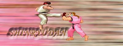
Shinryudan
12-25-2006, 02:52 AM
heheheheh, made this while listening to the flash gordon theme song. I used CS2 and the Flash Gordon logo.

and another on cs3, also on a new LCD monitor. No renders on either of these, text only.

Made again using only the text that you see and 2 filters. This was 4 layers total.

And another, four words to this one, however the background is a blurred distortion of only "fight fire"

Mailbox
01-02-2007, 12:52 AM
Shinryudan
01-06-2007, 08:29 AM
This will blow your eyes out. Late night shopin', slept till 3pm today and am now really energized, its now 2:30AM and my book is done, my parents asleep, and thinking I am in bed... Stupid Melatonin cycles...

2words again.
something at 3AM while listening to soft jazz and Celtic rock

brotherhood619
01-06-2007, 11:49 AM
Damn you Ryu! you can always make text look really good. ive been stuck using visitor on 10pt.
Shinryudan
01-06-2007, 09:05 PM
This is all Times New Roman on a default 12 size. I sometimes free transform it.
brotherhood619
01-07-2007, 04:42 PM
Yea thats what i mean, it just baffles me how you do it even when i do the free transform i cant get it to look good
New one :) :
Shinryudan
01-07-2007, 06:16 PM
Ewww... Try saving that as a .png. Or at least a higher res than 7Kb. The quality is downed enormously from that. Try to make the text flow a bit more. Like aline some with the hair on the right side of the face, the edge of the face on the left, or the redish dash that currently intersects the text.
brotherhood619
01-07-2007, 09:40 PM
hmmm can but try, damn jpg

any better?
Hi, I have a problem. It's not a big problem, but it is a problem. >O
I'm a little unsure of which sig to use, I made both of them myself, but which one do you guys think I should use? The one I have now, or the one below?

brotherhood619
01-08-2007, 02:15 PM
tbh id say the one you have now just a personal opinion tho
what happend to that avatar i made you zulu?
Shinryudan
01-08-2007, 09:39 PM
... Well I meant to use the rotate, transform and the text warp tools to put the text along the line, don't make the sig form to the text, but the text to the sig.
This entire piece is filters and text tools. No images from other sources.
Two versions. I didn't exactly get the colours that I would like of these, not vibrant enough for me.


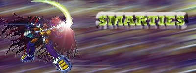
jewess crabcake
01-10-2007, 07:44 PM
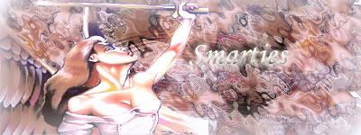
My first sig please be gentle.

UltimateFFFan
01-10-2007, 08:24 PM
... Well I meant to use the rotate, transform and the text warp tools to put the text along the line, don't make the sig form to the text, but the text to the sig.
This entire piece is filters and text tools. No images from other sources.
Two versions. I didn't exactly get the colours that I would like of these, not vibrant enough for me.
Ryu, nice works, I see what you mean about the colours though, not your usual colours.
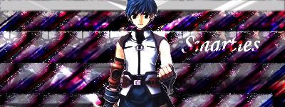
Smarties, for a first time sig, it's not bad, but it could do with a lot more work. If you'd like I'll make you a sig tutorial to show you how to make some decent ones? Theres plenty of effects you can use rather than using brushing but brushing produces more originality if you know what i mean. I don't really like the Noise over the top, it ruins the background. Just send me a PM if you want som brushes or the like
Shinryudan
01-12-2007, 03:14 AM
Ichigo from bleach in Bankai form.

I hate using renders so much, filters only.
and another, made off of the word Glisten. Was listening to glisten by Fini Tribe

listening to U2 In the name of Love.
background colours just wouldn't work out

jewess crabcake
01-12-2007, 06:43 PM
Well I used the film grain to get that grainy old school gargoyles look. these were the prototypes.


I would love some sig tutorials.
Shinryudan
01-12-2007, 11:25 PM
www.good-tutorials.com
www.pixel2life.com
www.biorust.com
www.deviantart.com/resources
www.greycobra.com
www.digitalindustries.net
another race by eiffel65

brotherhood619
01-13-2007, 12:00 PM
smarties your doing better than i did when i first started, then i bumped into UFFF's full sig tut and i went overboard using that.
UltimateFFFan
01-13-2007, 12:04 PM
smarties your doing better than i did when i first started, then i bumped into UFFF's full sig tut and i went overboard using that.
Can't remember if I posted that on here or not.... I'll have a look lol.
brotherhood619
01-13-2007, 12:21 PM
I got outcomes like this from it
hey wait a min howd i make that text look like that.
Shinryudan
01-15-2007, 03:41 AM
A present for a friend.

brotherhood619
01-15-2007, 01:58 PM
nice work, text blends well
Which is best outta these
V2:
V3:

i havent saved v1 as a png so im not showing it.
I like V2 the most. V3 is almost identical, but not quite.
I need some validation on my current set. I have a couple of other ones, but I thought about use this one for a while.
Feedback would be nice!
brotherhood619
01-16-2007, 01:54 PM
v3 has scanlines but thats it i guess it should be called v2.1.
im expecting ryu to say that the text needs blending more but i'll have to wait and see
oh and btw the one that poeple like most will go as my current sig
zulu: the render seems to go well with the bg, i think it is better than the one you had before, do you always make your ava and signiture match? might be something i'll try with v2
Shinryudan
01-16-2007, 09:00 PM
Text is sufficiently blended, possibly to subtle though. Only complaint is that the ruffled look to the background could be a tad more distinct. And all that negative space is odd.
brotherhood619
01-16-2007, 09:06 PM
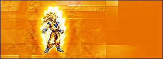
lol it is really wierd how i did that smudgeing with a grunge brush its supposed to be goku drawing in power from all the squares but ok it doesnt work. the big void is wierd but im a beginner... lol
Shinryudan
01-17-2007, 09:22 PM
No, it isn't my second c4d sig. Its still text, the background is made with ripple, motion blur, and a few other things. The original text is in the top right corner and my name in the oppo corner. No Times New Romans was used in this piece.

brotherhood619
01-17-2007, 09:26 PM
hmmmm i like others that you have done more but its still good
Shinryudan
01-17-2007, 09:29 PM
For drawing in power, you could try little paths of white dots, the spirit bomb.
magic slap
01-21-2007, 12:57 PM
well, here are some of mine...


comments/tips/hints are welcome
brotherhood619
01-21-2007, 01:11 PM
they look fine to me cept that doll EVIL lol
UltimateFFFan
01-24-2007, 11:21 PM

Just a couple I've done. C+C please
brotherhood619
01-24-2007, 11:24 PM
wow liking the 2nd
UltimateFFFan
01-25-2007, 12:58 AM
wow liking the 2nd
Pixel stretch bg, did the blast myself using a crescent shape filled white, did polar to rectangular, then back, then polar to rectangular again. Then feathered and cleared slightly.
Shinryudan
01-25-2007, 04:19 PM

My first using Corel Paint shop pro

brotherhood619
01-26-2007, 11:25 PM
which is better?


Hogan
01-26-2007, 11:30 PM
Shinryudan
01-27-2007, 02:13 AM
SHNAZZY!
UltimateFFFan
01-27-2007, 10:22 AM
which is better?
If you select the top layer of the first one, by control clicking it, then hit control+alt+d, then enter 25, then hit control+shift+I and hit delete a couple of times you'd get a better effect. Then change the blending mode to Color Dodge, and take a look.
EDIT: Or even something like this, which is completely redoing the top layer with polygonal lasso, feathered by 15, then filled with a white to transparent gradient:

brotherhood619
01-27-2007, 11:00 AM
well i tryed to get the kind of effect that you have now but for some reason the layer wouldnt blur :S I'll have a try again sometime soon.
might get rid of the corners (making them transparent) as i think it ruins it
Edit: btw my internets messed up at the moment so i may not be as acttive as hoped but i will still try to keep up with things that are going on
Shinryudan
01-27-2007, 10:27 PM
I don't use renders much anymore heh.

Mostly the paint daub filter
brotherhood619
01-27-2007, 10:33 PM
hey ryu, have you ever thought of making tutorials as some of your sigs do turn amazing?
jewess crabcake
01-27-2007, 11:48 PM
I 2nd that motion.
Shinryudan
01-28-2007, 12:56 AM
hey ryu, have you ever thought of making tutorials as some of your sigs do turn amazing?
I've got two. They can be found on my deviant art account.
Shinryudan
jewess crabcake
01-28-2007, 01:02 AM
Link plz.
UltimateFFFan
01-28-2007, 11:39 AM
http://shinryudan.deviantart.com/
Oddly enough lol
Also, Smarties, I'll do you a full sig tut when I've recovered from my hangover. Went for a drink yesterday as it was my birthday on Friday and I'm paying for it today lol.
brotherhood619
01-28-2007, 12:09 PM
ahhh deviant art, wait im not exactly sure what it is, all i know is that its a good place for brushes
Happy b'day jimi btw
jewess crabcake
01-28-2007, 05:55 PM
http://shinryudan.deviantart.com/
Oddly enough lol
Also, Smarties, I'll do you a full sig tut when I've recovered from my hangover. Went for a drink yesterday as it was my birthday on Friday and I'm paying for it today lol.
Well you deserve the kickback w/ exams and all. To bad with the hangover, though HB, I hear there's pills to stop hangovers. IDK if they work.
jewess crabcake
01-29-2007, 02:41 AM
v1

v2

I can't decide.
UltimateFFFan
01-29-2007, 08:34 AM
Quite honestly, I was struggling to work out exactly what the render was and what the text says. Perhaps making the text stand out a little more, and not placing it over the render?
brotherhood619
01-29-2007, 02:10 PM
also i cant see a diffrence between the two.
dont worry im bad at text aswell :)
jewess crabcake
01-29-2007, 05:46 PM
In V1 I Put the text on top and mad it slightly transparent, v2 I sandwiched the text between 2 layers and faded the taop layer to make the b.g. show and the text more transparent. As for it not looking different IDK it looks more transparent on my PC.
UltimateFFFan
01-29-2007, 07:58 PM
Right, I'll do my full sig tutorial now, as I'm bored lol. There's 2 different one's I can do, so I'll do the easiest one first, then the harder more advanced one after that. They'll both be posted on gfxshop, I'll drop the links here when I've done them.
jewess crabcake
01-30-2007, 12:43 AM
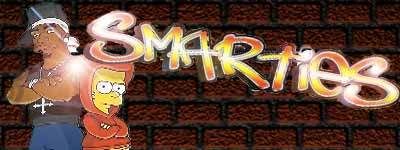
Combined a bunch of pics on my pc, Made a brick Bg with graffitied tag and Bart and fiddy for the gangstar touch. ^_^
jewess crabcake
01-30-2007, 11:51 PM
No scanlines
Or with scanlines
brotherhood619
01-31-2007, 01:59 PM
u go smarties getting better already just one thing might wanna add a one or 2 pixel black border to it
jewess crabcake
01-31-2007, 05:57 PM
Yeah Ive been meaning to ask how dow you make those borders, I've been trolling Photoshop cafe but no go. Also thank you.
brotherhood619
01-31-2007, 06:06 PM
just select>all then select>modify>border 2px
jewess crabcake
01-31-2007, 06:16 PM
Oh thanx.
z.zetsumei
01-31-2007, 10:10 PM
Try a white border to create a contrast with your sig and the rest of the boards.
jewess crabcake
02-01-2007, 12:49 AM

I couldn't figure out how to work the border, or perhaps I had a different idea what the border was. I want to get a frame in the sig to focus your attention on the sigs middle is that what the border is??
z.zetsumei
02-01-2007, 02:15 AM
Well, I can barely see it. Try a white one like I said earlier, since the background is so dark it'll have a better contrast.
Or you could make the border bigger.
Like these: ^^


Personally, I like the white border.
Or you could do a border like brotherhood619's avatar in either color and you'd be fine but probably better off with white yet again due to the overall darkness of the signature.
brotherhood619
02-01-2007, 05:16 PM
lol thats one of ufff's tutorials in action. i think he's gonna be posting it with the rest of his tuts on the gfxshop so i wont say how to do it until he's finished :)
jewess crabcake
02-01-2007, 05:24 PM
When I hit border nothing happened, no black border or white border, do I put the border on a new layer or am I doing something wrong?
brotherhood619
02-01-2007, 05:26 PM
sorry u have to fill it aswell because its just a selection at the moment i always put it as a new layer just to make things less complicated
z.zetsumei
02-01-2007, 05:46 PM
Hit CRTL+A first to select the entire canvas, then you should be able to create the border.
You could also create a 5 pixel border, then delete the outside 3 to create a hollow one.
Edit: The border option selects the border with a width that you specify in pixels. You then can fill that with any color of your preference.
Shinryudan
02-03-2007, 04:16 AM
Attempt Number 1...I Don't personally like this one.

Attempt Number 2...I like this one a bit more. It has some issues with colours, but I can't fix 'em.

UltimateFFFan
02-03-2007, 11:10 AM
Sorry about my recent inactivity guys, I've been busy with coursework, and really I still am. I won't bother with the tutorials on GFXShop, I'll just post them here for ease. Should have one up in a little while
brotherhood619
02-03-2007, 11:49 AM
It depends if they will let you put them on here as it isnt a graphics forum
Ryu: there not my favs of your but they still could be used
jewess crabcake
02-04-2007, 03:20 AM
Hey I like them Ryu, especially the second one the distorted vanishing point sucks you into those elusive colors, well here is my siggy.
Jarosik
02-04-2007, 04:05 AM
Here's one I made earlier! ;)

jewess crabcake
02-04-2007, 05:38 AM
That is nice What text is that?
Smarties made mine. And it is the shit. Good work!
KnightOfTerra
02-04-2007, 09:20 AM
What the hell....I'll throw mine up. My brother made this one and sent it to me. It keeps getting funnier every time I see it, ya know?
UltimateFFFan
02-04-2007, 09:59 AM
Thtat's soon to be removed for sig rule breach. Read em and weep
Shinryudan
02-04-2007, 04:27 PM
what was it?
jewess crabcake
02-04-2007, 05:12 PM
I wanna know, did I miss something funny.
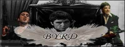
also @ byrd you have no Idea how hard it was to rip him from the background :p
brotherhood619
02-04-2007, 05:13 PM
im guessing nudity
edit: hey i cant find the sig rules :S
UltimateFFFan
02-04-2007, 09:40 PM
Sig rules state that:
The limits on signatures are that they can't be any bigger than 400x150 pixels, and the file size must be no larger than 50kb.
That guys was huge, something like 400x450 pixels and a massive 800kb
jewess crabcake
02-04-2007, 09:42 PM
how is that a sig!!!
UltimateFFFan
02-04-2007, 09:55 PM
I don't think it can be classed as a sig.....
Jarosik
02-04-2007, 10:15 PM
LR, the font on the sig above is called 'A Damn Mess' and may be found here (
http://www.dafont.com/a-damn-mess.font) sir.
jewess crabcake
02-04-2007, 10:19 PM
Oh first reading that I thought you said, "your sig is a damn mess" I was gonna be like :mad: Oh but that nice to now, I might use it.
Jarosik
02-04-2007, 10:26 PM
The sig you made is cool, but there are more effects out there than scan lines ;)
jewess crabcake
02-04-2007, 10:28 PM
yeah I'm taking baby steps, looking for more and more tutorial
Anybody know tutorials on animated sigs?
brotherhood619
02-05-2007, 01:59 PM
I havent found one for ages but should be simple if you know how to use image ready. if your thinking about just animation then it all can be done in image ready otherwise u'll have to use both
Shinryudan
02-05-2007, 09:39 PM
try searching for it here
www.pixel2life.com
www.good-tutorials.com
www.biorust.com
www.google.com
jewess crabcake
02-05-2007, 09:45 PM
Lol @ google but thanks.
Shinryudan
02-10-2007, 12:26 AM
had some fun. first wall in ages.

jewess crabcake
02-10-2007, 12:27 AM
What's your deal with abstract emotion Ryu, I've seen you use it a lot.
Shinryudan
02-10-2007, 12:45 AM
I don't know. I think I'll name my V.3 website after it.
Shinryudan
02-11-2007, 04:09 AM
And another wall. This one was like 80 layers.

jewess crabcake
02-11-2007, 04:17 AM
How is that 80 layers?
Shinryudan
02-11-2007, 04:20 AM
Start with only text and get to filtering.
brotherhood619
02-11-2007, 11:22 AM
i just dont know how people can go into 60-70 layers with walls, jeese then again ive seen some people go that far on sigs :S
Shinryudan
02-11-2007, 03:37 PM
Its not hard, when I hit something I don't like I use a lot of filters and colour layers and maps and masks on it until it looks totally different. That usually takes about 15 layers.
jewess crabcake
02-11-2007, 03:40 PM
when i have 10 layers i feel like I've used too much.
Doggoneus
02-12-2007, 12:55 AM
15 layers is usually my limit. Mine's still pretty crap but hey.
brotherhood619
02-14-2007, 02:00 PM
ok i know this is the sig showoff but im gonna show the ava that i did from a tut

pretty simple but i think its effective
stenchlord
02-16-2007, 05:15 PM
I have to say wow. I started off here on the last page and worked my way back about 30 pages and damn. There are some fantastic sig makers here. Awesome stuff. Keep it up.
I wonder how I'd go at making them... will have to give it a try.
brotherhood619
02-16-2007, 05:21 PM
I have to say wow. I started off here on the last page and worked my way back about 30 pages and damn. There are some fantastic sig makers here. Awesome stuff. Keep it up.
Im sure everyone likes doing what they do, but the odd good comment really makes them feel good so thanks.
I wonder how I'd go at making them... will have to give it a try.
Get Photoshop or GIMP and you can basically start messing around with the settings then after your familiar with the program ask again here and someone will point you in the right direction
stenchlord
02-16-2007, 06:08 PM
Yeah I've got Photoshop CS2 lol. I edit things for my photography stuff. I know how to use it, but never worked with stuff like this though. Animated stuff I mean. Will give it a go at some point though.
jewess crabcake
02-16-2007, 06:33 PM
Lots of tuts on the web, Shinryu needs to be put in lamen terms it's hella hard, I can't get shit right. And I can't even see UFFF's tut, GFXshop is like not in service or something.
Oh yeah I made this like 2 weeks ago, but it was too big, but I want comments.
http://i134.photobucket.com/albums/q92/Holysoldier000/Megaman-tribute.gif
brotherhood619
02-16-2007, 07:11 PM
pretty good good for the animation but mabey you should have it as it moving one pixel per frame its what i always do :) GFXshop works fine for me now try again with it
jewess crabcake
02-16-2007, 07:15 PM
I tried but that is hella of a lot of frames, also my hand's pretty fidgety.
brotherhood619
02-16-2007, 07:17 PM
just use the arrow keys while on the move tool every press makes it move 1px
jewess crabcake
02-16-2007, 07:31 PM
oh damn I figured there'd be an easier way, I'll update/fix the pic later.
brotherhood619
02-16-2007, 10:15 PM
Next one up this ones diffrent from the ones i usually make.
.jpg:
.png:

jewess crabcake
02-16-2007, 10:53 PM
Nice. How'd you get that double border.
brotherhood619
02-16-2007, 10:56 PM
just by using selections, something i learned off ufff
jap0911
02-17-2007, 01:33 AM
I only use about 5-7 layers when I make sigs.
I always wonder why people love so much layers.
Shinryudan
02-17-2007, 03:25 AM
I only use about 5-7 layers when I make sigs.
I always wonder why people love so much layers.
Personally I use filters and lots of correction layers. I just let myself go and usually don't have an idea where it will go.
stenchlord
02-17-2007, 04:35 AM
I have a friend who's going to be making me one :D
Woo!
jap0911
02-17-2007, 08:48 AM
Why not try it yourself?
It's pretty easy actually when you get into it.
brotherhood619
02-17-2007, 12:28 PM
Why not try it yourself?
It's pretty easy actually when you get into it.
yea same thought here an easy one to make would probably be a pixel stretch i can show you a tutorial if you want
jap0911
02-18-2007, 12:22 AM
There are many tutorial sites on the net too. ^_^ It won't hurt trying. Besides, you will learn it fast. Trust me. I mastered almost all the basic skills in 1 month (and I only open computer twice a week).
so, why not try it out? ^_^
jewess crabcake
02-19-2007, 05:39 PM
Just made sigs with people are hard imo, a lot less stuff you can do.
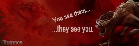
Gharmos
02-21-2007, 03:22 PM
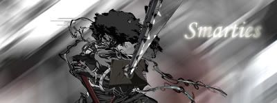
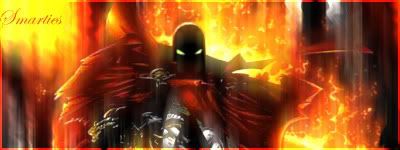
Smarties: Looks good, and you're good with the layering, but it just needs a border to look more complete.
Gharmos: Sorry, but most of those look unfinished and they need some polishing.
A friend of mine made these for me a couple of years ago, and I was just wondering which one of these you guys liked the most:
http://i17.tinypic.com/3ypdij4.gif
http://i9.tinypic.com/48cioag.gif
http://i19.tinypic.com/2zz0wzo.gif
I might switch between these three, currently I'm using the blue one.
brotherhood619
02-21-2007, 04:27 PM
i like the gold/yellow one better
gharmos: out of them 3 id say the fist one was the best but what did you use to cut out the images in the 2nd/3rd one?
I wouldnt try to go to far with the borders a simple black 1px can work better than a real fancy one
Gharmos
02-21-2007, 10:00 PM
I cut them out manually in normal paint. I didn't know how to cut them out otherwise.
Shinryudan
02-22-2007, 09:38 PM

some fun. Unfortunately its rather bright so you won't be able to see it too well on here.
jewess crabcake
02-23-2007, 12:05 AM
I like the use of colors looks very crystaline/celestial.
Shinryudan
02-24-2007, 05:33 PM
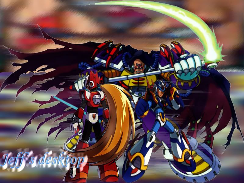
This was a screen shot of my desktop that was filtered and twisted beyond recognition.

It's beautiful, my only complain would be that the border vanished in contrast to the dark background of the forum. You should consider putting a white border on the outside, as the it would make the green one more visible.
TheGenius
02-26-2007, 05:51 PM
Here are some of my sigs; I was hoping to know what you guys think of them...
If you wat to see more; just go to my photobucket :); the link is:
http://s124.photobucket.com/albums/p33/Miyata-kun/
brotherhood619
02-26-2007, 07:21 PM
pretty nice although im not a big fan of grunge, you'll have to show me how to do some of your effects sometime :)
jewess crabcake
02-26-2007, 07:27 PM
Real nice. I like it.
TheGenius
02-26-2007, 07:53 PM
I try not to go for grundge, but more for smudged effects ;).
brotherhood619
02-28-2007, 09:47 PM
a new one i did, i think you can only like it if its your type of thing
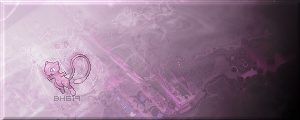
Also one i wasnt gonna post but thought what the hell
comments on both please
jewess crabcake
02-28-2007, 10:46 PM
I like the first one the mew is awesome,
The second one nice, the irregular shape is cool.
M~C~P
03-01-2007, 07:44 PM
Nice sigs there brotherhood619 and thanks again for my one!
Silfurabbit
03-02-2007, 02:52 AM
I cut them out manually in normal paint. I didn't know how to cut them out otherwise.
excelent job I love this one
Vincent Von Doom
03-03-2007, 02:23 PM
Shinryudan
03-03-2007, 11:34 PM
try adding more than one colour on your stuff. Its nice to see that you got borders down. Also if you are using photoshop, try out using the filters.
Filters only on this one, that and some paint bucket.

jewess crabcake
03-04-2007, 02:06 AM
I Wanna learn how to use borders someone please help.
Shinryudan
03-04-2007, 02:15 AM
GIMP or photoshop?
jewess crabcake
03-04-2007, 02:30 AM
Photoshop what's GIMP?
brotherhood619
03-04-2007, 11:04 AM
Gimp's like photoshop except free, pretty handy if you dont want to fork out for photoshop, borders dont have to be fancy like in shinryudans, i cant do them. i just do a normal 1px black border. one thing i did try out tho is flattening the image then bevelling it. could give a nice result, its what i did on my mew one.
jewess crabcake
03-04-2007, 05:23 PM
Yeah I got one to come out like that but I can't get PS to make any border at all.
Shinryudan
03-04-2007, 06:28 PM
Go to
CTRL+SHIFT+N (this makes a new layer)
CTRL+A (this selects the entire area)
Edit>Stroke (border maker)
Set the colour to Black and the stroke to INSIDE
Hit OK
Thread 25246
jewess crabcake
03-04-2007, 09:17 PM
Thanks ryu with your help I made this
brotherhood619
03-04-2007, 09:20 PM
pretty nice smarties uve made a decent sig maker out of your self, now all i think you need is more experience, its not easy to get, i still aint got it lol
jewess crabcake
03-04-2007, 09:23 PM
Lol now what are these "brush" things I heard of I mean what do they do make a grainy texture or just make the paint colors lighter?
brotherhood619
03-04-2007, 09:28 PM
brushes are basically diffrent ways of putting a colour onto your canvas, your circular brush that comes with photoshop is one, people make all types of brushes from stars to grunge effects, they can sometimes be used for making a background, i make a layer with one colour then brush over it with a black coloured grunge brush.
i personnally dont exactly like them as if you make a background out of your render then it sorta blends more. brushes are mostly down to taste i think.
you can get some good ones from deviant art and places like that.
jewess crabcake
03-04-2007, 09:33 PM
ooh thanks.
Shinryudan
03-04-2007, 10:32 PM
These are made using the brush tool.
Note the leaf looking images in here, that is the maple leaf brush.

This explosion is entirely made of brushes.

The tech pieces in the background are all brushes.
http://i64.photobucket.com/albums/h177/Shinryudan/sig2gt.gif
The white broken texture in this is a brush.

The paint blobs here are also brushes.

brushes are like a paint brush, some are literally in the shape of a paint brush and give you the same texture. Some are like a pencil or pen that you can draw with. others hold a specialized shape that acts like a stamp.
jewess crabcake
03-04-2007, 10:34 PM
poooh I may d/l some soon. Looks fun.
Shinryudan
03-04-2007, 10:36 PM
http://22pixels.com/flock.php
bout 2000 brushes and 150 fonts
brotherhood619
03-04-2007, 10:37 PM
hell thats alot
jewess crabcake
03-04-2007, 11:06 PM
hell thats alot
Shinryudan
03-05-2007, 01:53 AM
Made this tonight, personally I loved it until I started to place the text. Text sucked.

jewess crabcake
03-05-2007, 04:12 AM
I looks great to me...
brotherhood619
03-05-2007, 01:54 PM
jeese even on your bad days with text it still looks good
Lizzums
03-07-2007, 03:07 PM
http://sixpop.com/images/images/48582391.gif
Made purely with brushes, the gradient tool and filters (and of course blending options) oh and desaturated. ^^
Shinryudan
03-07-2007, 09:51 PM
I don't like the repetition of the brush. It is a nice brush, but I see it like 3 straight times in there and it seems tedious towards the 3rd. The colours are subtle, which is nice, but you might want to make the stuff a little less grainy and a bit more smooth.

I know, it looks like a collage, but there are a lot of effects on those stocks.
Lizzums
03-08-2007, 11:24 PM
I don't like the repetition of the brush. It is a nice brush, but I see it like 3 straight times in there and it seems tedious towards the 3rd. The colours are subtle, which is nice, but you might want to make the stuff a little less grainy and a bit more smooth.
I havent used the same brush more then once but it looks like 1 bit repeats, and its a grunge brush so you'd expect it to be kinda grainy...Thanks though. ^_^
Shinryudan
03-10-2007, 04:43 PM
First time I've used the smudge tool in about 8 months. A couple filters in this one, but mostly just gaussian and motion blurs.

COCONUT MILK
03-11-2007, 02:45 PM
Just made this thing because the forum wont let me have my normal sig.

brotherhood619
03-11-2007, 03:07 PM
pretty nice kind reminds me of the one i did a while back
Edit: new one done for SOTW at another site
V1:
V2:
COCONUT MILK
03-11-2007, 09:41 PM

Made a new bruce one.
Good blending and use of colours. It just needs a border to complete it.
brotherhood619
03-20-2007, 06:57 PM
Just trying out the pixel stretch C+C as with all of them
Shinryudan
03-21-2007, 08:07 PM
Don't really like the texture on the stretch. Also, try adding something over the stretch so that it is not that visible.
Fun with the marquee tool, and filters.

brotherhood619
03-21-2007, 08:09 PM
you mean the brush that i put behind it?
damn you like your transparency
Shinryudan
03-21-2007, 11:38 PM
ya brush.
jewess crabcake
03-22-2007, 04:54 PM
So wait you can d/l filters too? because I've never seen some of these filters.
brotherhood619
03-22-2007, 05:17 PM
ya brush.
I just put that there so it wasnt plain but oh well
So wait you can d/l filters too? because I've never seen some of these filters.
mabey, i cant say its not possible.
Shinryudan
03-22-2007, 07:58 PM
So wait you can d/l filters too? because I've never seen some of these filters.
Thats a combination of the default filters. Follow this guide for the basic background.

^I didn't make that, a buddy did.
Anyways after that I just experiment with what you can do.
Yes you can download filters and some are actually pretty fun. Not many of them are free though, and even the fun ones aren't normally usable.
Shinryudan
04-01-2007, 11:53 PM
May as well bump it a bit. Been almost 8 days.
V1

V2

brotherhood619
04-02-2007, 01:53 PM
not really the kinda thing i go for shinryudan but good job anyway
UltimateFFFan
04-04-2007, 07:58 AM
Something to do for one of my other forums. I'm not that keen on it to be honest but it was a quick 2 minute throwtogether
brotherhood619
04-04-2007, 09:04 AM
ahhh the old placeholder text
Shinryudan
04-04-2007, 01:09 PM
lorem ipsum dotor sit amet... Good old random non-conjugated latin. That's a weird sig. Hey Jimmy, whatever happened to that gfxshop site you made, I went looking for it a few weeks ago and it is gone?
Tried out }SoV{Saint's "Samus Smudge" tut, but with a few twists. I used a maple leaf brush (custom made, not the default) instead of an X. I also added a few mmore blur layers.

brotherhood619
04-04-2007, 01:17 PM
I've got the corrected link in my signiture jimi's just not fixed his link.
the whole damn thing messed up so jimi had to reinstall it you will have to register again :S
That sig looks ace better than the last one me thinks
jewess crabcake
04-05-2007, 01:46 AM
brotherhood619
04-05-2007, 08:57 AM
lol nice work smarties i'm sure shinryudan doesnt mind he's an alright guy
jewess crabcake
04-05-2007, 04:32 PM
With the first one I tried to make it transparent, but the matte showed up under it in the "save for web" screen. How do you make it transparent?
brotherhood619
04-05-2007, 07:19 PM
just save it as .png dont think the matte will matter its just a way for photoshop to show transparency
Shinryudan
04-05-2007, 08:52 PM
also make sure that it is transparent in the background so that you can see the checkerboard behind it. Also check the box that says transparency.
jewess crabcake
04-06-2007, 12:45 AM
made in like 2 minutes.

xLordCJx
04-06-2007, 03:18 AM
New set. The old set sucked, it was just something I threw together so I wouldn't look like a COMPLETE noob.
Old:

New:


brotherhood619
04-06-2007, 11:19 AM
Nice work smarties
xLordCJx: definate improvement on the second one especially with the text. you havent got any text or a border on the avatar
jewess crabcake
04-06-2007, 01:36 PM
I reallly like the brush work, I've been meaning to try some brushes myself but I'm a procrastinator.
Shinryudan
04-06-2007, 03:22 PM
I took a few captures with "Video Redo Plus" unfortunately I found out that cable TV quality is pretty horrid. So since doing some renders of it wasn't possible, I figured some signatures wouldn't be that bad. This is from the final episode in the American series, FLClimax.
STOCK (

)

And another.
STOCK (

)

magic slap
04-06-2007, 05:26 PM
Here's my latest:

jewess crabcake
04-06-2007, 06:42 PM
fresh from shop.
brotherhood619
04-06-2007, 07:14 PM
mabey your best so far smarties?
KnightOfTerra
04-06-2007, 07:17 PM
I Photoshop NES screenshots I take with my emulator. One screenshot usually takes me about 15 minutes depending on what I change. I'm trying to figure out super-imposition so I can start using sprites to create better pictures. Eventually I'll get it.
brotherhood619
04-06-2007, 07:45 PM
i dont think its really that hard to use sprites i do it quite a bit, if you need any help with anything just pm me :)
KnightOfTerra
04-06-2007, 07:50 PM
i dont think its really that hard to use sprites i do it quite a bit, if you need any help with anything just pm me :)
I'll definitely consider that. Once I finish building my sprite library, I'll PM you and you can help me out. I also give you credit for your time.
UltimateFFFan
04-06-2007, 07:53 PM
New sig using a tut I found. C+C pleases
brotherhood619
04-06-2007, 08:01 PM
2 of the things ive done scince last i posted up a sig

^^seriously like this one^^
xLordCJx
04-06-2007, 10:13 PM
My latest.

brotherhood619
04-06-2007, 10:16 PM
pretty nice colours blend well not sure about the text above and below the main text tho
xLordCJx
04-06-2007, 10:17 PM
Yeah I'm thinkin' of editing that.

Little better.
Less bubble-texty.
Fixed up the color balance too, so her head isn't lit up like a light bulb but the rest of her isn't as desaturated.
brotherhood619
04-06-2007, 10:32 PM
better what is that text supposed to say anyway? or just random text?
xLordCJx
04-06-2007, 10:37 PM
It's the lyrics to the opening theme of Stand Alone Complex. I think it's Russian for
"The only one who doesn't know happiness
Is the one who couldn't understand it's call."
EDIT:
Got another one.
I'm churnin' out a lot of these today.

brotherhood619
04-07-2007, 09:10 AM
you seem to like that background effect, want to share it with the rest of us shrine'er's? ;)
xLordCJx
04-07-2007, 09:36 AM
Hmm... I used a tutorial for it but for the render blending I just did my own thing, but heres the tutorial.
http://www.22pixels.com/forums/viewtopic.php?t=1051
Shinryudan
04-08-2007, 11:32 PM
xLordCJx
04-09-2007, 09:29 AM
Shinryudan
04-09-2007, 07:22 PM
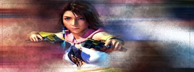
You need to work on your text placement and the fonts as well. Also try working on some effects for it so it can stand out a bit more. I don't like the repeated theme the signatures seem to take. All are motion blurred in the same direction. Try to get the renders to flow. With the master chief, set the angle with his rifle, for yuna, with the gun. For the Battousai one, set the angle to follow his arm.
With flow, look for the straighter areas of a render, these stand out more when flow is not matched, therefore hide them with a flow in that direction.
A new stock manip. I took the capture again.


mtbanger
04-11-2007, 04:24 PM
A random Vert sig I found in my photobucket.
brotherhood619
04-11-2007, 05:49 PM
hmmmm not bad infact i like it im gonna have to try something like that
Shinryudan
04-13-2007, 02:19 AM
The text is great, but try to give some colour to that white haze at the top.
This is part one of a two part tutorial to create this piece.
Found here.
http://www.deviantart.com/deviation/53090452/
Do not img tag it to this site, just follow the links.
brotherhood619
04-13-2007, 10:34 AM
ermmm ryu are you showing that you made a tut out of that piece or just showing it?
Shinryudan
04-13-2007, 11:25 AM
Tutorial, follow the link.
magic slap
04-13-2007, 04:31 PM
Here's mine

c&c appreciated
brotherhood619
04-13-2007, 06:43 PM
Needs resizing i know but i like this one better
this one was longer until cut it down because of all the blank space.
Magic slap: thats pretty nice like the star brushes.
Shinryudan
04-13-2007, 08:01 PM
Magic Slap
Try to blend in the render a bit more. I don't really like the over use of the ripple.
Brotherhood
You see, I did a double take when I saw this from you. This is really really well done. Only a few small problems I see. Try lifting some of that smudge off of the render, it gives it way too much of a shadowed feeling to it. Other than that, nice job.
brotherhood619
04-13-2007, 08:04 PM
a double take? whats that lol. anyway thanks for the comment, it just seemed to work :S mabey jessicas just my girl lol
There should be a seperate forum for sigs and the like. :P
Three versions
v.1
v.2- Slightly darker

v.3 Even more slightly darker. :P
Another one..
Couldn't get the effect I was going for to work out. :(
People liked this so I'll post it O_o
Made Spiderman one first
then the Robot one
Then the FF one. =P
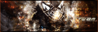
C/c and stuff please?
Prak_Hater21
04-15-2007, 05:19 AM
They are awesome man great job.
Also prak is a faggot.
brotherhood619
04-15-2007, 10:50 AM
Twbm: They all look good, spiderman ones my fav though, keep up the good work
prak hater: im guessing you put that comment about prak on all of your posts
jewess crabcake
04-15-2007, 07:43 PM
really good. Twbm how'd you get those effects
Cautsu
04-15-2007, 08:30 PM
jewess crabcake
04-15-2007, 08:43 PM
These are all very good especially the banner.
jewess crabcake
04-15-2007, 09:33 PM
I think it's a bit excessive, but I like it.
jewess crabcake
04-17-2007, 02:30 AM
Another one. nothing special it started out way different.
Cautsu
04-17-2007, 02:34 AM
These Aren't to bad. A bit simple for signatures, but they are good still. Better then when I started off. XD
xLordCJx
04-17-2007, 01:44 PM
really good. Twbm how'd you get those effects
A lot of it is brushing mixed with filters.
Instead of just adding a filter, try playing around with different blending effects.
Located Here:

In order to get a good effect, you'll need to experiment with multiple types of the same layer.
For instance, notice the layers named 'Layer 3, Layer 3 copy,' and 'Layer 3 copy 2.'
They're all the same layer, but just different blending effects added to them.
The original Layer 3 is the layer of the Prince with the smudging around the edges (to make it blend with background). The Copy is the original render (focus image, in this case, a cut out of the Prince) but set on the blending mode 'Soft Light.' Soft Light allows the layer to blend with the layers below it by making it slightly transparent.
I'll try to show you some stages.
This is what it looks like with 'Layer 3 copy' and 'Layer 3 copy 2' turned off:

This is what it looks like with just 'Layer 3 copy 2' turned off, and Layer 3 and Layer 3 copy turned on:

And this is what it looks like with all three layers visible (final product):

For the record, 'Layer 3 copy' and 'Layer 3 copy 2' are both set to 'Soft Light.' This is what it looks like with all three 'Layer 3's' set to Soft Light:

Try experimenting with multiple types of the same layer but on different blending settings.
Also, I noticed that with the Squall signature you used the entire image and not just a render. If you want to use renders, which is highly recommended, register on
http://planetrenders.net/renders/index.php
This is the same image as what you had, just without the background.
If you use renders, it allows for easy duplication methods and they're just easier to work with.

I hope I explained it well enough.
brotherhood619
04-17-2007, 03:24 PM
lol thats the same image that i tried to render the hair is definatly hard
xLordCJx
04-17-2007, 04:18 PM
Yeah, using the pen tool on that might be really difficult.
Shinryudan
04-17-2007, 11:07 PM
Its not too bad. I did that one awhile back. The whip is the hardest part
brotherhood619
04-18-2007, 01:03 PM
whip? do you mean thing in the back of his hair?
Shinryudan
04-18-2007, 08:00 PM
The blades. Sorry I'm thinking about another pose of him. the blades are a whip.
jewess crabcake
04-19-2007, 01:50 AM
this just couldn't do what I wanted
brotherhood619
04-19-2007, 06:39 PM
^one for a clan member^

^one for kamegi^
smarites the background really doesnt fit the render sorry
To be honest i think ive found my style i like it
jewess crabcake
04-19-2007, 08:48 PM
Yeah I did that after nothing seemed to flow right, I used the dissolve layer for the white specs and vivid light darked the colors, so you can barely see that that b/g is actually Fayt Gaussian blurred. If you look closely to the white spots you can see his vest.
Fayt is by far the hardest subject
jewess crabcake
04-21-2007, 12:10 AM
here's v1
v2
and v3
new one(s) for the weekend
UltimateFFFan
04-21-2007, 08:35 PM
Nice work smarties, I like the Spiderman one, and the Wolverine one would be good if the render was like v1 darker over the brushed background, like in v3
jewess crabcake
04-22-2007, 01:29 AM
Thanks I've been trying new gimmicks, changing layer styles and brushing and whatnot, also how do you link layers?
brotherhood619
04-22-2007, 10:21 AM
theres a little chain icon that you can click somewhere but ive never botherd to use it
xLordCJx
04-22-2007, 01:14 PM
Next to the little brush Icon that shows up to let you know what layer you're working on, there's a little empty box. Click that and it'll link whatever layers you click it on.
jewess crabcake
04-22-2007, 11:35 PM
Thank you, I've been trying to do gargoyles but their renders are non-existant
I really like this one, it's actually good in black and white.
and
today in ten minutes i might add.
xLordCJx
04-27-2007, 12:00 AM

Newest.
jewess crabcake
04-27-2007, 02:29 AM
Holy shit what is that, it looks great but creepy great.
brotherhood619
04-27-2007, 08:10 AM
hmmm nice work :P I might have to try something like that think i know how you did it tho the part at the bottom left of the text gives it away
xLordCJx
04-27-2007, 12:01 PM
hmmm nice work :P I might have to try something like that think i know how you did it tho the part at the bottom left of the text gives it away
Oh crap I didn't even see that. XD EDIT: Fixed.
And Smarties, thats a render of Raiden from Metal Gear Solid 4. Yeah he does look a bit creepy in this one, probably because he has artificial blood.
jewess crabcake
04-28-2007, 05:31 PM
These are plain but I like the nonetheless.
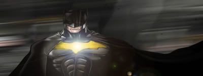
also I know it doesn'y sound like much but I put the yellow in batman's chest, I mean just so you know:)
I liked my sig so much I made it my sig
brotherhood619
04-28-2007, 10:28 PM
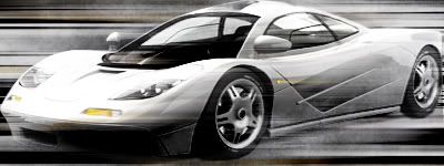
The car is blended well, not sure about the batman one tho. The one in your sig is probably your best so far
I dont know y but the board sent me 6 reply to subscription emails for one post :S
jewess crabcake
04-28-2007, 11:14 PM
Oh I think I know, the first was borderless so I added a border, then I had to keep it under the sig limit which made no sense, PS said the size was 48.6 but FFS said it was larger than 50 kbs, yea so six sounds about right.
Edit perhaps I should have darkened the b/g a bit for the the batman sig.
Powered by vBulletin® Version 4.2.4 Copyright © 2019 vBulletin Solutions, Inc. All rights reserved.


