Pages :
1
2
3
4
5
6
[
7]
8
9
10
11
12
13
Jasmijn
07-31-2005, 11:58 AM
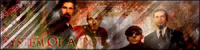
Chocobo Knights sig:
You can't really see the image well..And it's too yellow in my opinion. It also needs a border.. 5/10
Rinoa Sig:
The blending is kinda bad.. And the font color as well.. And this one also needs a border...
5.5/10
Shiva Sig:
This one is better then the rest. The coloring is good. But the font looks a bit too big.
Also needs border...
6.5/10
Squall Sig:
You can't really see the pic well..And it's a bit too plain. The color of the font, isn't really good.. I think this is your worst of the 4 sigs...
4.5/10
The other pics look okay.. =)
UltimateFFFan
07-31-2005, 01:04 PM
Thanks, I'll take that into account. I'm kind of a newbie at photoshop, and still haven't worked out the borders bit yet. Any chance you can PM me with instructions?
Jasmijn
07-31-2005, 01:17 PM
Yeah sure.. I'll do it.. a.s.a.p....
Landlord of Sector 7
08-01-2005, 03:47 AM
Light~Nimbo-stratus
08-01-2005, 05:43 AM
Those are cool sigs, landlord, your sigs stand out because they're slimmer and longer than other.
7.5/10 each.
Landlord of Sector 7
08-01-2005, 09:24 AM
thanks. i dont really like fat sigs, i like them to be like real, skinny rectangles. :)
UltimateFFFan
08-01-2005, 10:23 PM
Nice Landlord. Just don't go using the second one as your sig, it's too long. They are good.
1st One:
Nice colours, matches the text well
8.5/10
2nd One:
Again nice colours, but a bit too long 8/10
3rd One:
Font matches the brushes well, colours good match too
8.5/10
EDIT: Just made myself a new sig with some brushes recommended by a friend. What does everyone think? Links to my new image site (under construction)
Jasmijn
08-02-2005, 10:54 AM
To UltimateFFFan:
The brushes are cool, but the color doesn't match the color of the font and the borders.. 6/10
What about my signature? I also have a site! Plz check it out and leave a message! =)
UltimateFFFan
08-02-2005, 09:00 PM
Already done so Jasmijn, am awaiting your reply about affiliation. Nice, though I'm still trying to work out what it is, at the moment
7.5/10
Jasmijn
08-02-2005, 09:05 PM
Uhm.. Affiliation is just linking to each others sites.. =) But that means that your link has to be on every page.. =)
EDIT: You're accepted, I'll add you a.s.a.p.. =)
Light~Nimbo-stratus
08-04-2005, 05:30 AM
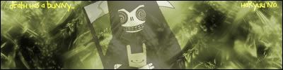
I came up with this one randomly, one day I wanna be a chocobo knight on a different character, so I made my own image. Comments?

Der Konig
08-04-2005, 07:27 AM
<table><tr><td>

Since Artistic Discussion has been overflowing in signature threads which push the real art threads down, we've decided to create one big thread for everyone to post their sigs (and avatars) in.
If you wish to discuss techniques, tricks, etc, please visit the Amateur Sigmakers Club (
http://forums.ffshrine.net/showthread.php?s=&threadid=7216" target="_blank)
So, if you want to show your sig/ava, please post them HERE, and not in an individual thread. Thanks. ^_^
</td></tr></table>
who says this isn't real art?
and this is my photobucket:
http://photobucket.com/albums/a30/Der_Konig/
UltimateFFFan
08-04-2005, 07:58 AM
Well said Der Konig, why don't you consider joining the GFX team, just make a post on the "Please make me a sig/avatar thread" and I'll add you to the list
Shinryudan
08-04-2005, 02:43 PM
I especially like the tech sigs, they are rather plain but very well done and thought up. Stop by the above mentioned thread if you want some work for sigs/ava sets. There is a nice long list that you can pick out jobs from.
Der Konig
08-04-2005, 02:50 PM
Well said Der Konig, why don't you consider joining the GFX team, just make a post on the "Please make me a sig/avatar thread" and I'll add you to the list
sure I'll join, but I don't do avy's-I can't be really active in the next week or so though cause school's starting.
Jasmijn
08-04-2005, 05:06 PM
Uuuh... Why don't you make avatars..?
Shinryudan
08-04-2005, 08:34 PM
New sig, took me awhile and had serious size issues for its original use. Rate and comments/criticism please.
Jasmijn
08-04-2005, 08:38 PM
The effect with "Shinryudan" is really cool! But I don't like the background much.. It's a bit too colorful since the image kinda has the same colors.. Hm... 8,5/10.. =)
Light~Nimbo-stratus
08-04-2005, 10:25 PM
I like your new sig, what do people think about the chocobo knights one I did?
Jasmijn
08-05-2005, 09:11 PM
@ Dark~Cloud..
"Chocobo Knights" is hard to read.. So that's kinda bad.. The background is way too plain.. The Dots don't match the image.. And the color of the border is bad...
I say.. about.. a .. 4/10..
Shinryudan
08-06-2005, 12:55 AM
You should add some brushing to the bg or some effects. As is its just an expanded picture with writing and a border. I'll refrain from rating.
Der Konig
08-06-2005, 06:46 AM
Thanks, I'll take that into account. I'm kind of a newbie at photoshop, and still haven't worked out the borders bit yet. Any chance you can PM me with instructions?
pm me your msn or aim and I can teach you photoshop stuff if you want
__________________________
Shinryudan
yeah um...not to sound harsh or anything but I'd rate it a 3/10
the colors don't work well at all
the fractals don't work with the tech brushing
the text needs work although the effect is cool
___________________________
and I don't make avy's because I don't like making them, thats good enough for me
___________________________
Ultimate FFFan, check out this page for your planet project:
http://gallery.artofgregmartin.com/tuts_arts/making_a_planet.html
UltimateFFFan
08-06-2005, 08:00 AM
Cheers Der Konig, I'll PM you now
Shinryudan
08-07-2005, 04:52 PM
Another animated sig, colors didn't work too well with it so I left much of it grayscale.
http://img287.imageshack.us/img287/9789/sig27hk.gif
Light~Nimbo-stratus
08-07-2005, 06:00 PM
Well, I'm not too good with borders and I couldn't find the right background color and the text color, well, I'm not sure. But I'll work on it.
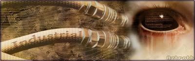
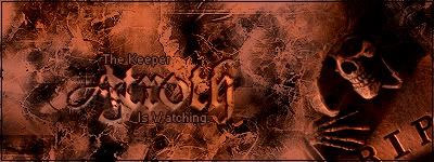
Aztroth
08-07-2005, 10:36 PM
well i can't get a decent image host for this pic because it's kind of big in file size... so just check out the link here (
http://ff7overlord.tripod.com/sig.html). let me know what you think...
Shinryudan
08-07-2005, 11:00 PM
Site Could Not Be Found, sorry Aztroth looks like it aint there.
Aztroth
08-07-2005, 11:08 PM
ok try it now... i changed the link... I forgot a punctuation, lmfao...
MossY
08-07-2005, 11:16 PM
my new sig
Shinryudan
08-08-2005, 12:57 AM
I like the qoute a lot. I took me awhile to realize that that was a split picture but NICE work on it. I love the animation on the clouds and how they break apart when the line hits them. The color scheme is a bit too dark for my tastes. The brushing is well done and the render is well blended. Since parts of the horse(its head) are cut it is hard to make it out well. Overall I give it a
9.25/10 In all but the darkness it is perfect
MossY
08-08-2005, 01:04 AM
yhank you i lokked up some tutorials that helped, what horses head though?
Aztroth
08-08-2005, 05:30 AM
lmfao I think he was talking about mine since mine had a guy on a horse in it, and thnx for the comments shinryudan... dark was the point... hence the quote, lmao... that thing took me about 2 hours to do... one of the longest sigs I've ever done...
but now I think you owe mossy a rating, getting his hopes up like that...
(btw, mossy I think it's pretty good considering... I personally don't care much for the jagged edges, but the overall sig is pretty good...
Shinryudan
08-08-2005, 02:39 PM
Did you use a tut for the animation, if so could you send me the URL.
The best animation that I have done to date is the one for "Samus Aran" on previous page.
Aztroth
08-08-2005, 03:01 PM
no I actually made it up as I went... i've been useing image ready steadily for almost a year now, and considering how many gfx I make thats alot...
Light~Nimbo-stratus
08-08-2005, 03:10 PM
How do you make all those cool back grounds and bords that like bend back the picture?
B.T.W. I worked on that one, possibly worse, you can read the text, though.

Aztroth
08-08-2005, 03:41 PM
im not sure what you're talking about.. maybe you could point out what your talking about...
Light~Nimbo-stratus
08-08-2005, 03:45 PM
I'm talking about those backgrounds with awsome colors and effects, and how do you put another picture into a signature?
B.T.W. I made a simple sig for Shinra Turk, he said he liked it, so at least one person does.

MossY
08-08-2005, 03:52 PM
^ what program are you using?
Aztroth
08-08-2005, 03:52 PM
Iuse photoshop cs2... I use brushes and other effects and as for the pics I take a pictue, cut it out and put it in.. thats putting things simply though... there is a little more to it than that, but thats the basic jist of it... But i've also been working with photoshop for about 6 years now...
MossY
08-08-2005, 03:56 PM
i was asking dark cloud but anyway how do you make your backgrounds? they look great the best i can do is a symetrical thingy thats hard to describe
Aztroth
08-08-2005, 04:02 PM
well if you are useing photoshop try going online and getting some brushes, and then getting some tuts on how to use them... it's too long to explain, but too simple not to understand... so making google your new best friend sounds like your best bet...
Light~Nimbo-stratus
08-08-2005, 05:12 PM
I use Photoshop 7.0.
MossY
08-08-2005, 05:28 PM
Experiment with it, its what i did for my sig
Light~Nimbo-stratus
08-08-2005, 08:14 PM
Can anyone PM me with stuff to help me make sigs? Like borders and all that fancy stuff?
UltimateFFFan
08-08-2005, 09:27 PM
Look on these sites for some good tuts:
www.greycobra.com
www.good-tutorials.com
One of the more useful functions I've found in Photoshop (not that any are useless) is the radial blur tool. If you set the blur type to zoom, it will make it look as if the image in the foreground is emerging from a background like Az's sig
MossY
08-08-2005, 09:43 PM
I use that a lot too and distort wave
Light~Nimbo-stratus
08-08-2005, 10:55 PM
Yes, I have found out about this Radial Blur, and I tried it, very cool. Can you tell me WHY my brushes only do a shade over the color instead of replacing it? I tried to do stars with the Radial Blur but, the stars were barely visable. Also, when I'm going over a color, it just turns it a little to the color I want it to turn. It's getting really annoying, any suggestions? And if you do have some, PM them to me, don't want to clog up this thread :)
MossY
08-08-2005, 11:05 PM
go to your brushes and scroll up. pick one from the very top, youre using a translucent brush =)
Shinryudan
08-08-2005, 11:16 PM
With the previous question, you're probably not using a transparent brush. Go to the bar that says brush and set your FLOW and OPACITY levels to 100%. Also check that all your layers are a 100%. Another thing may be that your background color(default is white) is set to the color you are brushing on.
For colouring your brushing (can only be done to white) look up multi colouring.
Here are some nice sites I found helpful with Photoshop when I first started.
www.good-tutorials.com Use the search bar in the upper right hand corner to find what you want. Also do whatever looks cool to you.
www.pslover.com Another nice group of tutorials. Didn't use it much.
www.Pixel2life.com The other major tutorial site that I used.
And of course if all else fails there is always the ever present....
www.google.com
Light~Nimbo-stratus
08-08-2005, 11:30 PM
Thx, I'll check that out.
I did this with the water effect:

darkcloud
08-09-2005, 12:35 AM

well thats it
Light~Nimbo-stratus
08-09-2005, 04:52 AM
Good job.
Aztroth
08-09-2005, 05:37 AM
well I just got done with this for one of my forums... thoughts please...

Light~Nimbo-stratus
08-09-2005, 05:59 AM
I like it Aztroth, it's a great sig. *resumes struggle with borders*
MossY
08-09-2005, 12:39 PM
Again you have made a great background
Go Dream
08-09-2005, 01:19 PM
Here is mine: ;)
MossY
08-09-2005, 01:20 PM
I already said so in hi, its awesome, if a little big
chewey
08-09-2005, 01:21 PM
BIG SIG
Go Dream
08-09-2005, 01:45 PM
I'll find something smaller.
MossY
08-09-2005, 02:28 PM
just scale it down, it was a good sig
Shinryudan
08-09-2005, 04:06 PM
Aztroth, well done, though the shades of grey are all al tad too close together. Some of the text is a little hard to pick out because of the scanlines. In my opinion on that sig you overused the scanlines. 6/10 bad shades of grey
Aztroth
08-09-2005, 04:55 PM
well if you saw the skin it was meant for you wouldn't say so... pm me and I'll show you what im talking about...
Light~Nimbo-stratus
08-09-2005, 09:50 PM
These are recent pics I did:


Comments? Keep in mind I'm just getting the hang of photoshop.
Aztroth
08-09-2005, 09:54 PM
ummm, where did you get that last one? because i've seen it efore except in green...
EDIT: also here is another sig...

Light~Nimbo-stratus
08-09-2005, 11:11 PM
I got the instructions at one of UFFans sites he gave me, made a complete different in my photoshop skills, but I still don't know how to put an image into another one. *gets Irift worthy anger*
Der Konig
08-10-2005, 01:52 AM
@Az, I'd kill the scan lines add some color,change to a better bg then just that c4d
@ Az for the second one-urgh the brushing needs work.
@Dark and Az-Don't misinterpret me as being condescending or pompous, but you guys need work, you're not gonna advance at all staying in these forums, I'm still a beginner, yet I haven't seen anyone better then me at photoshop here yet, you need to surround yourself with better artists so you can get better yourself.
I reccomend going here:
http://s11.************.com/Prodigy_Graphics/index.php?showforum=11
The entire gfx team is better then me, some of the members are better then me to, check it out, its definetly worth a visit.
Aztroth
08-10-2005, 01:57 AM
lmfao... you're one to talk... I haven't seen anything come from you... so until I do im just gonna ignore your comments... and I don't just stick around here... I spend most of my time at Dark Designs (link in my sig) so please just stfu until you can PROVE you're better...
Hogan
08-10-2005, 04:50 AM
No, my penis is bigger!
haryuu no
08-10-2005, 06:18 AM

and some weird experiment in which i got text from a manga screenshot and placed it on my sig:
:)
Nice dude, real nice I give it a 7.5
Light~Nimbo-stratus
08-10-2005, 07:08 AM
I did this messing around with filters, I wouldn't use it, though I do like the colors.

ffkiller
08-10-2005, 07:15 AM
http://thefilehut.com/userfiles/ffkiller/ffkilleryellow.gif um, i guess for stupid size restrictions this sig wont work here, but check it out
EDIT: whoops!
i almost forgot to say, i didnt make this, my friend from the xbox.net forums made it.
http://thefilehut.com/userfiles/ffkiller/ffkilleryellow.gif um, i guess for stupid size restrictions this sig wont work here, but check it out
EDIT: whoops!
i almost forgot to say, i didnt make this, my friend from the xbox.net forums made it.
Nice 8.5
Shinryudan
08-10-2005, 03:59 PM
Definetely wont work here, 1,300KB heheheheh. Anyway the movie and the car are blended rather well. The movie quality looks a bit like it has color dodge on it. Other than that the sig looks very well done. my compliments to your friend 9/10
Slash
08-10-2005, 05:47 PM
any one like the new sig?
pedo mc tax me softly, black person (whom i love)
08-10-2005, 07:06 PM
Blah blah blah.
Shinryudan
08-10-2005, 07:37 PM
any one like the new sig?
Not too much, mostly its a picture with a border stuck on it. 5/10
Jasmijn
08-10-2005, 09:31 PM
Not too much, mostly its a picture with a border stuck on it. 5/10
I agree with you Shinryudan.. It's pretty simple to make it...
Yeah if you can find the picture to it. *lol* Anyways yeah I like the sig slash, it's more original. I mostly like the original type of sigs than the ones they make today.
Der Konig
08-10-2005, 11:04 PM
lmfao... you're one to talk... I haven't seen anything come from you... so until I do im just gonna ignore your comments... and I don't just stick around here... I spend most of my time at Dark Designs (link in my sig) so please just stfu until you can PROVE you're better...
lol simmer down now princess, its okay
first: I've posted both a splash in the artistic discussion forum and I've posted a link to my photobucket account in this thread, so maybe you should pay more attention.
second:I don't care if you listen to me or not, I'm just trying to help you GFXers out, if you chose not to listen then what do I care.
third: I don't give a flaming fuck if you tell me to shut up or not, I'm gonna say whatever I feel like, you don't like it?
a) ignore it
b)try flaming me (LOL)
c) Actually listen to what I'm saying and possibally get better
fourth: Is that a challenge?
It may be a challenge, would you accept?
Der Konig
08-10-2005, 11:16 PM
Well I suppose, I mean, I don't feel like battling as I don't have the time or inspiration, but I'm not gonna back down from a challenge.
Shinryudan
08-10-2005, 11:20 PM
Yeah if you can find the picture to it. *lol* Anyways yeah I like the sig slash, it's more original. I mostly like the original type of sigs than the ones they make today.
I have the pic on my comp. actually, odd really I was extracting reno when I rated that.
Aztroth
08-11-2005, 02:25 AM
Is that a challenge?
it is if you're up to it... now all I need to do is find somewhere to post it! lmao
Der Konig
08-11-2005, 04:27 AM
lol, like I said, I don't want to, but I never back down from a challenge
UltimateFFFan
08-11-2005, 08:07 AM
Right, Der Konig, in some ways I have to agree with Az, your sigs are basic, but in other ways they aren't and you seem an experienced maker. It seems you both have a lot to learn from each other, and learning is a two way thing.
Der Konig
08-11-2005, 10:34 PM
I never claimed to be an expert, at NSL (Nationalsigleague.com) I'm classified as a novice, I'm good up to a certain point, but I'm not quite intermediate yet, and a lot of my sigs are experiments, my current is one of my favorites, and yet its not like most sig makers of my skill level's style, I like to consider my style relatively uniqe, so if that means I don't make sigs like

or
all the time doesn't mean I don't know how, I just like to experiment a lot
Venom
08-11-2005, 11:46 PM
I like mine alot
shadow_cammy
08-12-2005, 02:29 AM
Aztroth
08-12-2005, 07:15 PM
well speaking of experimenting, this sig goes against so many things that i do that its funny that i even made it. I hate pixel stretch, I hate the whole comic book style, I hate the font, i just flat out don't like it, but it got rave reviews for some unknown reason so (sry hit enter on accident) I figured Id show you guys... I was experimenting with things I dont like...

Der Konig
08-12-2005, 09:10 PM
urf, not likng your choice of brushing, grunge brushing (preferably soft grunge, like rust brushes from Metal CX) are the best for px stretch imo. its okay, nothing special my rating-5/10
Aztroth
08-12-2005, 10:25 PM
i know... I don't like it either, but others did, so I figured w/e just try it out.
also I was bored last night so I asked someone to request something really complicated so that I could have something to do. his request was as follows:
Size: 400x150
text: Minority27
animations: Doors open from the side. then doors open from the top. then it looks like minority27 is being writen, it doesn't just appear make it like an invisible hand is writing it, and when its done writing minority27 make lightning flash and the flames come up and the sig starts over
color scheme: black and red
and this is what came up with...
http://img352.imageshack.us/img352/7748/minority276bi.gif
mainly it was just to try to occupy my time
Not really my type of design, but pretty good work aztroth.
Light~Nimbo-stratus
08-12-2005, 11:23 PM
I liked it, Aztroth. I liked it because of the colors and I like animated sigs and avas, though I can't make them.
My Rating:
9/10
UltimateFFFan
08-13-2005, 07:14 AM
Thats because you're not really supposed to use them, just like dial up, it kills Sarah's children
Slash
08-13-2005, 03:09 PM
i like it personaly and im not into moving sigs....8/10
haryuu no
08-13-2005, 07:24 PM

>_>
Der Konig
08-14-2005, 04:59 PM
colors clash so badly, the text needs work, try using the font Visitor, the render needs to be either bigger or in the middle of the sig to create a better focal point.and the brushing needs work, it currently has no 'flow'
Shinryudan
08-14-2005, 07:42 PM
Also to add to that the whole thing looks like it has been "color burned or dodged." Change the blending mode on the render because a lot of it is transparent. Another option is to crop the sig.
Der Konig
08-16-2005, 02:01 AM
Yo Aztroth, I have a battle sig ready, just name the time and place
mac_mogul
08-16-2005, 02:42 AM
Here's a new one (i've gone on a FFIX kick lately O.o )
http://www.y44.com/ims/pic.php?u=2489FaZtX&i=22330
Here's my current one.
this pic of Vivi always makes me giggle like a giddy young school girl
darkcloud
08-16-2005, 03:15 AM
i reworked it
Aztroth
08-16-2005, 04:01 AM
Yo Aztroth, I have a battle sig ready, just name the time and place
lmfao, I'd forgotten about that! well if you still want to. but just for future reference, I don't really harbor any ill will towards you, you just kinda pissed me off by implying that I suck... but hey if you still wanna d it fine by me... I think that general discussion might be a good place... or maybe here in the artistic discussion thread... idk, doesn't matter to me... so what are the guidlines for the sig?
Der Konig
08-16-2005, 04:25 AM
@Dark and Az-Don't misinterpret me as being condescending or pompous, but you guys need work, you're not gonna advance at all staying in these forums, I'm still a beginner, yet I haven't seen anyone better then me at photoshop here yet, you need to surround yourself with better artists so you can get better yourself.
I just said you need work, I still need work so I dunno why you got all emo, and you called me out remember? I didn't feel like battling but you challenged me,
anyway
for the sig battle:
max size 400x250/freestyle/no animation
Make the thread and pm me the link so I can post my sig
hey guys i am an amature at gfx design but i am all for some feedback here is my recent works including my current avatar and sig


I like the stargate one but It looks to Stuck on if you understand what I mean you need to try and Blend in the Building to the back ground.
Light~Nimbo-stratus
08-16-2005, 07:32 PM
Hey Jeto, I think I've seen you on another forum, was it gamerenders.com or some other GFX site? I've also seen that ava of yours on the site I saw you on. I guess the web ain't that big after all...
heh guess so ^^ btw nice sig
grn apple tree
08-17-2005, 12:25 AM
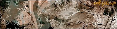
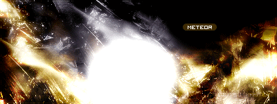
at der konig: that one meteor signature is amazing. just purely amazing.
at haryuu no: i like this new sig. to me the colors are nice, it's something new, which is always good. but the text is a little off. otherwise job well done man.
at jeto: this sig is awesome, bleach is an awesome anime/ manga. anyways i like it overall. but something is bothering me about the text. i'm not sure what or why it is, but something bothers me about it.
thought I'd switch my style up a bit.

(
http://imageshack.us)
k, well I made a few i'll go from oldest to newest... (btw if anyone wants me to make them a sig... just ask! i'll be glad to! :))
Thunder Plains:
http://img377.imageshack.us/img377/3218/lush39os.gif
http://img377.imageshack.us/img377/1885/lushsig3copy7qh.gif
Final Fantasy X-2:
http://img399.imageshack.us/img399/6579/lushavi6ly.gif
http://img377.imageshack.us/img377/6936/lushsig24hw.gif
Deviant Art: I may have made this signature but i did NOT draw the picture i used!

Final Fantasy IX: Lulusmoogle and nightshadow i have made for clients on another ff forum
http://img377.imageshack.us/img377/7561/nightshadow5ko.gif
 http://img377.imageshack.us/img377/9174/lulusmooglesig1jp.gif
Final Fantasy XII Also included in this section my avatar and sig! some of my better work!
http://img377.imageshack.us/img377/6981/ff12sigacopy6em.gif
Please note that some of these Avatars were made for other users (Vivi and Eiko, moogle) please do not take any! :) thanks!
Tell me what ya think? and if you want i'll make you one!
streamsun
08-20-2005, 12:34 PM
oops, this sig is bigger than the limit, so i guess i can post the link and people could comment?
http://img1.picsplace.to/img.php?file=img1/254/Beginingkingdonhearts.gif
April
08-20-2005, 02:00 PM
Sorry, streamsun. I think maybe I said it wrong in the other thread.
You can show the sig in this thread but what I meant was it was too big to be used as your sig on the forums.
:)
streamsun
08-20-2005, 05:19 PM
Ahhh :) i get you. Guess ill just add img tags around it, and keep my current. Cheers for telling me :)
Light~Nimbo-stratus
08-21-2005, 05:17 PM
From what I saw of it, you just need to remake it with a bit less exspance between the two renders. It's a great sig too.
made this for a friend nothing special..

Can anybody tell me what they think of this sig and avatar i made of Rikku... I'm thinking of changing my current one to this one.... but i don't know which one is better :S can anyone give me their opinion?
Avatar:
http://img398.imageshack.us/img398/9720/rikkuava125x1257iz.gif
Signature:
http://img398.imageshack.us/img398/8910/rikkusig5bw.gif
Thanks! :)
Slash
08-23-2005, 07:13 PM
wow i like them 8/10 they have a different style to most you see on here...nice to see a new sig maker on there
wow i like them 8/10 they have a different style to most you see on here...nice to see a new sig maker on there
this is embarrasing but are u talking to me? lol or Jeto...? lol
-Jeto-
08-24-2005, 04:27 AM
you :P
Thanks Slash... that's the nicest thing anyones said to me since i joined ffs... and all the other forums im a part of... people are pretty cruel sometimes...
lol oh well! :)
i also love how you do your sigs, with the cropping very original! :)
*Tifa*Aeris*lover*
08-26-2005, 05:32 AM
Yeah I haven't done one for a while.....but its okay, I guess?

Quina
08-27-2005, 12:33 PM
Quina
08-27-2005, 12:35 PM
*Tifa*Aeris*lover*
08-27-2005, 12:46 PM
wow i like them i like the aeris one ( can i have it lol )
MossY
08-27-2005, 02:08 PM
What do ya think of my new sig?
Guitar Woman
08-27-2005, 04:41 PM
I like it, but not as much as I would if it didn't have faggot Inu-Yasha in it :mad:
MossY
08-27-2005, 05:04 PM
I don't see much anime so I like basically all of it that I see, including InuYasha
Quina, I think yours are cool and unique, but I use to have your exact problem. Your sigs don't have layers, you need layers.......thats what makes a sig a sig......well that what makes a good sig a good sig...
btw, mossy, your sig sux...sry..I guess you have to start somewhere...keep it up!
*Tifa*Aeris*lover*
08-28-2005, 05:23 AM
What about my sigs on the other page?
What about my sigs on the other page?
*Tifa*Aeris*lover*;
What program do you use to make your sigs?
*Tifa*Aeris*lover*
08-28-2005, 09:04 AM
Something called Photo/image express why?
quina those are pretty good
Slash
08-28-2005, 12:33 PM
quina those are pretty good
Maria
08-28-2005, 07:06 PM
I made my ava and sig myself. Ive just started making sigs, so tell me what you think.
Zephikast
08-28-2005, 10:06 PM
Critique,

yea man
Light~Nimbo-stratus
08-28-2005, 10:36 PM
How do you get your sig in the center of the page? Nice sigs, quina.
Something called Photo/image express why?
Ehh, you need photoshop.....
*Tifa*Aeris*lover*
08-29-2005, 10:01 AM
Hey i can make them my way......they don't have to be Perfect you know!
Maria
08-29-2005, 03:22 PM
some more that I made:


Ive only started making sigs so tell me what you think.
Light~Nimbo-stratus
08-29-2005, 03:29 PM
Check out this one I did Today, I used stuff like Neon Glow and some other filters.

I suck with borders so, I really hate the border. But I like the sig itself. Comments?
Trigun_Kick_@ss
08-30-2005, 02:08 AM
I made the signitures I have on right now, and they own everything...
Light~Nimbo-stratus
08-30-2005, 02:20 AM
What did you think of my new one?
Rhyfelwyr
08-30-2005, 04:10 AM
Not bad, Here's my best attempt at a sig, and ive had about a hundred attempts :S
Light~Nimbo-stratus
08-30-2005, 05:26 AM
Nice sig, You blended the two renders pretty good, what Font is that? BTW, thanx for the comment on my sig, no one seems to be posting about it, more comments would be nice.
haryuu no
08-30-2005, 07:26 AM
Quina
08-30-2005, 11:44 AM
thanx guys and *Tifa*Aeris*lover* u can use the aires one.... ne1 can use my sigs i may make some more soon!?! just please let me know if you r using them
Light~Nimbo-stratus
08-30-2005, 04:40 PM
Good job Haryuu No, You have style like the Landlord fo Sector 7, long, slim sigs. Any comments on my latest one are appreciated.
MossY
08-30-2005, 06:08 PM
You're coming on well
grn apple tree
08-30-2005, 07:21 PM
quina: your sigs aren't too bad actually. though i don't like big sigs so that kind of makes me not like them, i'd say overall 8/10 (by the way your cloud sig is pretty awesome)
zephikast: nice sig, it's amazing. i like the colors and everything 9/10
*rinoa*angel*: nice sigs. they're not great but with some work they'll get better. overall
7.5/10
dark~cloud: to be honest i don't like it. but keep on making more sigs, you'll only get better with time.
5.5/10
trigun_kick_@ss: i really really like your first sig, it's just awesome. also your second sig is nice but not as nice as the first one.
8.5/10
rhyfelwyr: that's a pretty nice sig seeing as you're still kind of a beginner. but the resizing isn't that great. vincent looks kind of squished. but i'd say 7/10
haryuu no: i really like your first and last sig. the pictures and the colors go well with each other. overall 9/10
that's my opinions on the sigs...
Light~Nimbo-stratus
08-30-2005, 07:27 PM
Thx for the honest opinion, these are my latest:


MossY
08-30-2005, 07:33 PM
The top ones pretty good imo
Light~Nimbo-stratus
08-30-2005, 08:59 PM
Thx, Mossy. I just got on the GFX Team. UFFan said he my sig and that I'm getting better daily.
haryuu no
08-31-2005, 01:41 AM
ouch. The colors dont go well together at all on the first one. Also, your sigs don't look like much other than a picture pasted onto a sig canvas with colors, some slight effects thrown, and some text in. That's not much, and continuing to do sigs that way isn't going to get you anywhere. Try to do some brushing and more blending.
Light~Nimbo-stratus
08-31-2005, 05:26 AM
Other people seem to like them. I'll have to look for some brush downloads.
Aztroth
08-31-2005, 06:55 PM
MossY
08-31-2005, 07:43 PM
all 3 are awesome, I esspecially like the 1st one
Light~Nimbo-stratus
08-31-2005, 10:04 PM
Nice, I like the second one.
*Tifa*Aeris*lover*
09-01-2005, 02:04 AM
well i don't like those kinda things on my sigs but i suppose other people do so there ok
Light~Nimbo-stratus
09-01-2005, 05:41 AM
Aztroth really likes demons/skulls. *T*A*L*, what do you think of my Aeris sigs? You 'love' Aeris, right?
*Tifa*Aeris*lover*
09-01-2005, 07:20 AM
Well i don't love her cause i'm a girl, she is my fav character in ff7 only just tho and they r ok i guess i think u could do better
Quina
09-01-2005, 10:44 AM
quina: your sigs aren't too bad actually. though i don't like big sigs so that kind of makes me not like them, i'd say overall 8/10 (by the way your cloud sig is pretty awesome)
thanx i know ive gotta size them down but when i do they just look sooo crap
Denny
09-01-2005, 04:36 PM
Might aswell show off my one. Nothing over the top but i like it. :)
I made some FF related sigs, so please tell me what you think of 'em.
#1

#2

#3

#4

#5

#6

#7

grn apple tree
09-01-2005, 09:38 PM
dirge: you're right, it's not over the top also not as great as that seotaiji sig you made me (that sig was awesome). but i like it 8/ 10
zulu: i really like your sigs. they look like all dreamlike and stuff. whatever the word for it is. anyways i really like your work,
8.5/10 nice job
also quina, i see. well then once you get better at sizing them down, post them here. i'd like to see it, the sigs would look better that way i think.
grn apple tree
09-01-2005, 09:40 PM
sorry... double post
Aztroth
09-01-2005, 11:11 PM
zulu, honestly, I don't know what to say about them... they look like photomanips, so as far as that goes they are good... I don't do much with manips, so I can't really rate them, as I dont have much experience with them... some, but not a lot...
More coming through. ^^
#1

#2

#3

Light~Nimbo-stratus
09-01-2005, 11:57 PM
Do you try to make them so blury?
Shinryudan
09-02-2005, 04:41 PM
They all look like the same thing, gaussian blur with a coloring and maybe some levels adjustment.
The first sig i can tell is jellyfish of a sort, I really like how you use the colors in the sig. The second sig is too dark for me to make out.
also the only work I have accomplished in the last week or so. Just a link button for a site.
http://img358.imageshack.us/img358/1282/button1final8ff.gif
UltimateFFFan
09-02-2005, 06:52 PM
My latest work, critique please.

High Summoner Yuna
09-03-2005, 08:13 AM
Everybody has awesome work here!
Here's a couple I threw together a while ago:


Slash
09-03-2005, 12:49 PM
summoner yuna i like yours but there abit big for my liking, and ultimatefff nice job :) 8/10 for all
elem bahamut
09-03-2005, 04:34 PM
what do u think of mine
Light~Nimbo-stratus
09-03-2005, 06:01 PM
Nice one, UFFFan, what font is that? Neverwinter? I used to be quite fond of that font.
Shinryudan
09-03-2005, 06:16 PM
UFFFan--
Add a border to it. The blending is rather nicely done. Big improvement in my opinion from some of your earlier works this year. Lose a pixel or two on the outerglow for the text, I think a stoke might look good. Also, look into some multicoloring. 7/10
Elem bahutmut--
Yours is a resized screen shot, what can I say...
I have some more sigs I made. ^^
#1

#2

#3

Light~Nimbo-stratus
09-03-2005, 08:38 PM
Zulu, you make so many sigs, but you never use any.
I know... but there's many reasons to that. When I joined along time ago, people really hated me... so, the months went by and still they hated me. So, I decided to keep a low profile for a while... just till things settle down. O:
UltimateFFFan
09-03-2005, 09:13 PM
Got some more people

A Rinoa sig, I don't like this one, but my contacts on MSN seem to like it


One of my friends requested some ffx-2 sigs so i made them these, I don't think they look as good as my Aeris one, but they look good to me.
Dark~Cloud, yes that font is neverwinter, I like it because of the serifs, but other than that it's a decent font in itself
Shinryudan, thanks for the advice, i may redo it later if i get time
Rinoa Signature:
Looks good except it looks a little blurry, you should make the image a little clearer. I don't really like the red border either.
Rikku Signature:
Good, but again you should try to smooth out the texture so it doesn't get blurry.
Yuna Signature:
The best in my opinion, the only thing missing is a border.
Light~Nimbo-stratus
09-03-2005, 09:40 PM
You should get some new fonts at dafont.com they got some great ones there.
UltimateFFFan
09-03-2005, 10:42 PM
Rinoa Signature:
Looks good except it looks a little blurry, you should make the image a little clearer. I don't really like the red border either.
Rikku Signature:
Good, but again you should try to smooth out the texture so it doesn't get blurry.
Yuna Signature:
The best in my opinion, the only thing missing is a border.
Thanks Zulu, weren't you called Edna at one point as well or am I thinking of someone else, anyway, it's the site I used for my images that's blurry i didn't edit the image at all, except take away the background and move it to the texture i'd already made. I've also got a Paine one done and a gullwings one i'll upload tomorrow.
Dark~Cloud, i know i get them from there
Light~Nimbo-stratus
09-04-2005, 03:20 AM
Hooray, I like Colony Wars, their Final Fantasy font is MESSED up.
*Tifa*Aeris*lover*
09-04-2005, 03:55 AM
I just made these to for rikkalesca
Avatar
Sig
what do u guys think
Light~Nimbo-stratus
09-04-2005, 06:05 AM
Hmm, it looks like you did the font then some effects on that, some filters, then you used Lighting witht the Spotlight setting.
Like this:

UltimateFFFan
09-04-2005, 07:51 AM
Looks good *T*A*L*. Try looking up some tutorials on greycobra.com. Also try some grunge brushes. I think they will go well with your images. Overall, 6/10
As promised here's the Paine one,

I tried to use brushes based around her full throttle dressphere from ffx-2 and to me it looks good, but I'm still not sure about the bordering.
I think it looks a little blurry T*A*L, like mentioned you should do a retouch.
Grate:
5.5/ 10
Guitar Woman
09-04-2005, 10:56 PM
Behold the worst sig ever:
Denny
09-04-2005, 11:35 PM
It`s diffrent, i`ll give ya that. ^^
Light~Nimbo-stratus
09-05-2005, 03:51 AM
That truely is the worst sig ever, guitar woman...
Light~Nimbo-stratus
09-05-2005, 06:11 AM
OMG! YOU'RE RIGHT FOR ONCE, PRAK!
UltimateFFFan
09-05-2005, 06:26 AM
Touch� Prak, anyway, here's my Gullwings sig that I've done, I don't like it, it looks too busy, but here it is anyway:

Critique please.
*Tifa*Aeris*lover*
09-05-2005, 06:48 AM
I think it looks a little blurry T*A*L, like mentioned you should do a retouch.
Grate:
5.5/ 10
it's suppose to be blury
Light~Nimbo-stratus
09-05-2005, 07:00 AM
It makes it too hard to see what it is.
High Summoner Yuna
09-05-2005, 08:25 AM
UFFFan, that's awesome!
Here's my new one:

Shinryudan
09-05-2005, 02:05 PM
Seeing as the only ones I've done lately are requests, I'll just post some of those.
http://img136.imageshack.us/img136/5984/ava13du.gif

Tell me what you think.
Light~Nimbo-stratus
09-05-2005, 06:04 PM
I think ****1/2
What font did you use? It seems firmiliar.
I'm still practicing animation.
Shinryudan
09-05-2005, 06:54 PM
I think ****1/2
What font did you use? It seems firmiliar.
I'm still practicing animation.
For animations, good tuts has a few nice ones, but mostly I browse on google. don't understand your rating, o 41/2 stars... And the text I got from your original try at sujin's sig/ava set. Colony wars
Light~Nimbo-stratus
09-05-2005, 06:56 PM
I thought so.
****=4 stars
1/2=a half star
I made some Bj�rk sigs... a little input is appreciated. ^^
#1

#2

Light~Nimbo-stratus
09-05-2005, 08:13 PM
I can see that you did some wind filters on the first one.
one i made for elemental bahamut:

MePhIsTo
09-05-2005, 11:08 PM
Here's my newest...

Tidus 66
09-05-2005, 11:52 PM
Great man
Light~Nimbo-stratus
09-06-2005, 12:11 AM
Sir Dyne said my sig was awsome and he also said for some reason that my sigs are some of the best he's seen here and he wants me to make him one.
MePhIsTo
09-06-2005, 12:42 AM
Sir Dyne said my sig was awsome and he also said for some reason that my sigs are some of the best he's seen here and he wants me to make him one.
Well I don't know who is this Sir Dyne but I know there were some ass kicking sig makers in this forums, there was even a sig making club lead by Mogk...
Dark Cloud you still have a lot of work to do on sigs, try and follow some background tutorials and try to blend your image with ur background, I suggest you start by render backgrounds, there are some neat techniques with them and they are rather simple... ^^
About ur sig being awesome, I cant say I agree... :S
Well here are some tips if ya wanna follow if u agree u can improve:
- Follow some background tutorials, mix some of those techs to make a cool background for your sig
- Try to blend ur picture better with ur background, use some color balances, the eraser to start with...
- Make a border for ur sig!
If you follow this for now you should improve on your next sig! ^^
Shinryudan
09-06-2005, 01:15 AM
At the momment, the only sig making club is a small list that UFFFan has over in the wokshop. I don't think I have ever seen MogK post since I joined.
MePhIsTo-- Forgot to rate yours earlier. Anyway the render is blended rather well into the bg, the bg looks like fire or molten metal and fits in with the ifrit and its colours. I like the border with your name in it and also the scan lines at the bottom. The black vein at the bottom looks rather odd, though something needs to go there I don't like that bit.
7.5/10 in my opinion.
MePhIsTo
09-06-2005, 01:37 AM
Oh well I'm sure an oldbie here... :p
kinda sad to know MogK isnt posting anymore...
There was a forum in the Shrine where u could create a club...
The sig-making club was where I started out, back then Mogk posted some tutorials and the members posted there their sigs and he and some more skilled graphics users told everyone what they should change...
It became a lot like show-off when A LOT of members joined though...
What about Nymph? She was a kick ass sig maker too...
From what I can recall!
About ur sig:
Nice tech looking vectors, I'm not very fond of the background's colours but the render is rather nice, nice image, good blending, the font really has a lot to do with the sig, kinda big for my tastes, but thats just me :P
Overral:
7.5/10
grn apple tree
09-06-2005, 02:41 AM
Oh well I'm sure an oldbie here... :p
kinda sad to know MogK isnt posting anymore...
There was a forum in the Shrine where u could create a club...
The sig-making club was where I started out, back then Mogk posted some tutorials and the members posted there their sigs and he and some more skilled graphics users told everyone what they should change...
It became a lot like show-off when A LOT of members joined though...
What about Nymph? She was a kick ass sig maker too...
From what I can recall!
About ur sig:
Nice tech looking vectors, I'm not very fond of the background's colours but the render is rather nice, nice image, good blending, the font really has a lot to do with the sig, kinda big for my tastes, but thats just me :P
Overral:
7.5/10
nymphadora or something like that, left a while ago. if you look at her sig then you'll know why. i'm not sure why she left though... also nice sig i like the colors 8/10
Light~Nimbo-stratus
09-06-2005, 03:36 AM
Me latest for Sir Dyne:

Dark Specter
09-06-2005, 12:36 PM
I made a sig and avatar and i would like you guyz to tell me what you think of it!
I know its nothing compared to what you guyz do here but its my first!
http://www.geocities.com/tiago657/Avatar.gif
http://www.geocities.com/tiago657/Sig.gif
Tidus 66
09-06-2005, 12:39 PM
MogK still comes here, not so usually but he still posts some things! Nynphadora left
UltimateFFFan
09-06-2005, 03:30 PM
Hey people. I'm going to take a hiatus from requests in the workshop for a while, because of college, I should be able to do some at the weekends, and Mephisto, there is a "sig-making club" though it's more of a group. I am still taking requests by PM though, so feel free if you want a sig to PM me.
haryuu no
09-06-2005, 05:00 PM

"Get the cool shoeshine"
>_>
MePhIsTo
09-06-2005, 05:22 PM
Nice grunge attempt, some things I dont like though, the right image is mot very well blended and its kinda hard to see it, the text is hard reading too...
6/10
Light~Nimbo-stratus
09-06-2005, 07:21 PM
It's a good sig, I just would have put the text somewhere else.
MePhIsTo
09-06-2005, 07:24 PM

Tech Abstract Sig... any comments?
Light~Nimbo-stratus
09-06-2005, 09:40 PM
8/10
Ilike the bg.
elemental bahamut v1
09-06-2005, 09:42 PM
how do u get the writing on to the sig
elemental bahamut v1
09-06-2005, 09:45 PM
Dark cloud chould u make me one
Tidus 66
09-06-2005, 09:46 PM
It's not on this thread you ask for one, and you Double posted!
Shinryudan
09-06-2005, 10:40 PM
People seem to really like you Dark~Cloud. If you have a request for him, PM him or post a request in the "Please make me a sig/ava" thread.
Also, whats with the V1, aren't you just elemental Bahatmut?
Light~Nimbo-stratus
09-06-2005, 11:52 PM
Elemental Bahamut V1, I already made you a sig for Elemental Bahamut, stop making new accounts.
First it was Ele Bahamut, but everyone hated him.
Then it's Elemental Bahamut, nothing wrong with him.
NOW it's Elemental Bahamut V1, STOP MAKING NEW ACCOUNTS!
BTW, you use the Text Tool in Photoshop.
Alright can someone help me out... i'm trying to figure out which signature i like better, which one should i use next
Here's my Yuffie set:
http://img149.imageshack.us/img149/1234/yuffieavi1250xy.gif
http://img217.imageshack.us/img217/6756/yuffiesignature0ge.gif
And Here's my Yuna set:
http://img149.imageshack.us/img149/264/yunastyle1257nj.gif
http://img149.imageshack.us/img149/7595/yunastyle8kk.gif
Thanks in advance! :)
EDIT: these may not be the right size, i'll fix them once i get everyones oppinions! :)
Light~Nimbo-stratus
09-07-2005, 04:04 AM
I like the one you have now, mainly because I like Rikku.
UltimateFFFan
09-07-2005, 07:47 AM
I like the second one, it looks better and I prefer FFX :p
Anyway, Elemental Bahamut, like Dark~Cloud said, stop making new accounts, if you're banned, it's usually for a good reason, and if you forget your password, just hit the forgot password link when you sign in. The more times you make accounts the more people will hate you.
Shinryudan
09-07-2005, 11:50 AM
And eventually they will ban your IP, then none of your accounts will work.
Anyway like UFFFan said I prefer the second as well, just because the texture of the first one is not that good.
MePhIsTo
09-07-2005, 01:06 PM
Lush, imo the second one is better, the texture is strange in the first one, besides its too bright...
Light~Nimbo-stratus
09-07-2005, 04:55 PM
...what he said...
MePhIsTo
09-08-2005, 12:02 AM
Bahamut sig, will go to the gallery if my sugestion is accepted...

Slash
09-08-2005, 12:04 AM
i personaly like your sig because ifrit owns! so
9.5/10 from me and 9 for the bahamut because i dont think the colours go very well...but i know nothing abouts sigs and its my personal opinion
Light~Nimbo-stratus
09-08-2005, 12:59 AM
I like the Bahamut one, it's got a better quality than the one you have right now.
MePhIsTo
09-08-2005, 02:33 AM
Sig made for a contest...

Thanks guys i'll go change it right now! :)
UltimateFFFan
09-08-2005, 07:48 AM
I'm coming up to 1000 posts, so I though I'd make a celebratary sig

It's not my favourite, and I'm going to experiment with it some more tonight, but critique please
*Tifa*Aeris*lover*
09-08-2005, 09:19 AM
I like it it's good
MePhIsTo
09-08-2005, 03:11 PM
I'm coming up to 1000 posts, so I though I'd make a celebratary sig
It's not my favourite, and I'm going to experiment with it some more tonight, but critique please
Well imo it's a bit too plain, besides it lacks a border and the text is kinda strange...
Other than that I like the way the render is blended and the color selection!
Overral: 7/10
Slash
09-08-2005, 03:26 PM
i like it personaly so il give it 8/10 and the one you entered for the comp is cool 9/10
Sujin
09-08-2005, 03:28 PM
New set.
CRITIQUE!!!!!!!!!!!!!!
Light~Nimbo-stratus
09-08-2005, 05:14 PM
Mephisto: 7/10 I like it because it's blueee.
Ufffan, you blended the render and bg quite well, and I like the effects you put on the font 8/10
Sujin: Shin did a great job, I like the border and the animated ava.
9.5/10
MePhIsTo
09-08-2005, 07:02 PM
Mephisto: 7/10
Shin: 8/10
Sujin: Shin did a great job, I like the border and the animated ava.
9.5/10
You are supposed to say ur like and dislikes on the sig...
High Summoner Yuna
09-09-2005, 03:30 AM
MePhIsTo
09-09-2005, 03:54 AM
Simple sigs, the first one is eye candy but you probably noticed the problem with chars going out from sig borders... I was exploring that technique for a while but the edges come out just too pixelated and strange, I also used outer glow to try and smooth them a bit :p
Anyways I found the way to make those sigs without those annoying edges, but you need to have good resource renders for it, backgroundless...
the 2nd and 3rd didnt really catch my eye...
Try and work a bit on background too! Besides, dont make that bevel, just add a border, looks better ^^
High Summoner Yuna
09-09-2005, 04:11 AM
Yeah, I only use the glow effect cause it looks dodgy if I don't, but then the glow goes crazy lookin', lol.
Thanks for the comments, I'll work on them a little more.
*Tifa*Aeris*lover*
09-09-2005, 04:13 AM
i like your 1st sig it look really cool
Powered by vBulletin® Version 4.2.4 Copyright © 2019 vBulletin Solutions, Inc. All rights reserved.


