rotane
08-15-2016, 03:47 PM

When you think about the typeface Comic Sans (that i just used up there), what springs to your mind? Most likely how hated it is. But why is that? It's not because it's a rather ugly font (which, arguably, it is), but because people have been using it everywhere. Not necessarily here on FFS, but you have seen it. Alongside Arial and Times New Roman, it's one of the most hated fonts.
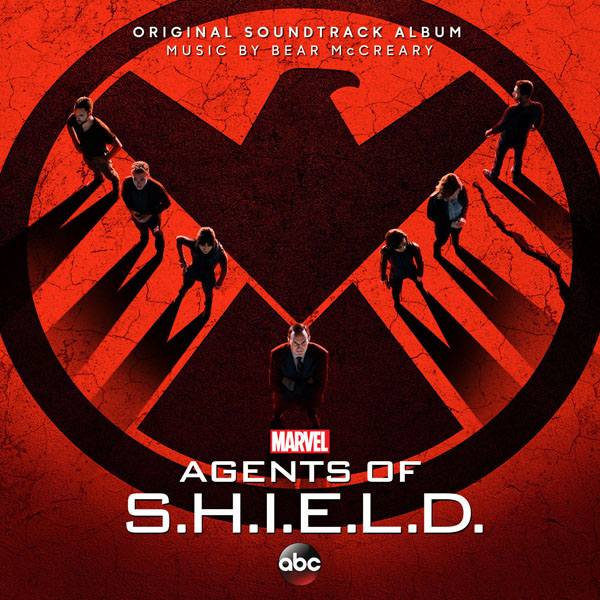
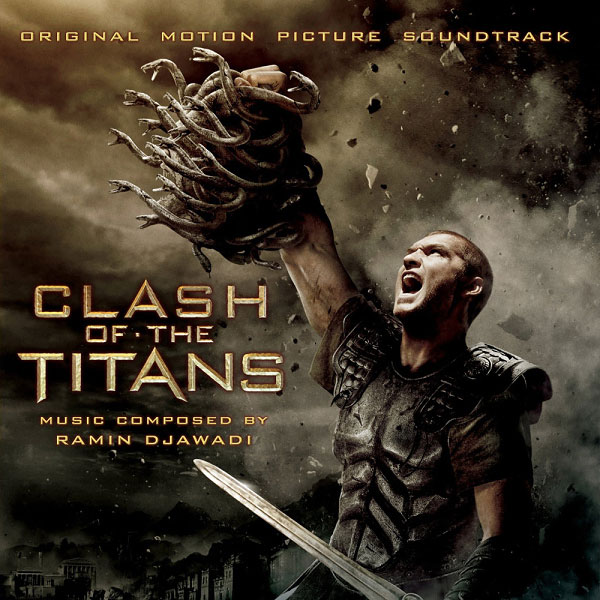
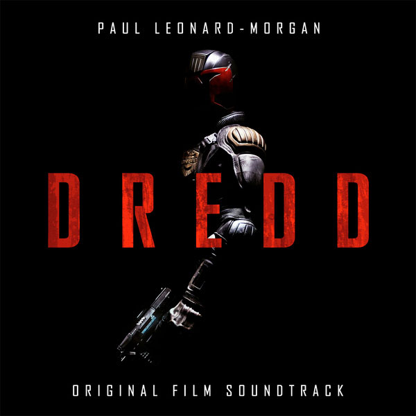
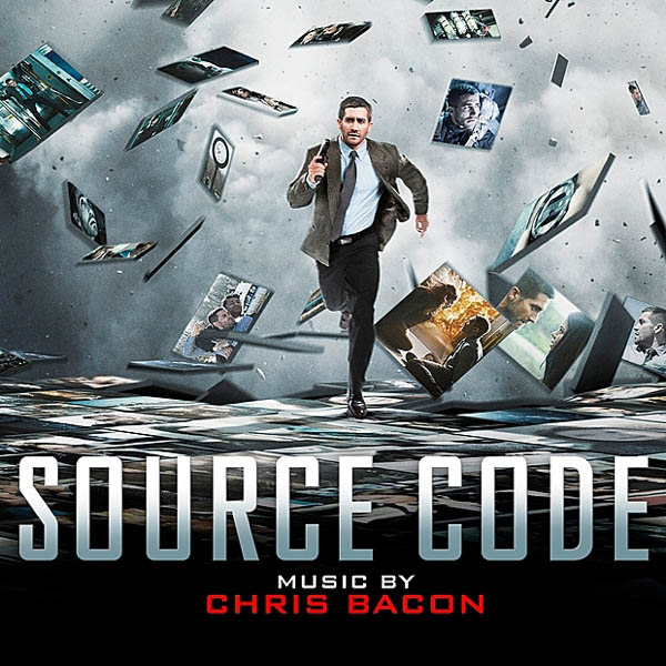
But i'm not here to hate on typefaces for their ugliness, i'm here to talk on their overuse. Because there are 2 other typefaces that take the crown these days (and yes, here on FFS as well, when it comes to custom covers) for being almost ubiquitous: Trajan and Gotham. Gotham (
https://en.wikipedia.org/wiki/Trajan_%28typeface%29">Trajan</a>, being a serif font, is the simple go-to solution for when you need a timeless or "classy" font; <a href="https://en.wikipedia.org/wiki/Gotham_%28typeface%29), a geometric sans-serif, is used for "all things futuristic". But even that rule isn't really true anymore, as you will shortly see. They're usually set in uppercase (or small caps) as well to make them appear even more grandious. (Of course, Trajan doesn't even have lowercase letters to begin with.)
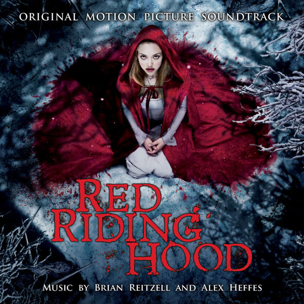
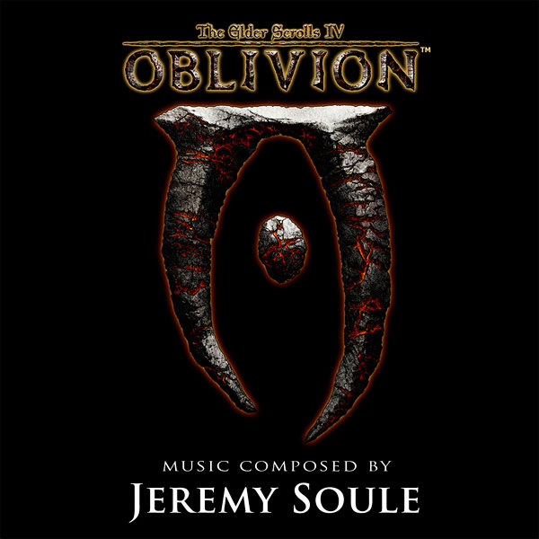
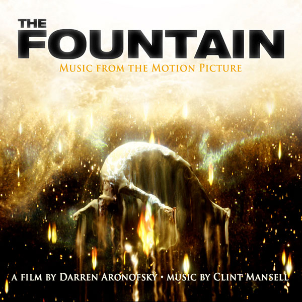
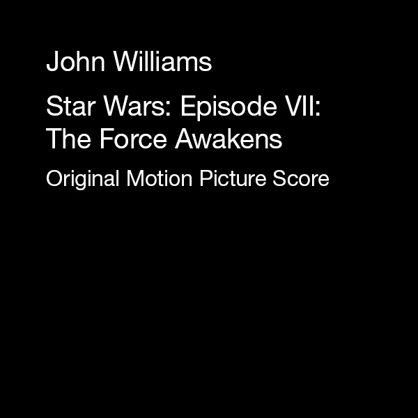
Now, before i bore you with paragraphs of text, i'll let these pictures do the talking. I've searched for album covers that use them � and believe me, it didn't take me all that long to find them. What i want you to take from this (if you're a custom cover creator � or designer in general), is to think before using either of these fonts. There are literally thousands of typefaces out there, and chances are high that one of them is better suited for your project. (Of course, don't see this as an excuse to use Helvetica, because that one is even more overused than all of those that i mentioned in this post.)
Okay, let's kick it off with�

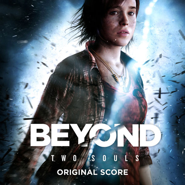

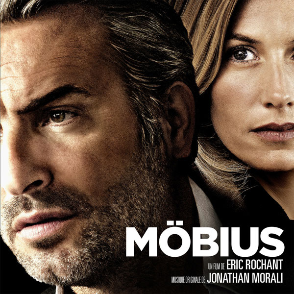
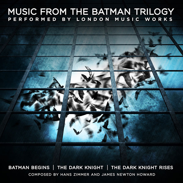
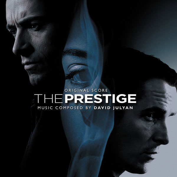 http://hoffer.cx/data/trajan-gotham/gotham/Tomb-Raider-
(2013).jpg
And now�

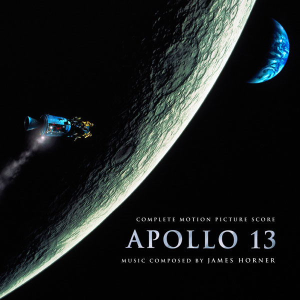
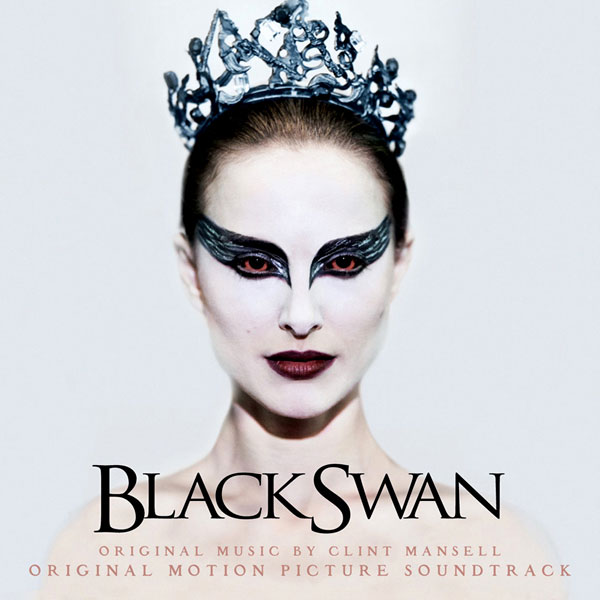
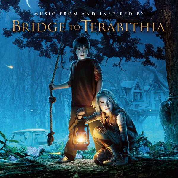
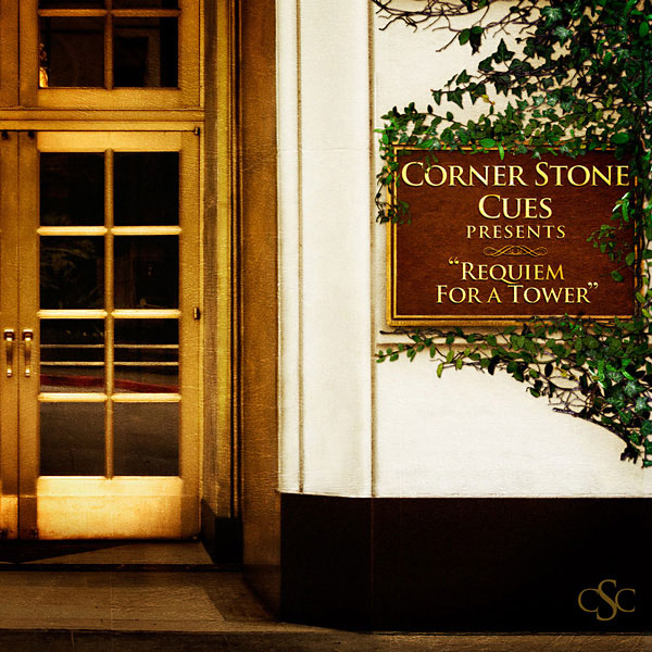
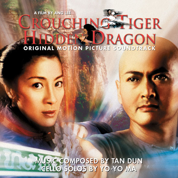
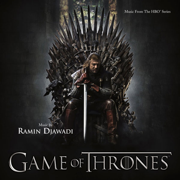
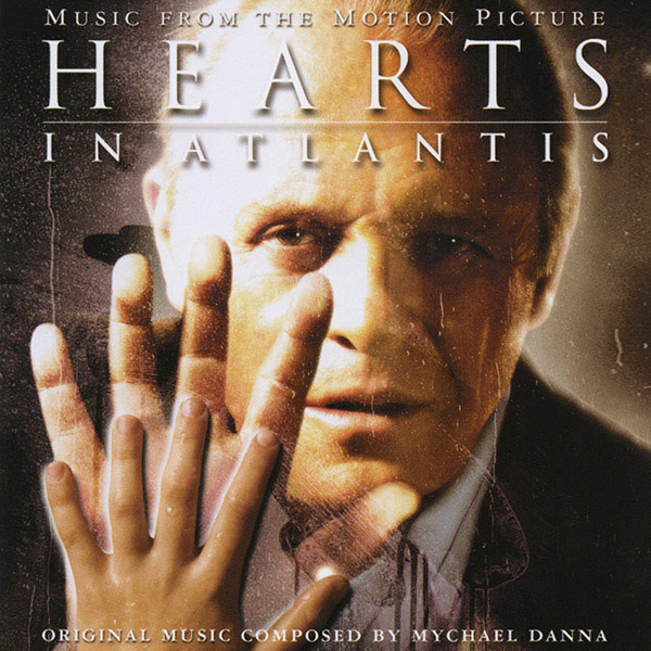

 http://hoffer.cx/data/trajan-gotham/trajan/The-Astronaut
's-Wife.jpg
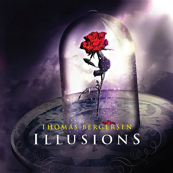
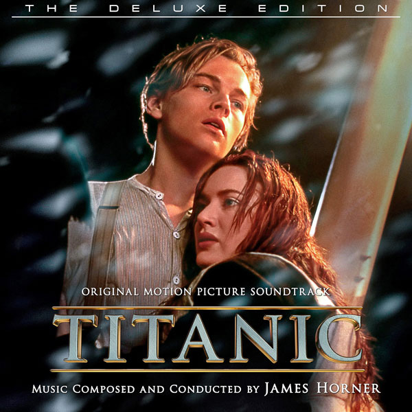
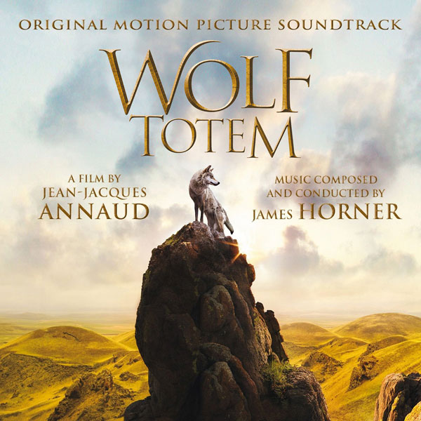
Of course, we're not limited to using it as the title font, they're often used as the byline, like here:
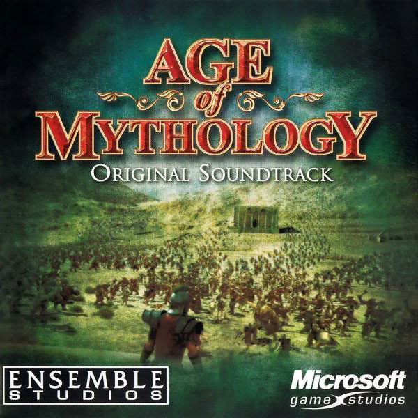
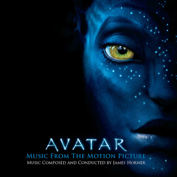
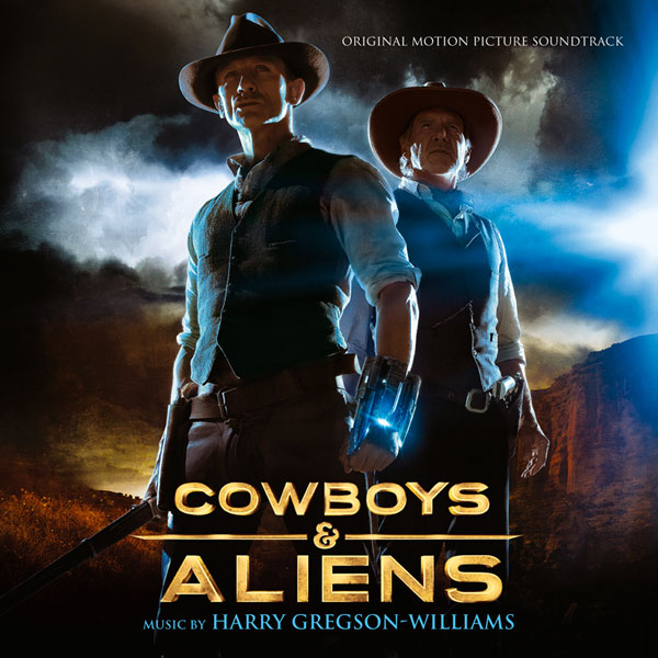
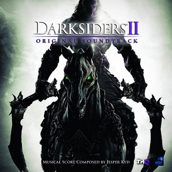
 http://hoffer.cx/data/trajan-gotham/byline/Harry-Potter-And-The-Philosopher
's-Stone.jpg


I think by now you get my point: It gets boring after a while. Don't mistake me, these are not ugly fonts! But when you start using them everywhere, they lose their uniqueness, and in the process, the movie (or poster, or cover, or whatever) loses its uniqueness too.
ROKUSHO
08-16-2016, 01:49 AM
i really give no fucks what font people use, as long as i can read it clearly.
rotane
08-24-2016, 04:37 PM
Well, yeah, readability is of yourse crucial for any commercial work, but style and aesthetics take a close second. If it's of no importance to you, than fine, i'm not going to argue.
However, if readability was the only important aspect of a cover, sooner or later we'd end up with nothing but this:

;)
Dave999
08-24-2016, 05:00 PM
No, thank you. We already had to put up with this crap:

ALSO, those score covers only make me want to download the scores LOL, they don't do anything to me about the typeface.
If anything, some of my reactions were "holy crap, that's that typeface?" :D
rotane
08-24-2016, 05:14 PM
If anything, some of my reactions were "holy crap, that's that typeface?" :D
Yes, you've just made the first step! Next time you're looking at a cover (any cover), you'll notice the typeface a little more consciously, which, in turn, will make you think a little bit longer about the choice of font of your next cover. Which is really what this thread of mine is all about. ;)
TheSkeletonMan939
08-24-2016, 05:15 PM
:laugh:
I can just imagine they were printing the cover and it got jammed, spitting out that mess.
"Oh man, we ruined the cover! What are we going to tell Kanye?"
*Kanye walks in*
"Perfect"
Killgrave
08-24-2016, 05:27 PM
Thank you rotane for illustrating incredibly pointless leper-picking-at-his-scabs quality the Internet has become famous for.
What's next, complaining about the unjustness of gravity and how it always makes toast fall butter side down?
rotane
08-24-2016, 05:35 PM
Killgrave, we all have something we're passionate about. Typography seems to be one of mine. What's wrong if i want to talk about it?
TheSkeletonMan939
08-24-2016, 05:38 PM
Thank you rotane for illustrating incredibly pointless leper-picking-at-his-scabs quality the Internet has become famous for.
There are some who'd say that thinking critically about film and videogame music is a waste of time.
James (The Disney Guy)
08-24-2016, 05:50 PM
Killgrave, Buddy No Need To Insult The Guy. He Feels About It Like You Do Your Film Reviews Or I About My Shows.
Leave The Guy Be.
SonicAdventure
08-24-2016, 06:01 PM
Ah, man, couldn't you have included more titles I designed using Trajan? :D I was an abuser!

And you forgot Bank Gothic. Love to abuse it as well (and it has been used for countless promotional designs, too):

This is a very good thread! If people like you wouldn't tell others what typefaces have been overused, I wouldn't know :)
gururu
08-24-2016, 06:16 PM
Thank you rotane for illustrating incredibly pointless leper-picking-at-his-scabs quality the Internet has become famous for.
What's next, complaining about the unjustness of gravity and how it always makes toast fall butter side down?
Somebody woke up this morning to find an empty Wheaties box. And no milk left too!
****
The topic of typefaces and their application in cover art design certainly has merit, it's the framing of said topic which could use some adjustment.
Dave999
08-24-2016, 06:28 PM
Never knew Salt was Bank Gothic. Great movie, simple but great font. I'm learning new things here but picking a font out simply by looking at it will never be my fort�. That's just overkill.
heidl
08-25-2016, 10:46 AM
Regarding your posted STAR WARS cover... only the "EPISODE I" subtitle is in Trajan. All other text is in Albertus MT. I just felt like clarifying this ;)
Beside that, very cool thread! I'm really passionate about font design myself. It even goes so far that I start identifying fonts during my daily life. Really, it's becoming an obsessional neurosis. And there's no-one around to talk about it haha ;)
But I have to say, Austrian license plates have a much more beautiful font than German ones lol.
How big is you daily-use font collection? Mine's 1445.
Do you know this awesome blog:
https://typesetinthefuture.com/
And did you know that Steve Jobs attended a calligraphy course in his younger days and that's one of the main reason why Apple design became as iconic and famous, especially during the late 90s/early 2000's.
Font design can be pretty powerful:

?oh=e8d565d93172d4502317723339201fe4&oe=5852C54B
rotane
08-25-2016, 11:57 AM
Heidl, you're absolutely right about the Star Wars cover, i just wasn't specific enough. ;)
It's the same for me, it's an obsession � and not necessarily a healthy one. Spotting fonts in the wild, seeing underlying grids� Sometimes it's driving me nuts that i cannot not see it.
My font collection� Well, installed fonts on Windows: 1455 � i kid you not! On my Mac the number is much smaller, mainly because i'm currently in the process of re-organizing them, for both machines � there are a lot to toss out, and a lot of newer ones to add. It's a daunting task, and a seemingly never-ending one.
Yeah, a fantastic blog! Too bad the guy isn't posting more.
I did hear that about Steve Jobs (i read his biography), and i found it quite fascinating! And it might be an explanation why Apple is currently struggling with good design � there seems to be no-one there in a top position with a knack for typography. Jony Ive might be a good industrial designer (that's an understatement), but he doesn't seem to know a thing about UI (maybe i'm exaggerating now); so putting him in charge of the Human Interface software teams seems like a bad move to me. But i digress�

?oh=e8d565d93172d4502317723339201fe4&oe=5852C54B
Ooh, this is lovely! <3
---------- Post added at 12:57 PM ---------- Previous post was at 12:39 PM ----------
And you forgot Bank Gothic. Love to abuse it as well (and it has been used for countless promotional designs, too):
That's a good one! Here's some more examples of Bank Gothic:


(Though to their credit, for the last one they did modify a few letters.)
Another popular one is FB Agency:


(Europa Report uses Bank Gothic for the secondary text, Total Recall uses Gotham.)
And as bonus, this one here is almost Agency (notice the R is somewhat different) � and the byline is set in� you guessed it� Bank Gothic ;)

GlassButterflies
08-25-2016, 01:36 PM
Thank you for this interesting thread, rotane, and for listing all of the best fonts to use for future custom covers. You're a champ!
Dave999
08-25-2016, 02:38 PM
How big is you daily-use font collection? Mine's 1445.
Do you know this awesome blog:
https://typesetinthefuture.com/
And did you know that Steve Jobs attended a calligraphy course in his younger days and that's one of the main reason why Apple design became as iconic and famous, especially during the late 90s/early 2000's.
-5.802 (but I REALLY need to weed out the ones I don't use/are ugly).
-I know it too, and it's very handy :)
-Cool! Didn't know that, and an interesting fact indeed. Although I do like the San Fransisco font (but not for covers).
SonicAdventure
08-25-2016, 05:03 PM
Oh, this is a fun thread!
Apart from arrogant self promotion, can you spot the font? There are actually 3 on just one "sheet" (the maximum possible amount until it looks disorganized).

And the fonts are commonly used in logo design, advertsing campaigns, etc.
gururu
08-25-2016, 05:42 PM
Century Gothic
Bank Gothic
ITC Avant Garde (Tex Gyre Adventor being the free substitute)
SonicAdventure
08-25-2016, 06:09 PM
Century Gothic
Bank Gothic
ITC Avant Garde (Tex Gyre Adventor being the free substitute)
Close ;) It's not Century Gothic but another often used font (family).
gururu
08-25-2016, 06:14 PM
Ya know, I should have gone with my first instinct: Futura.
SonicAdventure
08-25-2016, 07:00 PM
Ya know, I should have gone with my first instinct: Futura.
Yup, it's Futura :)
rotane
02-01-2017, 04:22 PM
� because i love resurrecting my own threads ;)
I just stumbled upon a nice blog post:
<a href="https://creativemarket.com/blog/10-fonts-that-designers-love-to-hate">

Aesthetics are for losers. Courier or gtfo.
ROKUSHO
02-02-2017, 01:19 AM
hating a font is fucking stupid. i use comic sans whenever and wherever the fuck i please.
and people have to deal with it.
In the context of score covers, the title, which is the most important component from a font standpoint is not even a choice: you're using the film logo.
The choices are really more about the supporting text, which, being supporting, are more about legibility, size and placement than they are font type.
Usually, I'm doing book covers, so I'm doing the title as well as the supporting text. But I've done some album covers for my own use and in those cases I usually go with something simple and legible, with some weight to balance out its small size.
For all font choices I use a freeware program called font frenzy. You plug in the text and it shows the text in every version of every font on your system. I scroll through at top speed, because if it's going to work it should work at a glance.
I've got a mess of fonts, I don't remember how many, but there are some common ones I tend to use a lot.
Ache
Algerian
Alliance
Alor
Ancient Script
Argonaut
Arial (Don't laugh, it works almost anywhere)
Bangle
Beach
Carolus
Cupid
Dictionary
Eterna (Awesome everywhere you would use Arial, but want an extra pop.)
Flat Brush
Gabriel
Garamond (My default body text font.)
Georgia
Heidelberg
Industrial
Indy
Love Letters
New York
Palatino Linotype (When you want to use Garamond but need an extra pop.)
Philadelphia (Very good heavy sans serif font.)
Rubber Stamp
Times New Roman (It's ubiquitous for a reason.)
Trajan (Less than you might think.)
University Ornate
Wright.
But of course, it's always a case by case basis.
Open your mind and body to monospacing.
A very zen experience.
Sort how like if you star at a QR code long enough it becomes a magic eye picture.
heidl
02-23-2017, 03:59 PM
hating a font is fucking stupid. i use comic sans whenever and wherever the fuck i please.
and people have to deal with it.
wow you're so fucking metal
13mh13
03-01-2017, 01:24 AM
Anyone see the awesome doc. film from 2007:
Helvetica (2007)
 http://www.imdb.com/title/tt0847817/
https://en.wikipedia.org/wiki/Helvetica_
http://www.imdb.com/title/tt0847817/
https://en.wikipedia.org/wiki/Helvetica_(film)
I guess THAT typeface, according to the film, is worth billions of $.
thearmusicgroup
03-29-2017, 06:33 PM
Another couple examples of FB Agency- Iron Man 2 & Black Ops 2
Latar
10-26-2018, 08:46 PM
Helvetica is clearly the most used font, it's interesting, universal or just overused ?
Personally I think overused.
Powered by vBulletin® Version 4.2.4 Copyright © 2019 vBulletin Solutions, Inc. All rights reserved.


 http://hoffer.cx/data/trajan-gotham/gotham/Tomb-Raider-(2013).jpg


 http://hoffer.cx/data/trajan-gotham/trajan/The-Astronaut's-Wife.jpg


 http://hoffer.cx/data/trajan-gotham/byline/Harry-Potter-And-The-Philosopher's-Stone.jpg