

Prepaid Card
No Deposit
Instant Withdrawal
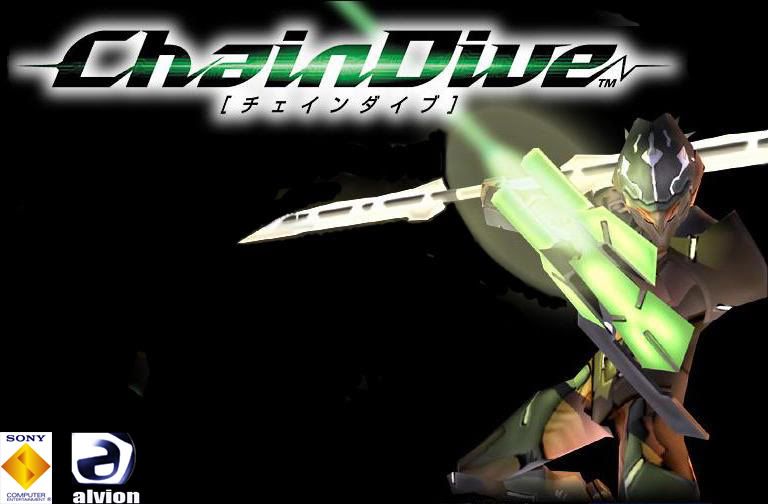
Well here they are (Photos are sized huge to specifically look at the two logo differences):
Cover Art 1 –
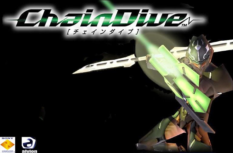
Cover Art 2 –
Thanks in advance for both taking the time to check this thread out and your opinions.
In any case,I love it. Looks awesome. How’s the game itself?
In any case,I love it. Looks awesome. How’s the game itself?
lol the logos are the difference, and thanks. The gameplay is very unique. It’s basically something you’ve never played before, but not hard to catch on. The stages are a bit repetative, but there’s always action. The music is great as well. I recommend it to old school gamers of the older generation, cause next gen gamers only care about graphics.
http://www.youtube.com/watch?v=O3eZSq_YRZI Gameplay footage.
It’s like NiGHTS into Dreams mated with Bionic Commando and/or Rez or something.
i prefer the first man, the reason is simple, you keep the aspect of the Sony Logo size in the first pic instead of a resize in the second one.
then people say "the 2nd logo is resized in the 2nd pic also??"
of course yes, but ILL ViLLaiN had rezised it in keeping its original aspect (no deformation horizontal naeither vertical)
it’s my opinion on it.
Ahh! So you’ve noticed the difference. The first is really resized as well. Like about 20 pixels less on both height and width. Thanks on your feedback. If others who view this thread weren’t so shy, and gave there opinions on it, it would be more easier for me to make a decision. If nobody reply’s I guess I’ll use cover 1.
If you see a smudge then I missed a spot, if not then its just the jpeg I was working on, but still I feel that I didn’t completely finish the task. I double check constantly, and if I don’t see anything I usually get opinions from someone else. I’m picky too. I made a signature and put it in the signature thread, but made two versions of it. I understand how you feel, but I will clean it up after a decision is made. Thanks for you feedback.