
Online Casino South Africa
Online Casino New Zealand
Online Casino India
Online Casino Australia
Online Casino UK
Online Casino Canada

Online Casinos
Lately I’ve been reading a lot of tutorials in an attempt to mesh different styles together to make myself stand out in some way…not sure if it’s working, but hey, I’m still a fledgling (sp?) graphic artist.
I put together a Dissidia collection because I am enthralled with Nomura’s work on this game. His style is so edgy and amazing, I love it!
<a href=”http://smg.photobucket.com/albums/v63/ehrgiez/?action=view¤t=Dissidia-FFs89and10heroesandvillian.jpg” target=”_blank”>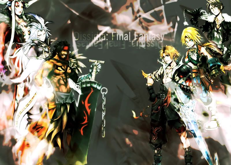
Just threw the heroes and villians of FF’s VIII, IX, and X together.
<a href=”http://smg.photobucket.com/albums/v63/ehrgiez/?action=view¤t=Dissidia-FFs12and3heroesandvillians.jpg” target=”_blank”>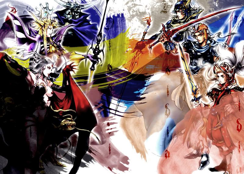
This one turned out horribly wrong. Though I do like the idea of clashing strokes of color, I think I may have overdone it here.
<a href=”http://smg.photobucket.com/albums/v63/ehrgiez/?action=view¤t=wingsoflight-encroachingdarkness.jpg” target=”_blank”>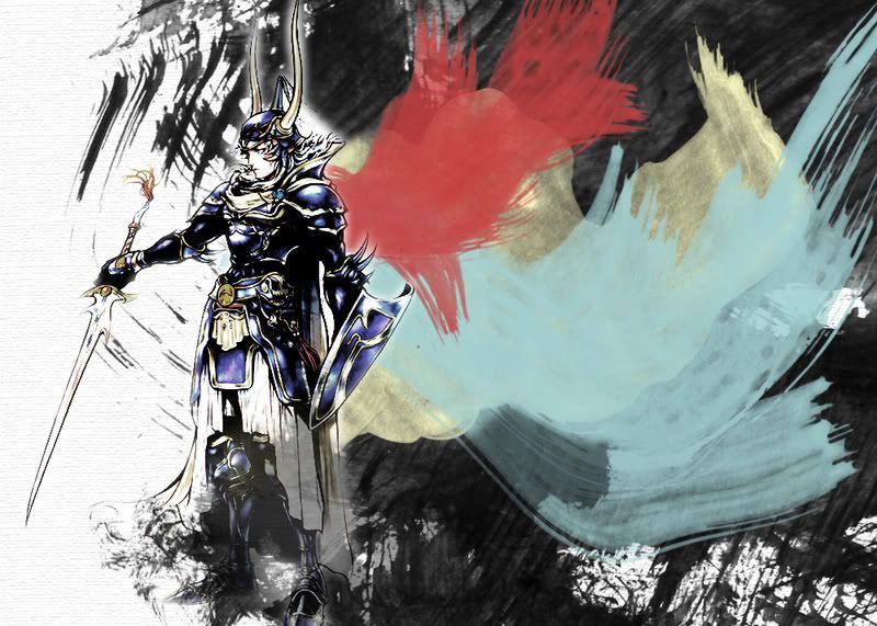
I was so bummed about the above fiasco that I wanted to fix it somehow, while keeping a similar style. This was the outcome, and I’m MUCH happier with it than I was with the previous attempt.
<a href=”http://smg.photobucket.com/albums/v63/ehrgiez/?action=view¤t=CecilHarvey-Dissidiawallpaper.jpg” target=”_blank”>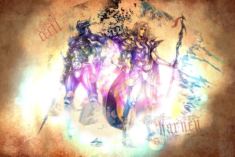
This piece marked my first time using textures in my art. It looks so much nicer with a texture 🙂
<a href=”http://smg.photobucket.com/albums/v63/ehrgiez/?action=view¤t=BartzandExdeathwallpaper.jpg” target=”_blank”>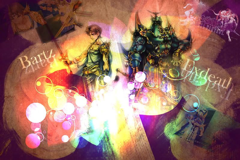
I was so pleased with the Cecil Harvey wallpaper, but I wanted to improve it in some way with Bartz and Exdeath…but it looks too much like the Cecil Harvey one. I’ve discovered that the first time I try a style is the only time it looks good. Later attempts at the same style usually pale in comparison.
<a href=”http://smg.photobucket.com/albums/v63/ehrgiez/?action=view¤t=bartzandexdeathwallpaper2.jpg” target=”_blank”>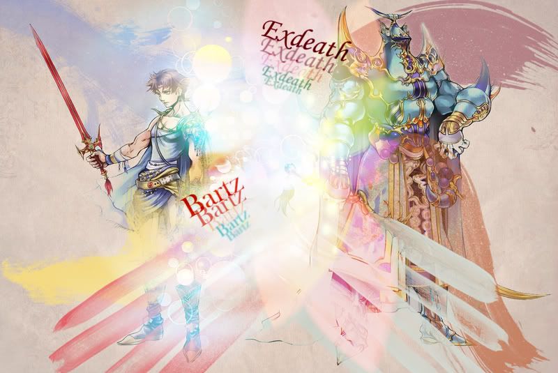
After coming to the above realization, I decided to try again. I would have liked it more without the text…ugh.
<a href=”http://smg.photobucket.com/albums/v63/ehrgiez/?action=view¤t=ZidaneandKujawallpaper.jpg” target=”_blank”>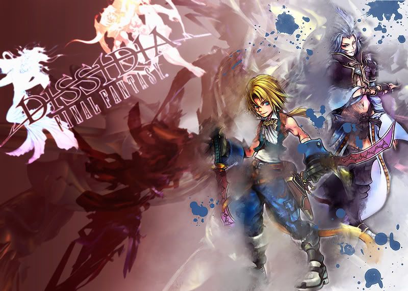
Another style. I really like it, but perhaps it’s a bit too busy.
<a href=”http://smg.photobucket.com/albums/v63/ehrgiez/?action=view¤t=TerraandKefkawallpaper.jpg” target=”_blank”>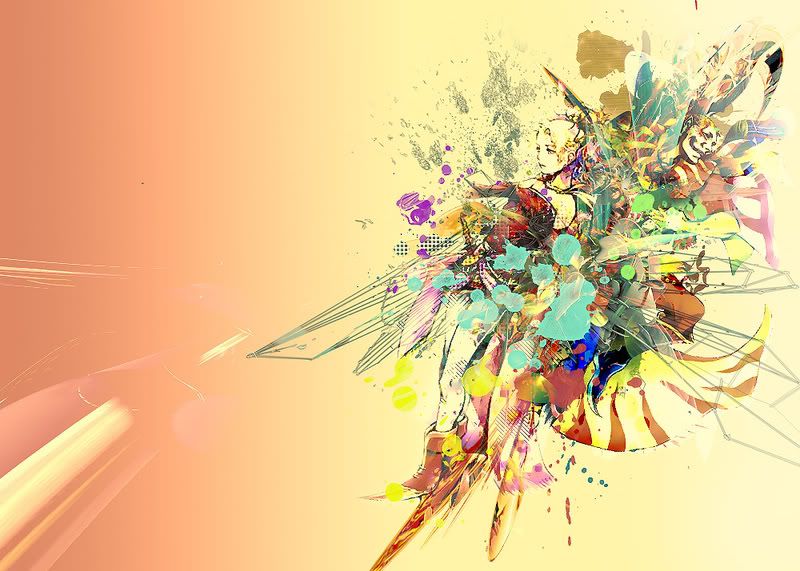
Finally, my most recent piece. I absolutely love it! Since FF’s VI and VII are my favorites, I think they deserve special Photoshop treatment. I like the idea of contained business and clutter, so I "contained" Terra and Kefka in that sort of "clutter" while leaving the space surrounding it peaceful and plain.
That’s all of them. So…what do you guys think? I know some of them are blah, but towards the end I think I improved a bit. If you’re wondering where I got the character stocks, I found them on the Final Fantasy Wiki. Just search for the character you’re looking for and head towards the bottom of their respective character pages to look for descriptions of their appearances in other games; artwork usually accompanies said descriptions. I usually wait until scans are released from Famitsu or somewhere, then I keep heading over to the Wiki to see if some one has uploaded the characters by themselves in decent quality.
Honest feedback is welcome. Fire away 🙂
An FF8 only would be the tits.
Damn I wish I could use something other than Dreamweaver.
That’s prefect, is it not?
The darker Bartz/ExDeath is also pretty cool. I like the subtle inclusion of what look like screenshots.