CartridgeCulture
06-09-2014, 12:29 PM
Hey! I've made some shitty "album art" representations of game boxes to fit in with the rest of my music library, and I thought I might share them with the rest of you! I'm posting this in the VGM download links forum as its the most relevant to game music and the intended audience of the thread, although it can be moved anywhere if needs be :)
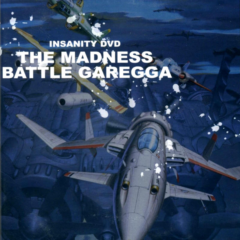
THE MADNESS: BATTLE GARREGA PERFECT SOUNDTRACK. THIS MIGHT BE SLIGHTLY OVER-CONTRASTED AND THE CREASE ON THE LEFT NEEDS REMOVAL. MADNESS.
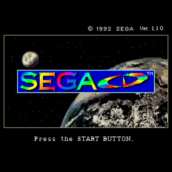
The majority of these files are 100quality .jpgs saved at a max of 600x600, but some are stupidbulky .png files, and some are above 600x. Like this one. Maybe add -2 saturation but the original art might be that colorful
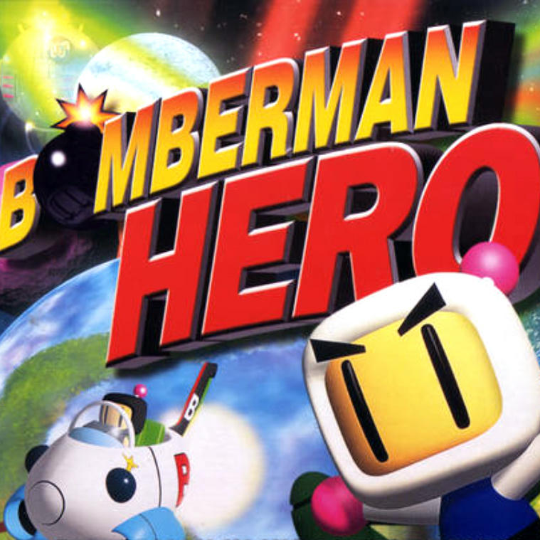
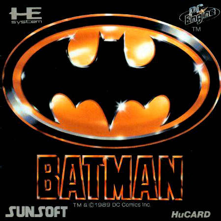
Here's where composition is a bitch. Properly framing the title would have cut off Bomberman, so this is as good as it gets. This picture is old as fuck, artifacted, blurry, taken from a bad source, etc. Just passable.
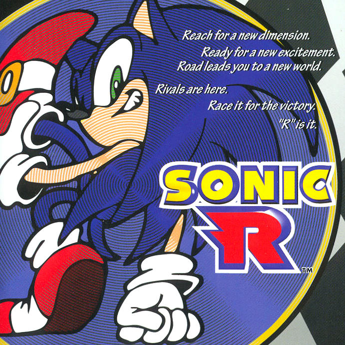
I don't remember why, but I think all the Sonic R scans out there were sliiiightly misaligned. This actually looks pretty good.
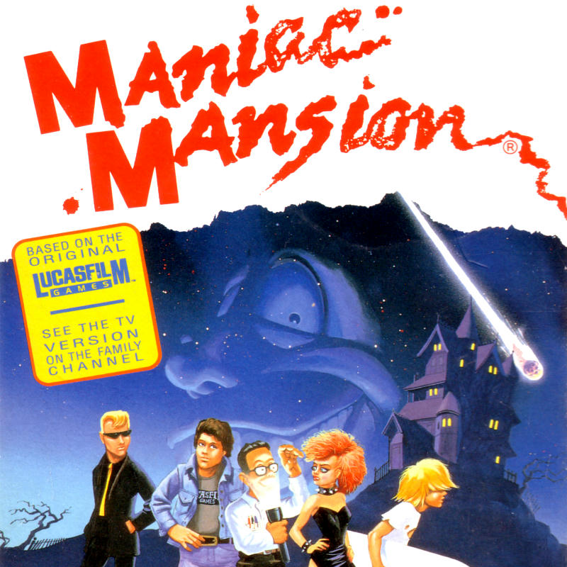
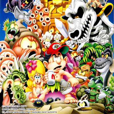
Maniac Mansion is the beeessstt, I seriously wish I could hear more early LucasArts x NES. This also turned out pretty good.
Is this a hint too red? I look at the white and it looks alright, and the whole picture feels alright, but... I don't know, this was tough.
With Battle Garrega, there's that same crease on the left. Not to mention I couldn't find a good source. This would need a lot of work.
Eh, turned out okay. I think I cropped the title low because the NAMCOT logo was intruding, but I could have edited that out in a pinch. Okay but lazy.
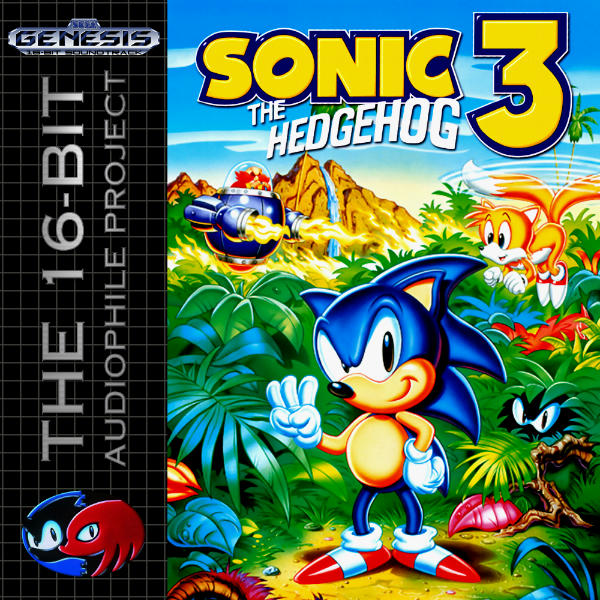
Why did I do this? I vaguely remember the 16-Bit Audiophile art having overly-green, oddly tinted colors, so I think I tweaked the Sonic side of this? Probably not by much.
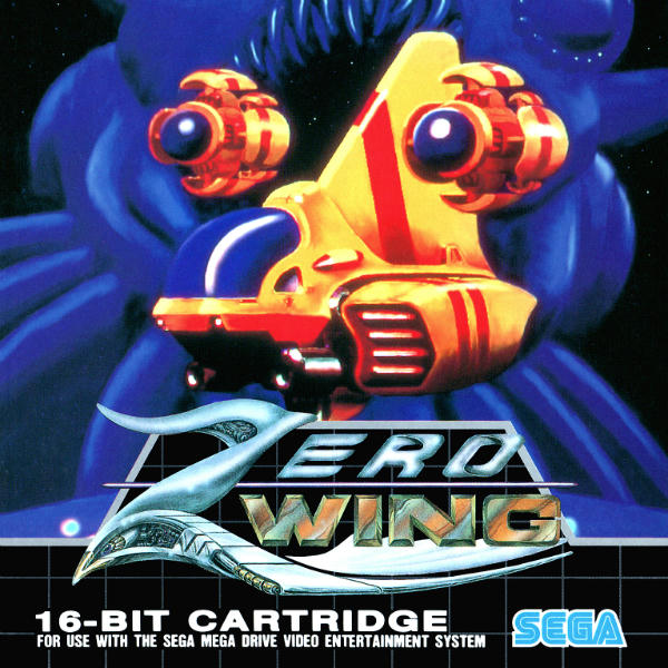
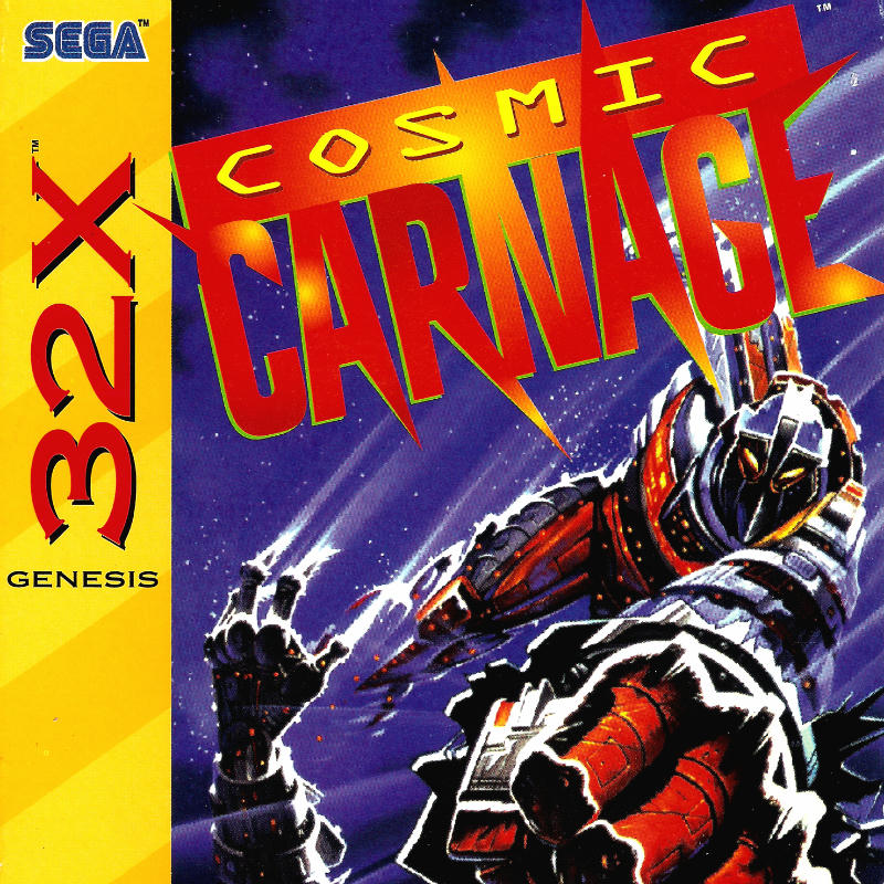
Eh. Genesis boxes. At least the logo and the main subject both fit comfortably in frame. I'm convinced the source art for this box lacked vibrance to begin with or the box designer used a bad scan, or something. The art just looks a little gray and unsaturated compared to the Genesis b/w grid branding at the bottom (what I used for reference).
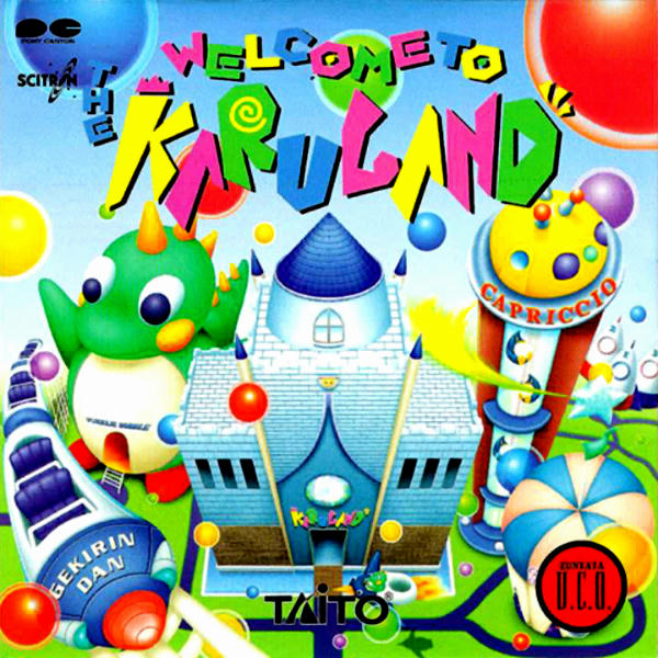
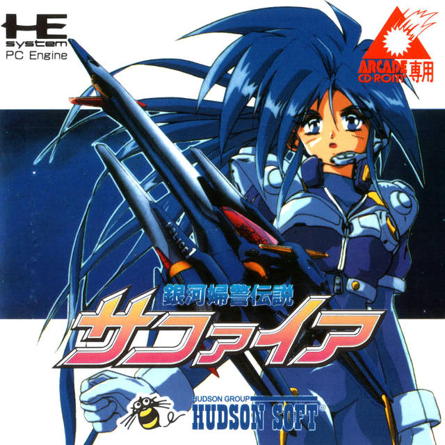
Don't blame me! Clean scans of this album are rare as balls, I tried to get the best source I could and clean it up. Honestly, this is where my limits of correction come in. I think it's too green or something, but the blue sky throws me off. Either way, if you like Gekirindan or Puzzle Bobble, there are some ancient .mp3 rips up on ********* if you're interested.
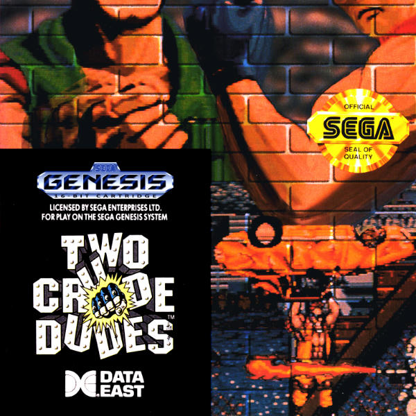
TWO CRUDE DUDES. TOO MANY REDS. This one's okay, but its hard to estimate what the original box would have looked like with all the bad scans on the internet.
Okay you can totally blame me on this one. But fuck if all the original sources looked like balls. Same with Crude Dudes, what the hell does an original box even look like anymore?
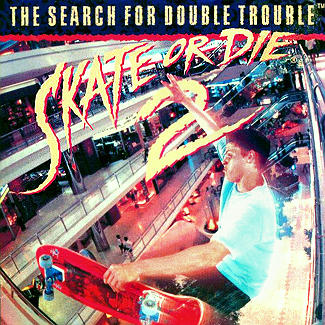
Using the PAL version here, because every time I see the NTSC box life becomes a little less special. Over-saturated, over-contrasted, this one's passable but poor. Sorry Takahashi :(
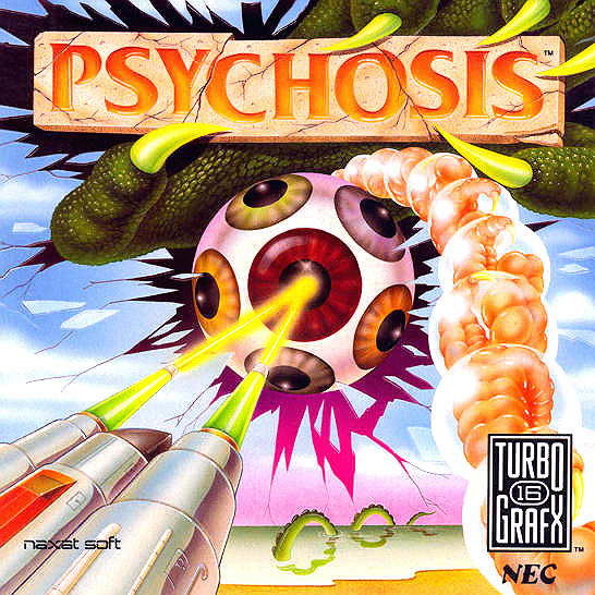
All the sources on this were pretty small, so this is the best I could come up with, and even then, these colors could be ANYTHING. I hope my approximation is close.
Turned out okay for what I had to work with (an unreleased prototype). Go listen, it's pretty. (https://www.youtube.com/watch?v=EZrRisstvGk)
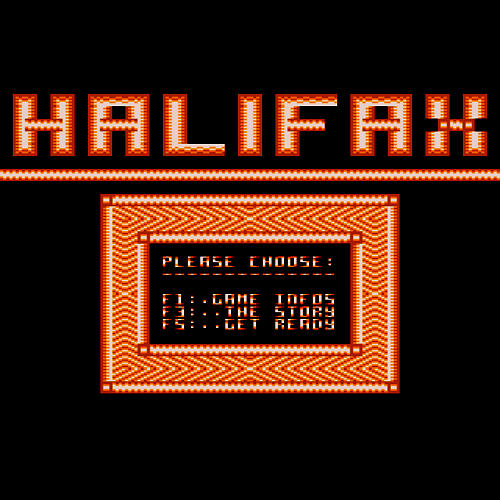
I rarely have cases where music in my library doesn't have proper physical art. Sometimes (as in the case of Halifax) it's software-only and might have only received release in a magazine or compilation disk. In this case, I had to find a suitable "album art" representation of the sounds of a system BIOS, so... what do you do? Hopefully this works for now.
I think I got this off of our resident Iron Goat's FLAC rip page of the same game. I think I might have squared it off and deepened the blacks but I really didn't do much. A little scratchy looking to begin with.
Small, grainy, but clean and representative of Gimmick!. Took a little creative liberty here, isolating the central shot on the box as opposed to showing the entire box (which consists of a single-color frame you see around the shot here).
Eh, here's what I was talking about. We don't even know who composed it (someone from Onyx Design probably). Anyway, turned out pretty good for what I had to work with.
That's it for now, enjoy!
THE MADNESS: BATTLE GARREGA PERFECT SOUNDTRACK. THIS MIGHT BE SLIGHTLY OVER-CONTRASTED AND THE CREASE ON THE LEFT NEEDS REMOVAL. MADNESS.
The majority of these files are 100quality .jpgs saved at a max of 600x600, but some are stupidbulky .png files, and some are above 600x. Like this one. Maybe add -2 saturation but the original art might be that colorful
Here's where composition is a bitch. Properly framing the title would have cut off Bomberman, so this is as good as it gets. This picture is old as fuck, artifacted, blurry, taken from a bad source, etc. Just passable.
I don't remember why, but I think all the Sonic R scans out there were sliiiightly misaligned. This actually looks pretty good.
Maniac Mansion is the beeessstt, I seriously wish I could hear more early LucasArts x NES. This also turned out pretty good.
Is this a hint too red? I look at the white and it looks alright, and the whole picture feels alright, but... I don't know, this was tough.
With Battle Garrega, there's that same crease on the left. Not to mention I couldn't find a good source. This would need a lot of work.
Eh, turned out okay. I think I cropped the title low because the NAMCOT logo was intruding, but I could have edited that out in a pinch. Okay but lazy.
Why did I do this? I vaguely remember the 16-Bit Audiophile art having overly-green, oddly tinted colors, so I think I tweaked the Sonic side of this? Probably not by much.
Eh. Genesis boxes. At least the logo and the main subject both fit comfortably in frame. I'm convinced the source art for this box lacked vibrance to begin with or the box designer used a bad scan, or something. The art just looks a little gray and unsaturated compared to the Genesis b/w grid branding at the bottom (what I used for reference).
Don't blame me! Clean scans of this album are rare as balls, I tried to get the best source I could and clean it up. Honestly, this is where my limits of correction come in. I think it's too green or something, but the blue sky throws me off. Either way, if you like Gekirindan or Puzzle Bobble, there are some ancient .mp3 rips up on ********* if you're interested.
TWO CRUDE DUDES. TOO MANY REDS. This one's okay, but its hard to estimate what the original box would have looked like with all the bad scans on the internet.
Okay you can totally blame me on this one. But fuck if all the original sources looked like balls. Same with Crude Dudes, what the hell does an original box even look like anymore?
Using the PAL version here, because every time I see the NTSC box life becomes a little less special. Over-saturated, over-contrasted, this one's passable but poor. Sorry Takahashi :(
All the sources on this were pretty small, so this is the best I could come up with, and even then, these colors could be ANYTHING. I hope my approximation is close.
Turned out okay for what I had to work with (an unreleased prototype). Go listen, it's pretty. (https://www.youtube.com/watch?v=EZrRisstvGk)
I rarely have cases where music in my library doesn't have proper physical art. Sometimes (as in the case of Halifax) it's software-only and might have only received release in a magazine or compilation disk. In this case, I had to find a suitable "album art" representation of the sounds of a system BIOS, so... what do you do? Hopefully this works for now.
I think I got this off of our resident Iron Goat's FLAC rip page of the same game. I think I might have squared it off and deepened the blacks but I really didn't do much. A little scratchy looking to begin with.
Small, grainy, but clean and representative of Gimmick!. Took a little creative liberty here, isolating the central shot on the box as opposed to showing the entire box (which consists of a single-color frame you see around the shot here).
Eh, here's what I was talking about. We don't even know who composed it (someone from Onyx Design probably). Anyway, turned out pretty good for what I had to work with.
That's it for now, enjoy!